Play game
Chomp chomp!'s itch.io pageResults
| Criteria | Rank | Score* | Raw Score |
| Use of the Limitation | #34 | 3.000 | 3.000 |
| Overall | #41 | 2.975 | 2.975 |
| Enjoyment | #47 | 2.800 | 2.800 |
| Concept | #48 | 3.100 | 3.100 |
| Presentation | #53 | 3.000 | 3.000 |
Ranked from 10 ratings. Score is adjusted from raw score by the median number of ratings per game in the jam.
Team members
https://nicoledev.itch.io / [Me] , Raphael M
Software used
Unity
Use of the limitation
Finite amount of time and food
Cookies eaten
none :(
Leave a comment
Log in with itch.io to leave a comment.


Comments
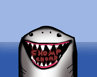
like the drawing! it was very fun trying to eat fish in time. the UI is kind of weird and maybe add sound effects to make it even better but over all it's pretty good!
Thank you very much!
Nice work! I loved how challenging the game was, there was always just enough food found in just enough time to win, it got really tense at points! I liked the different levels too, and the difference in daytime / music that went with that, it added some variety to the game and kept me playing for longer. The graphics were readable as well, it was very easy to tell the fish apart from everything else, so that was good! Well done on this game!
Thank you very much!
Glad you liked the gameplay and music!
The idea of being a shark is must be awesome. You could add more juicy details to this one to make it more addictive. Water/Bubble trail for the shark, bubbles when moving up/down, blood particles when catching a fish, sound feedback on those events. Those details would made the game much more effective. Maybe I would move counters to the top of the screen too. Keep it up!
Thank you! Yeah i was planning to do them but I didn’t have much time and I already submitted pretty late ;v;
Perhaps I’ll make an after jam update!
i will try to expand it after the game jam ends :D
Glad you find it interesting!
Simple and easy to understand gameplay! I will say I don't think having the spacebar as a speed ability is necessary, I found myself just constantly holding it down. I'd either make that speed permanent, or have some sort of limit on the amount of dashes you get. Also the solid blue background could be disorienting at times when you have eaten everything in that area. Maybe add elements in the far background to give players a better frame of reference for where they are? You could also try a wider field of view. Other than that a solid game I enjoyed :) Definitely reminded me of hungry sharks!
Thank you! Glad you liked it!
I’ll try and update the background perhaps after the jam ends
Liked the art, liked the concept, gameplay was easy to understand and pretty cool! Good concept!
Thank you very much!
I was inspired by Hungry Sharks from Ubisoft
Good job!
The art is good, and the music is very nice, although it was hard to find fish at times, sometimes I find 10 next to each other, other times I wander for 20 seconds with no fish in sight.
Also, the UI is very hard to read, and it's not in the corners of the screen (is this intentional?)
No it's not intentional, I thought it was easy to read :(
There is a randomiser in some levels which make some fish dissappear making it easier or harder sometimes.
You should use the spacebar and speed up, it is necessary to beat the levels.
A lot of fish are usually lower and inside the purple cave.
Glad you like the art and music!