Play game
YUME's itch.io pageResults
| Criteria | Rank | Score* | Raw Score |
| Use of the Limitation | #9 | 3.800 | 3.800 |
| Concept | #21 | 3.667 | 3.667 |
| Overall | #26 | 3.567 | 3.567 |
| Presentation | #33 | 3.667 | 3.667 |
| Enjoyment | #58 | 3.133 | 3.133 |
Ranked from 15 ratings. Score is adjusted from raw score by the median number of ratings per game in the jam.
Team members
UrBoiRAD
Software used
Clickteam Fusion 2.5, Aseprite, Bfxr
Use of the limitation
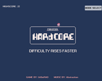
Each playthrough has a random modifier.
Cookies eaten
13
Leave a comment
Log in with itch.io to leave a comment.



Comments
this feels rly good and complete. the art is consistent and cute and the gameplay was fun enough for me to play a handful of times. the limitation mechanic was by far the most interesting part and kept the game fresh. if you wanted to keep working on this it would be cool if you added new obstacles or mechanics the more you're alive just to keep each run interesting (i found myself giving up after a while without new stuff)
A nice take on the limitation! Although i got really scared by the volume(i had it on full) xD! Nice job!
Clever and supercute. The only thing I would change probably are fonts. Man, the art is super nice but the fonts don’t seem to match the style… otherwise great entry!
Now THAT'S a clever take on the limitation.
As someone who struggled with my first use of a sequencer this jam, the attention you put into the first minute of experience in this game turned out just lovely. All of the screens are informative, absolutely beautiful, smoothly transitioned and very well timed.
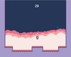
You've managed to do a lot with a little for gameplay, and the mechanic was motivating enough for me to play a few times. Were the big stars supposed to be pickups? They weren't interactable for me, so it made the dominant strategy just walking as little as possible back and forth whenever a spike came out. I was thinking it could be more fun if patterns of spikes came out (i.e. only one safe tile vs only one dangerous tile) or if there was a reward on screen motivating additional movement (maybe that's what the stars were though).
All and all, an almost perfect, extremely well polished and loved game in my book. I genuinely can't wait to see more of what you come up with.
Thanks! Your supposed to jump on the stars for extra points. (probably should have made that clearer).
Jump ON them-- I get it now. Love it :)
Really cute art and a lot of randomness on the modifiers, was really fun! Good job!
Did a great job implementing so many different mechanics, quite a lot of work there.
Pretty palette, pleasant visuals and nice mechanics. This one is very enjoyable overall! Well done
Solid experience. I wish there was more to it, because I like the way it feels and I enjoy the visuals. Two is Better than One is super fun haha. Nice work.
Thanks!
Controls felt solid and the game is polished.
Thanks! Yours is a very solid entry as well.
I LOVE the pixel art and the palette that you chose!
Thanks!
I really enjoyed this. Great work! The game was very simple but felt great to play and it looks great too! I also really love how you implemented the limitation. One small thing that I probably would have liked is to see how many "power ups" I have yet to discover when the wheel spins at the start of the game.
So simple but so enjoyable. I absolutely love the use of the modifiers, it truly changes the game every single time! Well done! :)
Great use of limitation and a really clever concept. Keep up the good work!