Play game
Small Fall's itch.io pageResults
| Criteria | Rank | Score* | Raw Score |
| Use of the Limitation | #43 | 3.529 | 3.529 |
| Enjoyment | #68 | 3.059 | 3.059 |
| Presentation | #73 | 3.118 | 3.118 |
| Overall | #74 | 3.118 | 3.118 |
| Concept | #105 | 2.765 | 2.765 |
Ranked from 17 ratings. Score is adjusted from raw score by the median number of ratings per game in the jam.
Team members
ACB_Gamez
Software used
Godot 3.5.1
Use of the limitation
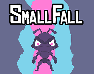
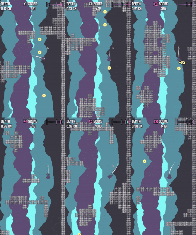
The player is an ant infinitely falling through a spider web trying to avoid getting caught.
Cookies eaten
0
Leave a comment
Log in with itch.io to leave a comment.


Comments
got around score 1900, great game, I'm having a good time :D
Ahaha i like it, looks like Minecraft Dropper
Fun game! Interesting mechanic with the multiplier ;) With some more obstacles it would be great!
Coming back to this since the web build seems to be fixed now. Achived a score of around 19000 by going full speed and the obstacles generation was in my favor at that run, but most runs I had to slow down a lot to go through gaps and take sharp turns.
Fun game and nice graphics.
Fun idea - I played until I got around 1000 score.
I like how you made the player fall slower by default - one of my problems with games where you fall down is that you move too quickly and have little time is given to react, but I don't feel that way here (and you're given an option to go fast as well). I think the movement was done well for a game of this type.
One small critique is that the foreground/background separation could be a little bit better in some places - for example the spider is the almost same color as the center of the screen, and the cyan color in particular popping in and the background sometimes distracts my eyes from the webs.
As other people said, good use of parallax to create a unique environment.
Thanks for playing! Yeah I noticed the issue with the foreground-background separation as well. I wanted to add a fog shader and drop the saturation a bit, but ran out of time. I also wanted to do more with the obstacles than what they were, and I think they were a little hard to see compared to the solid black squares I used during prototyping.
I love the idea that you can speed up to increase a score multiplier, but god I'm too tempted by it XD
Thanks! Yeah, I feel like trade-offs are what make games interesting. There was also supposed to be a giant spider chasing you if you went to o slow, but never got there.
Its a really well made game and I especially like the movement. The ui is also quite nice and in General I think visually its pretty amazing, with the parallax effect, trail while falling, dynamic score multiplier and speed bar. As far as I noticed there is no Music/sound with neither the web nor download version, but considering how well made the other parts of it were, I recon there just wasnt enough time. Overall its a great game and can keep one entertained. Really well done!
Thanks for playing! Believe it or not, I made all the art in about an hour last night! and yeah, no time for music or sounds, though I had them planned. I made the entire game in one day because I wasted so much time trying to figure out proc gen, only to scrap it.
BEAT MY SCOORE OFFF FOUR THOASANND TWOO HUNDREEED :P
Neat little game, could do with more than just blocks for obstacles and I don't see how this fits the theme of web, but I like the parallax and simple ui. also, could do with some sound effects.
Nice game tho :)
Thats pretty good! Yeah I had wanted a mixture of cave walls and webs with some animated mini spiders for the obstacles, but didn't have the time. And the blocks are supposed to be spider web :( haha. There was also supposed to be a giant spider chasing you if you, but I never got that far haha.
Horizontal and downwards movement feel good !
It feels great when you use the down arrow. Good game and use of the limitation but its so unrelatable to me, I just don't get what I am doing.. falling and eating?
Thanks for playing! Yeah there was supposed to be a giant spider chasing you that was supposed to motivate you keep going.
I feel like a few adjustments would be good, move the camera down a bit so you can see more of the level ahead, also felt like the left and right movement was too fast compared to the down movement and was hard to control. Potential to be a fun challenging little game!
Thanks for playing! Yeah I didnt really have time to play test. I think I want to keep the movement sharp but make the rooms a bit easier at first. Your game was great by the way! You could win the whole thing!
Looks interesting. But I can't play it unfortunately.
Like you say on your itch.io the brower version isn't working.
Btw. You I read this text on your itch.io site, except you highlight everything. Since your text color and theme color is both white.
Hey! I just got the html version working and fixed the itch page. (sorry I did that at 4am last night)