Play game
Starlight's itch.io pageResults
| Criteria | Rank | Score* | Raw Score |
| Use of the Limitation | #28 | 3.549 | 3.833 |
| Concept | #64 | 3.086 | 3.333 |
| Overall | #68 | 2.816 | 3.042 |
| Presentation | #76 | 2.777 | 3.000 |
| Enjoyment | #108 | 1.852 | 2.000 |
Ranked from 6 ratings. Score is adjusted from raw score by the median number of ratings per game in the jam.
Team members
Nerushi: Director and programmer, Christess12: Lead programmer, Heather: Lead artist, JustTheDani: Composer
Software used
Unreal Engine 5.3.2
Use of the limitation
Light is required to travel this plane of existence
Cookies eaten
A decent number, but hard to calculate exactly how many cookie casualties there were
Leave a comment
Log in with itch.io to leave a comment.


Comments
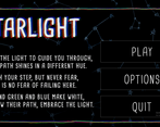
The lighting got really spotty during some parts, which made it kind of really difficult to play. I think it was when I walked onto the light bridges? I also really wish there was a way to look at the poem in-game. I also think the art styles between the menu BG and the assets were incohesive; maybe having more simplified visuals would have worked in your favor? (and make it easier to see too). I liked the sound design of picking up the stars though and the fact that the mechanics were reverse of what you expected (kind of like how light and reflecting works IRL!)
Thank you for the feedback, it's really helpful! It seems we indeed overdid the contrast in light intensity. Doing this first game jam definitely taught me a thing or two about player expectations :)
I totally get it. It’s pretty difficult to be able to just put yourself into the player’s shoes when you put a lot of hours in making a game. And then when you release, players realize things you’ve never thought of! It’s always a learning experience.
Much deserved props for completing your game though ^^.
nice concept and atmosphere <3
In my opinion, paths should not be color coded but the idea was fun, really liked :3
Glad you liked it :) Does the colour coding make it too easy?
I got a little frustrated by how hard it was to see, but I still liked it. I think it's cool how each star is a reverse key of sorts. The music is nice and really fits the vibe of the game. This was fun :)
(Composer Here) Thankyou so much!! We were somewhat hoping for players to make mental maps of the area but the size of the level may have been in a goldilocks zone of "small enough to know where everything is" and "too big to see where everything is" :P
I really liked this concept, and I thought it was well-executed for the short time frame. The menu design and animation was really good. I'd love to see a few more levels.
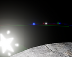
I thought it was a little lacking in visual clarity. I had trouble seeing what leads to what, because the platforms that have no stars on them blend in perfectly with the background because they're unlit. Great work overall.