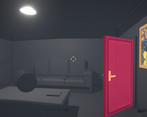
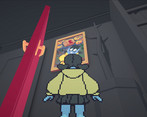
I got stuck in the box with the TV... but the pixel art on the picture frames are really cool
Play game
Hako's itch.io pageResults
| Criteria | Rank | Score* | Raw Score |
| Concept | #6 | 3.842 | 3.842 |
| Use of the Limitation | #11 | 3.737 | 3.737 |
| Presentation | #13 | 3.842 | 3.842 |
| Overall | #14 | 3.553 | 3.553 |
| Enjoyment | #35 | 2.789 | 2.789 |
Ranked from 19 ratings. Score is adjusted from raw score by the median number of ratings per game in the jam.
Team members
2
Software used
Unity, Blender, and Aseprite
Use of the limitation
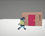
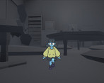
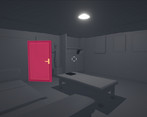
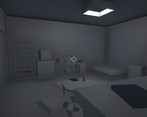
We made the player travel through bedrooms from different continental styles that are contained in boxes that lie in those rooms. Boxception!
Cookies eaten
Too many to count
Comments
I wasn't able to complete the game unfortunately, as I couldn't get past the platforming section in the second room. Just.. couldn't make that first jump after bouncing up for the life of me lol. The character's move speed also felt rather slow, which was a little frustrating after falling down. The atmosphere, concept and art style are fantastic though!
I LOVE THE ARTSTYLE! It's cute and original too! Same thing for the gameplay, it's very interesting. Movement is also quite good, altough walking is a bit too slow maybe, but other than that i liked it a lot
Nice artwork. I feel lost early on the first level, jumped over some things but didn't advance too much. Anyway, it's very nice to play, good job.
The art in this is so cute! I’m a huge fan of 2D in 3D worlds. The animations and mapping of the sides of the character to the camera looked really good. Platforming felt fine it just needed a shadow under the character to help figure out where you’re going to land. But without that it didn’t make it impossible to make the jumps. Good stuff!
We had this suggestion during testing and I actually implemented something quickly but what I implemented unfortunately didn't look as aesthetically pleasing as without it, and didn't help with platforming as much as I would've hoped so we ended up ditching it! haha. I do think a clean bob shadow that fits the style would be great but ah well! Maybe next time ;)
Thanks for playing!
The box-in-a-box concept of game progression with the player becoming ever smaller to explore further room is great. Pixel art, both 2D and 3D is blended with the minimalistic achromatic 3D environment in a tasteful way, with minimal conceptual problems (i.a. inconsistency in the use of black - both to indicate interactables required to progress and newly-created platforms). The artwork is great to look at, although I do not feel that panties were a necessary addition to the player sprite.
However, any failures in the game's main mechanic, 3D platforming, are more punishing than they should, in my opinion, because of the character slow movement speed. If you fall, it is a long way to the point where you have been. It also discourages exploration when in minimised state - it takes too long to e.g. circumnavigate a bed for it to feel worthwhile.
The change in the detail level/depth when entering a new room is noticeable, but not too jarring.
I have managed to get the 'stop dillydallying' message, which was a nice touch.
All in all, nice looking game with a good concept, although I did not feel engaged with its main mechanic, being more frustrated than content with. At the same time I do have a skill issue when it comes to platforming.
Bugs
Some flickering issues connected and camera out of bounds problems.
Additionally, I have managed to enter the Large Door Basement (name mine). To reproduce:
- Get to the first portal room (the one with the goal box inside a drawer)
- Stand before the portal
- Manoeuvre the camera to get the "Press E" prompt and click "E"
- The drawer will close. Now you have entered "Drawer Hell" (name mine). Your movement options become limited, with you being stuck inside the drawer. At last, with some more opening and closing of the drawer, only strafing left or right remained. Keep opening and closing the drawer, as well as wiggling about.
- You should start sinking. After some more sinking, you'll finish the bug reproduction and fall here:
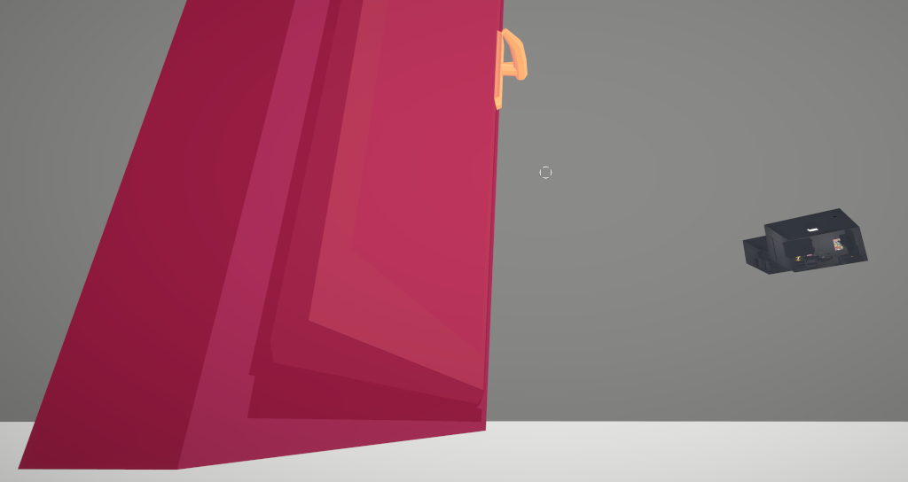
Thanks a lot for the thorough review! I can't say much more besides that I completely agree with essentially everything you pointed! Including the panty shot haha. I think we went a little ambitious especially since we didn't fully utilize the full 72 hours of the gamejam.
The movement speed was also a little tricky. I do find it interesting to see everyone's opinion on the platforming difficulty vary. I think the first room was not too bad but the last room was particularly poorly executed with the ceiling being too low. Initially I wanted to focus more on puzzle solving from the first person perspective rather than the third person tiny perspective, but we opted for something we could implement very quickly.
I think ideally I would love for this to be a mainly puzzle game with an element of platforming sprinkled in.
The change in the detail level/depth unfortunately was simply a technical issue that we didn't have the time to resolve, it was my first time trying this effect and as someone who usually lets his fellow colleagues handle the rendering side of things I was admittedly not as well equipped to tackle it as I could've be.
I love that you found the 'stop dillydallying' message! I think in the end more easter eggs like that would've been a better usage of my limited time; of course hindsight is 20/20.|
Once more thank you so much for giving our gamejam game such a thorough playthrough!
The box-in-a-box concept of game progression with the player becoming ever smaller to explore further room is great. Pixel art, both 2D and 3D is blended with the minimalistic achromatic 3D environment in a tasteful way, with minimal conceptual problems (i.a. inconsistency in the use of black - both to indicate interactables required to progress and newly-created platforms). The artwork is great to look at, although I do not feel that panties were a necessary addition to the player sprite.
However, any failures in the game's main mechanic, 3D platforming, are more punishing than they should, in my opinion, because of the character slow movement speed. If you fall, it is a long way to the point where you have been. It also discourages exploration when in minimised state - it takes too long to e.g. circumnavigate a bed for it to feel worthwhile.
The change in the detail level/depth when entering a new room is noticeable, but not too jarring.
I have managed to get the 'stop dillydallying' message, which was a nice touch.
All in all, nice looking game with a good concept, although I did not feel engaged with its main mechanic, being more frustrated than content with. At the same time I do have a skill issue when it comes to platforming.
Bugs
Some flickering issues connected and camera out of bounds problems.
Additionally, I have managed to enter the Large Door Basement (name mine). To reproduce:
- Get to the first portal room (the one with the goal box inside a drawer)
- Stand before the portal
- Manoeuvre the camera to get the "Press E" prompt and click "E"
- The drawer will close. Now you have entered "Drawer Hell" (name mine). Your movement options become limited, with you being stuck inside the drawer. At last, with some more opening and closing of the drawer, only strafing left or right remained. Keep opening and closing the drawer, as well as wiggling about.
- You should start sinking. After some more sinking, you'll finish the bug reproduction and fall here:

Very cute, and an intriguing premise! The platforming was quite difficult, and unfortunately I got stuck in the second room (opened the box door to the purple portal, but couldn't enter it), but I enjoyed my time nonetheless!
I liked the artistic side of the game, really cute and creative with the character scaing. The game bugged at the end though.
Neat concept! I like the 2D in a 3D world setup, and the 2D art was really nice - loved the paintings especially. Gameplay was a little confusing and there were some disorienting z fighting issues, but overall really neat game :)
Thank you for playing! The z-fighting issues are on the WebGL version only, although admittedly fixable if there was less of a time crunch. Some of the core rendering effects are also not showing on WebGL unfortunately. So definitely would recommend giving it a download if you find the time. Thanks for the feedback!
I love the sprite work, as well as how it is incorporated into the 3d environment!
Game looks really good and the style looks neat! I really like the concept and mechanics of this game, the 2D sprite in 3D is really awesome! Great work!



Leave a comment
Log in with itch.io to leave a comment.