Play game
Wizard Trials's itch.io pageResults
| Criteria | Rank | Score* | Raw Score |
| Overall/Fun | #13 | 3.429 | 3.429 |
| Innovation/Theme (If the optional theme is used) | #17 | 3.286 | 3.286 |
| Overall | #18 | 3.143 | 3.143 |
| How polished/complete is it? | #29 | 2.714 | 2.714 |
Ranked from 7 ratings. Score is adjusted from raw score by the median number of ratings per game in the jam.
Leave a comment
Log in with itch.io to leave a comment.


Comments
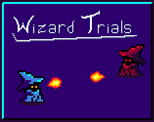
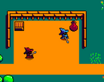
I enjoyed the retro aesthetics, cool sound design as well! I really appreciated the different kinds of enemies, kept the combat interesting throughout.
Thanks for playing and for the feedback.
Spell switching felt a bit clunky, as it did not always switch your spell. Nice concept, though I wouldn't mind an explanation of what each spell does. I liked the artstyle, and the controls worked well.
There's a bit of a cooldown on switching spells to avoid a couple of bugs, while each spell is rather simple, their interactions got very wordy so I opted to let players explore it instead of having a giant wall of text covering it, they're also not as expansive as I wanted as the code wasn't organised enough and caused many problems in development. The main interactions are water will put out fires and absorb poison, poison will explode with fire, fire will absorb air and air will push away most projectiles and enemies. Thanks for playing and the feedback.
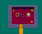
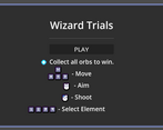
Very nice. The music has good ambience, I like it. The art looks polished. Exploring the world’s different areas was fun, but the controls were also somewhat difficult because of switching between waslking with WASD and the 1234 keys, at the same time as I use the mouse to aim. And a healthbar would have helped.
The healthbar is under every character, though I guess it's still a bit too small as I tried to reuse more code and components in this project, switching elements was something I didn't find a better answer for in time for the jam as it was either being too slow by cycling or difficult to keep track of what it was on without a lot more code to add fitting visuals for it. Thanks for playing and for the feedback.