Play game
Blast o' Shape's itch.io pageResults
| Criteria | Rank | Score* | Raw Score |
| Gameplay | #104 | 3.526 | 3.526 |
| Sound | #138 | 3.316 | 3.316 |
| Art | #292 | 2.947 | 2.947 |
| Creativity | #294 | 3.263 | 3.263 |
Ranked from 19 ratings. Score is adjusted from raw score by the median number of ratings per game in the jam.
Were the art assets made during the 48 hours?
Was all the music/sound created during the 48 hours?
Comments
The game is great but the art is not too refined. It's a pity, come on next time
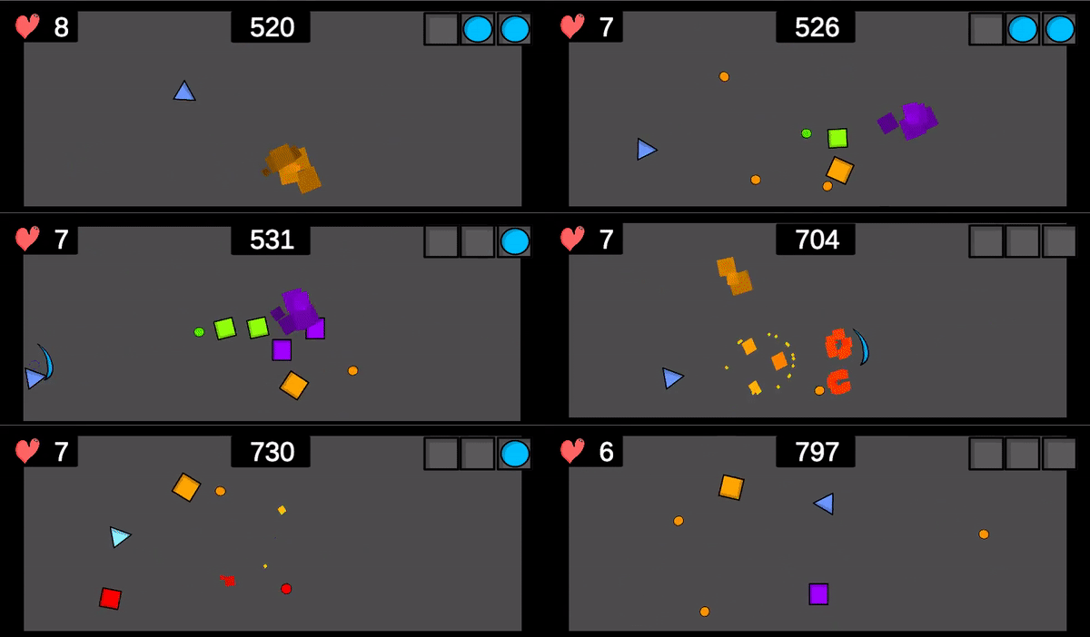
Wow that was super fun to play. I love the movement. It's fast and responsive. Art style is simple but aesthetic. Music fits very well. One issue i found is that sometimes enemies spawn outside of the screen. Overall great game :)
if you have a minute please play my game as well :)
Great music and I like the gameplay idea too.
I liked the main mechanic of the game, and liked the polish you've added in the game.
But I think you could add more polish, since you went for a simpler gameplay/art style for you game.
For example: make a simple animation for the bullet that scales up and down, giving a impression of livingness on it, add a trail to the bullet, so it makes a cool line, add some UI tween and polishing as well and so on...
A goal score, just to show some congrats message would be a nice addition too.
Overall I liked it!
Hey!
I really like the idea of killing enemies with the dash and managing your bullets like that, it keeps you engaging especially when there is a lot of enemies
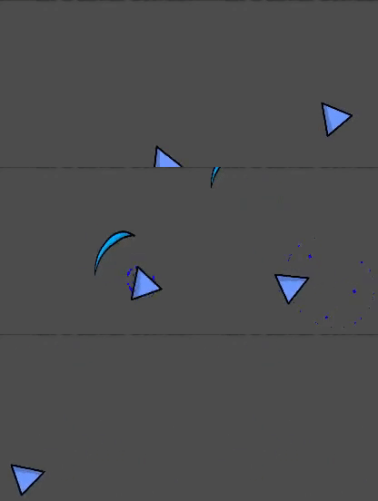
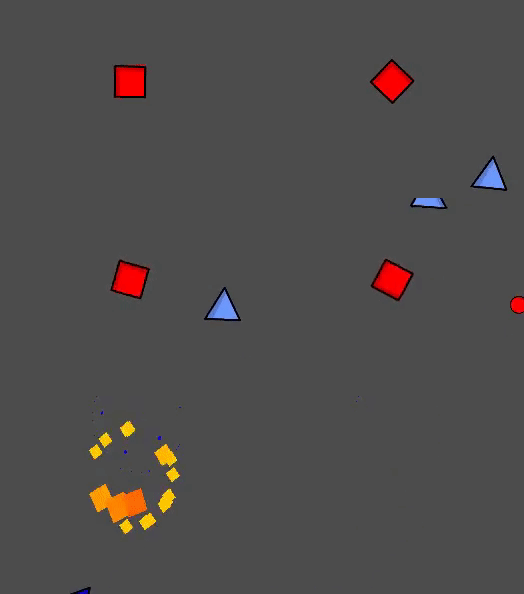
I was feeling a little bit lost when it comes to the direction the player is facing, because its a perfect triangle it was hard to say in a middle of a combat what hes looking at, Maybe adding some UI for the mouse or changing the shape of the player would help? Also I saw that other ppl were mentioning that but yeah, UI for the dash cooldown would be nice ahahah
anyway good joob! I enjoyed the combat! My highest score is 821
The sound is really cool, I like the gameplay. Dashing into enemies is really satisfaying. Great job mate !
As others have said, not knowing when dash was available was rough but otherwise I really enjoyed it! There's something very satisfying about simple shapes and colors. Liked it a lot.
Hi there! Really fun trying to beat my brother's high score haha.
Couple of things to make it even better :
- Spelling and grammar corrections in the tutorial
- Indicator for dash (sfx?)
- I think cos of the size of my monitor I was able to go off the edges, so maybe a resolution option
Nice game, my score is 3242, the only thing that was a bit annoying that you dont know when you can dash (its like in Minecraft Trying to sleep but its too early), But other than that its an epic game and the music was awesome too!
Good Job!
good controls, fun mechanics but i would like to see bar/timer (or some other indicator) that shows when you can dash as it is one of the main mechanics and sometimse i lost health because i thought i can dash but i couldn't
Very fun game my high score is 768 :)Controls are polished and killing the enemies with your dash feels awosme.Maybe adding a dash timer to inform the player can make the game better.I found myself trying to dash then hitting an enemy :D.Overall i loved the game great work!!
I tried merging the dash timer with the player's color (Inspired by Celese's hair color change) But it did turn out pretty un noticable. When he turn dark blue he can kill enemies, and when he is light blue he is recharging, maybe changing to other colors than blue would help.
Thanks for the feedback!
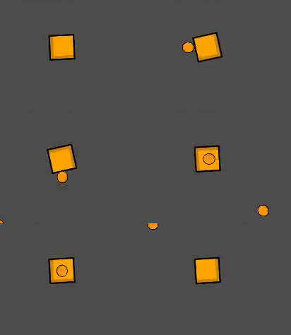
I had so fun playing this game. I found a bug that when player hits the tan color square the particle effects and sound will not play. There is no enemies in game so you can add some enemies. You can also add some more abilities to your player. Good game : D
Good job! The gameplay is very engaging and challenging. The player gets really nice positive feedback on his actions and the music is good. But I have some complains(hope they'll help you to improve): There is no quit button in the main menu - small detail but it will definitely help. It would also be easier to aim your dash with mouse. And I'm not sure how the game relates to the theme(or maybe I'm just dumb).
I've also experienced a major bug when I started the game for the second time: the UI gets weird and the text is not displayed, icons are replaced with some crazy glitchy lines.
But overall experience is very nice and juicy. Make sure to try my game! Basically Johnny is split to two parts - one trapped in a top-down perspective and the other is stuck in a classic platformer. Try to connect them :)



Leave a comment
Log in with itch.io to leave a comment.