Indie game storeFree gamesFun gamesHorror games
Game developmentAssetsComics
SalesBundles
Jobs
TagsGame Engines

Boilerplate

A topic by Munro created Jul 14, 2018 Views: 823 Replies: 19
Viewing posts 1 to 14
(1 edit) (+3)

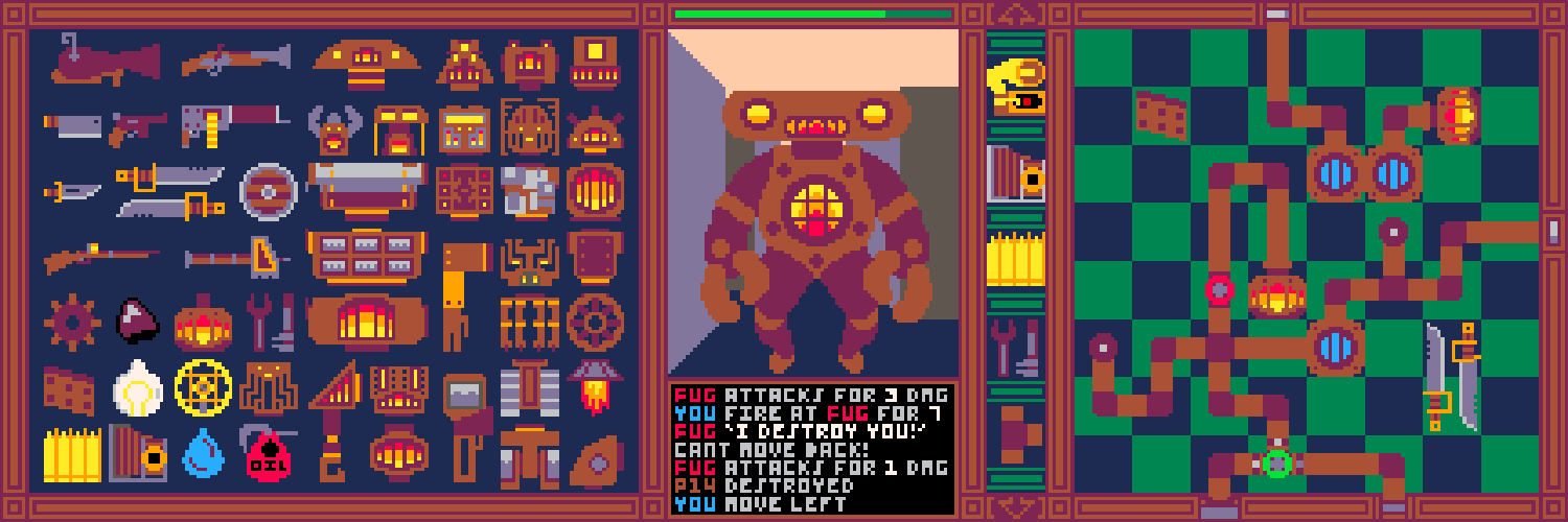
Hello! I'm making a steampunk dungeon crawler where you manage your robots internals with a steam pipe game. It's salvaging an older project, an experiment in inventory systems with robot game art, but I really want to be able to turn it into a game someone (you!) could play. I have two devlogs from before I realized I desperately needed to join a game jam to keep on track. Also should have a log for today with more robots. It's all being programmed in Unity C# so if you have any questions about what I am jabbering about or have a question ask away!

(2 edits) (+4)

Day -1:

Boilerplate is a in development steampunk robots dungeon crawler meets Pipe Mania. Shamelessly inspired by Zachtronics' The Bureau of Steam Engineering. Vaporum. and Ironcast.

Here's a summary of work so far:

  • You can place pipes and other items on a grid
  • They can be rotated, swapped, and even be different sizes but not sure if they will be since the grid is only 8 by 8
  • Boilers produce steam which will be used for powering your bot.
  • Pipes can transport steam between  each other through connections

Now today's progress:

  • I reworked the flow of steam to be more like Factorio's liquid system. It still is a bit wrong so may need eventual rework because it still orders everything without consideration for the next flow.
  • I wrote out a script that can notice objects I place in the scene editor and registrar them properly in-game with linkage and stats. Very helpful for testing and if I have a loadouts/save system.

Things that still need work:

  • Interact-able valves: Your robot is going to be a lot more modifiable even in combat than Zach's game so the ability to have more control over where the steam goes is going to be key. I wrote out a list of possible pipes that do special things:
    • Shutoff Valve- closes off steam flow (can be a straight or curved)
    • Switch Valve- Allows you to choose the direction of steam flow between 2-3 options. (tee or cross pipe)
    • Bumper Valve- Switch which of the fourway pipe's curve into each other (cross pipe)
    • Pump- Steam can only flow in one direction
  • Ability to move around the dungeon. I'm trying to decide how detailed it should be between a couple different modes:
    • Simple: You have one node which requires steam and if powered allows full traversal like most dungeon crawlers. (Most likely for development and very likely candidate)
    • Tank controls: Both your legs have a separate toggle for backward or forward. If both go the same direction you move in that direction. If only one is powered you go in the direction of that leg (left leg for left, right leg for right). If they are going in opposite directions, you turn.  (If I find movement to be too simple/not dynamic may implement this system)
    • Combine: There is a left leg and right leg node as well as a toggle. If you pump into both left and right, you go the direction of the toggle. If you only do one leg you move that direction (left/right). And if you have the toggle on you turn the direction of the single leg (turning). (I confused myself trying to explain this one, bad sign)
    • Split: Each movement has it's own separate node for a total of 6 nodes. (could take up a lot of internal space and maybe it's not a good idea to make movement so complex)
  • Essentially there needs to be 7 possible states (left/right/forward/back/turn Clockwise/turn Counterclockwise/stand still).
  • Combat system- For the moment just HP but eventually damage after you lose all your armor will be directed at the internal components. For causing damage I will be creating a placeholder weapon node that when powered deals equivalent damage.
  • Loot System- I'm thinking about making the loot system conveyor-belt style like the in-development Jack and Cassie but for the moment will create a simpler (hopefully) faux-inventory in the middle of the screen. Loot will drop whenever you destroy another bot and will sometimes be found in chests or on the floor of a tile.
  • Game background- I decided to make the shift to dungeon crawler instead of... I'm not sure what it was going to be but it involved turns, after reading How to make a 2D dungeon crawler in 3 days by Christina Neofotistou whose pixel art really inspired me to create bigger bots with more casual rounding. Need to implement the whole one-point perspective backgrounds thing with maps.

I'm currently debating whether to switch to a non-Pico8 palette. I love the dark red and brown and I think the warm colors work great but the dark green not sure on. Thinking about paring down to 8-12 colors total eventually. Games coming along, may have something player-testable by next week!

(1 edit) (+4)

Day 0:

Did some more work on the way steam flows visually and dungeon movement. Tomorrow I'll try to get some combat stuff in.

Work done:

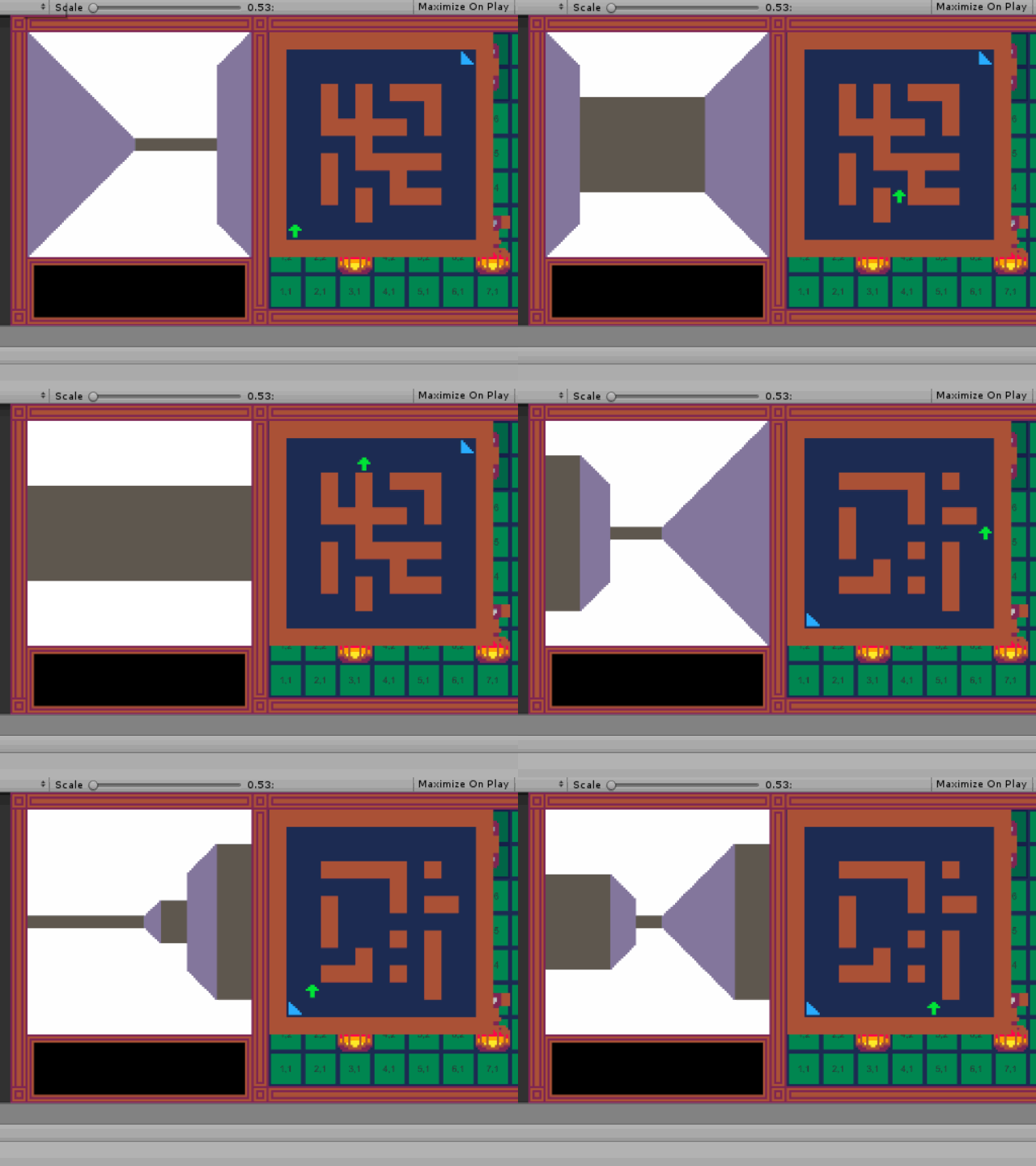
  • Basic movement around the dungeon (turning even!) and a grid map that has solid walls
  • Nodes which when powered correspond to actions (just whether you can move for now)
  • A slightly altered UI which removes the middle tab that was going to be used for loot. I think I will just use the upper right screen instead and make it bigger.
  • Playing around with the way you can see steam in the pipes. Right now it's a filled image and the pipes have little windows you can see into the levels. Really what it should be is that the pipe's get a thicker color the more steam is in them. Also the windows may be too small.
    • Windows: Steam can be seen in pipes by their little windows. Some pipes may not have windows. Currently implemented but makes testing hard and playing harder
    • Background steam levels: Change the background of the pipe to the steam color. Will change for now since it's easy and obvious.
    • Tooltip indicator- when you mouse over a pipe it has a visual indicator for it's pressure. Currently have a tooltip that only shows it numerical.
    • X-Ray: A toggle option to see the x-ray of everything. Would be awesome but too much dev time right now.
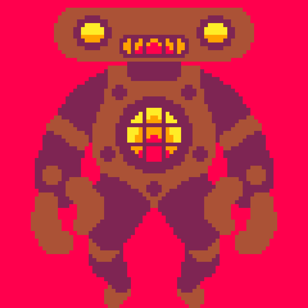
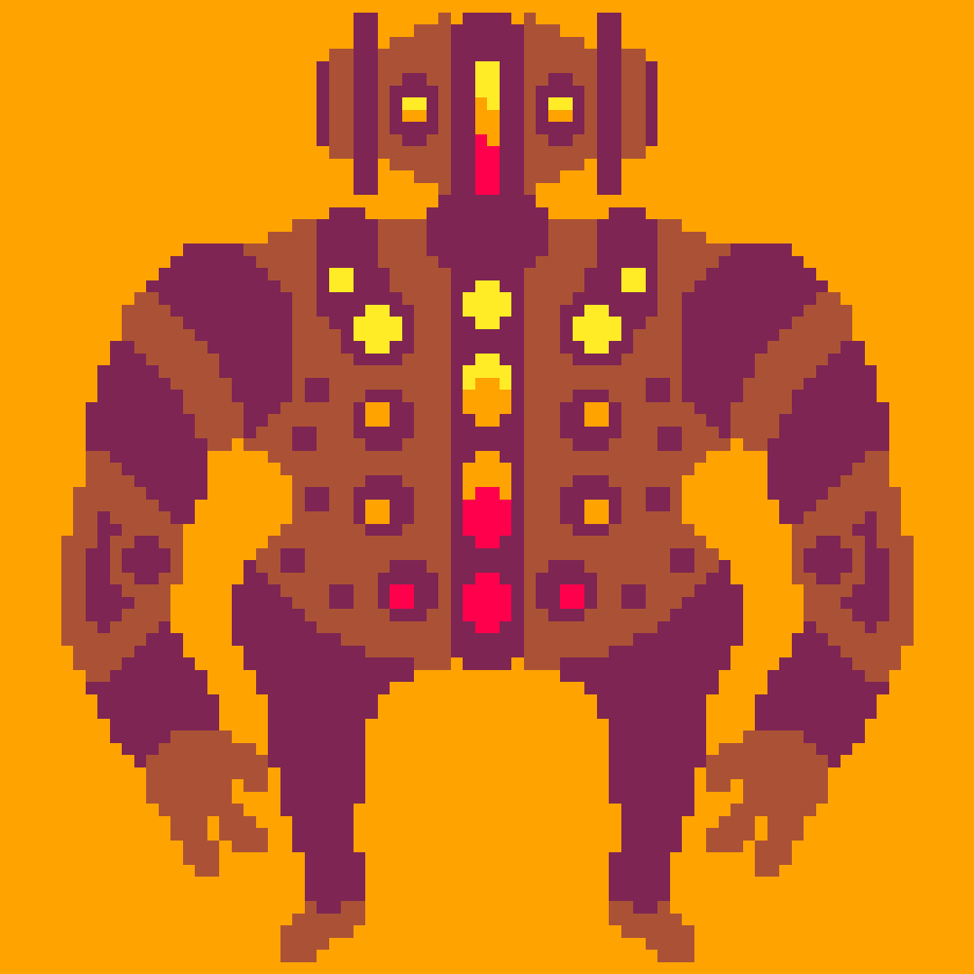
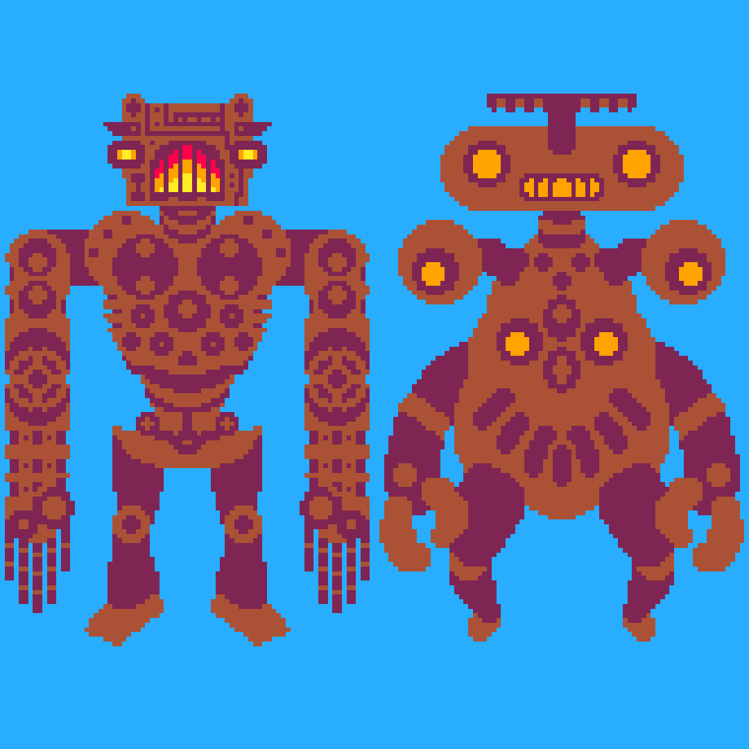
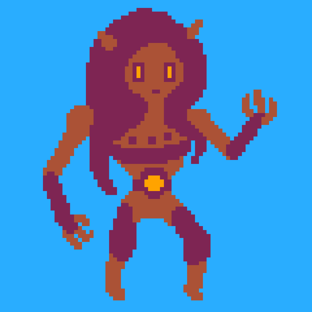
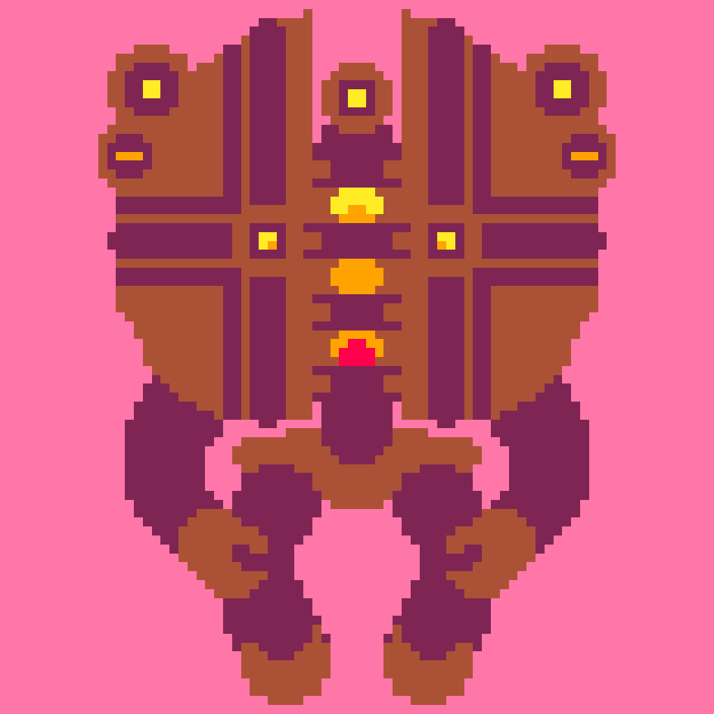
  • More robot drawings of course (next one's a test with a different perspective, not-mirrored)

I also took a look at Factorio's liquid mechanics and found that Zach had posted an explanation Bureau of Steam Engineering's flow equation. Short answer: Factorio ran into the same problem of not calculating multiple connections at the same time, which means that a tee junction will always favor one direction over the other. Reminds me of the Knapsack Problem where calculating the right distribution is mathematical challenging. Was pumped when I found Zach's own explanation of BSE:

For the curious: the pressure algorithm works by iterating over all paired connectors, each with a volume estimate and a pressure, and exchanging a “steam amount” (representing n in the equation PV = nRT) to neutralize the pressure between the two components. This is repeated until the pressures between each pair of connectors are neutralized to an acceptable degree (I believe I used a value of around 0.15 PSI). 

Less pumped when I realized I've forgotten a lot of algebra. Any case I think I'm going in the right direction, will try mess with some numbers and seeing if I can smooth it out. Worse case scenario I just up the tick speed and decrease the incoming steam and it will sort itself out. Also joined a game jam to give me a more of a sense of time-frame and meet some new people. If any are reading, hello! Can't wait to see what you come up with!

wow.....pretty ambitious,.....keep at it!

Thanks!

Host

wow your visuals are gorgeous! i like how you've detailed out your systems already and have a pretty clear idea of where you want to go with most of them.

that reminds me--we were thinking of holding a playtesting session during the middle of the jam so it'll be perfect if you can get a prototype by then!

Thanks! It's a game I've been wanting to make in one form or another for a while now- Sockets is basically a non-playable demo made in Construct 2. I use game visuals to get invested before working on a project (and as a cooling off from coding... and because it's fun). Having a mock-up image of what the game could look like as a point of reference really helps me focus.

I'd love to join the play-testing session,  so I'll try to get everything working on a fundamental level. Also excited to try other people's stuff!

I love everything about this. Can't wait to give it a try!

Thanks I'll be sure to send it your way when I have something playable!

love the art style! 

(+1)

Thank you! I feel a lot more confident in pixel art my pixel art abilities after working on it

(1 edit) (+2)

Day 1:

Alright lets begin!

Daily Update:

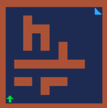
  • Read a whole bunch about rogue like level generation. I think the most informative was Bob Nystrom article with playable generators about how he designed one. Still don't understand it all well enough to implement so for now just going with a modified Unity Roguelike tutorial style generator.  May try to learn how to implement perfect maze algorithm tomorrow. It's an 11x11 grid with walls on the edges so whatever code I use has to make pretty small spaces look great.

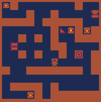
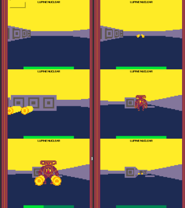
Side by side comparison of in-game  (left) currently vs mock-up (right). I think the generator is trying to say hi!

  • Implemented exits which regenerate the level.
  • Modified the steam code so it priorities lower pressure pipes in order. Also added a local variable that stores how much steam it's already spent not tied to the global gain it gets that turn (otherwise pipes would be giving away steam they are supposed to get that turn and go into the negative- the selfless dummies!)

Think I'm going to limit myself to one robot per devlog (otherwise I'll spend all my time drawing them and not making the game!)

Submitted

The project is so great, love the art and the concept. Lookin forward to test it.

Much appreciated! Hopefully will have something playable by the end of the week!

(2 edits) (+2)

Day 2:

Development Log:

  • Moved json data to streaming assets. I was terrified when the project wasn't working in the browser, luckily it was an easy enough fix. For PC. Then had to figure out some networking stuff for the webgl version... ugh, learning! Was working on a multiplayer Westrado-like networked game before this but the art-programming was becoming too lopsided for my taste. May revisit after the jam.
  • Also had a weird bug where all my publicly assigned variables got emptied out, something had to constantly deal with when making Sushi Inspector Extraordinaire! *shiver* Really taught me to resource loading and game managers though!
  • Rant about aspect ratios: So the art is all for 256x144. Obviously I'm not one of those monsters that makes you read tiny fonts (actually I totally am- I even created a custom font that's only 3x3 pixels wide muahaha! please use to annoy for all your games). So I thought that since 1920x1080 is also 16:9 all is good right? Unfortunately due to .5 in the rounding  it all gets wonky. I had to redo the UI to conform  to a base of 1024x576, 4x the pixel count. Which looks fine in the browser but also means that when you download the game it will look a bit jank. Letter-boxing might be the best option as the highest perfect ratio is 1792x1008, 7x the size.
  • Implemented a simple health and on move onto the same tile take damage. You can't destroy anything yet though!
  • Also found an embarrassing old list of names in the vein of  Pacific Rim- may still use them for the enemies cause they're so dumb. Here's a couple of favorites:
    • Lupine Nuclear
    • Massive Cosmos
    • Cruel Peninsula
  • Overall everything is working the browser as it should and on the pc, progressing along nicely.

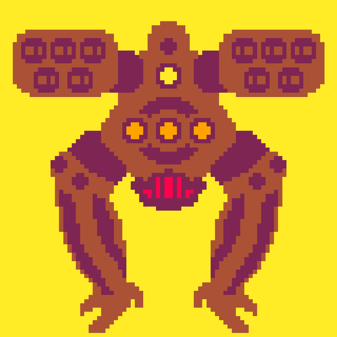
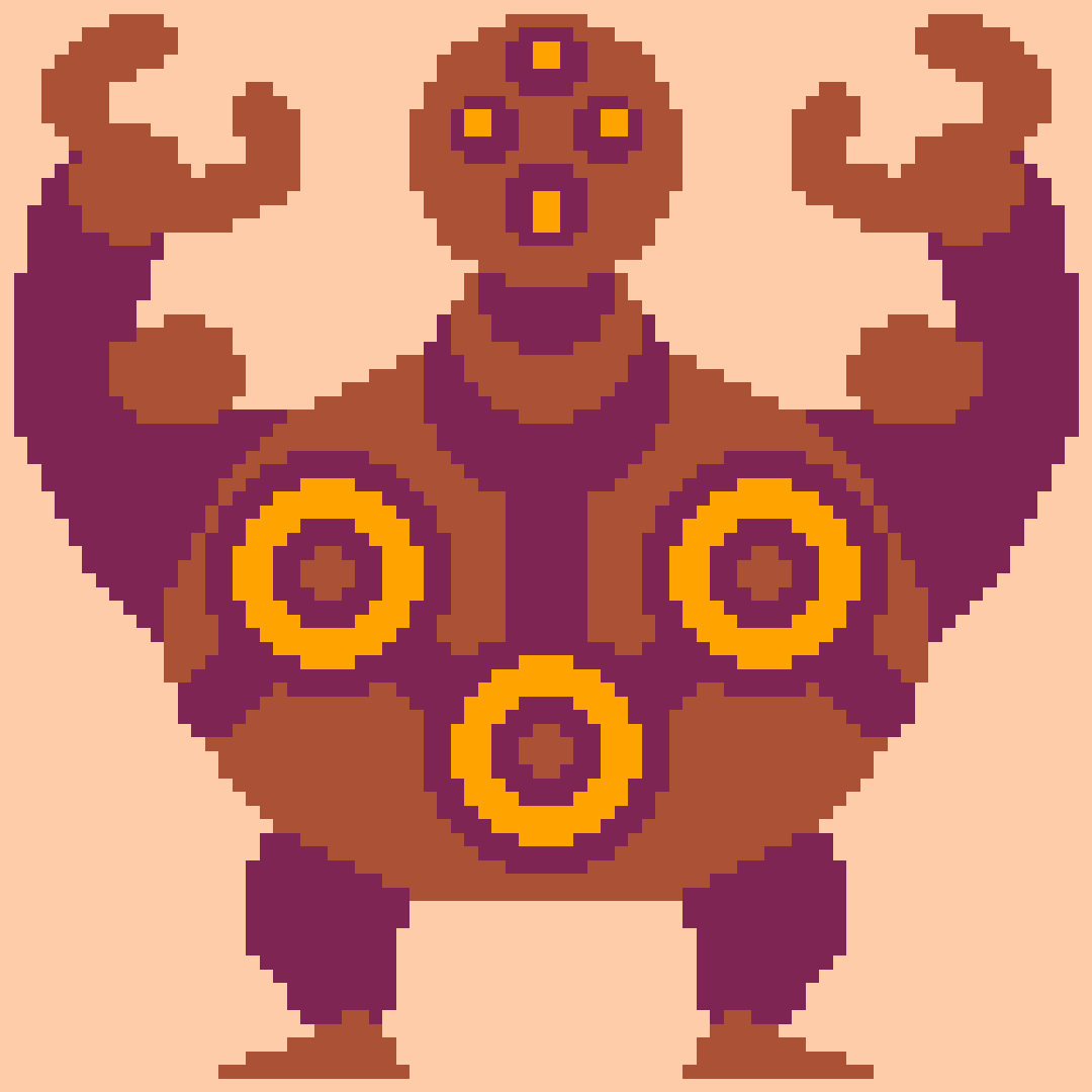
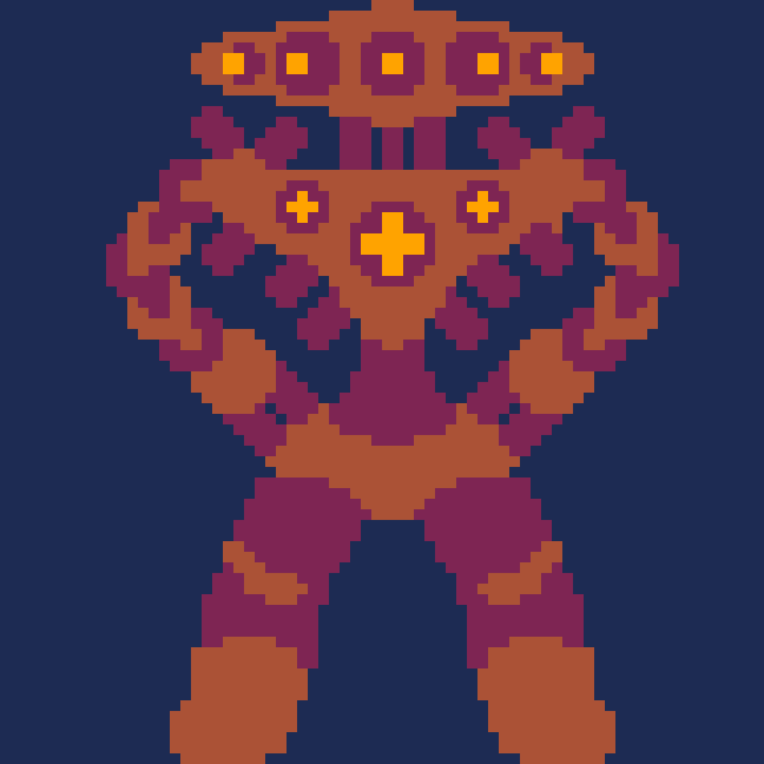
Crabby bot wants to show off his guns! (may be more literal in-game)

Tomorrow's update will be to the combat system. I keep trying to find this little example game someone made comparing the player being able to wait, not being able to wait, and the enemies being able to wait. The moral of the story is that having to offset your moves is way more interesting than just being able to wait until the enemy moves next to you. Sill haven't decided whether my game should be real-time, turn based, or a hybrid. Likely will go with turn based but I do want to experiment with turn ticks that go on without your input (Crypt of the Necrodancer style). Obviously not at that game's speed, I don't want to stress players out with real time puzzling. Roguelites are often turn based so it might make the most sense in the end.

(1 edit) (+1)

Day 3:

Daily Update:

  • Got a basic one point first person perspective of the game working. Currently the player only has a range of three tiles, plus the ones their on and any tiles adjacent to that line. It is really cool though! Also found an easy gif maker- so expect some gifs every now and then.
  • Then I woke up the next day and realized I over complicating everything and had no idea how to do rotation for the player. So I redid it all in 3d. Much simpler.
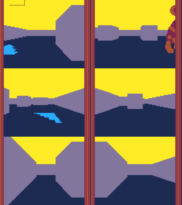
  • Can you tell the difference? I don't really feel like redrawing all the sprites for every facing so they're just going to always face towards you. It's also just compressing at different distances, which I could do smaller versions but again, lots of work! I could also render the screen at higher res even though that's a bit cheating. I might justify it by making all the sprites still conform to the general sizing.
  • Started to sketch out the combat system, worked a bit on a range system.


Submitted

Awesome, and the 3D view looks really great, how did you make it?

(+1)

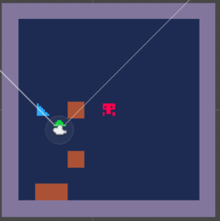
First one was a recreation of Castpixel's dungeon crawler method which is basically fake 3D where you take a 2d grid and map out different 2d sprites that correspond to it's position on the screen to display. It's a hack to get 3D in 2D., something I realized I didn't need to after spending a couple of hours jurryrigging a 1D array of sprites since Unity already has full 3D support.

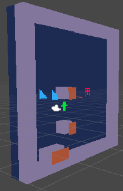
Second method is a 3D camera with cubes, which correspond to a 2D grid of objects in the code. The camera uses a render texture at a lower resolution to give it the pixelation and then I use a raw image with the texture to display on the ui canvas. If you have a 3D engine there really doesn't seem like a lot of benefits to using the former method. The 2D sprite of the robot has a bit of code that changes it's rotation to face the camera at all times. Hope that helps.


Here's an image of second method in the editor.

Day 4:

Daily Update:

  • Added enemy health and basic AI copied from Roguelike tutorial. They aren't smart enough to get around walls yet. If they try to move unto the same tile as you, you take damage.
  • Added player firing bullets which deal damage to enemies and can destroy them. They're actually 3D models fired at a slight angle and  are high caliber!
  • Extended node scripting to limit you from firing if you don't have enough steam power.

(1 edit)

Day 5:

Daily Update

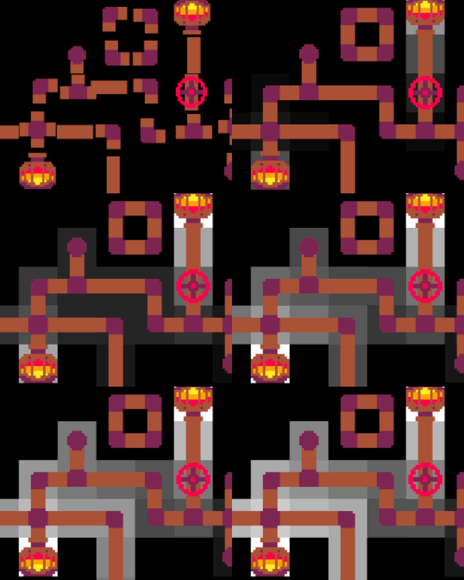
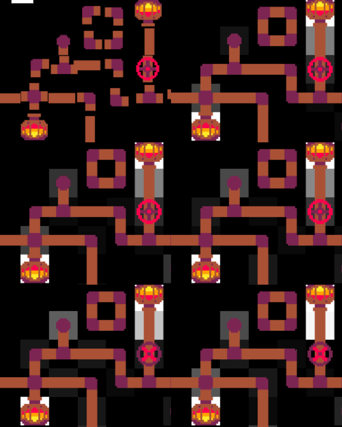
  • Messed around with the steam calculations again. Also tried out color changing instead of filling for representing steam levels, I like it. Still not found a equation that does exactly what I want
  • Up top is an example of two equations I tried out: First method is an older but simpler one. It equalizes out mostly but does have problems with buildup in the pipe immediately after the boilers. Second method is as close a copy to Factorio liquid system as I could fathom. It instead has buildup in the boiler itself and a rapid change  in dead-ends but it takes into account pipe volume, so larger spaces will need more steam to fill (also inertia). I think i'll go with the first method until  it becomes an apparent problem.
  • I found that increasing the volume makes it a lot smoother so everything will be at a 100.
  • Chests are now implemented, complete with inventories that persist as well as loot from defeated enemies.
  • Added a shutoff valve so you can control the flow of steam.
  • Reworked enemy health a bit.
  • Changed 3D colliders over to using purely 2D colliders. This game is not going to be a FPS, so there's no reason to use box colliders over 2D ones. Also I understand 2D collisions a bit better.
  • Bullets now have a map icon when fired.