Indie game storeFree gamesFun gamesHorror games
Game developmentAssetsComics
SalesBundles
Jobs
TagsGame Engines

[Devlog] Tim's Birthday <Visual Novel>

A topic by Kymarai created Jan 07, 2017 Views: 5,397 Replies: 31
Viewing posts 1 to 16
Submitted (18 edits) (+3)

Tim's Birthday


About The Game

Type of Game - Story-Based Visual Novel (Point and Click Adventure)
Genre - Drama, Psychological, Mystery, and maybe one last one... Depending if you consider it :)
Game Engine - Ren'Py

Description -

Tim's Birthday is a Visual Novel that uncovers the story of Anne, the protagonist and the older sister of Tim, who wakes up on the day of her brothers birthday hung over and has to slouch her way around the house and convince her little brother she wasn't doing "The Thing". As a player, you follow Anne through her attempts to make sure Tim has a great day but in the end it J USUsUSUUsS..>S..>>TTTTTTTTTTT

TTOTTTTTTNTTTTLTTTYTTTGTTTTETTtTTTSTTTWTOTTRTTSTTE

Whoops. Ignore that. I hope you enjoy!

Team

Kymarai - Writer: Concept and Ideas - Developer: Scripter
ellieinthesky - Artist: Talk Sprites and Scenes
Lord Dragon - Artist: Background and Objects
Deoduckla - Composer: Music

Screenshots

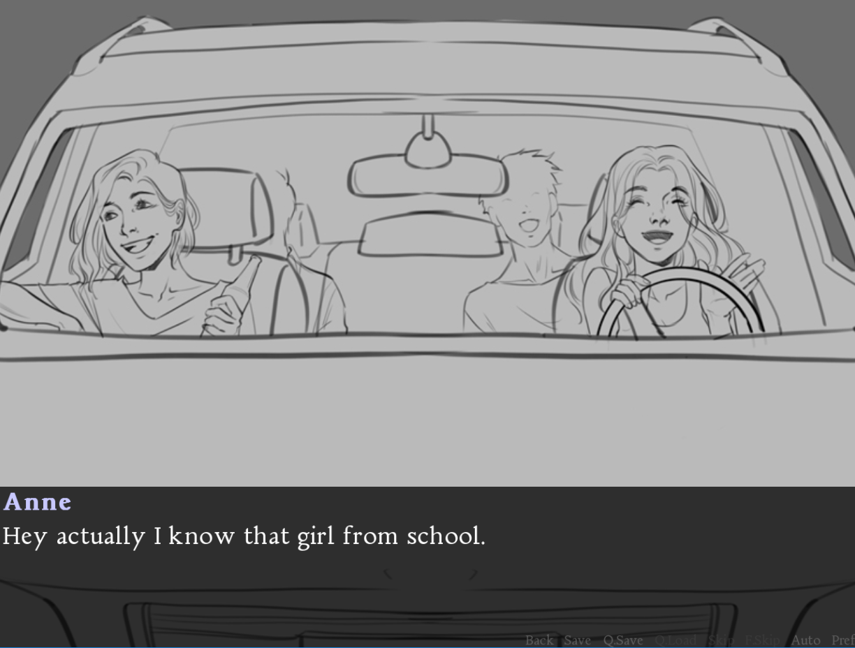
I wanted A cover photo... So I decided to use the concept art.
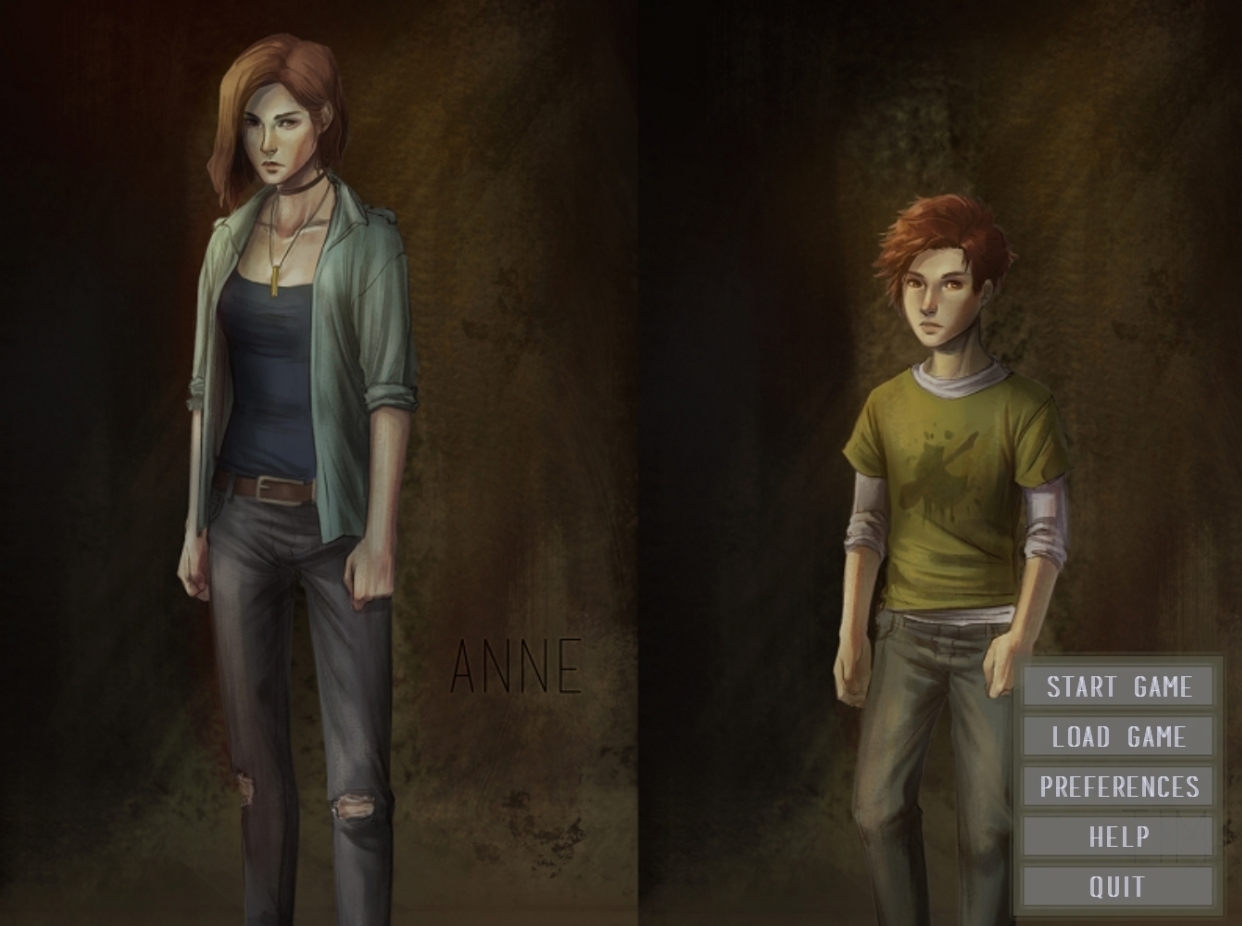
I love this font god damn...

Scenic backgrounds are amazing.


Kymarai's Devlog Section

[Day -1]

Prior to the game jam, I've been organizing my team and providing details and information to assure their interest and capabilities. So far, everythings going just great.

I've jotted down tons of information (that may have been rather repetitive) such as gameplay, overview, characters, and more. Now It's only time to write the script and the puzzles.

[Day 1]

I've started writing a brief storyline, apparently theres going to be "Days" in our game so I guess you can say I wrote day 1.

[Day 2]

I'm over all done most of the story aspect. Time to write about the game play and hopefully day three will be all about scripting. Oh man this'll be so fun... I'm so excited!

[Day 3]

Scripting is annoying, especially when you're trying to adopt someone elses code for the "Point and Click" aspect of the game. So far I've conquered it and included a whole bunch of blocky comments. #Programmerlife. Anyways, I wrote done a bunch of unedited lines down to just when the gameplay starts. This is going a bit faster than expected.

[Day 4]

Not the best day... Unfortunately ran into some tech difficulties switching over to a newer computer and still having troubles with that. Pretty unlucky to be honest.

It's the end of the day, I totally didn't do anything on the project, but GOOD NEWS... My CPU is up and running and everythings better than ever! (This may cause me to work less on the project, whoops..), totally fear not though, the project is pretty high in priority.

[Day 5]

Getting picky about the details, I'm really trying to get this game to have a neat appeal to it. I certainly do hope players will accept the odd story telling and horrible dialogue. Needless to say it's making progress though.

[Day 6]

More of game's own "swag". Slower production... I did some gameplay, kind of.


Time to move the rest of my Devlog in a comment below... Main post is getting glitchy!

(2 edits) (+3)

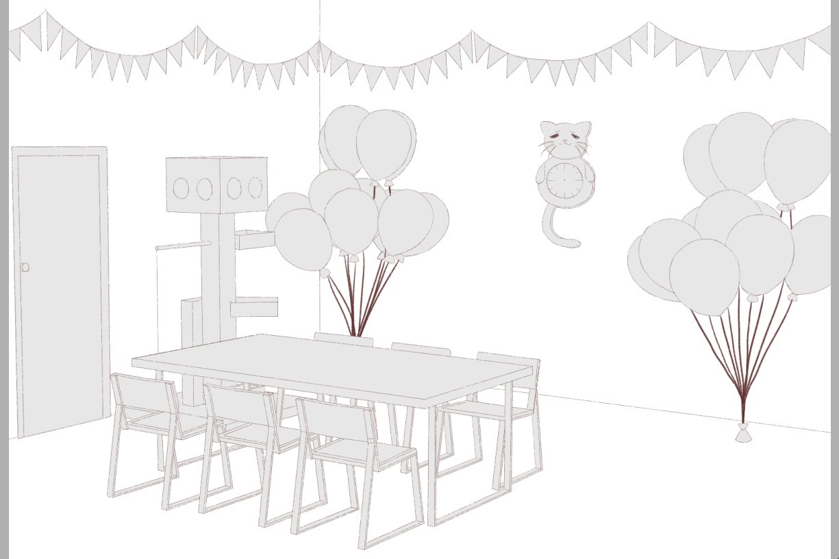
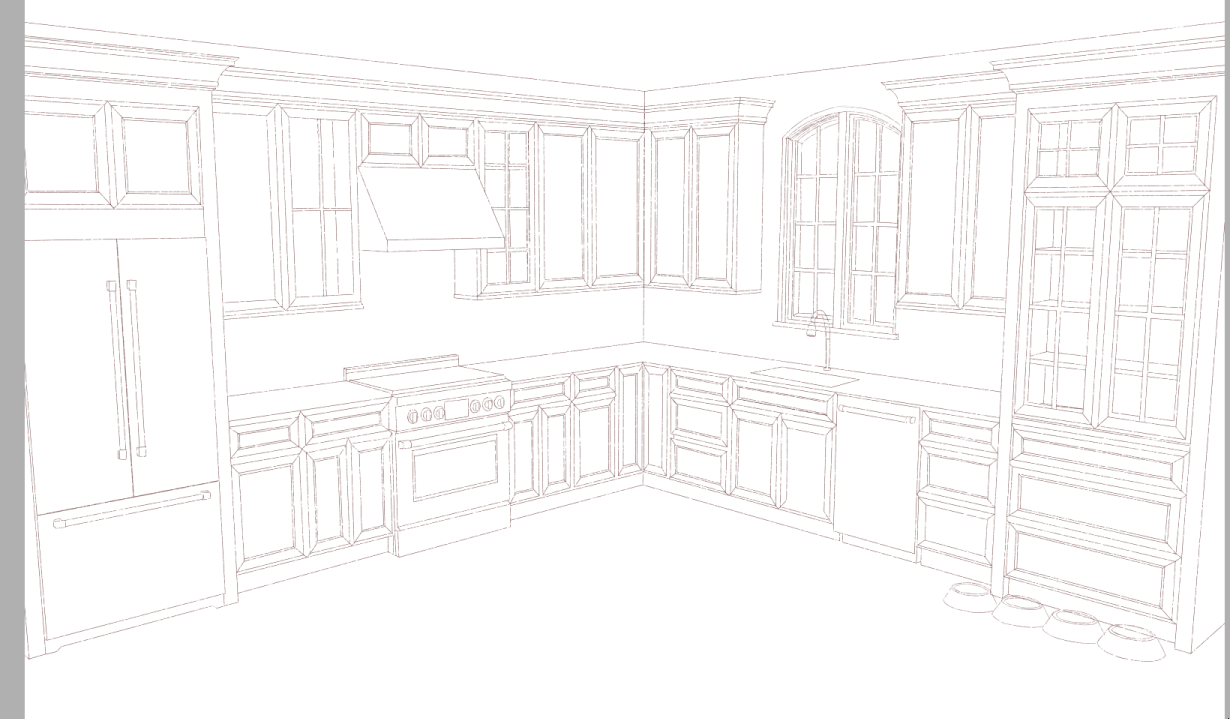
The Funtime Backgrounds Devlog

It's my first time drawing backgrounds and stuff bear with me

[Day 1]

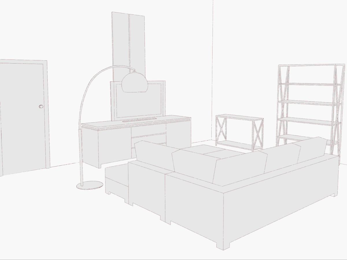
Well I sketched the living room for our little house, I haven't populated it with anything yet though.


[Day 2]


Nice work! The perspective is really great! Almost has a 3D feel to it. Can't wait to see the final version.

Host

omg your pitch has me hooked. the living space is looking really nice so far!

(+2)

Hi, composer of this lovely project here.

[Day 2]

I finished first track for the game, and you can check it out here: https://soundcloud.com/deoduckla/bagatelle-for-cel...

Time to do more :D

Submitted

Wow this is really coming along nicely! Love it so far.

And the music is really nice, too! Well done.

(+2)

Hi guys! I'm the other 2D artist of the project! :)

[Day 3]

I'm streaming now on my twitch channel the creation of the characters for the game :)

This is the link: https://www.twitch.tv/ellieinthesky You'll find the videos after the end of the live too!

Enjoy~ :)

(+2)

[Day 3]

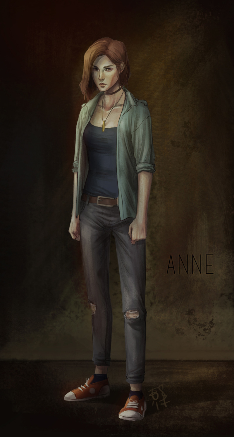
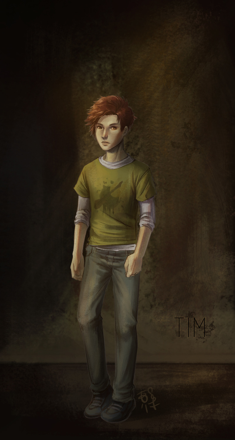
What I made during the 3rd day: the character designs of Anne and Tim!

Two more to go~


Submitted

Whoa, I am loving these character designs! Your environmental art is pretty great as well. I like how clean the environmental art; it should make the character designs stick out in the foreground really well. Excited to see more!

Submitted

!! It's so neat to see these different sides of development around the same game! Keep up the good work, it looks great so far!

Host

these character concepts are sooo good and i'm totally feeling the game's tone through them!!

Submitted

Believe me I'm feelin' the tone of the game too. I'm my own game's biggest fan.

This game looks absolutely beautiful so far! What brushes/textures do you use for the character concept illustrations? I'm really digging it. I think I'm in love. <3

Hi! Thank you so much, I'm really happy you like it! :D

I used just one brush (my favourite one so far), it's just a rectangular brush with some texture effect :) I can send you that if you want!

For the background I used a mix of random textured brushes (really randomly picked from my brush library lol) but you can use a grunge texture picture to achieve a similar effect!

Really?! I'd love that if it's not too much trouble! They're really gorgeous and I've been trying to emulate that effect for like, everrr. lol <3

Sure! Tell me just how can I send it to you :D

Hmm, I guess the most efficient way would be email? My digital mailbox is allergictoghosts@gmail.com! Unless there are other means you'd rather prefer. Whatever is easiest!

Submitted

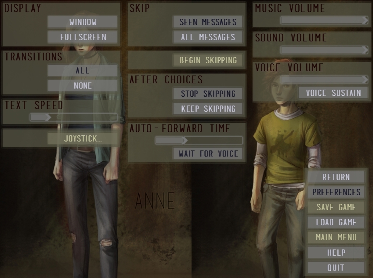
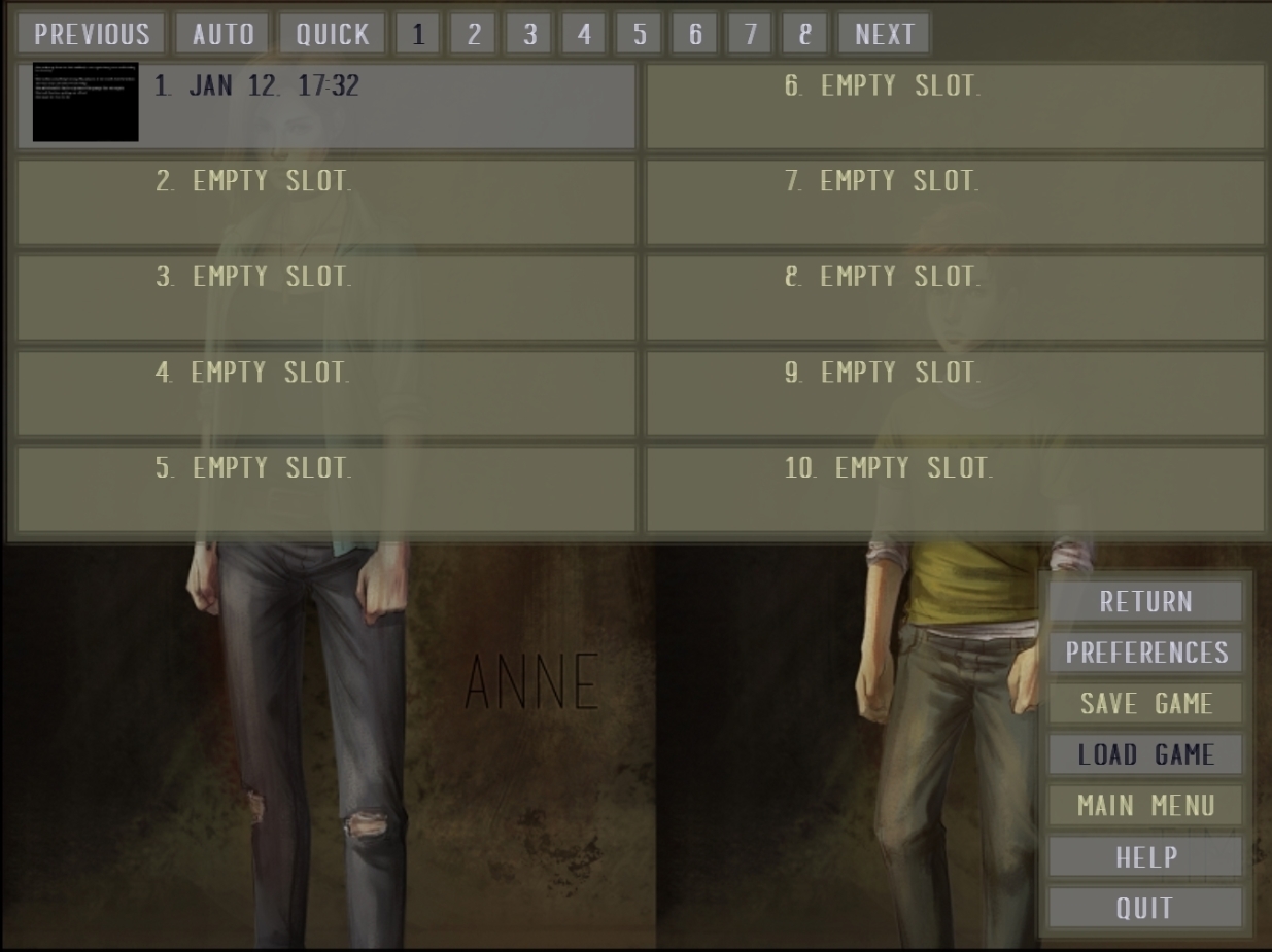
I think you need to increase contrast in the menu, it's a little hard to read, since the contrast is pretty low. (font to color of the boxes)

But I really like the artwork for this game so far ^^ great work.

Submitted

I've updated the screenshots to match the current style. Thanks for noticing, I too thought that. If there's still something off, feel free to let me know.

Submitted

Way better! But I would also increase the contrast on the buttons a little, good advise is to squint your eyes a little and see how much you can still recognize (you should at least be able to guess that there's something written on the button). I guess you always have to think of people with bad eye-sight who aren't able to see low contrast, I know that from my sister who often has problems with reading, because it's kinda hard for her to see small letters or low contrast stuff. ;)

I think I remember something about 20-25% in brightness difference... or something like that was a tip from my typo teacher back in school, haha.

Example:

50% brightness bg, 25% on the dark and 75% on the bright font. And it might be still a little hard to read for some people XD

But I often have a problem with contrast aswell ;)

Submitted

Here we go, I tried the squinting thing and I can totally relate. This time, I've left everything bolded. I've completely fixed the contrasting between the background and the forground colors on the buttons. The game will be played in full screen so there will most definitely be no problems. I apologize for the inconvenience, I'd be an honor to have you and your sister play my game. But be warned, there contains graphic scenes and may not be suitable for the younger audience (that is assuming you or your sister are of young age, or to anyone of such age). I hope this is the best I can offer. Thank you for your patience.

Submitted (1 edit)

I did not want to be anoying, haha X'D Sorry if I have been!

I wish you look for your game. Looks promising!

Submitted

No no, dear, you have not been annoying. I love feedback, thank you for your time.

Submitted

Pfuuuh, that's a relieve! Haha. Some people are somewhat bad with criticsimn and get demotivated quickly, which I would not want! ;)
BTW it looks way clearer now =)

Submitted (4 edits)

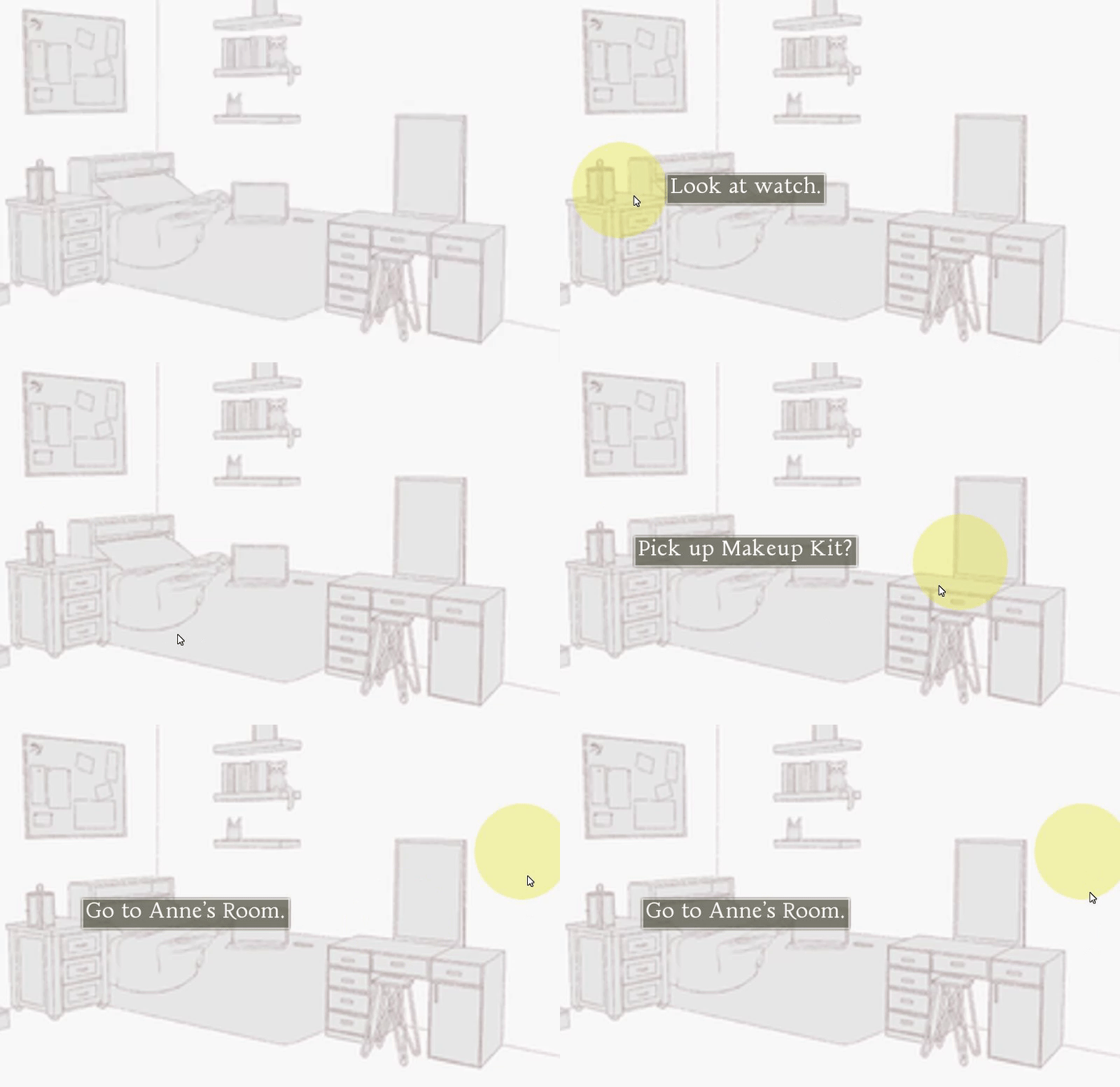
This is the rest of my DevLog for the next few days.

[More Screenshots]

This is only


[Day 7]

All the pieces coming together are lookin' real good. I'm impressed with this so far. I've done some of the "screens" (from the first screenshot of this comment). Like most of the rooms but no item functions yet.

[Day 9]

Well, I told myself to do all the rooms and every interaction. I did it. Feels good to finally finish something up. Tomorrow, finishing the complete gameplay and Day 11, finish game (code wise).

Submitted

That face when I don't even know what day I'm on... (I can't tell day "9" is day "8" or... ahh!)

Anyways, no more daily devlogs.

Host

ohhh nice work on the hover detection! this feels like an classic adventure game and i love it!!

Submitted

Ah don't give me too much credit. I found a well done Point and Click game made with Ren'Py and used it's aspects. Though of course, learning the un-commented set of code was something else.

Submitted(+2)

We almost done. We got a couple more things to do and it'll be out before the deadline. Hope you guys enjoy the game.

Submitted

Oh, yeah... The game is done!

Make sure you guys leave comments to let me know how you felt about the game!

Thank you everyone for tuning into my Devlog!

Submitted

Hey guys, check out Tim's Birthday, an Extra Look here. Please note that this contains spoilers!

Deleted post