Play game
Glof's itch.io pageResults
| Criteria | Rank | Score* | Raw Score |
| Graphics | #4 | 4.200 | 4.200 |
| Concept | #9 | 3.000 | 3.000 |
| Overall | #9 | 2.933 | 2.933 |
| Audio | #9 | 3.200 | 3.200 |
| Theme | #10 | 3.000 | 3.000 |
| Enjoyment | #12 | 2.200 | 2.200 |
| Story | #13 | 2.000 | 2.000 |
Ranked from 5 ratings. Score is adjusted from raw score by the median number of ratings per game in the jam.
Did you use any optional theme? If so which one?
Didn't use an optional theme
What game engine did you use?
PICO-8
Something you wanna say? ٩(^▽^)۶
Hope you enjoy :D
Leave a comment
Log in with itch.io to leave a comment.


Comments
I had some difficulties to understand how to play
I liked the visuals, and did manage to understand a bit
I really like the retro style, great work but maybe a little difficult
I liked the game but it's really difficult.
Great work on core mechanics, visuals, items and so on.
But it feels almost impossible to find the ship. Also it'll be great to have pause while inventory is open. I ended up eating everything I found in order to not stay at one place.
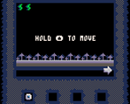
I think this game would improve a lot with some instructions. For instance, i did not know that i also had to hold X until the “searching” label lights all the way up to white, and i thought that all i had to do is press it, finding nothing at all.
Navigation is also hard to wrap my mind around. Seems to be some kind of 3D level shown in just 2D screen in each of the four directions, and i never know where i am going. Unfortunately, could not find the ship.
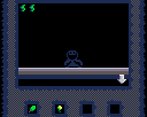
Nevertheless, i found the art nice and the creature crawling up to you is a really creepy touch that holds well.
yeah, i was really unhappy with how the movement mechanics worked out. they're clunky as all heck.
glad you enjoyed the aesthetic though. thanks for the feedback :D
really great art and interface. Really feels like something you could play on an early Gameboy. I think it'd be nice to have something that goes off when you might be able to discover something. right now the reader just shows you grassland or the moon and the player is lead to believe that sense nothing is on the screen then nothing is there.
i really like seeing the monster come up slowly and creepily. the style of this is off the charts. I guess id suggest a mechanic that lets you know something is searchable there. A different blip or beep other than the one that goes off for the monster
glad you see you enjoyed the aesthetic. there is an item you can pick up that shows you what you can get on each screen, but i get what you're saying. there should be some sort of indicator to tell the player there's something to find rather than nothing.
thanks for the feedback!
I can't figure out how to play... Maybe it's because I'm not used to this genre, but some explanations would be nice?
thanks for the feedback :D