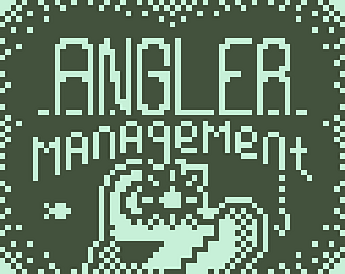
This was a really creative idea, and the polish with the different death animations was top notch!
Play game
Angler Management's itch.io pageResults
| Criteria | Rank | Score* | Raw Score |
| Adherence to restrictions | #47 | 4.684 | 4.684 |
| Overall | #86 | 3.882 | 3.882 |
| Polish | #90 | 3.684 | 3.684 |
| Design | #90 | 3.737 | 3.737 |
| Enjoyment | #122 | 3.421 | 3.421 |
Ranked from 19 ratings. Score is adjusted from raw score by the median number of ratings per game in the jam.
Comments
This is a really simple and great concept that's fun to play. You've also managed to make an anglerfish cute, which is an impressive achievement in itself
Very intriguing concept with dark/light and various obstacles. You're placed in a position where you need to use the lure, but you want to minimize it, so great job on the balance!
I would love to see this go in a more lovecraftian direction with the environment getting spookier as you go down into the depths.
Unique concept! Nice gameplay. The UI text is a bit difficult to read(that's the only problem according to me :))
This is a fun game to play! The idea of summoning the fish and then eating them works really nicely, I think, and the graphical implementation of the light looks good -- the dithered edge of it here doesn't seem confusing because it's obvious what it is and there's nothing else to conflict with. I was quite confused about whether I was making progress, though, and I think a couple of small changes would help with that. The first is to have the bite action make a different sound when you successfully eat a fish; that would clearly show that something had happened. And the second is that the "score" top right would benefit enormously from using a larger font with clearer numbers. It wouldn't have to be a lot larger, but the 3x3 font in use is so abstract that I didn't realise that they were numbers for quite a while; if it were 3x5 it would not take up very much more of the screen and it would be immediately obvious what it was.
The game over screen is very cool art given the limitations of the medium!
Fun! The concept is creative and plays really well. I really like the title + game over screens. There's a cool moment when I first started the game where I was wandering around waiting for something to happen, then pressed X and saw all the other fish. Only complaint is that I couldn't figure out what the icon in the top-left corner was?


Leave a comment
Log in with itch.io to leave a comment.