Play game
RGBlast's itch.io pageResults
| Criteria | Rank | Score* | Raw Score |
| Creativity | #21 | 2.586 | 3.167 |
| Gameplay | #26 | 1.905 | 2.333 |
Ranked from 6 ratings. Score is adjusted from raw score by the median number of ratings per game in the jam.
Leave a comment
Log in with itch.io to leave a comment.


Comments
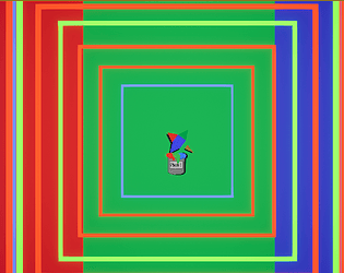
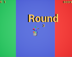
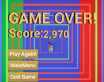
I think the controls are cool, definitely onto something there. Maybe you could make more of the rotational factor? The colour scheme is quite hard to look at for long periods (as people are saying). Try a palette which is more friendly on the eyes. Also the download size seems crazy, I have 3d models in my game and it's a tenth of the size. Overall, quite a creative game, nice one.
Thanks for playing, Glad you enjoyed.
After doing a little thinking im pretty sure the reason the file is so big is that most of the assets are actually 3d models. When i was making the game i wasnt really considering the size and if i wanted to improve the size it would be as simple as swapping out the 3d models for some 2d sprites. I understand the game becoming quite hard to look at and a new pallet would be a good idea, Thanks.
Sometimes I dip my brush by accident so maybe that could be fixed but otherwise pretty creative.
Nice game. Although after watching those flashing colors for sometime my eyes could not keep up. 😆
I don't know why the download size is so big. I've never exported a game from Unreal engine, but 364 MB seems quite too large for a simple game like this. Is it common for Unreal?
Also, someone suggested me that having mouse click as fire button is not good for hand health. So I changed is to space bar. I think you can do it. Just keep mouse movement for rotation.
Thanks for playing and i'm glad you enjoyed!
Not really sure why the file is that big, must be an unreal thing or maybe i just left too many unused stuff in there.
The reason i use left mouse button to shoot is because the direction is controlled by the mouse so i thought keeping all the functionality in one place made sense.
After some time playing this, my eye started flashing! :D
I didn't totally understand the "burnout" thing...
Interesting gameplay!
Game Page gives a better feel for the game than this submission page so check it out if you think this looks cool!
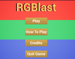
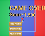
The submission page looks pretty cool but the text is hard to read. Maybe make it a darker color?