Play demo
Fish 1: Fishing Break Limited Demo's itch.io pageResults
| Criteria | Rank | Score* | Raw Score |
| Theme/Limitation | #32 | 1.692 | 1.909 |
| Music/Sound | #33 | 0.967 | 1.091 |
| Graphics/Animation | #35 | 1.048 | 1.182 |
| Fun/Design | #35 | 0.967 | 1.091 |
| Technical Implementation | #35 | 0.967 | 1.091 |
| Overall | #35 | 1.128 | 1.273 |
Ranked from 11 ratings. Score is adjusted from raw score by the median number of ratings per game in the jam.
Team Size
Solo (1)
What main engine/tool/language did you use to construct the game?
GDevelop
How does your game apply the optional theme "break"?
You are meant to escape to a "break"
Which art and audio did you / your team NOT create from scratch?
None
Which art & audio did you / your team create BEFORE the jam started?
None
Leave a comment
Log in with itch.io to leave a comment.


Comments
I'm not sure what to do in this game.
I wish it would be updated so the intro could be skipped and gameplay be cleared.
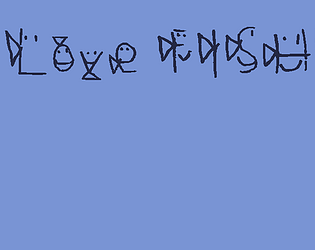
I do love fish. I also like the idea of the deliberately messed-up font. As it stands, it's hard but not impossible to read, and in a game with relatively little text, I could see it work just fine.
It would be nice if the game mechanics were explained, either in the game or on the page somewhere. I was able to figure it out with a little trial-and-error, though, and I think it's a fine framework for a game. With a little work (and some sound effects, and perhaps a way to skip through the opening cutscene) this could become a rather neat project when it's finished.
Very strange game! I included it in my Palette Jam 2 compilation video series, if you’d like to take a look. :)
A couple ambitious attempts, but some quality of life could be improved all around.
PROS:
CRITIQUES:
Interesting concept!
The font is very difficult to read and I couldn't read basically half of the words. The game restarting when you die also tends to not feel great since then people need to sit through the cutscene again and more often than not just end up quitting.