Play game
Healing Shadows's itch.io pageResults
| Criteria | Rank | Score* | Raw Score |
| Theme | #426 | 3.000 | 3.000 |
| Artistic Style | #469 | 3.000 | 3.000 |
| Playability | #487 | 3.000 | 3.000 |
| Cleverness | #876 | 2.000 | 2.000 |
Ranked from 1 rating. Score is adjusted from raw score by the median number of ratings per game in the jam.
Did you include your Game Design Document in your downloadable files?
Yes
Tell us about your game!
What is this darkness surrounding her?
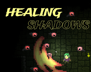
Basic dungeon crawling WASD controls. Attack with Left Click. Players will traverse through three sets of dungeons, using the light as both an offense and a defense. Clear all the monsters on each level to progress.
Did you remember to include your Game Design Document?
Yes
Is your game set to Public so we can see it?
Yes
Extra Notes
Developed by:
@henkibro @dh0le @hyp3rion3447 @lix.f @igunashiodesu
Leave a comment
Log in with itch.io to leave a comment.


Comments
Very nice! The primary mechanic with the shrinking field of vision was very cool, and the lighting in general was well-done (around corners, etc). My only complaint is that I was too busy playing to read the dialog, so I wasn't able to feel the full impact of the plot and the ending. It would be nice to have the game pause while the dialog is up so you're able to read it without passing out. Great job! (If I had a second suggestion, it would be restarting at the beginning of the level instead of having to walk down the hall... Yeah I passed out 7 times . But I made it!)
Thanks for playing the game and for the great feedback. We agree a 100% the dialog does not enhance the experience right now. Will be fixed in the future. Good idea about respawning in the beginning of the level!
Gamefeel is great, I was feeling great when starting out. Art and effects are great as well. The timer mechanic was very hard for me and I didn't get very far after several tries.
Thanks!
Was it too hard to get the initial light coins for the first upgrade (?), we noticed that it was almost impossible to clear all three levels without having at least one upgrade.
Yeah making one or two mistakes is game over
I liked the atmosphere a lot! The effect on the attack was also really cool looking. The dialogue was a bit too distracting when trying to focus on navigating the map + fighting enemies + lack of visibility increasing. Probably best to incorporate the story in situations of down time unless you are using audio to present it, or the environment itself. Nice work though! I'd definitely play a more fleshed out version of this. :D
Thanks alot !
Thank you!
The dialog is an double edge for sure.
We knew we wanted it, but we also noticed that you dont have time to read it, tho a little too late for it to be fixed. The dialog used to pause the game, but that took you out of the flow. There is for sure a better way to present it.
And good job on reaching the end! :)
Great job! Love the atmosphere and mystery of this game I just kept wondering what is going on here and can I help these characters? The sounds are amazing and the attack feels great, really nailed it! And love the use of the theme here as well, really creative!
Some constructive feedback:
- the text that appears during the dungeon since its the main character talking it should probably appear in a little bubble above the player character mostly because I am afraid to look away during gameplay to read anything since enemies quickly jump at you and it's costly to get hit.
-after a certain point where the visible range gets too small you can no longer see the enemies until they already jump at you and you can hardly react to that, so at that point the run already feels over
Thank you so much!
And thanks for great feedback!
That's a great idea with the chat bubbles.
Yes a way to show enemies even tho the darkness has almost taken over would be great, then you could make some last seconds light pickup and keep going.
This will be the look of it in the next release, not perfect but better. Such an easy fix, now I feel bad that I did not get to it in time for the submission :E
Looks much better yeah! Don't worry I got things I am facepalming about not including or changing in time as well. Happened to all of us I imagine.
Woohoo! Someone finally gave props over the sound and music design!😁😅 Thanks for playing our game and giving some constructive criticism!