Indie game storeFree gamesFun gamesHorror games
Game developmentAssetsComics
SalesBundles
Jobs
TagsGame Engines

Progress Sharing Thread Sticky

A topic by dustdfg created Apr 16, 2024 Views: 554 Replies: 42
Viewing posts 1 to 8
Host

Share your WIP (work in progress)

Host(+1)

I have some doubts about a size I chose although

for good tips on sizing isometric blocks check this post

https://peoplemaking.games/@eniko/111521352476368264

Host (1 edit)

Thanks! I partially meant what you think but mostly I meant that I am not sure that such a big sprite is what I really want...


I see you are an active mastodon user. I am glad to see people use it

yup, https://mastodon.online/@pebonius if you wanna hit me up

isometric is hard, that post breaks down nicely something that would probably take me months to figure out

Host (1 edit)

I saw your mastodon account before and sometimes look at it because I also saw there just drawings but I am not on mastodon because I don't have what to do there ¯\_(ツ)_/¯

Host

(+1)

Well, your jam is the thing that had me first sign up and plan to participate in (and post!) on itch.io. Hello world, I guess?

Host

You know really beautiful hello world!

Submitted(+1)

Getting some basic blocks going before getting actual tiles done.

Half height tiles - and quarter height as well - are a useful and cheap way to avoid aligning everything.

Submitted(+1)

Testing the tiles made so far against some characters. Characters ripped from FFTA and edited to match the palette.

These are looking really awesome! I love how cheerful your palette is, too!

Submitted

Thank you, glad you are digging it! I am still in the process of figuring out this new version of my palette. Been using a similar one for around 4 years now, felt the need to touch it up a bit.

Host

Cool!

Submitted

Glad you are diggin it, mate! I will add a couple more blocks today, I hope I can make at least one character before the jam comes to a close.

Submitted(+1)

Okay, enough blocks and variations, time to get some doodads and then try to get at least one character done.

Host

Very pretty! About adding character... You can "cheat" a bit. You can add animal if it is easier for you although jams are for challenge (or at least for fun)

---

In the center and in the top I see a shadow for those skewed blocks. I am not sure that the shadow should differ by size from usual blocks but it seems to me that maybe should at least a little? idk ¯\_(ツ)_/¯

Submitted

Oh snap, that shadow should be slanted, yeah lol kinda like the ramp itself. Thanks mate.

Regarding the character, I will try to go Tactics Ogre Knight of Lodis here, not so many frames, not so big, which might give me just enough time to make more than one.

Submitted (1 edit) (+1)

Okay, you know what, I will let whatever engine the person is using to get and draw the outlines. It is taking way too long to figure out all the combinations possible to try and bake outlines on the tileset as empty blocks with just the outline.
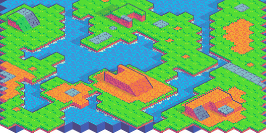
A possbile solution is: Every level is a different layer, one iterate through each column of tiles and draw outlines for sides that aren’t connected with anything else. To further optimize this I believe it is worthwhile do draw these lines during loading and make it a temporary texture with the same Z index as the lowest Z value on that layer instead of doing all these draw calls while rendering the game.
Submitted(+3)

Testing character sizes. The bigger one doesn’t look right, the other two seems viable.

Submitted(+1)

Its alive!

Submitted (1 edit) (+1)

Fighter is ready for action.

Submitted(+1)

The cleric joins the fray.

Submitted (1 edit) (+1)

The mage is a go!

Host(+1)

It reminds a cat!

Submitted

It is a cat! :D Cats are magical creatures, true spellweavers.

(+4)

I guess I'm a little behind ......

Host

It is quite good!

Thank you!

I'm still kind of lost about how the final product should look
I decided to start with the parts I wanted to do first

Submitted

Looking nice!

Thank you!

I'm still not sure how useful some of these turning tiles are
It feels like the more I draw, the more there end up being

I'm more familiar with how to connect top-down tiles.
This is my first time trying to draw Isometric tiles

Submitted

Yeah, in the end the isometric approach have more combinations than the oblique approach. That seems to be why some old isometric games relied on pre-rendered stuff, since you model it only once and then rotate, render, touch it up and you are done.

Hardly, moving water that tiles well and looks nice is one of those things that...ugh. Time consuming! This looks fantastic!

That's right!
It took me a lot of time to get the water tile animation smooth and natural, but that’s what makes drawing pixel animations fun!

Oh, I completely agree! It's more that, no, you're definitely not behind. You just did the hard part first, lol!

(+3)

I think I'm a bit lost

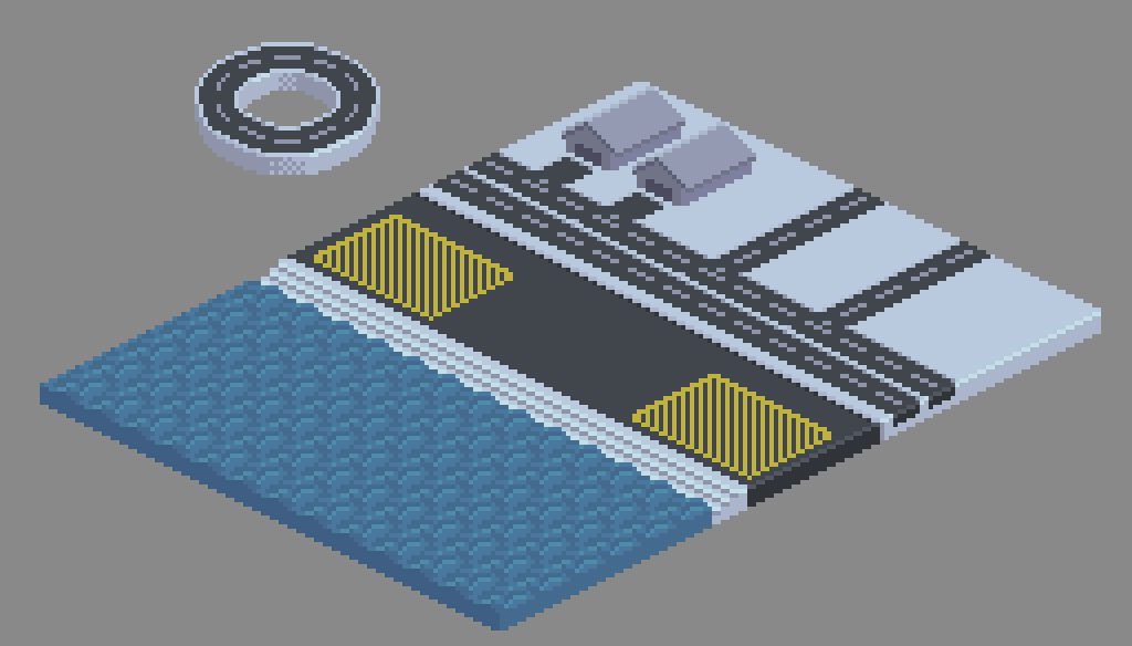
At first, I wanted a very small scale for my map, similar to an RPG world map, but as I drew, it seemed like a larger scale would be easier to represent

I tried making the warehouse smaller, but it looked very strange
If the map is on a world scale, the tiles, except for the terrain tiles, should look like landmarks (city, port, town, etc.)

I want to create some tiles in a modern style or in a style typical of low-income areas within a cyberpunk setting
There are already a lot of nature-based tiles out there, so I'm trying to avoid them

In terms of concerns about scale, definitely keep what you've done so far and don't scrap it! If you end up with a minimap size, a world scale size, and a more normal size, people can make use of whatever it is you make and be creative with it. I think just go with whatever you're enjoying making! No need to necessarily worry too much about it.

Submitted(+3)

I’ve been working on a modular pipe set. I have a few basic pieces now, so I can start seeing how they look together.

uoooogh lookin good

Submitted(+2)

wow I didn't know we have a WIP topic (don't know how to use itchio very well yet). I'm doing brazilian food! I guess this counts as isometric? 


Host(+1)

Yeah it counts. It is not an feature. Itch just have a community tab for jams where you can post your posts. What is it? Everything... It can be searching for team, asking questions or just create separate topic for WIP


The teapot looks a bit too plain IMO

Submitted(+1)

teapot? the big brown one? not a teapot actually, I didn't finish that one yet that's why lol. It's more like a clay pot with feijoada inside.

Submitted(+1)

Do I see a fellow Dolly Guaraná enjoyer? Truly a person of culture.

These are looking great, festa junina is just around the corner, so the pamonha is just right. Well done!