Play game
The Investigadoor's itch.io pageResults
| Criteria | Rank | Score* | Raw Score |
| Audio | #3 | 4.583 | 4.583 |
| Overall | #3 | 3.938 | 3.938 |
| Graphics | #4 | 4.250 | 4.250 |
| Gameplay/Design | #6 | 3.667 | 3.667 |
| Fun | #11 | 3.250 | 3.250 |
Ranked from 12 ratings. Score is adjusted from raw score by the median number of ratings per game in the jam.
What would you like feedback on?
Mainly game design and level design. But I appreciate feedback on every aspect of the game, except for sounds and music. Note that some arts are still placeholders.
What did you update?
I updated some mechanics, added a tutorial and some new levels.
Leave a comment
Log in with itch.io to leave a comment.


Comments
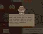
So, I think the core idea of a card-based investigation game is really neat and the visuals are fantastic. My biggest concern is that it mostly felt like a clicker game to me as the cards/actions you get are either very linear (just upgrade to make the number go up) or weren't useful. (I could take a luck chance to remove one of my cards at one point, but it cost more than investigating so it wasn't worth it) My biggest feedback would be that the tutorials are way too long and spread out. Until the addition of the time mechanic, all the previous tutorials were so easy as to be boring and the heavy dialogue made them feel even longer. Eventually I skipped several tutorials to go straight to a case so I could see the normal gameplay was and I found that much more enjoyable. I think combining a number of tutorials could really help with this, rather than having to investigate-click through several progress bars before a challenge is added. That and a little more versatility to player choices would help keep people playing.
Thank you for playing!
I'm afraid you are hitting a soft spot here... Right now the game is a mix between a card game, a strategy game and a puzzle game. It ends up to be none of those. I like the shape it's taking but I feel like it needs a change somewhere in the core mechanics. I want to experiment a bit more. Giving player more agency is something I want to achive. Thanks for your feedback! ^^
I think you are on the right track and definitely no offense meant or anything. I think the key is figuring out what type of game you want it to be, that way you can lean into that gameplay more. I think that will help slim down the tutorials and give you a better angle on which mechanics are good to work on. I think it could work well for a card, strategy, or puzzle game so it really comes down to what you personally like and have the most ideas for.
To be transparent, these critiques are coming from someone who's not very good at management games, so please take them with a grain of salt.
While I enjoy the atmosphere of this game, I found the actual gameplay kind of confusing.
The investigate button seems to be the only thing that's important because of how text-heavy the tutorial is. So I gave up after attempting the timed tutorial for a 4th time because I'm not sure what the win condition is.
This game has a lot of potential to be fun but I think the tutorial text should be cut down and the win conditions could be better illustrated.
The music and art so far are lovely and set a great mood. I like the character art especially and the doors as level selectors. The game play though I still find a bit confusing.
The tutorial feels too text-heavy; I would prefer to be doing more in order to learn the controls, rather than read about them at length. The downside of this is also that it names a bunch of things in text and I still don't know what to do, because it doesn't show them. I'd rather have the game do things like highlight a button I have to press, with perhaps a single sentence explaining what it does, so I can see the effect of those mechanics immediately and understand how to use them. I find myself just pressing things a bit too randomly instead.
A small nitpick is that the text moves a bit too slow. I know you can double-click to write it out instantly, but for the "talking" effect it could still be a little faster.
I see you've gotten a bunch of feedback about the tutorial already and I agree it can use some work in order to get into the game flow quicker and easier. But the game's general great vibe and promise of what's to come definitely invites you into wanting to play.
Thank you for playing! I will definitely try to make the tutorial easier to digest! ^^
Pretty cozy strategy game!
I am really not good at puzzle games at all, so def take what I say with a grain of salt. That being said it def felt good to play once I got the hang of it and the whole ambience is nice.
Small comments:
Thanks for playing! ^^
I really liked the concept of the game, both graphics and music bring a cozy atmosphere that combines with investigation. I got a little lost in the mechanics, but I still managed to have fun. Good job.
Thanks! Glad you find some fun playing the game! ^-^/
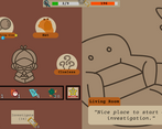
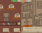
A cool light-strategy game that I was a bit skeptical of at first, but once I understood it I really got into it. The UI could probably use some cleaning up – in particular, it would be nice if you could consistently see how many clues a room has before entering it; as is, you only can when entering from the right side. Plus, the first level with the red herrings seems to depend too much on luck of the draw. Still, I had a good time with it.
Thanks for your comment! I'm glad you had a good time with the game! ^^
About the clues preview, you can actually pan and zoom the map to see how many clues are left in each room. But I totally agree that this is a crucial information and is not displayed properly :/ The clue counter is too small and not very highlighted. I will do something about it in the future. Thanks for your feedback!
A card based investigation game is an interesting concept.
The graphical style is polished and cohesive. The one suggestion I'd put is that the orange accent color you use doesn't contrast well with the background. This makes the text highlighted in that color unreadable.
As Maui has said, the tutorial portion stretches a bit long. I felt that the first tutorial stage didn't give a good idea of the whole game. The second level made it much clearer. I think you can merge those two levels.
The resource management could use some balancing. Activating cards requires a limited resource. But you lose the card quickly as you move between areas. When the card is lost that resource is also essentially lost which feels bad. I think it'd be better to have the buffs expire as you do actions.
Overall, it's a very polished entry with a lot of room to expand design-wise.
Thanks for playing and for your comment!
You are right, the first tutorial level is a bit pointless. I thought it was fun that you have to just press a button to solve it, but it doesn't really help the player to understand the game XD
About the tutorial itself I'm struggling a bit to find a way to make it less painfull. I noticed watching some playtesters that people after a while just skip dialogues and miss important part of the game rules. It's like the rulebook of tabletop games, nobody want to read it :/ Also, just like board games, my game has many rules, some of them are unintuitive. Maybe I should try to split the tutorial instead of explain all the rules at once ^^
The levels were very well designed. The visuals were charming and the game had a lot of soul!
Thanks for playing!
Interesting concept. Took me a while to get it but it has potential. I really like the chill atmosphere and art (the music probably had time to loop more than 10 times over while I was playing but it never annoyed me, which says a lot).
I feel like the tutorial is a bit too long though. And the game gets difficult way too fast. At least for me^^ I stopped after completing "Case 1 : Red Harrings" by the skin of my teeth with just 1 "time" unit left after 6 or 7 attempts. I don't know if I was unlucky with all those "Red Herring" items or if I just suck...
To be fair, this kind of strategy / puzzle game isn't really my thing to begin with. So I would wait to see what others think before making major changes to difficulty^^
Also, a few minor things :
- The writing speed for the dialog feels too slow (I know you can get the whole text instantly by clicking though). I would multiply it by something like 1.5 or 2.
- You have 2 fullscreen buttons. I think you should keep the one from Unity and remove the one added by itch.io that never works well (it's in the edit game page, the option : "Fullscreen button — Add a button to the bottom right corner of your embed to make it fullscreen").
At least, that's how I handle it for my webGL games :)
- A custom mouse cursor would add a lot to the style of the game I think. Something thematics like a pen or magnifying glass maybe ?
Anyway, great entry overall, good job :)
Thanks for playing and for the detailed feedback! ^-^
I received some feedback that the herrings level (I also mispelled the level name, lol) is particularly difficult, I'll try to add more time to make it a little more forgiving. Some following levels are (should be) much easier.
About this... I usually do the same thing, but this time I wanted to force full screen at the start of the game (because the UI is not yet responsive and in windowed mode there are some issues). However, in doing so, I discovered that sometimes a conflict occurs if one presses Unity's default full-screen button D: For now I've left both to fix this, but I understand it's ugly and confusing... Sorry for that ^^"
That's a great tip! Thank you! :D
Great puzzle/strategy game, loved the little art style and the music. Very well done over all! Even for placeholder art it still looks good, and game play is very unique.
Thanks for playing! ^^