Neat game, super fun. I included your game in my Pirate Jam Pre-Jam Skirmish compilation video series, if you’d like to take a look. :)
Play game
Treasures of the Sinking Sands's itch.io pageResults
| Criteria | Rank | Score* | Raw Score |
| Adherence to Theme | #12 | 3.357 | 3.357 |
| Creativity | #16 | 3.286 | 3.286 |
| Design | #20 | 2.714 | 2.714 |
Ranked from 14 ratings. Score is adjusted from raw score by the median number of ratings per game in the jam.
Comments
Others have already given thorough feedback so I'll just add one suggestion: if there were "bad" items which harm you when you dig them up, the player would likely pay more attention and feel like their decision of where to dig matters more. For example, if you dig up a bomb it destroys some of the treasure you dug up, or a counterfeit crown which decreases your money. Good job!
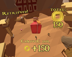
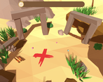
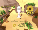
I liked the concept and the art looked very nicely done. I liked that sometimes the columns and structures get in your way so it's more difficult to remember the good spots, but I think there is too much stuff falling, so most of the times it doesn't matter where you're digging. Also, I didn't learn I could skip the bounty animation until the very end (but maybe I missed it).
Great job!
It looks really good and the idea made me chuckle, but I'm not sure I totally get it. It felt like it didn't really matter which spot I picked because there was treasure everywhere anyway, so I'm not sure if I misunderstood something.
It looks really good and the idea made me chuckle, but I'm not sure I totally get it. It felt like it didn't really matter which spot I picked because there was treasure everywhere anyway, so I'm not sure if I misunderstood something.
You made great use of the assets in the time allotted, good polish! A radius preview and lower volume music would have been nice. I also understand why the rotating screen is there, but I wish another method to confuse the player on the treasure locations was chosen.
The production value is pretty good, good music, good art. But I have some bugbears about the design:
- I don't like it that the primary skill it challenges here is memory.
- I find it difficult to make a meaningful decision - I don't know how big the radius is, I don't know how far I can go from a potential item to still collect it.
- I think the rotating scene detracts from that understanding even further.
I think this could make an interesting mobile casual game given it's really simple input, if there's a stronger incentive and loop!
Good choice of soundtrack. I turned it so loud my neighbors knocked at my door to come dance with me


Leave a comment
Log in with itch.io to leave a comment.