Play game
Zaverox's itch.io pageResults
| Criteria | Rank | Score* | Raw Score |
| Theme | #3 | 4.000 | 4.000 |
| Platform Usage | #10 | 3.636 | 3.636 |
| Overall | #10 | 3.341 | 3.341 |
| Game Design | #11 | 2.909 | 2.909 |
| Fun | #12 | 2.818 | 2.818 |
Ranked from 11 ratings. Score is adjusted from raw score by the median number of ratings per game in the jam.
Reviewer Notes - Required
Sega Genesis rom tested with:
http://www.gens.me/
https://www.carpeludum.com/kega-fusion/
Leave a comment
Log in with itch.io to leave a comment.


Comments
A promising start for a dark cave exploration / metroidvania game!
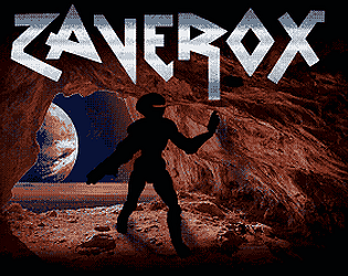
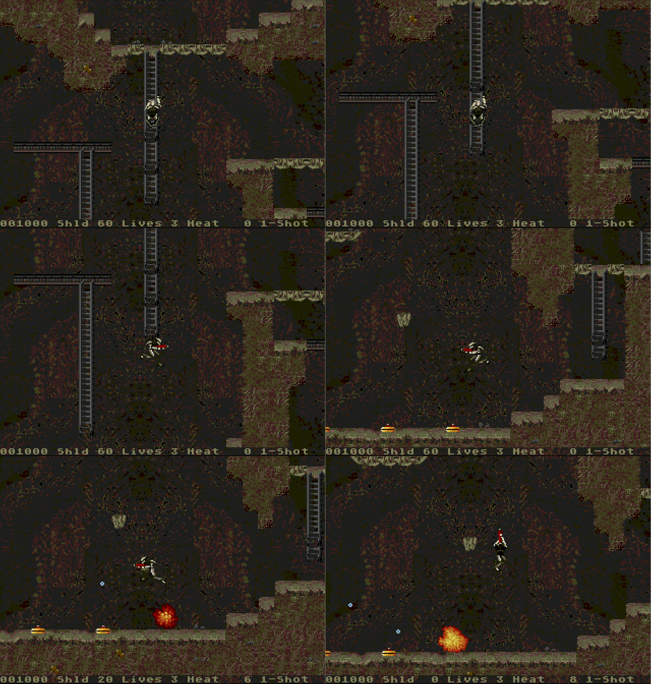
I love that you used the Abuse main character, it bring back a lot for memories of this (scary!) game! The graphics overall are good, and the large cave was interesting to explore, with a lot of jumps and ladder.
Regading platform movement, as another comment noted, I too fell that the main character is a bit "floaty". I think the jump is maybe too "long", or maybe by having a stronger gravity I would like it better, but this is a bit nitpicking, and I know platform movement is very hard to design.
The game needs music the add to the already great atmosphere of being lost and lonely in a large cave. I'm looking forward the next versions of the game!
Thanks for the feedback.
Now that the jam is over, one of the things we want to do is take the time to tweak and tune some of the basic mechanics like jumping, and try to get it feeling just right.
We will definitely be adding music to the game at some point, but (particularly since neither of us are musicians) had to accept it wasn't going to happen in time to be included in our submission for the jam.
It's a good start! I love the graphics - they have an appropriate, gritty pixel art look. I know exploration is a big part of this platformer-Metroidvania genre, but the large, open-air cavern design got me turned around a couple times when I would jump and miss a platform (not unlike falling in Getting Over It with Bennett Foddy lol). I think having some direction markers or landmarks would help players find their footing better. Overall, pretty solid stuff!
Thanks for the feedback.
The getting lost thing is definitely something we've recognised watching people play the demo, and have been thinking hard about how to improve. Rather than banging on about these ideas here, I might post a devlog soon on what we learned about level design in the course of this jam.
I’m not a fan of platformers, and I found the character hard to control, but that’s probably down to my inexperience with the genre. I like the ability to turn the gun and shoot in all directions, but I kept thinking it would be great if it was somehow separately controlled from movement, which I realize with the limited buttons of the megadrive is not an easy thing to do. I’d experiment with using the A B C buttons for directional firing, and use the d-pad only for moving, but it may be that would make it worse.
Thanks for the feedback. Yeah, complete separation of aiming and movement is an awesome mechanic and would be the dream, but without a mouse or twin-stick controller our feeling is that it's impossible to pull off without massive compromises. We've thought about ways we could use the six-button version of the Mega Drive controller, but I'm still reluctant to go down that path - I never had one back in the day, so it doesn't feel like "authentic" Mega Drive experience to me. And even with the extra buttons, the worry is that it would become slow and fiddly, sacrificing other elements of the game we're ultimately trying to make. This tech demo gives us the chance to play around with fundamentals like the control system, though, so I'm sure we'll experiment some before moving on.
Speaking of an authentic experience, it's awesome to see the demo be played on a CRT. I feel like I understand now why there are musicians still putting out their albums on vinyl :)
Nice and simple to play. I found the exit easily and there was not much challenge. There was something floaty a bit with the movement or the jump that made me lose my step. Graphics are nice.
Thanks for the feedback. The level for this demo is shorter and simpler than ideally we would have liked, because time was short, but hopefully it managed to give a bit more sense of the "exploration" gameplay that we want the game to offer than a pure tech-demo would have done.
Movement in a game like this feels like it will be the most straightforward thing to implement, but then the deeper you get into it the more decisions you start having to make. We'll definitely be looking to tune it as we continue to work on the game, and hopefully can dial out whatever is making it feel "floaty" to you.
Nifty! Quite ambitious, but shows a good head start. Now you need more, stronger enemies. I was hoping for a boss battle when I encountered the first bot like monster, but I valiantly bested it with one single shot! ;)
Thanks. Greater variety of enemies, with distinct behaviours/strengths/weaknesses, and boss bottles are all definitely in the plans, but we were very limited in how many of our aspirations could make it in to the alpha/tech-demo release we'd decided was our goal for this jam. We hope to show some of these enhancements soon.
very good game! reminds me on "abuse" for ms-dos
Thanks. Abuse is certainly one of the games we've been inspired by, and I think it's fair to say we've both kinda wanted to build a game that used those assets ever since they were released to the public domain. But I think if anything our game is a more direct descendant of older console run'n'gun platformers like Turrican (even though it's not a game I ever particularly loved). That might be just us showing our ages though :D
how you made that game?