Play game
ENFORCER-209's itch.io pageResults
| Criteria | Rank | Score* | Raw Score |
| Fan Favorite | #6 | 4.500 | 4.500 |
Ranked from 18 ratings. Score is adjusted from raw score by the median number of ratings per game in the jam.
Leave a comment
Log in with itch.io to leave a comment.


Comments
Great custom art and animations, however it felt very short. I liked the idea of a larger game world that the player could work within.
Suggestion: Give some more meat to the game! You’re a great dev and these jams prove that 100%. It really did feel far too short and just left me wanting more and to know exactly what was going on in this universe and with the MC.
Even having watched a play through previously on stream, experiencing this game firsthand just blew me away, from the title screen to the final hyperspace jump.
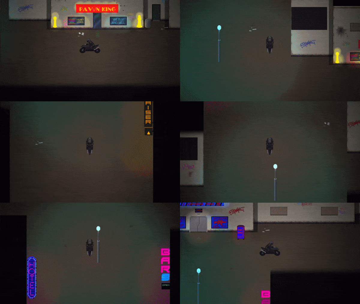
The setting is perfect: the creepy ambiance of the dark streets and dilapidated buildings; the high-tech neon glow of the business signs; the brutally overpowered weapons and crunchy death animations. Like many have said before, it nailed the Dredd vibe but also touched on a bit of a space-Western theme (Mandalorian etc.) right down to that ending sequence.
And the thing is, I am completely hooked - I want to know what this guy's backstory is, why he's traveling next to [spoiler], and what complications might arise from the events of this story.
Combat is visceral and has a sense of danger especially when your shield goes down. There are just enough skills to offer impactful tactical decision making like whether to take down the hard targets or go for AoE damage, or even play more defensively. I would not have complained if the fights were a bit harder, but for the jam format I can understand wanting to err on the side of approachability.
If I had to mark down anything it would be the awkward transition when mounting the bike, where there's two character sprites for a frame or so.
That aside, it's basically perfect.
I wanted at least an hour more of content at very least and could unquestionably see this turning into a full-scale game.
Well done.
Thanks so much for the kind words, you've given me a serious motivation boost!
It's very likely that I'll start working on the full game once the jam is over, I'll be making an extended version of the demo too. I've got some pretty cool ideas about where to take the story.
The bike transition was actually really easy to fix, I had just forgotten to activate transparency in the common event.
Oh yeah, I hear that - it's an easy fix and just one of those tedious RM things that's also easy to forget.
(I've never done something similar when making party members join or anything, I swear!)
Definitely looking forward to the extended demo and of course a full version.
Please see Teal's play-through video, as well as her review of the game in the video description:
As usual, an excellent implementation of 1st person battle view with satisfying animations!
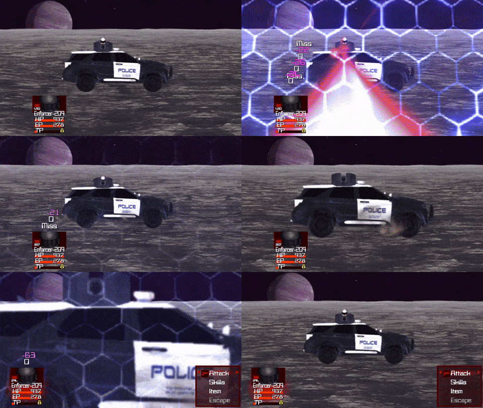
I was particularly impressed with the car combat scene that brings a sense of motion in contrast to the standard standing still and shooting enemies in the previous battles. The planet surface was well animated with the multiple parallax layers giving that 2.5D feel.
Nice work Kemsyn!
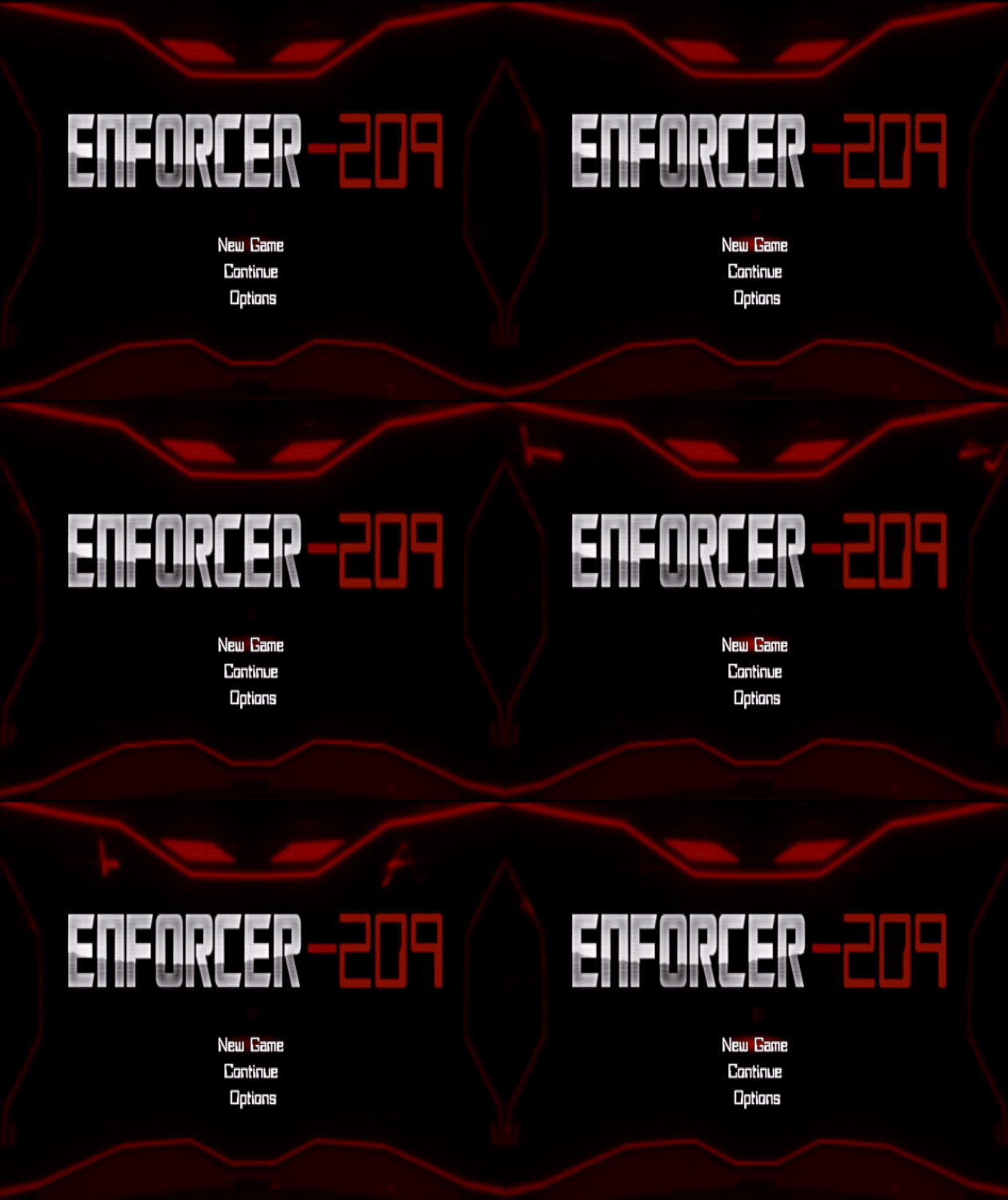
The music and title art in this game are fantastic. The opening sequence sounds soo good on my subwoofer/studio monitors. Really good job with the sound design.
The storyline is straight outa the 90s. It's literally Judge Dredd, a cult classic which I really enjoyed at the time. There is a scrolling text but it almost looks like it's scrolling over a movie background. It's probably just a very well done sprite animation though. Very cool atmosphere.
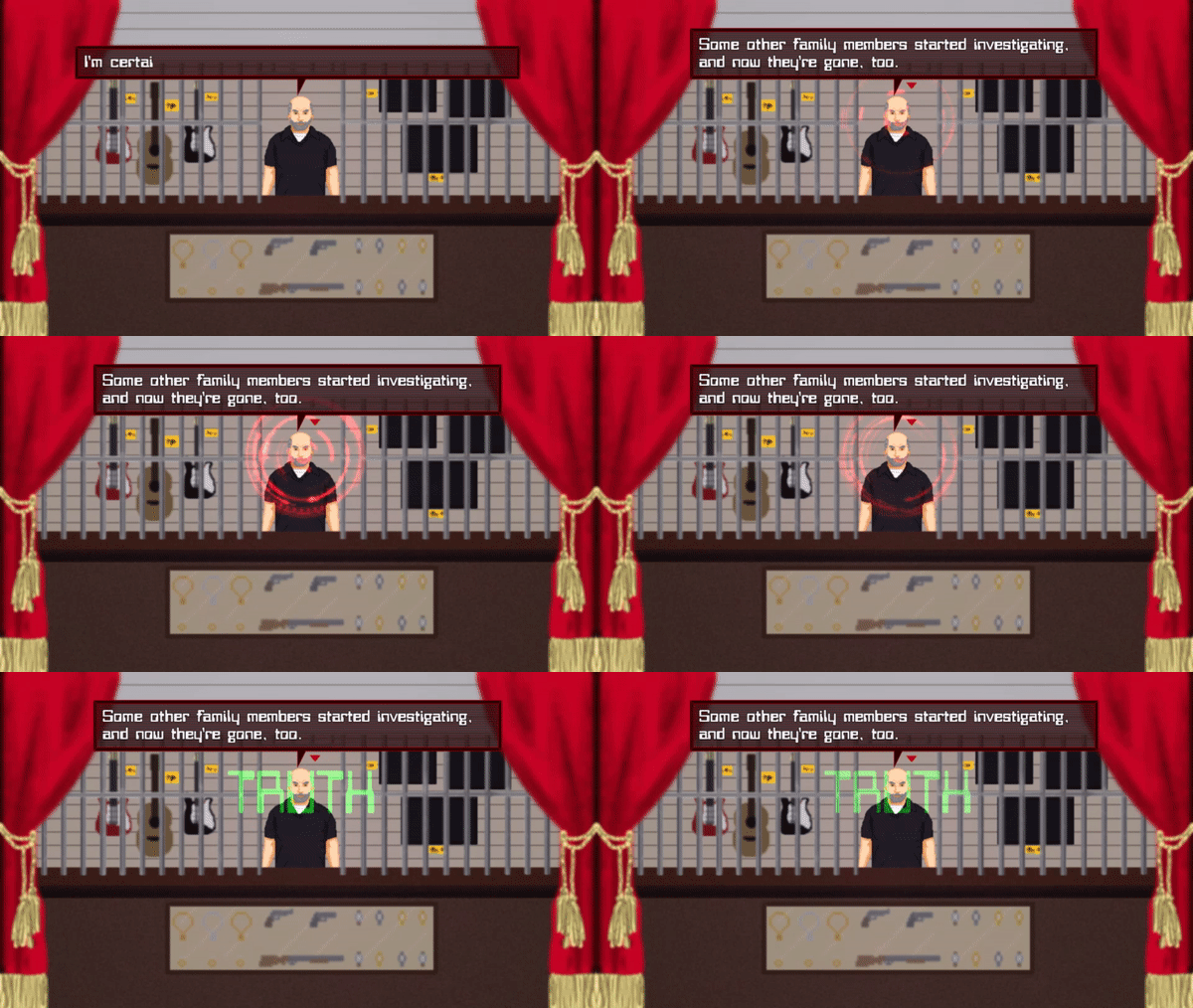
The main character is an enforcer with futuristic technology that is able to determine if what is being said is the truth or a lie in order to help administer the law. Such a cool concept.
The backdrops are all custom, the sprites are all custom and it feels like it's own world. That combined with the creative use of a lighting engine is one of the reasons this entry feels captivating.
The menus and icons all stick to a low color palette which keeps it all stylized in the same vein as to not make anything feel out of place. It's cohesive and well executed.
You have four equip slots and four skills. Enough to give the player something to look at but not analysis overload. I think this too was done well.
The game doesn't start you at a beginning point, but instead in the middle of a story. Which can go wrong if not executed properly, but this game doesn't force feed a book of lore down your throat because you don't really need to know every detail to enjoy the story. I think this is a good approach to storytelling.
The maps open up but don't feel too big and there are some arrows telling you where the transfer events are when you look for them. This is a good idea so people don't miss entire maps because they didn't know that there was a transfer event. I think adding a mini-map that you could toggle on and off would be an additional helper.
The character moves around slow but you get a motorcycle to ride around on and it really takes advantage of the spacing on the maps. Very well executed use of space to move speed ratio.
Since the game isn't very dialog heavy I think it could see an improvement with some good voice acting(VA). Anytime that you add VA, if it's not done right it will only hurt the overall game. That being said if you get the VA right, this game would really step it up to the next level.
The animations are top tier, the enemy battler sprite match the character sprites and look awesome in combat. Even the battle backgrounds match the scene that was set with the mapping. The whole experience is very cool looking and really makes first person combat fun again.
The ending is satisfying, all of the battles feel unique and polished, you even get an optional ending Easter egg if you fed and pet the cat. (Don't tell anyone that I fed an pet a cat!)
This is a stellar example of how to make a game. It's short and sweet, it took me like 20 minutes to beat the game start to finish. Basically, this is the whole package. It's marketable and the only things I could suggest for improvement is to add some good voice acting and a mini-map. Other than that, it's flawless! Wow! You should really play this one and see for yourself!
To be praised so much by someone I've looked up to for years is one of the greatest feelings ever. I can't find the words to express how grateful I am that you enjoyed my game.
Very short game, was able to finish in maybe 10 minutes?
Definitely has a Judge Dredd vibe and the battles were pretty interesting, sort of like an arcade shooter vibe. Probably could have pushed that feel a bit more by adding hotkeys, an ammo switcher, and done away with the menu so that it really feels like an arcade shooter, but that would require more work and a very likely would need a plugin to do that.
There is a glitch where you can leave your bike onto the cop car.
There is a glitch where the game looks at your sidearm instead of your main weapon for the purpose of comparing weapons until you equip a main weapon (put your main weapon on top and it should stop that).
Might also want to change your game's window title.
You made some good suggestions about the combat. I wanted to add an ammo system but figured it wasn't needed so much in a short jam entry, but I will add it if I expand the game.
Thanks for pointing out the glitch on the cop car, I wasn't aware of it. I think the weapon comparison in the shop shows the last weapon you had selected and is sidearm by default, I knew about this glitch but didn't think to swap them around, great advice.
There's a few more visual bugs I'm aware of but you did a good job finding stuff I missed, I wish I had you to test all my new projects :)
I was never requested to break the game, so you got a quick run instead of a thorough run ;P
For the low price of XX per hour, you can have your own pocket Sin!
I think even for such a short jam entry, it would have made your game stand out more.
I'm a bit disappointed you stopped playing before seeing the combat since I worked really hard on it and did some pretty unique things this time, I get that you want to limit the time you spend on each title, but it would have been nice to get some feedback on the battle system especially since most people are finishing the game in under 20 mins.
I think you must have failed the shooting challenge and lost 500 credits in the bet, which is why you couldn't buy anything at the weapon shop. I made it so that if you lose you're stuck with the default shotgun, if you win you can afford the best weapon, or you can ignore the shooting game and just buy the plasma carbine.
A few people have had a hard time seeing the arrow entrance indicators and that's on the top of my list of improvements to make, as well as adding more life to the city as I originally intended before running out of time. You did miss a side quest in one of the back alleys which gives you a secret ending bonus, which might have added a bit to your experience.
I did get some useful feedback from you, so thanks for taking time to check out my entry, although it sucks that you didn't get the full experience to give a proper review.
I watched d757's stream of this game and I was blown away! I can't wait to download this and try this myself because it is so unique! 5/5!
This game definitely has that,. Judge Dredd/ Robocop nostalgic vibe...Overall it's very engaging with the Music and the Visuals... There are no words I can say to describe how good this game is.. Although its a very short game... Im very upset at the dev for not making it any longer because im definitely hooked!!! great freaking job, lets freakin go!!!!
Love what you did with combat this game! That vehicle battle was awesome (the ramming animation was a great moment). Pretty easy and short, but I hope you picked up some good knowledge in MZ along the way. Seems you got the engine down as well as MV. My suggestions are all probably things you know that more time would have allowed for, polish, little graphical things. I did also get lost because the green arrow to the right building was easy for me to miss.
You got these jams down! Looking forward to a full length game!
Hello, fellow game jam contestant here!
I can't help but notice how fantastic your game's title screen looks. Can you please share to me how you managed to remove the black rectangles that's normally found in the back of every menu choice? I'm not talking about the window, but the slightly transparent boxes. I'm currently working on a project and I want the menu screen to look a certain kind of way.
Of course, it's up to you if you want to keep it a secret.
Good luck btw! Hope you get some of that prize money. Lol.
Edit: Rated 4 stars on the aesthetic alone.
Hey, I'm glad you liked my game, thankyou for the kind words.
I think I know what you mean about the dark boxes in menu. I assume you are using Visustella's core engine, there's an option in the parameters called Window Settings, look at the options for that and you should see something that says Show Backgrounds near the bottom, just change it to false. It was my first time using MZ and it took me a long time to find out how to do this too. I hope this helped you.
I am the enforcer! Really cool game, I know its been mentioned here but the fight scenes are pretty awesome. I also liked how you were compress all your game files into the exe instead of separate folders. Would love to see a longer version of the game
Really happy you liked it. If you want to pack your game files like I did you can just follow this guide, it's real simple.
Ah, the 1st person battle master himself XD. As always, cool animations, (Glad I saw another type of barrier animation).
The only downside it was super short this time.
Kudos on another great game!!
A few people complained that my entry for the last game jam was way too long so I tried to keep it short and sweet this time, I just hope it isn't too short now.
Hey I just played trough your game.
The bike is a great idea, just add some spinning wheels and bike sounds and you will turn that into an awesome idea ^^ Also streets to drive on would help the immersion.
Well you know it I know it, the star of your game are actually the battle animations, which are like super crazy fps like. It could maybe feel a bit more visceral with shorter animations and camera shakes. Also the boss fight was pretty cool. I think all of us could learn a thing or two from you. I certainly did, so thx bro. ^^
I actually had streets in the original map but then I decided I wanted the town to seem underdeveloped and like they set it up hastily, also I thought the chase transition would be a bit weird going from road to desert land. I was imagining something like the towns in Tatooine in star wars, only a bit more cyberpunk.
I would have kept them and placed a sign with "to the Desert" at the end of each street ^^