I love Mirielle's little quotes, a lot of fun!
Play game
The Dreadful Critters's itch.io pageResults
| Criteria | Rank | Score* | Raw Score |
| Game Master Usability | #52 | 3.318 | 3.318 |
Ranked from 44 ratings. Score is adjusted from raw score by the median number of ratings per game in the jam.
Comments
I like the idea of a bestiary of small beasties, and some of these (rainbow snail) are definitely going to make appearances in adventures; I think the theme is a little diluted with some of the monsters that aren't exactly wee beasties (even with the intro explaining that really it's a collection of monsters likely to be underestimated or just missed).
Submitted
Silver Paths in the Night GardenThings I love about it
- Every monster stat block has a brief description AND a quote about the monster from an in-universe character. This something I absolutely LOVE to see in bestiaries as I often photoshop out the stat blocks and just give the descriptions to my players IF they spend in-game coin to buy an in-game bestiary from a merchant.
- The layout/design look great and really fit the Shadowdark theme of pdf design.
- The art is lovingly made by someone that has passion.
- All monster stats are reasonable for low level characters with the only exception being TRAFAWL APES with a whopping 15 HP, three +3 attacks. Even for Level 3, that may be too powerful.
- The page margins are narrow allowing a lot of information and art on each page!
Things I don't love
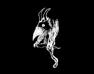
- The art is not on par quality-wise with officially released products, which is understandable considering it's fan-made! It has a homey-feel like a child drew the images. But, they are still personally below my standards.
- The title page could be more avant-garde with it's art style. There is a lot of whitespace. The fonts chosen for the title and subtitle aren't my favorite. they seem almost "piratey"?
- The text on page 2 for "A Guide to the Dreadful Critters" seems really tightly squished which makes it difficult to read.
Things I'd like to see someday
- An additional redesigned pdf that is specifically supposed to be handed out to players. No stat blocks involved. Only descriptions, quotes about the monsters, battle tactic recommendations, and if possible some tactics to avoid combat. Example: "Rainbow snails will generally ignore you if you scatter coins around." or some such thing. I've been in love with Players having handout bestiaries ever since watching Questing Beast's video on youtube about "The Dark of Hot Springs Island" which has an amazing player's bestiary.
Improvement recommendations
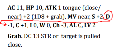
- The monster stat blocks need to be better laid in an easier to read manner. There is no reason to leave Dexterity dangling at the end of the sentence and have the next one below it start with -1.

this happens frequently throughout the pdf. It's especially noticeable on pages 3, 4, and 5. often a sentence will end with "MV" and the next will start with "Close".


Leave a comment
Log in with itch.io to leave a comment.