Play game
The Phantom of the Black Rose Revue: Act 1's itch.io pageResults
| Criteria | Rank | Score* | Raw Score |
| Character Designs | #1 | 5.000 | 5.000 |
| Game Graphic & Logo Design | #3 | 4.913 | 4.913 |
| Game Page Design | #4 | 4.826 | 4.826 |
| Overall | #7 | 4.826 | 4.826 |
| Sound Effects | #10 | 4.435 | 4.435 |
| Log Line | #19 | 4.507 | 4.507 |
| Story | #21 | 4.681 | 4.681 |
| User Interface Design | #26 | 4.551 | 4.551 |
| Music | #30 | 4.420 | 4.420 |
| Accessibility | #36 | 4.362 | 4.362 |
| Halloween Themed | #80 | 3.884 | 3.884 |
| Voice Acting | #84 | 2.304 | 2.304 |
Ranked from 69 ratings. Score is adjusted from raw score by the median number of ratings per game in the jam.
Leave a comment
Log in with itch.io to leave a comment.


Comments
What an absolutely beautiful game!
I really enjoyed playing this and can't wait for the full release!
I cannot wait for the rest of the game, I am completely hooked!
Gorgeous! Love the style and all the visual effects, from the sparkles to the spinning roses to the malevolent energy from Tomiko! The attention to detail is beautiful, I adore the dazzling stage backgrounds, the bouquet of roses, the opening envelopes, ahhhh I’m gushing!
At the end, I laughed out loud at the to-be-continued scene! Reminded me of those mini gag comics at the end of a manga chapter from the artist. A part of me felt like it was long enough to have put that energy into continuing the story hahaha! Eager to play more!
Thank you, I'm so glad you enjoyed it! The post credit scene was just me having some fun and celebrating the end of coding the demo. We actually have the other two acts already planned and mostly scripted, but there was no way we could finish them to my standards before the end of the jam!
That’s awesome, I can’t wait to play the rest!
Unbelievably stylish in every respect, and as someone who adored everything Phantom of the Opera as a child, the story beats felt like catching up with an old friend. Beautiful work!
absolutely impeccable aesthetic. so excited to see the next parts of the story!!
sooooo cute and pretty and fun. I don't keep up with revue stuff, but i love learning about it. An incredibly stylish game with many fun special effects. I'm looking forward to the next installment!!!
The art is really pretty, I can't wait for the rest!
This is very engaging and quite a lot of fun! It shows good promise for the game's full version.
I really like how much movement there was in this visual novel - how many animations there were. It wasn't just a load of backdrops appearing and disappearing, with a bunch of characters sliding around. There was ACTION! Moving objects, visual effects, elaborate set pieces, elaborate, fun transitions... it almost felt like watching an animated show rather than a visual novel, and I really appreciate how much effort was put in to make everything fun, kinetic and vibrant.
I liked the writing. It had the right balance of simplicity and verbosity. Enough elaborate, dramatic language to set a passionate, serious and hearfelt tone, but also enough simplicity to stop it from becoming bloated or pretentious.
I also like how many times I was given a choice in what to do or what to say. That sort of thing is important in a visual novel, to help the player feel involved and immersed in the story, and I feel that I was given a choice not too many times, and not too few times.
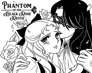
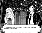
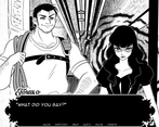
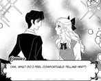
The art style is striking and nice to look at. There is a risk that a completely black-and-white pallete could look boring, but not here! Everything can be clearly made out, and all the lavish effects really help make everything look interesting. I like how, a lot of the time, the shading looks deliberately 'drawn' - cross-hatching and spirally, for example. It really helps to give the impression that this is a manga come to life - which is the style that this game was clearly going for!
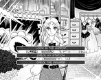
However, I have to say that this art style led to one of my most serious complaints about this game. Sometimes, it's hard to make out the game options on screen - the 'save', 'history', 'load' and so on. These words are in very similar colours to the rest of the screen, and sometimes a lot of the words get completely obscured by the characters! Admittedly, this wasn't a HUGE problem. I could just about work out where to click even if I couldn't completely see where I was pointing my mouse... but even so, this should NEVER happen. Players should ALWAYS be able to see the options clearly and distinctly. I suggest maybe making the options be in a colour that clearly stands out from everything else on the screen - have them be in red, or something. Although, that could possibly ruin the black-and-white aesthetic of the game... maybe put the options in a black box and have the words be in white, so they can always be clearly seen?
I liked the music, overall. It seemed a bit stark and harsh at times, and sometimes I don't know whether I'd have prefered more naturalistic sounds rather than the more electronic sound that I got, but overall, it was nice. There was a nice variety in sounds, and the different tunes skillfully gave across the tones of each scene they were playing over - which is what you want from music!
Well done to everyone involved in making this! This isn't really the kind of visual novel that I'd usually play, and yet I still had fun and felt drawn into it. That should be a good sign! :) Good luck with all your future efforts.
I only started playing so I will write another comment later, but since I tend to play very slowly - I just wanted to say now that the atmosphere and the beautiful style absorbed me from the very start, and I love all the references - they make the experience metatheatrical in the best way. Thank you for this wonder.
Edit. After finishing Act 1, I just want to add that it was amazing start to end. Love the dialogues, Raika's especially. Also, I like the interface - playing was not only exciting but also comfortable. Looking forward to meeting the characters again in the full version.
It's a great demo and it made me nostalgic for old manga.
Can't wait for the full game and I'll be making a video of my play through.
An honestly amazing demo. It hit all the nostalgia points for me with the art style, being inspired by classic Shoujo manga and anime, but it has a great charm of its own. It's a simple story and is not afraid of just taking its inspirations and running with it. The designs are great, presentation immaculate, and I have to give particular kudos to the sound design. There's a couple of scenes where the SFX used hit absolutely right!
Only point where I feel it can be improved on more is the menus. There are certain elements that feel too much like the basic Ren'py fare, but not too many to bother. Most of the GUI is perfectly in line with the aesthetics of the rest of the game. Also, it has no voice acting but that's not a detriment: just something to keep in mind for people going into this.
Can't wait to see where the game goes next!
Excellent demo, I was hooked the entire time playing. Very excited for the full release!
Stunning visuals, themes, and writing. the cliffhanger put on edge, definitely a scary story in gay shojo style!
THIS IS SO FUCKING GOOD
What a lovely game.
The UI's monochromatic style is very pretty and contrasts well with the 8bit music.
Speaking of music, was there any Ace Attorney music influence in it?
The effects are so well done.
The story is lovely.
The art style is amazing (sometimes it looks just as good if not better than Utena).
I haven't seen a visual novel with such incredible presentation in a long while.
Congrats and thanks for all your hard work.
Hope you all a well deserved break and have a good one.
Thank you for your kind words! The team is quite fond of Ace Attorney, but I must admit that, as the composer, I haven't taken so much influence from the Ace Attorney soundtracks for the reason that, amazing as they are, I don't know them particularly well :')
A game combining 70s shoujo manga with Phantom of the Opera and lesbians is so incredibly my kind of niche that of course I'm gonna enjoy this VN lol.
This game's visuals do a wonderful job of emulating the visual style of Ryoko Ikeda's shoujo work; I believe the team primarily looked at Rose of Versailles, but Tomiko definitely has vibes of a character in Ikeda's other manga Onii-sama/Dear Big Brother. My favorite things about work trying to imitate Ryoko Ikeda's work is not just how they emulate the art style, but how they depict her abstract patterns and lines that she regularly used to suggest a specific mood or intensity from the scene and the characters. This game actually goes through the effort of emulating that aspect with motion design around the character sprites, and I'm really a big fan of the results! It's definitely something I'd love to figure out how to emulate in my own work.
I'm not a big fan of VN's (I can count the ones I love one one hand) but I am a fan of 70s Shoujo, Takarazuka and lesbians and this pretty much hits all those notes in spades. Also all the references to Shoujo series of the last 60 years sprinkled throughout just this demo? Absolutely amazing work!!
The fact that something like this exists at all wants to make me rank a full five stars across the board... Absolutely excited for the full game.
It was so much fun! And so many Sailor Moon reference! Love the artwork, really remind me of the sparkly shoujou manga I read when I was a little girl. And the animation is really so good~! Love it so much!