Play game
A Knight in the Woods [Trijam 255]'s itch.io pageResults
| Criteria | Rank | Score* | Raw Score |
| Visuals | #9 | 3.857 | 3.857 |
| Overall | #12 | 3.219 | 3.219 |
| Gameplay | #15 | 3.190 | 3.190 |
| Audio | #19 | 2.857 | 2.857 |
| How well does the game fit the themes? | #24 | 3.333 | 3.333 |
| How much do you enjoy the game overall? | #24 | 2.857 | 2.857 |
Ranked from 21 ratings. Score is adjusted from raw score by the median number of ratings per game in the jam.
How long was your dev time?
8 hours
Leave a comment
Log in with itch.io to leave a comment.


Comments
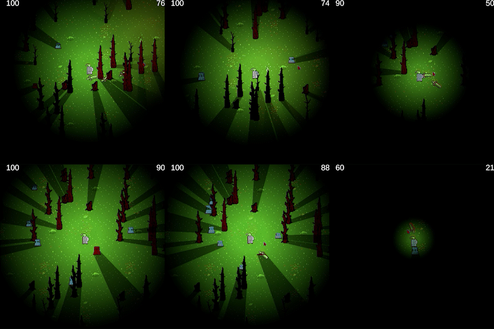
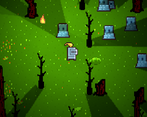
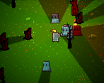
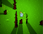
Top notch visuals! The shadows add a lot, and I like the flickering and color changes you did with the lights. The think the UI could be a bit more clear as to which number is health and which is time, but this is a well implemented game overall. Nice work! 🎉
Really nice shadow effects !
The gameplay was quite fun and easy to understand, good job.
I enjoyed this game a lot, the shaders were well done, and the shadows looked nice. Only needs a little bit of polishing. Well done :D
Thanks for the feedback. I already have some updates ready for after the voting period.
I like the casting shadow effect :). Overall game is missing a bit of polish and an ending, but it was pleasant to play.
Well done, shadow casting is super cool. Great use of pre-existing assets, and nice tie in with the theme
I loved the effects used in this one. The sound effects were also fairly good and the base is there for a great game! Well done.
Cool project! I like the look and feel of this game so far. It could def be turned into something longer!
Note: The build download seems to just be an HTML5 build; not sure if you meant to make this visible/available or not.
Lovely visuals, and I also appreciate the pun! Gameplay unfortunately got a little dull after a while, though I’m generally not a huge fan of twinstick shooters, so maybe that’s just me. Having to find fires to keep my light burning was a nice touch.
Thank you for the feedback.
"little dull after a while" is valid. With more time, I would like to add either a second weapon mechanic or multiple weapon choices. It also needs more variety of mobs to offer more gameplay variance.
I'm glad you appreciate the pun on the title.
Loved the mechanics and the visuals.
Doesn't have much of a goal, but at least it looks nice
Lights and shadow are greats !
My sword finger hurts. Nice entry, loved the lighting.
With more time, I would add an alternative bomb-like weapon, to give a break from endless clicking.
Thanks for the feedback.
Nice entry! A bit buggy on my laptop in fullscreen mode, maybe it is just a resolution setting. I like the light effect, it fit well with the theme.
I found that out too early today when trying to record some footage. I change the resolution during development, and somehow, it reverts to a smaller resolution in full screen.
Thanks for the feedback.