Play game
Bip Bap's itch.io pageResults
| Criteria | Rank | Score* | Raw Score |
| How do you rate the game overall (you can consider fun, dev time, etc.)? | #11 | 3.727 | 3.727 |
| How well does the game fit the themes? | #11 | 4.182 | 4.182 |
| Gameplay | #15 | 3.545 | 3.545 |
| Overall | #22 | 3.455 | 3.455 |
| Audio | #25 | 3.091 | 3.091 |
| Visuals | #39 | 2.727 | 2.727 |
Ranked from 11 ratings. Score is adjusted from raw score by the median number of ratings per game in the jam.
How long was your dev time?
2 hours
Leave a comment
Log in with itch.io to leave a comment.


Comments
Feels very much like an ancient arcade game from the 80s! The scope is perfect for a the jam time, and the minimalist graphics must have let you focus on perfecting the mechanics, because the movement feels very responsive and snappy, with just the right amount of cushion.
Impressive for a 2-hour timeframe. The gameplay lasts just long enough that I played it several times over just to try to get better. It could use just a tiny bit of polish and maybe some short tunes, something very retro sounding would add a lot to the experience.
Agreed, I at first thought that maybe the sounds of playing would be enough but in retrospective a short 8 bit tune would solidify the game.
Feels straight out of an arcade in the best way possible, incredibly fun and definitely matches the theme! Sound effects were great it just needs a chiptune song for the full experience. Really impressive you did this in only 2 hours, as if a 3 hour game jam wasn't difficult enough lol
Very enjoyable and responsive gameplay. I think the SFX did a lot to give it a good game feel.
This was way more fun than I expected it to be! The minimalist visuals and audio were a smart choice in making it all cohesive given the time constraint. Great job overall!
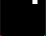
Game fit the theme well. Having the score go negative felt punishing the first two or three attempts but then felt like a good driver to do better. Also felt like an interesting twist on "Do the Best you can by touching Green" by giving the option to "Do the Worst you can by touching Red".
Would have preferred a bit wider of a frame for the game, it felt very tight to move in.
Pretty much the idea, glad you liked it :). As for the wider frame it was a balance choice. If it was too wide it would take too long and feel tedious to move from one end to another and the difficulty increase probably would include raising the speed for the player. Shorter frame made the travel time shorter from one point to another without sacrificing the tension of getting hit, the blocks didn't have to drop fast and the player speed felt okay as it is with no need of adjusting. Thanks for the feedback tho, I might experiment adjusting the frame more to get the best feel.
That's definitely fair. I'm glad to hear you had considered the options for balance. :)
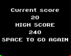
Incredible game! My high score was 130 and it felt really good to play. I didn't like that you could get negative points below 0. Overall you did an amazing job putting this idea together.
Nice! Mine was 350 :)