Indie game storeFree gamesFun gamesHorror games
Game developmentAssetsComics
SalesBundles
Jobs
TagsGame Engines
A jam submission

Curse of the sandmanView game page

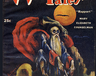
Curse of the sandman a lvl 5 to 7 module for the Weird Tales Shadowdark Game Jam
Submitted by Ikyto — 9 hours, 10 minutes before the deadline
Add to collection

Play game

Curse of the sandman's itch.io page

Results

CriteriaRankScore*Raw Score
Inspiration: Effective use of assigned "Weird Tales" cover elements.#883.0833.083
Vibes: Overall atmosphere and feel of the supplement.#1002.7502.750
Usability: Practicality and playability at the game table.#1012.6672.667
Overall#1012.8332.833

Ranked from 12 ratings. Score is adjusted from raw score by the median number of ratings per game in the jam.

Leave a comment

Log in with itch.io to leave a comment.

Comments

Submitted(+1)

Love the color choices, and the history/origins of the power.  I appreciate the effort in the design.  Taylor covered much of what I would suggest.  I might add that using words to show importance repeatedly, can take away the very effect you're using them for.  Mood, Vibe, Feel all describe essentially the same thing but don't become "standard." An example is "might," where you could use: arcana, vigor, force, or sway.  Bonus for using my favorite color purple!  

Developer(+1)

Thanks a lot for the critique and the time you spent reading the module!! :D
Word choice is definitively something I'll have to work on .

Submitted(+2)

This adventure is super creative and fun. You asked for some feedback on discord, so i have a few notes:

Layout:

  • I'd use a more readable font as the body. A028 Medium is a cool Albertus riff (love me some John Carpenter) but it makes for a bit harder reading as a body font. In that vein,. spacing is a bit scattershot. Sometimes lines touch, sometimes there's padding between paragraphs. Set up you file so that the spacing you want is there automatically - trying to do it manually is much harder to get consistent.
  • I like the use of coloring, but I'd suggest more contrast between the heading color, and the read-aloud text. I might also add a shaded box for read aloud - the bar alongside is cool but is kind of hard for me to parse.
  • I'd also turn on the spellchecker in indesign/affinity, or run your text through a word processor first. Many spelling and grammar mistakes distract the reader.
  • I'd love to see more structure for tables. They are also hard to separate from region descriptions in their unformatted state. Also, i think weather table doesn't fit after the eelbucket entry. Later on when I want to roll weather, I won't think to look at the eelbucket town entry to find it!

Magic Items:

  • I'd try to format the magic items like Shadowdark does. I think you ran out of space, but that just means we needed to rework the layout so the right formatting could get in.
  • I'd try to clarify how long the tea box bonus lasts, unless we're imagining characters eat a pastry as soon as they get mind blasted!
  • Sandman's item lore and effects don't line up for me. 

Locations:

  • Eelbucket: we get NPCs and their related info in the back, but it would have been better to put their info on the same page together. At minimum we should introduce the NPC's first in detail, then reference them shorthand in the adventure.
  • Random encounters: Would like to see a few less 'random animal hunting' entries or 'you stuck your foot in a trap'. One such entry on a table is fine, but in general we want random encounters to have something players to interact with. Try to push yourself on these!
  • Unclear where we encounter 'the swamp'. it might be every in-between area, but I don't know for sure.
  • hunter cabin: in my opinion, every piece of content must either fill the PCs lives with adventure, or breath life into the world. I think we need some kind of hook for what's going on at the hunter's cabin, or a fleshed out NPC to give the world color. 
  • Old Chapel: Very cool location. How will players know how to solve the puzzle? I didn't notice any clues leading up to this location. Puzzles are great, but we need the accompanying clues to have a satisfying piece of gameplay.
  • The dirty old water spring: what's this creature? Wyrmbat? We should reference that fact in the entry. 

Dungeons:

  • Abbey Dungeon: The locations are all kind of samey. 1d6 imps doing a specific thing (which is a nice detail to include), but no encoutner variety. We know one group of imps wants food. The rest are just chilling, presumably to fight the party.
  • Castle Dungeon: Random encounters and how it works first, it's confusing to read those last. Also, is there any clues on what the trick is, or how to navigate? This dungeon is a puzzle, which is cool, but we also need some way to detect the solution other than brute force.

The Good:

  • Overall well imagined area. You gave it life, and I think it's great. Its just the details and encounter design that need work.
  • The map and travel times are super helpful for a point crawl! Love this. Functional and efficient.
  • Many of the random encounters are well structured and interactive.
  • Some locations are just nice atmospherics. Love that!
  • Abbey Dungeon: Good map, and good detail on keyed locations and what's going on at each. Plenty of detail to riff!
  • Castle Dungeon: A puzzle dungeon is a lot of fun, and I think this is a great idea.
  • Tea box: Super fun character. I'm sure many a party will get attached to their new pet sentient furniture.

Please don't read this as me being overly negative or hating the adventure. I think you vividly imagine the locations, and more formatting, design and spellchecking will make this a superstar adventure.

Developer(+1)

Thanks a lot for the time you took for the detailed review! It means a lot!

And thank you for your word of encouragement !

Submitted(+1)

Animated treasure is the coolest. As for cretique (You asked for it) the purple text matches that 1 headeder a little too much to differentiate. marble a lighter shade of purple would be better.

Developer(+1)

Thanks a lot for the critique and the time you spent reading the module!! :D

Submitted(+1)

No problem your's was a fun read through.

Submitted(+1)

Exit light
Enter night
Take my hand
We're off to never-never land

Deleted post
Developer(+1)

thanks for the kind words and the time you spend reading the module! :D

Submitted (1 edit) (+1)

This adventure has a lot of variety, and the Abbey may be my favorite aspect! The maze castle design is interesting, but it doesn't seem to be a puzzle the characters have any way to "figure out" because North is arbitrary. 
The layout and dressing elements are unique; they might benefit from cleaner spacing within and between sections. 

Developer (1 edit)

Thanks for the advice, the kind words and the time you spend reading the module ! :D

Submitted(+1)

Giving little descriptions for the NPCs and what they might know, how they might act is a good touch. But I can't tell where they exactly fit in the adventure.

Developer(+1)

Thanks for the advice , the kind words and the time you spend reading the module ! :D