Indie game storeFree gamesFun gamesHorror games
Game developmentAssetsComics
SalesBundles
Jobs
TagsGame Engines

I've had a go at my first graphics... They feel to me a bit Subsunk / Seabase Delta esk to me...
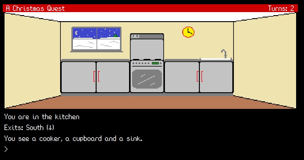
Classic vector graphics look good to me.

The purpose to me (at least) is to give the player a sense of geography.

Will you have a version of the graphic with an open cooker / open cupboard?

If so, you should check out the "overlay" command (in the cookbook).

Haha that would be nice. May be possible but I'm already having to make people suffer a graphic location. I dont want to uspset them even more!

I'm not going to make any promises!

Ooh! Nice! I worked on graphics last night too! 

Nice one - thank you. Good luck!

Looks great. Just be careful of perspective. For example, the handles on the right should face the other way, ] rather than [. The cupboards have no depth and look like they're painted on the wall. To fix that, the cupboard on the left should extend a few pixels to the left of the corner of the walls and the one on the right should extend a few pixels to the right of the corner.

Thanks. I knew it wasn't perfect but I'm no artist. I might fix it if there is time, but I've got 11 others to produce and I'm finding them the most stressful part of the jam. 

I know what you mean. Pixel-style graphics don't come naturally to me. I have to work hard at it, but it is fun in a masochistic sort of way. Just allow plenty of time to allow for all the false starts and discarded images.

(1 edit) (+1)

My kitchen got a redesign... It is a lot better now. I'm sure the artists among you could improve it but I am at my create limit!

Very nice indeed Richard.

You really undersold.your skills.

They have really been a challenge for me!

Very nice. Mine will probably be in a similar style (ala 'The Witch's Apprentice' and 'Charlie the Chimp'), but I haven't started on the graphics yet.

Looks great Richard. Nice work.