Interesting, the visuals remind me of Going Nowhere: The Dream.
astralCastoff
Creator of
Recent community posts
Thanks for clipping it! Can be hard to find it in a big long stream vod.
Mongol
This? https://bydarkcrusader.itch.io/mongol
I don’t think I’d seen it before, looks cool.
I like the “oil painting” shading in principle, but it has imho bad interplay with the low-rez non-AA’d edges, making everything wobble a whole damn lot.
How so? The hard edges themselves don’t wobble, or are you talking about the animated textures like the sky in the desert area?
To my taste it should be more static, like real oil painting.
There’s actually an inbetween step where the game is rendered in low resolution and then upscaled with a smoothing algorithm, I wonder if it might be more appealing without that and being high resolution. The problem having it static would be that the distortion stopping when you’re not moving the camera would be very noticeable and jarring. This type of wobbling (which is entirely screenspace) is still relatively temporally stable compared to doing some kind of screenspace stroke-based rendering, I could make it take into account depth like Memories Retold, but it’s a ton of work for something that’s a totally different aesthetic than what I was really going for. I’ll definitely have a think about it, though.
couldn’t do anything
Sorry about that, they’re totally broken right now. They’re in the middle of being moved from a hacky solution to a properly functioning inventory.
Thanks for checking it out!
Thanks for the feedback. I’ll cut the static to 4fps instead of 12fps. I’ve gotten the same feedback on the text, but part the shader pipeline cannot be selectively run on part of the screen, but I have a solution for that. Uncapturing the mouse was for debugging but I forgot to disable it for the build. I’m going to change how the teleports work so I can set your rotation and look angle to make sure you won’t walk straight off of anything.
I LOVE the art. So clean, feels retro but without getting all blurry or anything. Fun gameplay, had to get used to dying a few times per level before I really knew the level.
One issue I found was that if I went up the stairs at certain angles (diagonal? against the wall?) my movement would go jagged where it was seemingly getting caught on the steps?
I just tried it on a 144hz monitor and there was no difference, that code runs in the FixedUpdate() loop so there shouldn’t be any variance in the momentum it gives you. 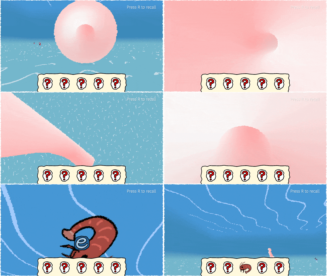
Are you getting this high? Less?
The game was using up way more CPU than it probably should have
Sorry, the game currently has every area loaded at once, that could be it. I’ll try profiling it or something just in case it’s another problem.
Thanks for the feedback.
The tutorial is beatable while not really using the surf features at all. The backstep mechanic is so overpowered that any incline trivialises the entire level, allowing you to shoot into the sky and land wherever you want. The air-strafing allows complete preservation of momentum with zero effort. Feels less like a recreate of source/quake movement and more just a list of hardcoded surfing rules.
Maybe take a look at the open source surfing recreations out there for some tips, I know of multiple Unity ones which use C# just like Godot that you could probably take some inspiration from.
Gorgeous art and presentation, but I had some gripes, I listed them out in case they’re of any use to you:
Click to expand...
-
Having to click on the “base” tile that a character is on instead of being able to click anywhere in their body is confusing and can make you think that something isn’t interactable when it is.
-
The character changing direction rapidly sometimes when you try to move diagonally looks quite jarring, is the lack of non-cardinal-direction, non-grid movement a limitation of the engine/framework?
-
The main character’s default walking/running animations look very rigid.
-
Explaining all the stats at once when you shoot the deer targets is near-useless, there’s no way you’ll remember any of them, you’d have to be screenshotting the explanations or something, at which point you might as well just put that explanation in the menu when you hover on that stat’s name.
-
Enemies in the start seem to rarely hit any attacks. Intentional?
-
After walking back up to the swirling tree area, walking left or right actives the trigger to go back down to the bonefield. This is easy to do if you click anywhere that isn’t directly above the character, as the game tries to move horizontally first even if you click right above the player and only very slightly to the side.
-
I just realised arrow keys do movement too, had presumed mouse movement was the only control scheme. Is there any reason for walking to exist when sprinting does the exact same but faster, and is the default when using the mouse? Though I would prefer to use the keyboard, I don’t like having to use both hands just to move (or awkwardly press the arrow keys and Right Shift with the same hand).
-
The red flashes from what I presume is the curse draining my health are too strong, they give me the same funny feeling that seizure-inducing gifs do (I am not epileptic but am mildly sensitive to the same flashes). Same goes for the flashes when touching into the deer that you can’t fight.
-
I totally get it if you’re going for a “tough as nails, doesn’t hold your hand” game, but yeah it feels pretty sucky to blow your healing items on not realising the curse is draining your health mega fast,
-
The 2nd time you approach the mirror that teaches gaslighting, it vanishes while the character is saying “I need to find her…”
- Very nice sprites and music.
- Pixel font is strange and a little hard to read.
- Escape being the Start key is weird, expected Return/Enter.
- First boss is difficult, took me about 7 tries. Not sure if intentional or not, but I needed to learn to use the dash to beat him, which isn't taught in the tutorial before then.
Press "1" to use the Air Burst ability to make it past that jump. The reason the candy respawns is because larger lobbies that run for longer get pretty barren after the first 10 minutes without the candy respawning, but I see what you mean about how it would be more like a collectathon if it was one-and-done for each, possibly keeping them for solo-play only.
Is that a homestuck-styled username?


