Indie game storeFree gamesFun gamesHorror games
Game developmentAssetsComics
SalesBundles
Jobs
TagsGame Engines

AverageStardust

63
Posts
11
Followers
1
Following
A member registered Jul 12, 2019 · View creator page →

Creator of

Recent community posts

(1 edit)

Apparently the web built was really broken… I made it just a bit less broken now. I’d still recommend just downloading the game.

Two minutes and someone found a duplicated glitch 😭

Please pick another font. This game would be unplayable for anyone with trouble seeing or reading.

The moment I realized that world looped over edge to edge was just wow! The way you get all the creatures to move, showing how to control them without text, is just so smart. I doubt I found everything, but I kinda like that about cryptic games.

I either really struggled to jump 3 units with the blob, or occasionally broke the physics and jumped 3 to 4 units with the blob.

I mostly just want to make more textless games now.

The game was developed on Windows and Linux with V8 (basically Chrome). So you’re getting lag on the ideal platform, that’s weird. Sorry, I can’t do much without profiler data.

Great to hear you loved the dialog. I wish we had a better font too, but by the time we had dialog we were kind locked into low-res pixel art. You live you learn.

I had fun setting up the conversation system, and I think our writer loved writing for it. We might have to make something in the future with it. There were no audio bugs, we just didn't have time for any sound.

Sorry to hear about the lag. If you don't mind, what browser and OS were you on?

This is cool but did you really just use a physics engine to do disc sampling? I will let Mr. Shiffman expain a faster way...


I often found I could not eat people. It would play the sound but the slimes mouth would not open. This bug ended most of my games.

I wish I could resize the window into full screen but past that, it was perfect. The art is good looking and cohesive. That sound is crunchy and the gameplay is fun. Also, why does it say "No DC" in the corner, was that a debug thing you forgot to remove?

Safe to say I didn't see anything in that story coming.

I hate that flesh blob gif at the top so much

I really should know better than to read into the story of this game, but I hope you tell him.

Happy to see a jam game with controls that don't make me want to gouge my eyes out!

(1 edit)

I love the idea and the art is very well put together.  Although something about the jumping controls and slippery movement made this feel like a rage game. The good thing is that there is a lot of small physics things you can do that will mostly fix this.

The story is beautiful, the platformer controls are atrocious.

I'll be seeing you in the top 100!

Maybe you have an older browser idk. Fixing it would be high effort and that is against jam rules.

+++++++++++++++++++++++++++++++++++++++++++++++++++++++++++++++++++++++++++++++++++++++.---------------.+++++++++++++++++.

Sadly I didn't have any time to add something after the boss, that was it. And as for the paradoxes, decided that translating the idea of a paradox into a game more literally wasn't going to do well for me. So I cut my losses and did something weird like paradoxes and called them paradoxes.

I can totally second that. With Logisim I have gone from "What is a adder?" to "I just made a shitty microcontroller" in a year.

How does it sound if explosions temporarily increases turning speed? I think this would pull up the skill ceiling a little.

Good to know, my speakers are terrible so I couldn’t tell, I will pitch it down or something after jam.

I thought about making a new font for this game, or maybe custom text to make it easier to read. I may do it in an after jam update.

You made Microsoft flight simulator look like it was made in MSpaint.

(2 edits)

While searching for bugs I crashed the car a few times on the starting line and soft-locked the game! Yay!

The sound effects were very juicy MEATY.

This is way better than the band of the same name!

Felt like I was playing Beat Saber my first go, and that's high parse from me

(1 edit)

In game jams a  submitted game is never a bad game! I did have one bug to report; returning to the title screen after dyeing makes multiple copies of the music play over each other.

Thanks for  the feedback!  I liked making this game a lot because it has a high skill ceiling. For example I know some tricks are possible but after a few hour I still can't pull them off consistently.

I checked on the movement system today and it felt better. I don't know if  the perceived improvement was from a edit to the code or me knowing it was an 8 directional system. 

Sadly I still had difficulty with text, example below. I suggest you open the image in fullscreen to see the problem clearly.
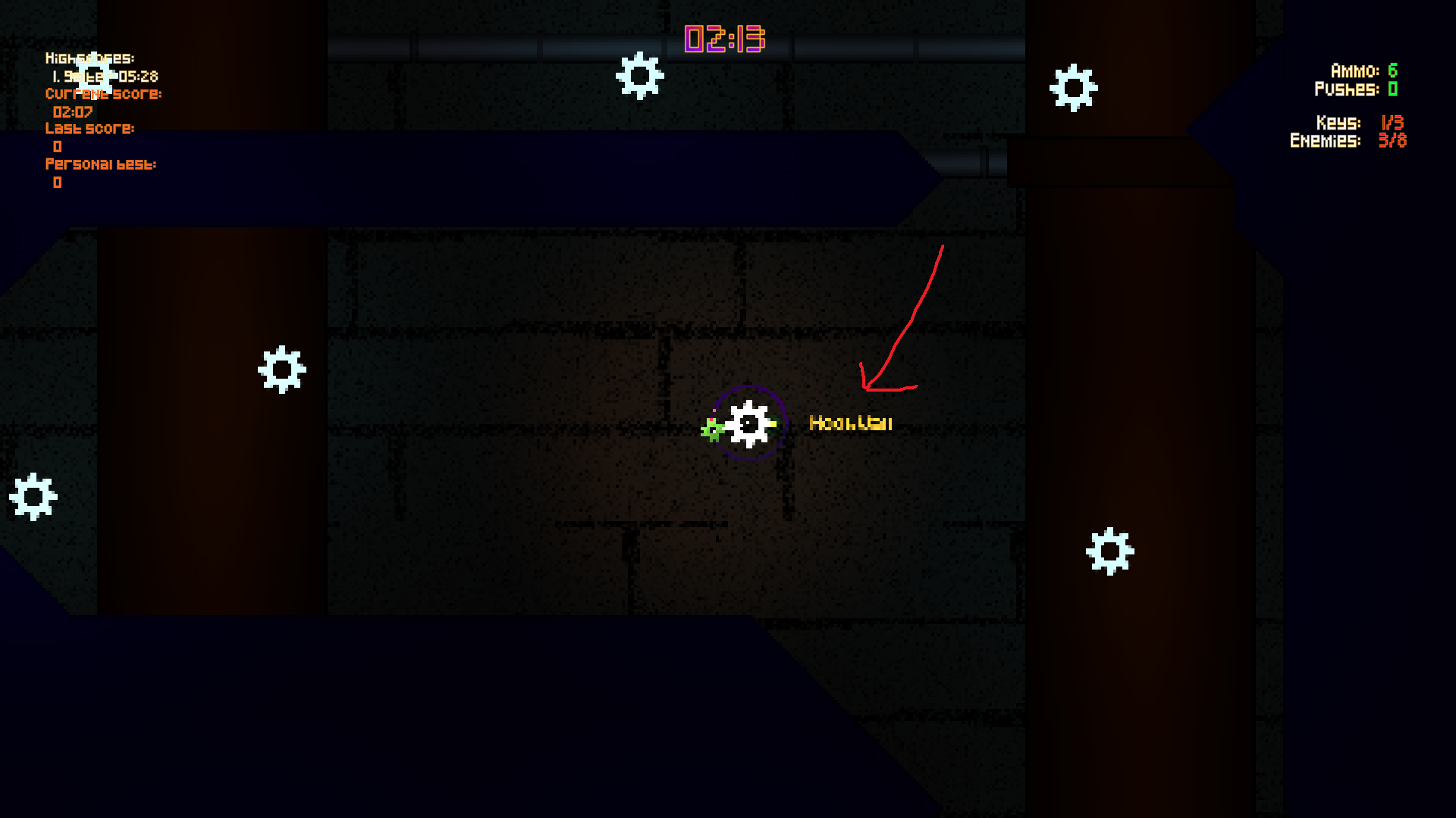
I think you made a good solution to the enemies problem and I am happy it was not pushed off tell after-jam.

I am going to have a lot of criticism  nitpicks, so let's get some praise out of the way first. I absolutely adore the aesthetics, the music, the graphics, the everything! The movement mechanic is so interesting. There are a few areas that need fixing up as well- the controls were very offputting, and the enemy system seemed like an unneeded weight in its current form. Aswell the whole "pushes" thing felt funky, and I am not quite sure how to fix it.

First of all, it is completely unclear where the player will fly when releasing from a cog. To improve movement I would release directly outwards, or with the direction of rotation (perpendicular to the former). Next, it's no fun searching for one last enemy. It feels like enemies just artificially extend the game. It could feel better if you connect movement and enemies mechanically. For example, to kill enemies you must slam into them with the player character. Next up- pushes! I wish they could be regained as you play, but no idea how this could work. I might also replace the complicated directional pushes with a single key gravitating the character to a nearby cog.

I have gained an appreciation for per-pixel lighting in a pleasing pixel art game and believe me, the pixel art is VERY pleasing. The single graphics thing that bugged me is the anti-aliased text for pop-up messages. It took a minute straight to read, "Kill more enemies." It appears the display location needs to be rounded to the nearest pixel. I hope someone sat through all that, and I hope I didn't ramble. Now it is time for me to stop procrastinating on English homework... keep well and keep creating!

I love the theme of the game... and Obama Prism. It is so cool to be sloshed around by the virus and your own cells. Remember, simple systems are often much better. I don't know how much work you put into the acceleration effect on the player movement/ rotation, but I would scrap it all. It feels like the whole game is a skating rink. I like the graphics, but I wish the appearance change on cells was more drastic. I hope you can patch any problems out before the deadline and keep well!

I would suggest if you die and then run into a health potion you should come back to life. I did something like this in my submission and it was a lot of fun.

The felling of this game is so awesome, I only wish I found it in time to rate it'

Thanks for the feedback! I was thinking about explosion effects during that jam too, but as it was we submitted 10 minutes before the deadline. I never thought of the time slow, but I might update the game after voting to add that, sad thing is the physics are locked to the frame rate and so it won't look perfect.

There seems to be a lot of bugs when it comes to enemies dying while being moved by the mouse, it seems to me that the mouse can:

a) clone enemies somewhere, and bring the clones back after death

or

b) keep a reference to enemies, even dead ones causing it to reanimate dead "deleted" enemies

Other that that, the game and it's art is awesome!