Count on it mate.
Commander Rad
Creator of
Recent community posts
Yeah, the version number is 0.07. That's more or less where I think the game is at right now. Still exploring gameplay, adding basic features. There is a game loop but it ain't a real game yet.
We actually also have an in-depth terrain system. So a tank will turn way slower on sand than it does on asphalt. None of the in-game stats have been balanced or anything. Next version we'll have a closer look at these things.
We're switching to flow maps for navigation in future, things are already much better on internal builds.
Anyhow, thanks again for your feedback.
Thanks Tomodev for your detailed feedback.
FYI, this version was focused on doing maps and making tiles and water look better visually. So a lot of the UI stuff that was added in last update and other gamefeel & QoL issues haven't been looked at yet.
Options and Credits are placeholders for now. Folks do seem to complain about this, so I think I will definitely move some options into this by the next update.
As for fullscreen mode, the coder previously wanted to add it after some specific selection feature was in. Then we both just forgot about it. I just had a chat with him and there's nothing preventing us from adding it in the next version. lol
We have yet to add keyboard controls to much of the UI yet. We will probably add that alongside customizable hotkeys.
One of the core features of my game is that I want a map for every inch of the planet. Feels like a pie in the sky, but we're actually pretty close to making it a feasible thing through map generation. I stopped at 109 because I felt it was enough for batch 1.
There is a list for the maps, but there's also a 'world map' selection screen where you can browse the world map and click on parts of the map to zoom into and select the part of the world you want to play. I think in future I will make the world map interface the default and have the map list on one side of the world map or something like that. It's currently kind of clunky and needs improvement so the map list is the default.
Franz josef land 17-1 #2 is a typo on my end. I just checked the map list Excel spreadsheet. They are named according to province and subdivision they belong to in real life. All the arctic provinces are huuuuge, so there's a lot of maps for them. We're working on the Arctic maps first because those biomes are barren and easy to make. The names will become more varied as we move south because the provinces will become smaller. Map names with numbers at the end will be rarer as we move into more settled territory.
Color selection order and default settings I think we could change into something a bit more 'gamey'. Does 'blue' for P1, 'red' for P2, 'green' for P3, and 'yellow' for P4 sound good? Maps are generated as 4 players as a max by default, although there can be more.
Only one faction for now. I want to have it fully completed before moving on to hammer out the second one.
The Tech Tree is just a grid with tech tiers on one axis and production buildings on another. We just added that in the previous version as well, we haven't added any visual polish to it yet.
I think the scrolling issue will go away once we make things full screen.
What do you think about the build menu though? Currently we have three things displayed: 'things you can build', 'things you can't build because you don't have enough money', and 'things you can't build because you don't have the tech.' I'm thinking it might be better to hide all the 'things you can't build because of tech', since the tech tree is accessible in-game anyway.
As for the build order of the vehicles, I don't think we're going to change that right now. In future we will add hotkeys to help build things faster.
There is no real AI right now. In fact this version with the maps just added the infrastructure needed to add AI in the future.
Pathing is the core problem of the game right now, one which we are taking about 2 months time to fix right now. Increasing unit response time and improving path smoothness and unit object avoidance are all things we're working on right now. See the new Object Avoidance right here: https://twitter.com/GamesBreakfast/status/1566827073003352066
As for why Jeeps and all vehicles rotate in place. This is a trade-off of the path finding. In order to have bigger maps with amphibious and navel units in future, we need to simplify the pathing objects. So they all just pivot in place. We had very complex navigation in earlier versions, but that did not fly with the complex and large maps we wanted.
Building animation is something we would like to do, but currently do not have the time and resources to do. We're going to redesign some of the production buildings. The vehicle depot is the oldest and lamest buildings of the whole bunch and its getting replaced.
Yeah that HEMTT thing is also a typo, I just fixed it in the internal dev. Thanks for spotting it. The HEMTT is cheaper than the Stryker, although it is more expensive than the JTLV light transport.
Gathering points are for later. It's something that is doable and we have plans for.
Yes, all vehicles have a single 'driver', for the sake of our sanity, we're pretending that all vehicles only need the one driver. It makes leveling them up, giving them abilities, and transferring them from one vehicle to another in the future easier. They encompass all the functions of the vehicle. I will not add multiple different crew types for single vehicles and aircraft. In future, when ships sink, I might add a bunch of 'sailors' that you can save for a small monetary bonus, but all the abilities and experience will be given to a single 'captain'.
The economics of the game has yet to be tweaked, kind of can't until the path finding is fixed and supply trucks can gather supplies reliably. The Supply Dock is not infinite by the way, so you need to seek out new ones eventually. Also, in the future, I will also give the player an option to get supplies from specific points on the edge of the map. These will be infinite, but obviously will take longer to gather. Early game will be about the supply dock nearby, mid-game will be about fighting over other ones on the map, and late gate will be about securing the edges of the map to ensure the flow of supply.
Unit path finding response time is something we're trying to improve right now.
For the zoomed out view, we currently haven't found a comfortable limit to how far away it should be. We might limit it a lot more once we add a full map view into the menu.
This is developed on the Love2D framework. Not 100% engine-dev, but close.
We have added some context-sensitive selections in the sidebar menu we'll add more once we feel the layout of the sidebar UI is mature.
Yeah, there is a lot of work to do.
So, the thing with maps is that I am purposely making them very big to test the limits of our path finding and how the gameplay feels on the big maps. I've heard the maps are 'too big' many times, and their size makes the game really chug. So, all in all, the it's highly likely that maps in future will be smaller. The current maps are based on 0.5 degree longitude and latitude squares, which are about 56 square km at the equator. We might have to shrink that down to 0.25 degree squares instead. Making them smaller will obviously mean I have to make more of them to cover the entire globe.
We've spent 2 versions focused on things other than actual gameplay and QoL. One on new UI, one on the map making and tiles. So the next update will be on improving QoL and gameplay.
Thanks a lot for your huge in-depth feedback. I appreciate it very much.
Yup, haven't put anything in those two menus yet.
The text is something we're going to fix. The current text seems too small for most people, it's on the list of to-dos.
The game is a memory hog, and there's rather large lag spikes whenever you build something taht alters the terrain. This is something that's being fixed right now by changing the entire pathfinding system, but that will take an entire month yet to finish.
Yeah, our game has most of the features we want in right now, we need to work on playability, game feel and content now. The groundwork for adding AI has been laid with this version, with all maps have little markers to help the AI navigate. They will also serve as capture points for players.
Yeah, Right now it's 0.07, I think it'll be 0.1 to 0.12 before we have something I would consider a full 'slice' of the game.
Cheers and thanks for playing though. Any and all feedback is appreciated.
There is no AI at the moment, they are empty placeholders for now. Functional AI is probably 2-3 versions away still. There is an AI called "Swarm AI", which just sends waves of units towards your base.
Collecting supply is automatic, but the path finding is a bit wonky right now and the supply trucks can get stuck. Supply is displayed at the top of the sidebar UI.
But yeah, right now its functional but not really playable. Lots of bugs too. Will be better in a few more versions.
Thanks for playing!
Next update is tiles and map focused, but after that, we're rejigging the pathfinding again. We're just going to use flowmaps, which is what many RTSes use, we actually have it half-implemented somewhere in the code already. This will also prevent clumping, which happens to some units but especially infantry when they are first built or disembark.
Our future plans for infantry is to have them be semi-automated. They will automatically tether themselves to troop transports or garrison themselves into buildings. If you order a troop transport or building to attack, the infantry within will dismount and attack as well.
We're adding a big map in the ledger menu soon. Didn't add it for this update since the minimap will likely have some changes due to upcoming map focused update.
Anyhow, thanks for playing the game. The development will continue to chug along.
The reason the AI didn't do anything is because there is no AI yet. There is a 'swarm AI' though, just just spams units in your general direction. Multiplayer also exists. It functions, but is kinda unstable.
Most of the complaints we have has been UI and info focused, so we're doing a UI overhaul now, mainly redesigning that sidebar. A big map screen is part of the plan. We'll also be adding a proper map select screen as well as a faction select screen, but there will likely still only be USA faction available then. That should be out by the next Demo Day.
Then, weirdly enough, we need to add 3D. Currently, we're severely limited in the number of tile types we can have due to them being 2D, which is why there's no transition tiles right now. Static 3D tiles would be a significant improvement. Everything else needs to stay 2D though.
After that, we need to get a fog of war system in. Vision / line of sight/ not being able to shoot through hills, is actually already in but we need to be able to present it visually. That actually ties in with tiles as well.
Then AI, that'll be the big one, but I actually think that will be an easier one to implement. Basically just going to have the AI cheat a lot and copy the main logic from Command and Conquer: Generals.
Anyhow, cheers and hope to bring you an improved version in the next round.
Yeah, some time down the line we will need to update the sidebar menu. As you said, make the map omnipresent and perhaps move the various tabs down to the build menu. The build menu takes up too much real-estate in the side bar at the moment.
Having the map rotated 45 degrees, just like the isometric map itself, is the eventual plan. However, this big UI update is a few more updates away. We're currently just using default UI elements as much as possible in order to save time and make the rest of the game more functional first.
Highly appreciate it mate. We will look into it in detail.
Yeah, you can select the minimap tab with one or multiple units selected. Maybe I should make the minimap stay open by default instead of have it switch over to the unit info or multiple unit tab.
A function that we have yet to add is to be able to order units on points on the minimap directly. Thinking about adding it in the future, but it's not high on the priority list. Might add a full-screen map instead.
For multiplayer, See walkthrough below:
The current map supports up to 4 players.
For the Host
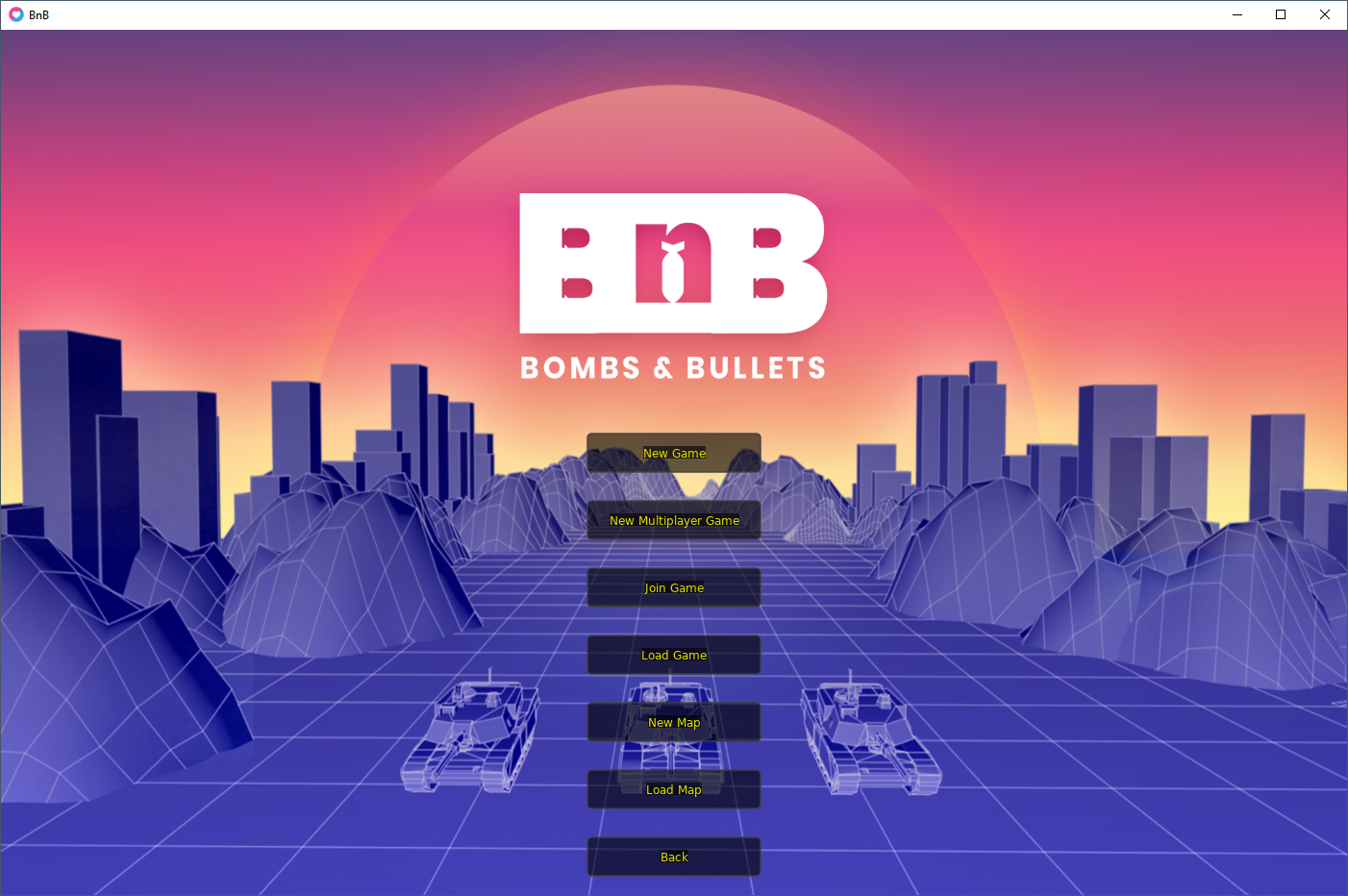
The host selects 'New Multiplayer Game' and heads to the map select screen.
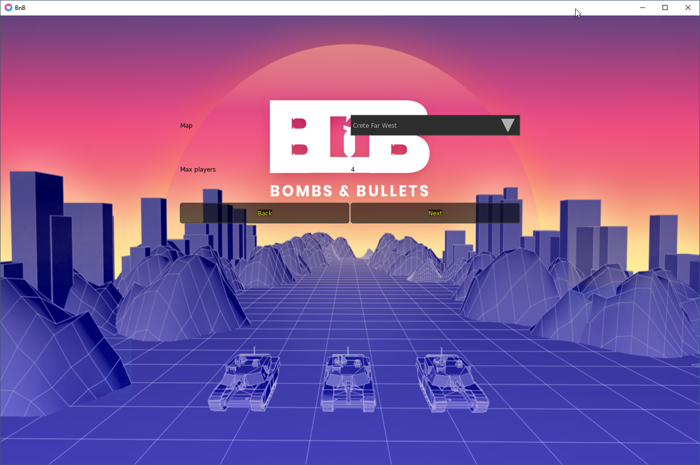
There is only one map, so just click 'next'.

Once in, the Host can set the settings for the game and wait for the client player.
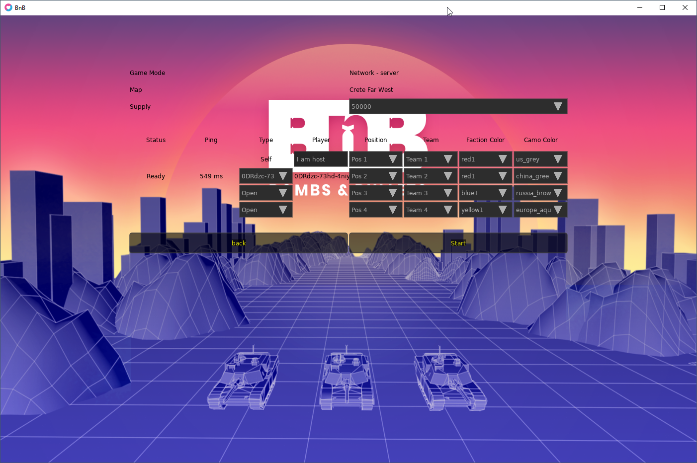
Once the client enters the room and hits 'ready' on their end, the Host can make some final changes to the settings and hit "start" to begin the game.
For the Client

Click 'Join Game'.
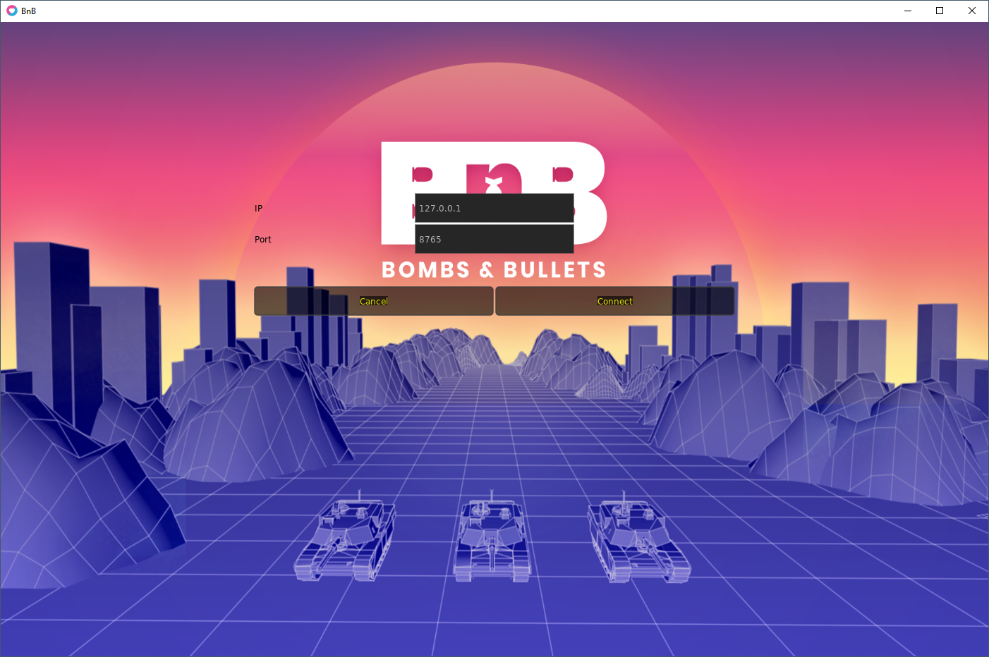
Just enter the hosts IP and click connect.
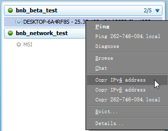
You can do this via Hamachi. First the host and client need to join the same Hamachi network. Then the client can just copy the IP address of the host.
Alternatively, if both computers are on the same wifi network, you can play directly without Hamachi. The Host can use the command prompt, enter the 'ipconfig/all' command and look up their LAN IP to share with the client player.
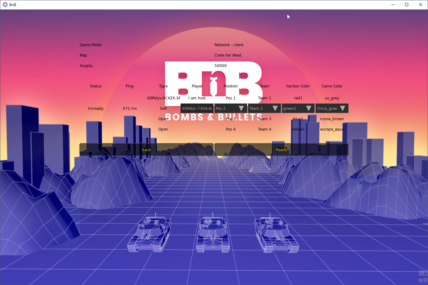
The client player enters the room. They can set their settings and then hit "ready". After hitting ready, they can hit 'unready' to change their settings.
Afterwards, the Host can start the game on their end.
For single player:
You can play against one or multiple 'Swarm AI', which will spawn units infinitely and attack your base, gradually increasing in difficulty.
Requirements:
Curranty, the game is not optimized, and you will need around 8Gs of RAM and 3.5Gs of VRAM. You can still try it if you want, the game will just gracefully crash when you hit either limit.
Cheers and I hope you give the game a try. New features, improvements and content are just around the corner.
Everything you just said is planned. We are going to record a tutorial / intro video but I don't have the time and the game isn't solid enough for it yet. You can build infantry via the barracks, only a rifleman and driver though. In the far future, we plan on adding aircraft and ships as well.
There's other features buried in there that aren't immediately obvious. Like all vehicles having a driver that can get out, individual character portraits and names, infantry boarding into apcs, etc., Multiplayer via LAN technically works too.
It'll be much better in version 0.02, although but it'll be a few more versions than that before it's worthy of getting put into Early Access on Steam.
I'm not sure what you mean by shaders. Do you mean our 2D shadows? Because those shadows don't look so good at the moment. Those are mainly just a proof of concept. We put them in, gat a sort of day/night cycle working, then just left it as-is.
Right now, we're mainly concentrated on getting critical non-visual features in, so it might be a while before we double back and fix the shaders. We're currently working on adding in terrain, and it's a huge pain, we need to rework a substantial part of the game to get it in.
I certainly hope we can improve it in future, because I don't want to compromise on the day / night cycle, and I don't want to render out all the shadows and shading.
Fun little platformer.
Very good plot.
She be thick.
For real though, the game looks nice and plays alright, but there's just a bit lacking in the game feel department. I can't shake the feeling of the slight bit of clunk. Got stuck on a spike once or twice. Maybe I need to play on controller or something. Although I did play through Super Meat Boy on my keyboard and nearly destroyed my hands in the process.
I wonder if that can be masked with a bit of music. I think that's why it felt it bit empty. Perhaps commission some music for the game? Or maybe just find some royalty-free stuff and put it in as a placeholder. I think that would improve things quite a bit.
Great progress. Hope to see more.


