Thank you, glad you have fun :)
ありがとう、楽しんでくれてよかった :)
bulletHellMaker
Creator of
Recent community posts
So far, I manage to reach to Fin. on easy mode and unable to pass Origile on standard mode. here is my feedback.
- Overall, this is a cute and difficult STG, having a way to show hitboxes would be good (use a mini star or add accessories to her, like a red ribbon).
- Sometimes the star shape effect feels like enemy projectiles. I mistaken them once a while only to realize the stars are not going to damage me, my suggestion would be adding color to those stars to prevent mixing up with boss projectiles.
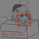
- Ayer hitbox is quite big, which make the game punishingly difficult on the later stage [Origile and Argrave onwards], so my suggestion would be reducing her hitbox size from her face till her neck. so far Ayer current hitbox size make squeezing through boss projectiles very difficult. [very notable from Choria]. could try the hitbox to be this size (refer to image below).
tldr: Fun and cute, but Ayer hitbox too big, making the game difficult to clear.
Love Ayer pose when you collided with projectiles. Very cute.
Oh, if you want feedback for every stage, feel free to update me. ヾ( ˃ᴗ˂ )◞ • *✰
I am a fan of bullet hell shoot em up games.
Nice game with a creative reload method, although my feedback would be bomb-dropping is hard and get punished for poor aiming.
Having a target crosshair like the arcade game "Xevious" would make dropping the bomb easier to hit. Or just having a bomb pickup would make the game less punishing.
Overall, the game is fun and creative, I enjoyed it.
Interesting way to have in this storytelling, creative use to make the player feel creepy while using bright tone asset.
I find the "Juicy" part of the story started late which make the game feel draggy. So either has more variety in gameplay to entertain the player till that part or have the "Juicy" part trigger often. Rotating make it hard to draw too.
overall, a fun way to tell a story by painting. I didn't expect GameMaker can be coded to be like MS paint.
Thanks for streaming my game and giving feedback. Aiming to make the comedic so that is where you smash astronauts to the asteroids.
Seem like a doable idea to just crash directly instead of waiting till u fling as well as improving the health indication part.
I will try improve on these idea and see what happened.
Overall, the gameplay is fun while a unique way to use the shield to reflect the project. I like the colour bullet that deals extra damage and the shield bomb. Although I find the complexity of the game is overwhelming for beginners as there's a lot of things to master in a short time.
One way to reduce the complexity would be introducing one colour shield first then introduce another colour shield, with this type of pacing will give players the time to understand how the colour shield works.
An alternate suggestion would be changing the controls, where WASD control and rotate the ship, the left mouse button to shoot, lastly holding the right mouse button with movement to control the shield. These will reduce the complexity by grouping control together.
Creative, relaxing and simple gameplay. I enjoyed the spacey visual effect of the game too.
I feel adding an effect once the player reaches the space station will make them feel more rewarding and look more complete. Might want to reduce the hissing/buzzing radio sound as it is quite loud for headphones users.
Relaxing and easy game, I like the starting stage design cause it is a free tutorial that teaches players how to play. A smart way to teach players without instruction.
Adding relaxing music and have some flying objects passing through would make the game more relaxing. Overall, it is a fun relaxing pipe puzzle game.
This is simple, fun and has many different stages to play. might want to add a simple AI just in case if the player is just alone.
I find the most creative part is allowing the player to hold down a button to slow down aim which brings out the simple factor. Overall 5/5 fun for me.
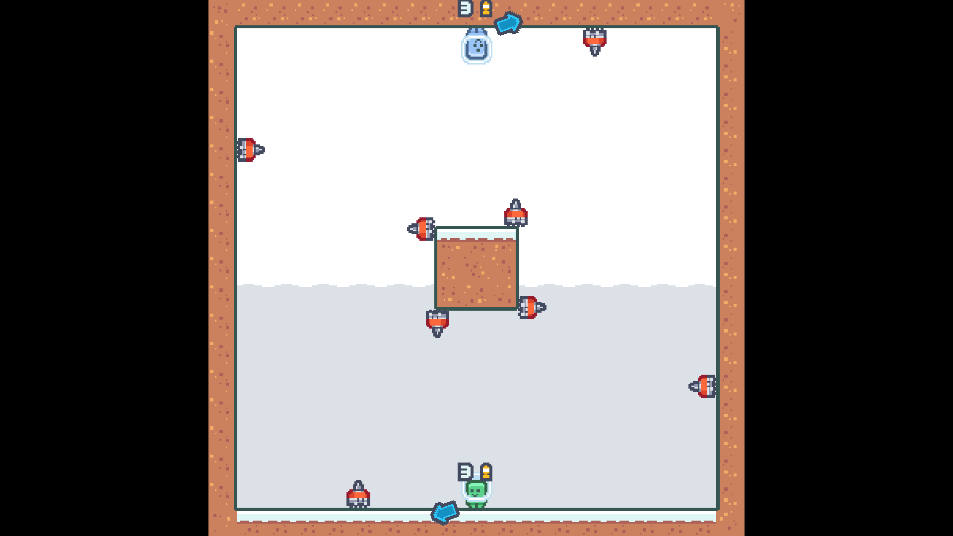
Just a nitpick, u might want to reduce the number of rotating objects from 4 to 2 on the outer square to give the player enough time to react, otherwise it will be punishing to the slower reaction player.
Interesting idea, try having clear indication on what block can rotate, that would help save player time to figure out what to click. An example the color will change once u mouse over the rotatable object.
Adding ambient noise such as wind will also help make the game more forest like.
I like the arrow prank at one of the stages.
The added stacking rule makes the game more strategic choice, such as more moves or more piece. Although the AI miss obvious opportunity and hardly will go offensive mode, a perfect practice for beginner to understand the rules. And having 2P is a fun choice to play with friends.
Suggestion for improvement
- Giving the player a choice to choose a more difficult AI could give this game more replay value. (example: easy, medium, hard AI for the player to choose so that they can challenge or improve themselves).
This game sticks closely to the theme "joined together" (pun intended :3). Very fun, simple but yet challenging too. Overall this is game feel very simple to learn but yet complex to solve, easy for a new player to learn. I find this game nicely polish within 48 hr.
Fun part
-A lot of level and many ways to explore how to a puzzle. (almost got trick by the red button)
Suggestion for improvement
-Adding "auto restart" after the player dies will greatly improve the user experience, save time pressing "r" again.
- Changing those color squares to a simple Crypto Currency logo (Bitcoin, Ethereum) could enforce the game title "blockchain" as the word would lead the player to think about crypto.
Same for my side, my main issue is getting the flocking work nicely but in the end, time ran out and had to cut a lot of features ( wanted a shooting feature and add a bee boss). Sadly time didn't allow us to do that, so we ended up focus on getting the game to be playable.
Nice, rare to see someone who knew about this game.
Don't worry, your game concept is interesting and fresh, just need extra time to polish the rhythm system, as your game relied heavily on "behind the scene" side (beats, sound, timing) for your game to work.
All the best to your future improvement too, I will be improving my code and fixing the game after this voting (especially those small bees).


