Feel free to ask any questions here
EsKei
Creator of
Recent community posts
Very cool! I loved reading about the game on the "wikipedia" page, the little links to other things added such a nice touch as well! In terms of the actual soundtrack, I broke it up song by song.
Precambrian: A very nice little upbeat track, befitting of a character creator!
Shallows: A nice loop for a chill first area! A tad bit repetitive, but something that wouldn't be an issue for an area in an MMO.
Ectosymbiosis: A mysterious, yet relaxing theme fitting for a puzzle themed area. There are some parts that just tickle the musical part of my brain, as such its probably my favorite of the bunch!
Biolumenesca: This theme very much fits the whole strange, dark, and just plain weird ecosystem that the void has. The occasional bits of dissonant notes help to eleviate this feeling, and I feel the track does a great job at that!
Deepest Known: When I read the discription of this track, I had in my head a sort of deep, empty void that players could fill with creativity. The song itself though has a very intimidating atmosphere to it only really picking up towards the end, quite fitting of a dark void, but it doesn't exactly fit the discription imo (This is entirely up to my opinion and how I interpereted the text, I could be totally off base from your vision). Judging the song off its own merits, I love the atmospheric choir, and when the song picks itself up and becomes more upbeat it sounds really great! It's probably my second favorite song!
Wash Away: The "lost" song, I didin't really know what to expect from reading about it on the main page. It turned out to be a really nice, chill song with callbacks to the previous tracks! Honestly I feel like if I was a player of CURRENT, this sound would feel quite bittersweet as the game approached the server closure.
Overall, very well done! You managed to make a lot of songs, and they all felt like they had a lot of love and effort put into them! Great job!
Thank you very much for your feedback!
The truth is that most things that I end up doing are completely by accident! I generally just play by ear and see what happens. The only music theory I know is keys (like C-B) and time signatures, outside of that I have no idea what I'm doing.
And I realyl appricate the musical jargon, it helps to research and learn from it!
Thanks once again!
Really lovely orchestral-like soundtrack! The underwater vibes going through it are also really cool!
Submergency was really good! Especially the part where it ramps up and the whole chorus comes in! Everything sounds really good together!
Sea Frog is very groovy! Not much else to say other than the instrument samples sound really good!
Abyss Eyes is a very neat atmospheric track! Some of the notes towards the middle part sound a bit odd, but towards the end everything comes together well!
Final Breath starts almost like a super intimidating dark souls boss, and then it gets really chill and hopeful before finally climaxing into a triumphant orchestra! I see a lot of storytelling potential in this song, and it really impressed me!
If I had to give any criticism at all, it would be that there's not very much panning in the songs, most instruments are stuck in the center. Which is better than bad panning, but experiementing a little more with that could make some songs sound more "full." Because of that it also makes the occasional panned instrument feel oddly out of place? (Not sure how to discribe my thoughts fully). But take anything I say with quite a bit of salt as I am still very much an amateur! Fantasic job on the soundtrack!
Hello! My soundtrack makes use of some instrument samples. But being broke I often just sample these instruments from old-ish (SNES-DS era) video game soundfonts (think Pokemon Mystey Dungeon, Chrono Trigger, Earthbound). I know use of soundfonts is in a legal gray area so I wanted to make sure you guys were totally cool with me using them first.
If I can't, I have another soundfont that I know is entirely copyright-free, but the samples aren't quite as good (Most notably the pan flute, which the soundtrack uses quite a bit). So it's not like its the end of the world, but it won't be quite as good sounding.
I will be proceeding with the soundfonts until I get a reply. But I will try to minimise usage of them, and try to use the other one as much as possible. But if you give me the word I will modify and re-export everything for the jam!
A very good entry! I did a metroidvania for the Nokia Jam 4, and this is much better than mine was! It overall was well designed, and it felt very coherant. The major thing I can say is that the final boss doesn't have enough player feedback to tell if you've done actual damage to him. Besides that the text color is a pure white instead of the Nokia green, but that shouldn't disqualify the game in my opinion. There was also one jump towards the beginning that felt a lot like a "developer jump" to me (a jump that's stupidly hard, but because you're the developer you don't notice. My metroidvania had one as well XD). Besides that the game was very good. I especially liked how you limited it to only playing one sound effect at once to better emulate the nokia. Overall, amazing job!
Overall, I'd say that the game is interesting. There are some elements I think it could use, mainly a progress bar so the player can see how much further they have. But most of it would just come down to polish. The pseudo-3D effect is cool, but can make things a little hard to read and readct to. Overall, It's solid, it just needs some polish!
Almost a year later and I realised I mispelled the scratch audio name (warairingo, it should have been waruiringo). I also messed up the code somewhere to where one frame is repeated twice on accident. This lead to the video being slightly desynced, but because the cymbal crash still lined up with the water droplet I thought it was fine (I didn't realize it lined up with something earlier).
日本語下手すみません(私は2年前から日本語を勉強しましただけですから、そして私は日本人ではありません。間違いを見つければ、私に教えてください!)
「Pick Up バレット」はとても良いゲームです。
1ビットドット絵が素晴らしい、そしてこのゲームに たくさん Juice があります。ゲームプレイが また楽しい、しかし、時々1ビットドット絵のせいで 敵と弾薬アイテムを 見分けにくいのです。
よくできました!
ーーー
英語バージョン:
Pick Up Bullet is a very good game.
The one bit art-style is excellent, and the game certainly has a lot of juice! The gameplay is also fun, however, because of the one-bit art-style, it can sometimes be hard to distinguish between the enemies and the ammo pickups.
Well done!
Were you using the web version?
Json files don't export to html, so the buttons just default to the error text. I unfortunately didn't catch that before exporting.
If you want the menu options in readable text, you can download the game instead (The .json files export with that, so the text is all fine)
A gameplay video will be uploaded within the next day or so. You can also use that as a guide to the text.
Sorry for the inconvenience!
TLDR; Web version didn't export the correct files, so everything is messed up on that build.
(I saw in other community posts that you are mostly kept up do to the war in your country. Don't feel a need at all to check this out, focus on your personal health and other more important things instead.)
Hello!
I decided to add kerning pair support to my primary game font, yet every time I export the font, it doesn't export with any kerning pairs at all!
This also applies to other fonts I make for game jams and other stuff.
(I'm pretty sure my stuff is alright, because It shows up in the font editor, yet not in any other software.)
In the Font Editor
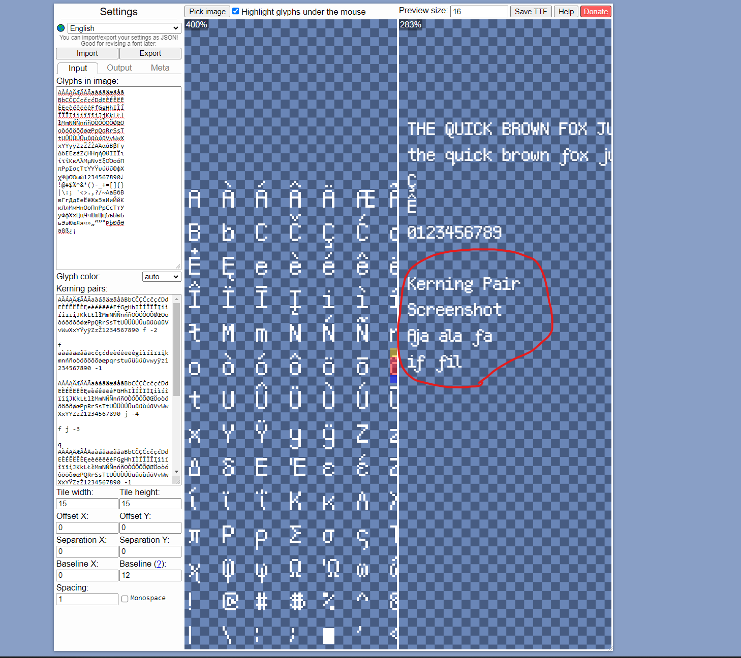
In My Game Engine of Choice (Godot)
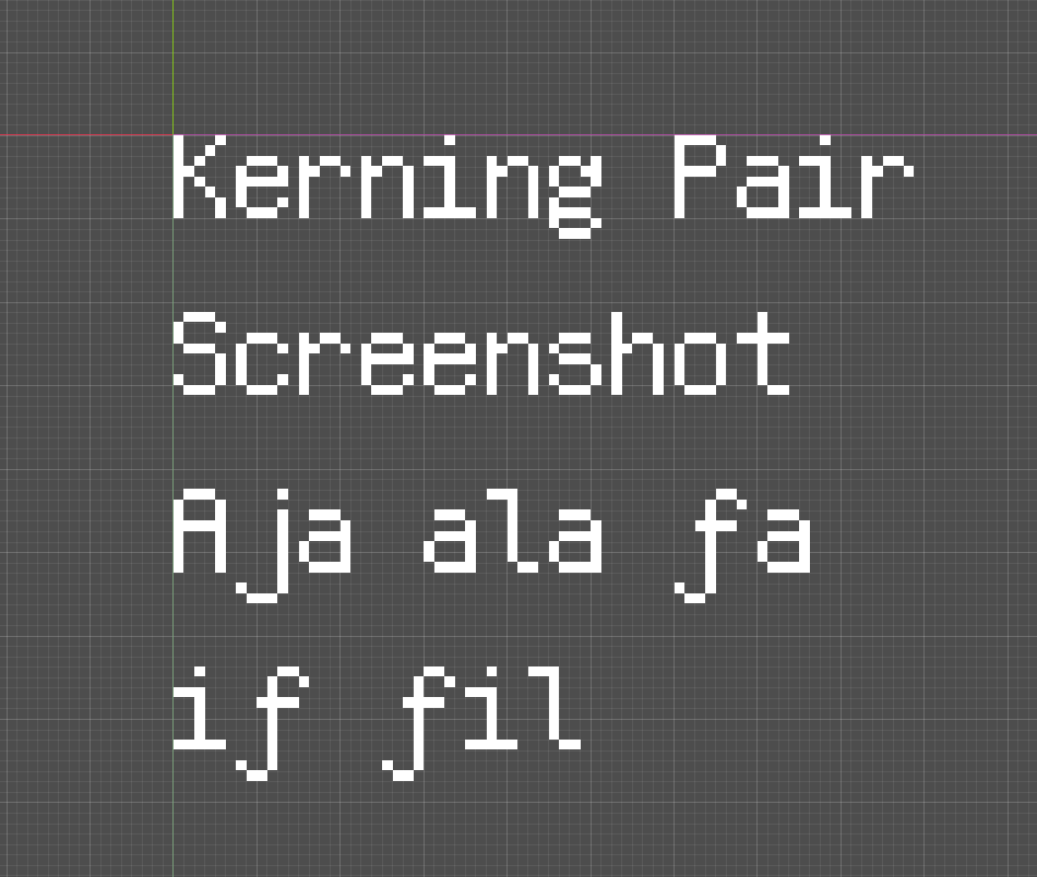
In Other Software (Paint.net)
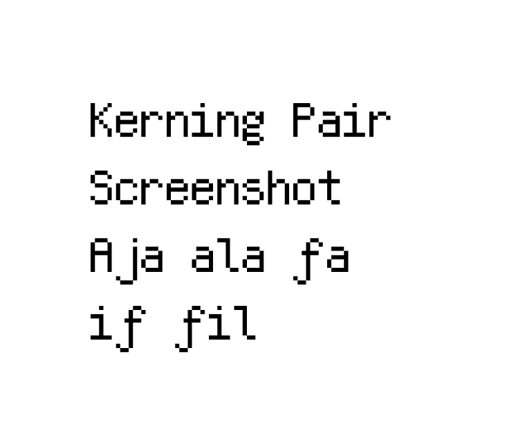
Here's the json if you want to see it.
https://skript-kitty.itch.io/kerning-error-json
password: kerning-pairs
Thank you so much for all of the feedback!
Because of how I divided my development time, I spent the first two and a half days working on the engine, menus, graphics, and SFX. With only about 3 hours of development on the levels themselves. This is (unfortunately) painfully obvious, the levels are not very well designed, the difficulty spikes are insane, and there are so many issues (heck, I didn't even have enough time at the end to fully playtest the game due to it's ludicrous difficulty.) But we learn from our mistakes, and I think I see improvement in each of my jam games!
Now to go into your actual points of criticism,
I intended to have more varied enemies, with unique bullet patterns amongst them, but I ran out of time to make that. It would have definitely made the game better though.
The cursor having a thicker outline makes so much sense in hindsight, but I never thought about it during the development time. A definite improvement for the fixed release!
Enemy health bars is a feature I considered, but I intentionally didn't implement (as a game-design choice, instead of a time thing.) However, I can't remember for the life of me why I didn't, it would have been better there. Again, a definite improvement for the fixed release.
Thank you very much for all of your criticism regarding my game and the choices made, I really appreciate people being able to point out the things you as the developer don't notice in the game! Again, thank you for your criticism and I'm glad you enjoyed it!


