Not really, we overshoot a little! but Daverinoe manage to give it a cool ambience, it was supposed to be a little bit more clear and with more immersive mechanics, inspired on the whacky style, but yeah it's pretty much a experience.
fetse
Creator of
Recent community posts
I agree with all your points.
Aiming with the keyboard was a gameplay decision based on the art style we were going for (and the game itself), the game was sort of a "multicrew" game that you play alone, like fixing lights, motors, and such things, we only got to the cannon and submit it that way which was a really intelligent decision as we wouldn't be able to introduce all the mechanics. That said yes, the cannon was based on art style more than how well it fits the gameplay, as it was a secondary minigame we kept as the main drive of the game, we didn't wanna use 360 engine rotations as it ruins the pixelart a lot from my POV (unless it is sort of polished 3D post processing.
Really cool game, the pets were really useful, I like the idea, maybe you need to work on the fight mechanic, it looks like "turn based" I guess training the stamina was about lowering your CD, it looks like turn based but it isnt. Also on the train race you can just spam "up" as much as you like and you get all the speed you need on the first pass.
Wow, the thing about getting out of the map into the null void is awesome, I can see it as an easter egg, a more polished null void (like intentional) that could happen after certain kilometers. Also about the kilometers, maybe there could be more reasons to "brake" or "go fast" than just advance into the game, it will be really hard to stick decisions into a linear setup, but for example there is stuff you can use at your advantage: more difficult as you progress in time (so enemies scale with time like risk of rain 2), that is: unique enemies for each time frame, with modifiers.
Enemies would be the hardest task as you need to consider how many dimensions you have to parameterize, a fact is that how many permutations on that dimension doesn't mean how many unique enemies, so you could make some sort of 5 dimensions for the enemies that makes sense to combine when applied to unique enemies (if you kill them too close they explode and damage your train, enemies that are invulnerable until you kill its minions, etc) those are stuff you can combine with unique enemies.
it can easily fit the "spam enemies" fest and chain reactions, but I think the "bleak" atmosphere is a nice touch.
So your progression system can be based mostly on shooting a lever to change the path gives a lot of intention into the game, but at the same time keeps it linear enough to feel constrained, but that doesn't mean you cannot brainstorm like for example one of the paths leads to a portal at some point, your idea has a lot of expressions to make it progressive, you start on a more "realistic" and wasteland set until you advance into the game, even adding stations to buy stuff.
About the idea of expanding your train, I think this one would be more fitting for a "barotrauma" style, which is having a set of different looking submarines in that case (here would be unique train combinations) each with it's advantages, for example one could be more tanky but slow, others more fast but cannot have a certain weapon (like heavy damage weapons) and how that do an effect on future decisions. Technically you can expand the weapons (like slots) but not the train itself.
Regarding Artstyle I was imagining while playing, a washed palette, sort of 3/4 perspective and not too clean (somewhat noisy), it would be sort of a factorio train for example: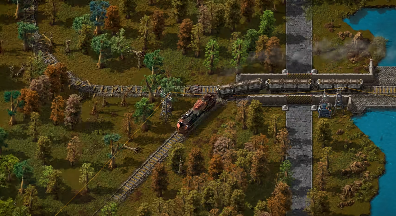
Good luck on this game if you decide on expand it, I would've love to help you on the art direction but I'm just a pixel artist.
I love the aesthetics, it gives me wasteland/alien-planet vibes, very polished, love the loopable music and sounds in general besides being subtle.
This can be expanded a lot, not exactly only "more enemies" which is obvious, but a more roguelike mechanic, different train types (sort of a class like behaviour), choice mechanics like upgrade trees after X experience, or you can choose where to go if you shoot a junction lever where you have two different ways, different biomes.
I don't find much meaning on braking the train, maybe I was missing something about it, the only way I can see it was useful for me is not missing a chest when I have cooldowns.
EDIT - Stuff I forgot to mention but I took note in my head:
I don't think there is a problem with the contrast of the game besides not having much detail, the only way I see you can fix readability is with a closer camera look , but not too close it loses the wasteland aesthetic, maybe introduce fog so you don't have any reason to raise the camera.
Controls are a little bit weird, I don't see how that could be improved, but I like the different options between using A and D or using numbers, if you didn't plan on "expanding" the train, you could use certain button as class buttons, like Q,W,E,R... which have a meaning not just "left and right".
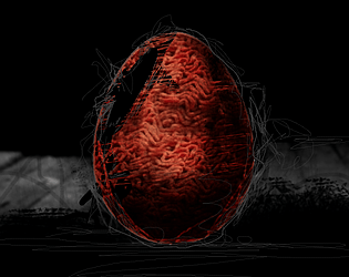
It is a cool idea for a mobile tycoon game, maybe you need to polish it so that you can introduce a more thought process strategy, and a choose factor, now it is just the egg game until you can buy everything and have enough strenght to beat the boxer before larry in 3 or 2 hits, then spam that + buy "+1 on all stats" from the store until you have enough streght to hit larry.
The avoid button does practically nothing because I get hit anyways.
Really cool concept and impressive you did this alone.
I had to beat tf out of larry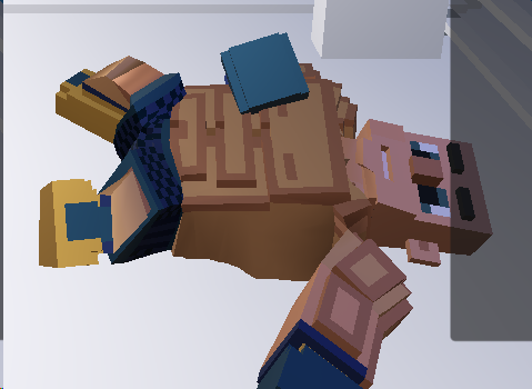
The goal and the gameplay in general doesn't say much about the game, or rewards/penalize in any way. The theme is more of the artstyle and the backstory. Also for some reason it takes so long to transitions, and the music feels a little bit invasive after the 4th loop.
Hit anticipation could have been improved mainly by sound clues as visual clues would be hard to see due the nature of the game's artstyle which is very vibrant by itself, also the music will obfuscate a lot the visual too (sounds also interact with visuals, so a more intense music will cause visual hints to blur a little). The only way I would have done it without changing the entire art direction is lowering the saturation and light a little of the overall game and using neon lights in general to indicate danger + sounds. Regarding the damage it would be cool a more distinct sound and that the music muffles a little.
I like that is just train as snake but the twist of the passengers, the only thing to improve is the controls, they aren't responsive enough, the feedback of the tile you're at is also weird, but it is not consistent when you press (sometimes it turns fast other times it completely ignores your input).
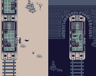
My personal favorite and winner so far. A lot of tiny details like the people, and the cars in the background. Suggestions may be better controls, like for example camera movement with A and D keys, or being able to press the train icon when they are about to spawn and jump right to its camera view. Maybe the trains don't contrast too much from the environment so it is not excessively readable.
This was my first game jam ever, I'm a pixel artist, and it was pretty fun doing the art, I may join in future projects, if you're interested in pixel art I can show you my work, contact me in the next jam and I may jump in if I'm free!
EDIT: It was ironically also my first top down experience, I'm more of sidescroller art.
Amazing idea, I like the pace of the game and the combos. This win many originality points, things to improve may be:
- Hit feedback: You don't get much feedback when you're about to be hit or when they hit you, so unless you're constantly checking your health you don't exactly know if you're doing it great or not.
- Hit anticipation (you don't know when you're about to be hit, it just happens, except for the long arm ones).
Everything else is amazing.


