Can't play at the moment... at work, but looks a little fun, might give it a try at home. Either way, someone is clearly a fan of Hunter x Hunter! haha
Gamekrazzy
Creator of
Recent community posts
*Yawn I fell asleep playing this game... jk
I did struggle to stay entertained though after my second attempt getting 227 Zs and 25 emails sent out.
The idea is very original and cute in aesthetic. I do feel the gameplay lacks a little however... after realizing how the game works... I could theoretically keep playing for hours for a high score, but thats less a game and more like work.... Goes to show... it's hard work to take a snooze on the job.
Bullet Hell, collect power and break out of confinement. Neat premise, while not the most original, I really like the progression and presentation. I was confused for the first portion before and after attacking the cameras. I did not know I was supposed to press both buttons to proceed... Overall this was a fun little experience!
Typically in sprite design weapons and objects held by the player are handled modularly so you can use multiple weapons, and that is the way I had designed this sprite at the time. If you have the program Aseprite or another pixel editor program, I recommend you merge the layers if you would prefer the sprite as one image instead of separate modular images.
So pressing J to pick up items was often unresponsive meaning it was difficult to rearrange items to make the puzzle aspect fun. Moving left or right while on an item would sometimes pick it up instead of moving on the grid left or right. Pressing K would also only rotate the item occasionally as well. I did actually "bug" the game once putting a dagger on top of a bat, but after picking one of them up by moving the cursor left, I had to place it in a location it would let me place it.
I really don't know how to explain it better then that, and if that's just the inventory being hard to understand.... I highly recommend you change the way it works then, because it is very annoying an unintuitive for the player.
Great Interpretation of the secondary theme! I did not get very far sadly as the inventory is a very frustrating buggy mess. I love the premise though and the gameplay is fun for the most part. Graphics a really good, I noticed a great deal of Final Fantasy inspiration with the sprite design, but they appear to be unique sprites, so that's good. Ironically I started to have more fun just pushing buttons in the inventory because the beeping would beep to the music.
Anyways, great job. Wish I could have played more, but the inventory bug was just too much of a set back for me. ^_^
Finally got around to playing this submission! I love metroidvania/castlevania games, and this game definitely nailed that vibe. Honestly kinda felt like playing Castlevania using only the ricochet ball sub-weapon (Not sure what that is called)
Anyways, fantastic work overall, I felt the art and everything fit the gameboy aesthetic very well. The only minor nitpick I'd give is that the gameplay could be a bit more interesting if it had more to do with the secondary theme, it felt like you guys had a planned gameplay style you wanted to do before knowing the secondary theme, and were like yeah, let's just say this castle is in space.
That said, obviously my lowest points for you goes in the interpretation of the secondary theme, but don't let that bother you, you nailed everything else and it was an enjoyable experience! I hope you finish whatever vision you had for this project, and continue to make games in the future!
First of all, you did a good job on visuals and concept. I like rhythm games and this one is alright considering it was made for a jam. The gameplay felt a bit frustrating however... the lack of interesting breaks in the songs, and on some customers the gameplay would start but no actual impactful music until a few seconds later. (little things like that make the rhythm part feel less interesting and more like random button prompts)
Anyways, I thought the music and art direction were still quite good and polished, and just wish I enjoyed the gameplay more to keep playing. Overall, good work, hope you guys continue to make games.
Hey, fantastic job here! You guys should be proud of what you made here. The game was rather short and really lacked in gameplay, but the simple story along with the music and visuals more then makes up for that! The music reminded me alot of the Mother series, and the art style was very pokemon, at least in the sprites. The hotel felt like real space, so your artist has a really good understanding of level design and making tilesets.
Anyways, like I said! Fantastic Job! Hope to see more from you guys in the future!
Fun little game! I'm not normally a fan of punch-out gameplay, so I played a little and it just wasn't for me. That doesn't make it bad of course. I feel the gameplay definitely "hit" what it needed to, unlike my punches :(
Anyways, Everything about this feels great and super polished. I'm also impressed with the box art you got too, definitely sells the game's vibe. The music was top notch, each area had its theme. Art was well animated and looks amazing!
I guess my biggest thing is well "Punch-Out" isn't fun for me, but it is for some people, so that's just a niche thing. The other thing is I felt you could have maybe played on the theme a bit more as outside of the fights taking place on the planets I didn't really see the planets as anything more then a stage select, so the "space" theme was highly under utilized. That said, this is one of, if not the best entry I have seen in this jam, so hats off to you, or should I say "gloves". :D
Amazing puzzle game you have here. Took me a while to figure out, and the puzzle is very thought provoking, interesting, and fun to solve over and over. I played all of Standard and did 1 level in endless. The music, while only 1 track and could easily get repetitive, was very interesting and easy to listen to for extended periods of time, which is great for a puzzle game, although I would have preferred the occasional different song for different levels etc.
Anyways, my biggest critique would be the controls for cycling orbital bodies, as they felt very difficult to navigate which comes with a constant moving option to select etc.... I don't have a solution to how to handle this, but yeah it felt very annoying trying to get to a specific body and not being able to, because it was hard to predict where the cursor would go after each input.
Overall,I thought this was a very fun experience and very polished for a jam game, so great work here!
Cool game! I died once not knowing what I was doing... took me a while to realize I was supposed to be collecting furniture. Got my place nice and spiffy, and was able to relax and watch TV thankfully.
Overall, you got a great rating from me, and I did play to what I assume is the end, even though you can keep shooting asteroids and aliens... Anyways, where it fell short for me was on the gameplay and soundtrack.
I can see lots of room for improvement, and right now I like that you slowly make your room more lively, but outside of shooting things and collecting furniture there wasn't much gameplay. As for the soundtrack... It was very calming and fitting for the concept, but it got repetitive fast... On lower volumes it is not that bad, and like I said the song is quite calming, one might even say cozy.
Anyways, great work, this was overall a very enjoyable experience. :D
What a very straight forward and fun game!
Great use of the theme "Space". I didn't quite understand what I was doing at first, but that's my fault, as I played the first game intentionally popping bubbles...
I didn't get too far overall as I got a high score of 35... guess I'm just not that calm. Anyways, this was a very fun and simple game! Great Work!
Hope you'll check out our game when my team submits it.
Gave you a follow, and I'll have my team try out your game and rate it when the submission period ends! :)
Glad you enjoyed the demo! And I really appreciate your compliments! While I haven't been working on this project recently, it is one story I keep wanting to go back to and finish. That said, I don't know when I will continue development, but I am happy to hear that you want me to continue work on it! Thanks So Much!
Solid game jam project! Was entertained for about 9 waves! Great job! Love seeing how you used my free character asset! The game was a tad easy although with the health pool being tied to just the fountain an a sort of Tower defense strategy game without the towers... would have liked it if the player had a life pool as well and got hurt when touching the enemies. Also, the game is a tad blurry, not sure what engine you made this in as I wasn't paying attention to the loading screen haha, but look up some options for the engine you used to either remove the filtering or work with the filtering to get rid of the blur, as for pixel art you want the art to be sharp and visible. Anyways... overally great project! Hope you do more! ;)
The game is interesting, and an overall enjoyable experience. I would like to mention that the platforming sections are a little irritating, due to the short distance some of the platforms are from eachother, where as you'd bonk your head trying to jump from one platform to the other. Also the hitboxes on the enemies were a bit overbearing. I couldn't get past a section because it required me to get on a platform a salamander was guarding. I kept getting hit by the salamander and knocked back into another enemy getting hurt twice, which brings me to my next point, Invincibility frames. There should be a brief, maybe 1 second long, moment of invincibility after getting hit to avoid problems of enemies continually knocking you into other enemies.
Anyways, great job to both of you guys, for a jam, this turned out great, and I'm glad to see you guys continuing the project!
Thanks for the suggestion. While not a bad idea, the change would require some reworking on the equipment, which I can do, although I am unsure whether I want to do such. Seeing as AP Skills also come from weapons, having a limit of 1 AP skill isn't really a limit of 1, as you'd still sometimes have 2, and the ultimate work around of either not having AP Skills on weapons or only having AP Skills on weapons doesn't sound fun to me. That said, I really appreciate the suggestion, and will look into ways to address it in the future.
Pack includes fully animated hero sprite, and an assortment of what you would need to build your own dungeon experience in the Gameboy Zelda-like style!
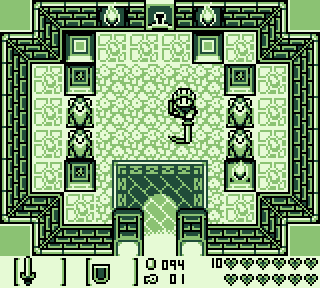
https://gamekrazzy.itch.io/gameboy-zelda-like-dungeon-assets
I should note, that the pack does not include the UI shown in the above screenshot


