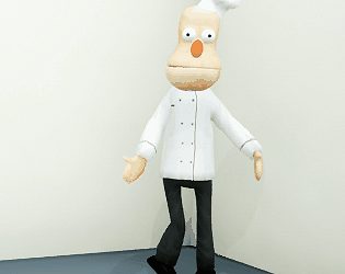
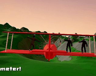
I did actually make a Ms. Dot Gobbler model back when I originally made the game, but never got around to getting it into the game. Maybe at some nebulous point in the future!
Giraffe Cat
Creator of
Recent community posts
Ahh, in that case, maybe this will help: https://gist.github.com/ompuco/3209f1b32213cec5b7bccf0e67caf3e9
It's the shader code that's used in the Haunted PSX Render Pipeline; perhaps you can make use of it!
Sorry, I meant to reply to this last week! If you're using Unity, the Haunted PSX Render Pipeline (HPSXRP) includes the dither filter, along with a number of other PlayStation features. I made this game in UE4 though; the specific post-process material I used is this one: https://blueprintue.com/blueprint/74pz_sk7/. There is also PSXFX for UE4, but that's a bit more expensive.
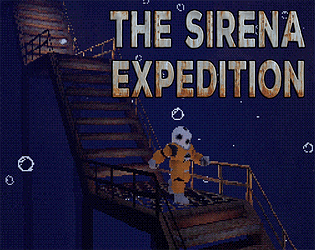
Loved the atmosphere in this! The texturing and use of billboards sprites makes it feel authentic, but also uncanny in a way that keeps you off balance. The use of the CRT filter, which becomes much more distorted when you're underwater, is also a really nice touch. It made me feel claustrophobic, and like I had to get out of the water as soon as I could! I got a little stuck in a couple of areas; the first time you get a key and have to go back through the water, for example, I struggled to make it back before drowning. Once I realised that jumping underwater lets you move a lot quicker, it all fell into place!
Hey, glad you enjoyed the game! I really liked your commentary on it. I did want to do something a little different to most horror games, and the 2.5D platformer is a style of game I've always really enjoyed, so I'm happy that it worked for you!
And yeah, sorry about the abrupt ending; I definitely could have pulled that off a bit better, but that's game jams for you. Oh, also, I noticed that you were able to jump over that gate in the storage room; that's a bug! I'll see if I can fix that one.
Thanks for playing!
Oh, whoops, sorry about that! That worked fine in the first version, but I messed around with it for the patch, and ended up breaking it! I also realised that I forgot to turn the underwater screen effects back on, so I've uploaded a new build that fixes both of those things. Thanks for your comment, I probably wouldn't have noticed my own mistake!
The art style here is ridiculously polished! The late-PS1/early-PS2-era textures and models work well with the modern trappings of UE4, like its lighting and depth-of-field, in a way that looks really appealing. I was initially thinking about not relying on UE4's lighting on my game, but it quickly became apparent that I wouldn't be able to get the same level of atmosphere without it! You've got atmosphere in spades, too. Also, it was nice to see another take on an underwater research base!
Atmosphere aside, the Resident Evil/Metal Gear elements are well handled, in a way that feels authentic, but not too archaic. Definitely interested in seeing where the story goes next!
Thanks for your thoughtful critique! One of the things I was least sure about when I submitted the game was how well the horror elements worked, as a couple of them are a little goofy, so it's good to know that they don't feel too out of place.
And yeah. I definitely agree that subtitles would have been a good addition; even as a native English speaker I prefer to have them. When I first added the voiceover I planned to add subtitles to go with it, but it was just one of those things that I had to cut due to time constraints! Hope it wasn't too hard to follow what was going on, either way.
Thanks for playing!
Thanks! I've been playing a lot of PS1 games for a while now, so I'm glad I was finally able to put the knowledge to use.
Yeah, sorry about the dialogue all being a bit squashed together; I did the environment design first, based on what I thought I could achieve before the deadline, but then decided that voiceover was what I needed to tie it all together, so I had to fit it into what had already become a shorter experience than I'd initially planned! I guess narrative design is important, huh?
Cheers for playing!
Hello! I do feel kind of bad that you had to walk all the way down to the first door, and then walk all of the way back to open it, especially with the default walk speed being so slow on keyboard (and the game doesn't tell you you can press Shift to run). My plan was to get rid of the slow movement entirely, and just have the Aquanaut always run when you use the keyboard, but maybe it's nice to let the player move at a slower pace if they want, and I should just tutorialise the Shift key.
Thanks for playing!
Hey Atte, thanks for playing! The storage area did kind of get the most attention when I was making it, because I figured you'd go back and forth a few times. I'd hoped to put more incidental scenery in other areas, but ran out of time!
Listening to Ruptured World now; it's really cool! I did enjoy making the audio for the game, finding weird creepy sounds. The piano (improvised by my partner after we recorded the VO) definitely brings it all together!
I really enjoyed the atmosphere in this! It was tense and spooky, and the light from the TV is evocative. The new version does make redacting documents a bit easier, and in general I liked juggling this with closing the doors. I'm not sure if it's possible to complete the last phase though; given that you only have 30 seconds to do 7 documents, and the doors are pretty much constant, it feels impossible. The fact that you get a Game Over screen seems to imply that it's not the canonical ending though!
If you don't mind a bit of critique, it feels like there needs to be a little more consistency in the difficulty as the stages progress. There are several elements that contribute to the difficulty of a stage: Time, number of documents, frequency of door openings, speed of door opening (I think this gets faster? I might be wrong about this), and number of redactions in each document. All of these except the number of redactions ramp up, but the door openings and number of redactions are randomised, in a way that means that sometimes when you do a stage is can be really difficult, and other times it's a bit of a breeze.
The main thing causing this is the randomness in the doors; sometimes they won't open for a good 30 seconds, and other times on the same stage you can spend 15-20 seconds moving back and forth between them as they repeatedly open up. A cooldown timer would probably be the most elegant way of handling this; when you've closed a door, it won't open again for another 15 seconds or so (this time could decrease as you progress). You would still have some randomness on when they trigger, but it would reduce the likelihood of you going back and forth repeatedly.
Sorry, I've gone on a bit! One last point is that it seems like a bug that when you finish redacting one document, the scroll leave is retained, so if you were at the bottom of it, you might then need to scroll up to the top.
Congrats on making your first game; in spite of my criticisms, I was impressed by it, and it did a number of things really well!
Thanks for your detailed review of the game! I'm glad you liked the environment; It feels like most of my development time was spent on building that! I'd not done a lot of environment modelling before, so I wasn't sure how it would turn out.
I agree that the ending probably needs something rather than just dumping the player back on the title screen. I blame the fact that I didn't get around to working on the ending until the very last day of the jam! I'll add a 'To be continued' or a 'Thanks for playing' in the next build.
And yeah, the ability to jump needs to be introduced a bit better; I had plans for tooltips to introduce all of the controls, but ran out of time, so the one for switches was the only one I managed. Jumping over a crate is a good idea, too, so I'll probably implement something like that.
Thanks for playing!
Thanks for playing, and for your comments! Sorry you had a hard time with the first door though; I did wonder if I'd made that obvious enough, and the answer is probably 'no'. Also, if you don't open the door first, it's quite a long walk back up to the switch, which is a little frustrating. I'll try and tutorialise that a little better in the next build!
And yes, you did complete the game! I'm thinking that maybe a 'To be continued' before it returns to the title screen would be a bit less confusing.
Cheers!
I liked this a lot! The presentation is great (I love the interface, and the way that the scene itself changes over time is really nicely handled). The primary mechanics reminded me of games like Mu Cartographer and Mirrormoon EP, which really appeals to me. I do agree with Tihan that it perhaps needs a way of discovering where you should be looking. I did find the last two monsters, but the first eluded me. The last one did scare the bejesus out of me though, so well done on that!
I really loved this game! I have a soft spot for games where the aim is mastery of a set of movement mechanics to explore an abstract space, and the mechanics here feel really well-tuned. I also really like the way you handled increasing the player's abilities, and how it feels like you can do some really cool things by the end of the game. The way the mechanics are taught to the player is also generally really good; I did struggle a little with climbing the 'ladders', and the wires were initially a little confusing, but once I got out of the first area it was all smooth sailing!
I liked this a lot! The visual style very much feels like your own thing, while also being reminiscent of first-wave PSX games (the way the scale in the apartment is all wonky reminded me of Lara's mansion in Tomb Raider, for example). I also enjoyed the general atmosphere, and the genre-switch in the middle was fun.
Oh, and the guy sliding out of the wall worked as a pretty effective jump-scare! You got me with that one.
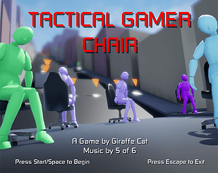
Yes, I saw your video! Sorry it all went a bit wonky for you; Unreal's physics can get a bit flaky at low framerates, so I'm not sure that I can do much about that, but the issue with the chair sinking into the road after a jump was something I was able to fix. So I did! I've uploaded a new version. At particularly low framerates you'll still see it sink in, but it will immediately pop out in the next frame, and you won't lose any speed anymore. There's also a new character, if you need an incentive to try it out again!
Hello! I've been playing around with this for a while now, and I'm having fun trying to make games look good in 3D. I've noticed a number of bugs with the UI, though, and as I have a background in QA I felt compelled to post them here.
- It is often difficult to change the settings when selecting more than one object at a time; the fields, like SizeZ and Layer, will display '-----' if the selected objects contain different values, but when you try to change one of the fields it will show the value of the object that was added to the group last. If you then select the same value, to change all of the objects to it, it fails (Presumably the code is checking the value of the last object against the value you selected, seeing that they're the same, and doing nothing). This often leads to me doing things like changing the group to a value I don't want, just so that I change it to the one I do want afterwards, which leads me to the next bug:
- Often after changing the settings of an object, or group of objects, when you hit 'Adjust' to confirm the changes, everything will be de-selected, which can be frustrating when you need to make multiple changes on a group of objects.
- Speaking of the 'Adjust' button, is it supposed to advance the game forward a frame? It feels weird that things can change when you're trying to adjust a large number of objects.
- When clicking and dragging to change the angle of the camera, the initial click counts as a selection if there is a valid object under the cursor, so you can often end up de-selecting your current object or group when you were just trying to re-position the camera.
That's all I can think of at the moment. Hope these are helpful!
I'm currently getting the same message with a .3dn file that I created for the game RoboWarrior. I'm using version 2.1.0, and it's happened twice now when starting from scratch. I tried starting from scratch and just changing a couple of things, but it seemed to load fine, so I'm guessing that something I've done both times is causing the issue. Here is the .3dn file:
https://www.dropbox.com/s/h32n724hw0kn518/Robo%20Warrior%20%28U%29.3dn?dl=0
This is really great! It has just the right mix of difficult controls and rapid game loop that means that learning how to play well is something you can really feel happening. Lots of really clever design touches (Like the coloured glow that lets you know exactly which enemy is going to spawn where), and it just looks and sound great!
I had a lot of fun with this! It's a very slick tower defence game, and I love the visuals and the music. I enjoyed it more when I made my own level, which turned out to be quite a challenge (Because the enemy spawning is the same for every level, shorter levels tend to be a lot more difficult), and it actually forced me to figure out the best places to put the towers, and when to upgrade them. Like you said in the forums, there's no real balance at the moment, but you can kind of make your own balance, with the level editor.
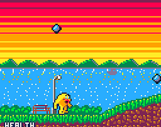
The latest version is marginally less weird! I fixed the bug where Dot Gobbler would get stuck inside walls, and made the mouse visible so that you can click on the pause button. I also made the power pills actually do something! It's actually a functioning Pac-Man clone now.
Regarding the plot, I wanted to tell it with dialogue between levels, but I ran out of time. In the credits screen you can listen to a clip from Idle Thumbs where they talked about Dot Gobbler, and made up a back story for him; that's basically what I wanted to do with it
Thanks for playing my weird thing!


