Indie game storeFree gamesFun gamesHorror games
Game developmentAssetsComics
SalesBundles
Jobs
TagsGame Engines

HANGOVER SUNSHINE

233
Posts
9
Followers
2
Following
A member registered Oct 04, 2019 · View creator page →

Creator of

Recent community posts

Hello! Thanks for giving our game a shot! Sorry to hear about that "opposite cards" bug. We got that fixed and are waiting for the jam to end to push an update. Also, yes, peasants start off waaaaay to aggro. Also fixed that in our prepared update. From what I've gotten to playtest with this next update, you have a lot better control of who you want to focus on when improving your rep with a specific faction. Regardless, I appreciate you giving the game some time and also for your feedback!

- S. "Essay"

(1 edit)

Hello! Thanks for giving our game a shot! Yes, the wrong card bug. We fixed it! Once the jam ends we're going to get that updated. Thanks for calling that out and also for giving our game a play. Glad you enjoyed the concept!

- S. "Essay"

That's a good read! I've used that as a base for talking to game devs about what I do in my research. It's interesting seeing the difference of sifting v.s. planning, though I might be more partial to the planning parts!

- Mica

(1 edit)

Oooooo, I would've not thunk of a procedural narrative, or one altogether. I def think it would be cool if the cases were more situationally reactionary versus the altercation of Societal Ranks. Idea was that the Society statistics were a reflection of the situation in the town you're judging, but am wondering if with some sprinkles of narrative if we can make it more impactful. Kind of like a Paper Please situation mixed in with stronger-feeling consequences of actual courtwork. I could totally see a case coming in after every certain number of rounds that take in the narrative of Mary Shelley's Frankenstein. We'll snoop and discuss. Appreciate the feedback!

- S. "Essay"

Aaaaay! Thanks for playing our game and for the feedback! Appreciate the highlights of those couple of lowlights, def agree with all those points. 

1) Peasants are way too mad, agreed. We have an update cooked where they don't start off as angry; the realistic approach was not the move lol.

2) Interesting catch. I know about this pesky card bug we fixed where it just didn't pick your card. Not sure of numbers not getting added. I know we fixed that guy and also some other stuff so I'm wondering if that got "auto" resolved. Something that def needs to improve is how we communicate the fun math in the game. Not being able to get rep up because people are too angry is something as a message that is lacking imo. I'm wondering if maybe a bug occurred in tandem with that situation? Regardless, we'll take a look!

Appreciate the time and thanks again!

- S. "Essay"

(1 edit)

Yo! Thanks for giving our game a shot. We def need to balance the game a bit more and work on the feedback of player action. Can def see a trend with the peasantry just being waaaaay to unhappy. We have an update ready once the jam ends to fix that and also that pesky "wrong card" bug. Appreciate all the love for the design and writing, I did not sleep :,)

Anyhow, appreciate the time you took playing our game and for the feedback!

- S. "Essay"

Enjoyed the crabs! Am in fact a big survival horde fan and have to say this is my favorite iteration of this for the jam. 3D art in jams is such a marvel, super impressed with the quality. Will say, I had no clue how the upgrade system worked. I would click on upgrades and watch in bewilderment as nothing happening lol. Once I realized you had to drag them into slots the game clicked. Did the game have an end goal or was it endless? Do always enjoy when games have an ending we try to get versus the "keep going" mentality. Maybe my only nitpick atm. Regardless, good stuff!

¡Gracias por tus comentarios! El arte fue mucho trabajo. No dormí lol. 

- S. "Essay"

Hey, thanks for giving our game a shot and for shooting us a comment. Yes, the animations! A tad too long if you see them over and over again (could imagine seeing the stats slowly move to center screen for the 15th time that I'd go crazy lol). We'll get those reduced for the update. Also, interesting bug you screenshotted, we'll take a look and see what's going on. I think the default Godot scaling of those guys probably broke it and had the slither go off the bar.

Regardless, thanks for giving our game a play and for the feedback!

- S. "Essay"

Yo, thanks for giving our game a shot and for the feedback! Some bugs in the project right now make it a bit difficult to get those peasant reputations up. Also yes, the card one, sorry that seemed to happen during your run. 

One big issue atm is balance, peasants start off super angry with lower societal values which is why I think they kept going down in your run (gotta get their other Social Ranks high to garner positive support). As for the 0% thing, I think what made sense to us at the time was that the majority needed to be mad, so if the Peasants were at 0%, then one of the other factions had to be below 50% to lose. 

Either way, I appreciate you leaving a comment and for giving our game a shot. Brought up some stuff I'm now thinking about for the update!

Cheers!

- S. "Essay"

Immaculate game title and art. Bit, perfected. Only feedback  I can give is just on gameplay, attacking doesn't feel very great for a survival horde battler. Kind of wish for something more akin to Vampire Survivors where you can attack without being slowed down. Nitpicking tho, good stuff!

Immaculate and clean game you got. I just love the visuals of this. The color palette of this pops so well, and the music and SFX go so greatwith the art. I think my favorite part about the game was that it wasn't necessarily endless, your combination of weapons did damage (think that was a great solution and could be leveraged into a deeper narrative). Can't think of really any big feedback, I wasn't necessarily able to get too far in the game, so it would be cool to know what other mechanics, beyond the crystals, that you included in the game to spice things up. Regardless, good stuff!

Oooooooo, pretty game. The quality is cleeeeean. Love the assets and animation. Only thing, I wished the movement and attacking were more dynamic. Being able to move and attack would've gone miles for action games like this. I also couldn't tell if I was hitting enemies since they didn't react to my attacks. Maybe like a white flash white help? Regardless, would be cool to see this game developed. Cool stuff!

Yo! Thanks for playing and calling that out. Game has some bugs we gotta tackle, that is one of them. That bug where you select a card and it gives you the opposite is on the list. Looks like it just randomly happens with some playthroughs (not ideal, def on the high pri). The game balancing is also a little off rn as well. Peasants are very very angry atm which we hope to balance once updating the game. The goal would be to make the  Clergy and Nobility not so happy at the beginning since their Societal Values are just very out of wack and high resulting in a positive rep in the early game. Either way, I'm going on a tangent, incredibly appreciative for the love and ty for your time playing through!

- S. "Essay"

Yes, totally agreed. We're going to calm that down for the post-jam update. Appreciate you giving it a shot! 

- S. "Essay"

Oooooo, fun little survival horde adventure game. I liked how the weapons got reaaaaaaaally big when you consumed stuff. The cult leader was really strong as well, kind of wish more enemies had that type of energy to them with bullet sprays and patterns. Will say, I didn't really feel a call to read those signs explaining how to play; didn't even realize how to open the inventory and thought the entire game was just the bow. Maybe forcefeeding that information might be better? Regardless, cool stuff!

(1 edit)

Super unique game! Was incredibly confused at the beginning, then accidentally scrolled to reveal so much. Was a delightful "ahay" moment for sure. I think my only pickle with the game is just the visuals. The zoom-out for me really ruins the rasterization and quality of yawls assets. I'm wondering if maybe having tiers of assets to switch between depending on distance might help maintain the corner quality of each character and building. Though not sure, something just about zooming out and having the same asset kinda looked weird on screen for me. Nitpicking, good stuff!

Okay! I got through it. I think the thing that confused me was that the you needed to release space during the dash to break the wall. Like you can't hold it. Thanks for the visual and good stuff with the other levels~!

Incredibly polished game! The visuals and sound effects are polished and clean. Super impressed y'all got this done within 96 hours. Will say, the gameplay was really difficult to get used to. Not that the learning curve was steep but the beginning of the game in delivering that first pizza while also getting used to unconventional gameplay mechanics was quite difficult to be successful. I think maybe adding a lil' extra time at the beginning might be helpful or just having a super easy delivery be first might solve it. Also, I'm not personally into the arcade style of games where it's endless. I always like a narrative or maybe some sort of end goal. Not sure if the game had one but it would be cool to see it in this type of game. Regardless, I'm nitpicking, incredible stuff!

Ooooo, very visually appealing game. I loved the environmental art so much. Also ty for including the controller layout at the start. Always dislike scowering itch pages for how to play. No crazy feedback to give. I think the only thing is that it's very difficult to move at first and does take a bit of getting used to. But once you start going, the momentum of movement feels great. Maybe the level design could be polished a bit to really motivate different directions of movement. I kind of wished the ball went up and down versus just going in one direction. Nitpicking tbh. Fun stuff good job y'all!

Always love the surival horde games. The sound effects crunch well! Stacking the wand to do some crazy attacks was satisfying as well. Was not sure why my wand would stop working and it took me waaaaaay too long to figure out how to unlock my mouse (was facing one direction for like half my playthrough). Also, not sure if the level has bounds but I think I ended up seeing the the default game-engine background for 2D games :P 

Either way, good stuff!

The art and style look incredible. Was a bit confused with what to do for a bit. Always appreciate in-game instructions over the itch page (I tend to never really read the itch page and need that info slapped in my face). Regardless, cool stuff!

Fun and cute puzzler y'all got! The puzzles weren't super challenging either, just easy enough to get through with enough charm to push forward. I think UI could be clearer. I don't like when games detail out how to play on the itch page. Would've preferred the same just telling me what each slime did when I got that point. Either way, cool stuff and keep it up!

(2 edits)

Oof yes, another lil' thing we missed. Taxation should be split among the classes. Right not it's just being treated as: 1) "high tax = bad", 2) "low tax = good". Also yes, the peasantry start off a bit toooooo angry and the others too happy. Think the realistic interpretation was not the best decision for balancing lol. I like the idea of rubber banding and the consequence of just focusing on the two. We'll discuss it and also get to balancing for the post-jam update. Appreciate the time you spent playing our game!

- S. "Essay"

Yo! Thanks for giving our game a shot and for the feedback. Def agree that the animation is a bit much atm, we'll polish it down to the bare essentials to not distract. Appreciate the time spent!

- S. "Essay'

Aaaaay, another Frankenstein game! Really cute lil' game you got. I liked how polished all the art and sound was. Would be cool to see you further develop this. Wasn't sure if the game had more gameplay elements beyond just increasing a score. Also wasn't sure what made certain things give you more or less points. Either way, good stuff!

Incredibly creative way to do the environment for this game. I love all the planets and things the player plays off of. Assets are cool as well. Didn't realize you could shrink halfway into my session. Feel like maybe the theme could be integrated in the gameplay loop more, but honestly, I'm nitpicking. Love what y'all did and it would be cool to see yawl develop this.

Love the aesthetics and style of the game. Incredibly cute puzzler! The hand-drawn texture you have on the assets really hones it together. Will say the difficulty spike is a bit too gnarly for me. These push puzzle games are my weakness, I always feel so dumb and struggle. Wasn't able to complete it but the passion behind is palpable. Good stuff regardless!

Wow I love this style and energy of this game. Super strong submission. Love the the visuals, sound, and even the feel of gameplay. Very polished! Music is def a bop. Will say, I got pretty lost throughout the game. I think I even soft-locked myself a couple of times but was not sure what to do after delivering the book to the grandma. Time would run out and then I'd be unable to go back to the library and some of the things I did would have been undone. Get the sins part reduces and increases scale but I got confused on like how I would know what thing would be a good or bad deed until I actually did it. Kind of wished for a heads-up on what I was doing for doing them. Either way, game is still good stuff!

Love the vibes and looks of the game! Super clean and polished! Would be cool to see this developed further beyond just typing the right keys. Regardless, good stuff and keep it up!

Really cool concept! Was not expecting it to become a climbing game and was confused early on when I did not see any monkey or bananas in the game. A pleasant surprise! Only critique I can think of at the moment is just on visuals. The webpage and game logo gave me the impression the assets would look like similiar. Kind of clashed with the pixelated look. Think vectorish simple flat colored assets may have felt cleaner for the vibe y'all were trying to go for, but honestly, I'm nitpicking. Good stuff!

Super simple and incredibly enjoyable. Not sure if it bugged but I got to the point where sheep and wolves started spawning outside the window (would see like their shoulder peering into view).  I like how the music seemed to change as more sheep spawned in. Art is A1. I do wish the game had a bit more added to the loop, like some sort of mechanic beyond just hitting letters. But again, jam game, nitpicking, enjoyed the game!

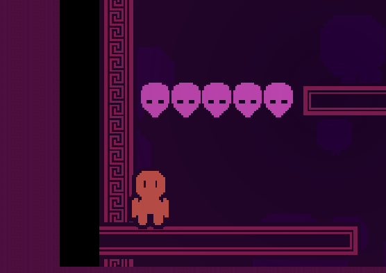
Game looks polished! Love the kind-of Greek vase-looking aesthetics with the color palette and edgework. Sound work is also A1. The only thing is I cannot figure out how to break these guys... :,( 

May need to come back to it later but game looks and feels clean!

Fun little game! Wasn't sure what the win condition was, kept dying, but I liked fitting blocks down while dodging them. The controls felt a bit disorienting. Having to use arrow keys and WASD was difficult and I found myself never actually using both at the same time. Not sure if that is an intended though, but either way, good stuff!

Yeah, we need to balance that more. The peasants start waaaaay to aggro. Appreciate the love!

- S. "Essay"

(1 edit)

This game is great! Feels like a fully-finished product. Every level had some sort of unique gimmick or twist. I wasn't expecting a boss battle, but y'all came through with a unique way of capturing that perfect puzzler feel (my favorite part of the game, to be honest). Think my only nitpick would be on the art. The environmental tileset felt somewhat out place, and you had like these watery backgrounds where the player would free a sea creature in water? Not saying the environment looked bad, it def had the quality it needed and I loved the weird abstract backgrounds, I just wished it created a greater sense of place. I'm nitpicking tho, game is fun!

Ah weird! Sounds like the scale bugged out. We'll take a look and see what happened. Sorry for any confusion and thanks for giving our game a shot! 

- S. "Essay"

Super polished-looking game! The floatiness of the character felt just right. I like that it had some leeway to forgive the player for some of those platforming moments (I'm not great at platformers and really enjoyed jumping off of blocks that were mid-fall). Will say I had some trouble navigating some of the levels, I felt a bit lost at times when on a specific chunk of a level. Either way, I really enjoyed the feel of the game and could even see it developed into a full release. Cool stuff!

The game looks incredible! 3D games in working on web are always a treat. Super polished! Every little aspect from the sound to the art perfectly captures the the inside of the human body. Will say, I wish you played a bit more with the gameplay mechanics, felt easy to get through and would've wished for some sort of interesting gameplay mechanic beyond just ramming blood cells. Good stuff regardless tho!

Oooo, I loved the art style of the game! Incredibly polished. Was a bit confused with what I had to do. Did not understand the difference between the two bottles and why one made you instantly fail and the other did not. Will say, the hip-hop music did feel a smidge out of place for me. It's not a bad mix, I just did not expect it when looking at the screenshots for the game lol. Cool game!