hi :)
Herald
Creator of
Recent community posts
Based
Feedback:
- It’s hard to lose (maybe just needs stronger enemies after a while or fewer heart drops, I never struggled to stay alive)
- I didn’t notice the shop until accidentally opening it (I’m kinda blind tho and it’s written in the description so yeah)
- Maybe right click for the shop would be better, I found it was hard to shoot around that area
- Upgrades can be repetitive when there’s 2 or 3 of the same one
- What are the red “gems” for? Why can’t I pick all of them up?
Now all the best points:
- Juiciness is really good
- The music and sound choice is awesome
- Feels really gritty with the blood splatters and fx
- Controls feel snappy and perfect (besides ZQSD only but that’s a nitpick for a jam game lol)
- Upgrades are fun, especially the spread feels great to increase gradually
I tried the post-jam version, but I couldn’t really figure out what to do.. What’s the difference between the shopping cart icon list and the “todo” icon list? How do I win a battle? What’s burning a card doing? I have so many questions 🥹 Also, for the web version being broken, it might have to do with itch viewport settings or godot project scaling settings, like setting stretch to “none” instead of “keep” or “expand”
All things considered still congrats for submitting! I know how hard it can be to run out of time too quickly :’)
Thanks for the feedback! Yeah, tbh I spent a long time messing around making A and D spamming feel fun haha. I was going to add usable powerups but didn’t have enough time to implement them fully.. You might have played some really similar stuff before since I chose a really generic game on purpose to focus on polish
Fun game! The name got me lol
I really like the story leading up to the game, it adds interest in a nice way. Another comment was talking about the mana, I feel like a simple way to make it intuitive could be to have the same icon on both the counter and the mana regen cards, at first I was looking around the screen for a battery icon :)
Also shopping cart is OP haha
There is so much to this game!! The fact you can draw your characters is such a great hook that drew me in instantly, and it fits with the aesthetics perfectly. The visuals are amazing!! It could do with just a tiny bit more animations for people getting hit etc, but that’s just nitpicking. Insane work!!
Love it! The cart physics are really fun and add a funny twist, I especially liked being able to push the wet floor signs around lol. Couldn’t figure out how to pick up groceries, maybe some sort of visual prompt when you are in the correct position would help! Also, the transitions between menu and game are super cool!
Interesting gameplay! I like the alternation between checking the cards and going to pick up the boxes. It could be interesting if you couldn’t move while checking the cards, or if you had to check them at a specific spot in the room. I actually like the minimal visuals, it makes the colors stand out and looks cool! A tiny bit more polish could go a long way! Like some kind of white noise ambience or other sounds, etc
I really like the 3d modeling and environment. It was a bit confusing at first but then I understood how to win! It was a bit tedious to get the correct card by drawing and throwing lots of times until it popped up.. Maybe a system where there is always a matching card in your hand that you just have to choose would make it more fun? But then it might make it too easy



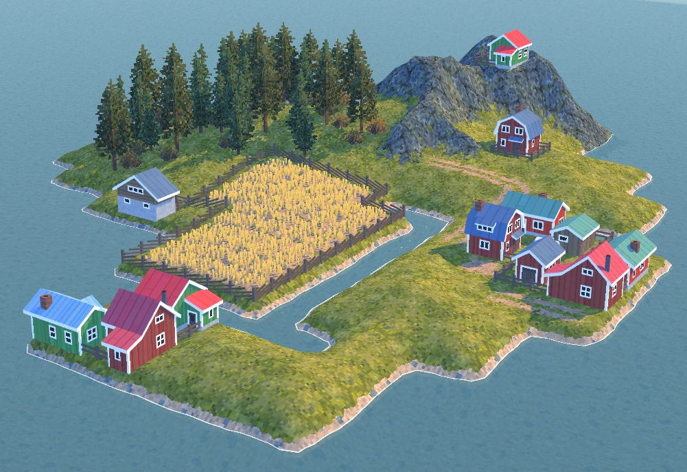 Super cool! I love how simple it is