I tried in browser first, then downloaded the v1.1. Both versions had the platform bug I mentioned
Kilansky
Creator of
Recent community posts
Not sure if I'm missing something, other people have said there's a lot of content here, but I can't get past the second level because the dragon doesn't actually land on the moving platform. He just keeps falling into it, and when I try to jump off of it all of the built up gravity gets applied and I zoom down into the lava. I do like some of the stuff that's here though, the 'portal activation' effect of the dragon looks pretty good, and I like how the world goes gray-scale when you turn into a ghost.
The music for this is just, stupidly good, I love it! The visuals of the glowing rings are pretty awesome as well, and the pace of the game seems to fit the music track nicely. My main criticism would be that it can be frustratingly hard at first to get a grasp of the movement and goal of the game. It's very smartly taught through changing the colors and brightness that hitting the green spheres is good, and eventually I came back to life, only to immediately get hit by a red pentagon. Once you get a hang of things though, it can be pretty easy. On my winning run I immediately died at spawn, revived, and then stayed alive the entire way after that. But for what it is I had a lot of fun playing it, so nicely done! Two thumbs up from me 👍👍
The environmental lighting and effects are exceptional, no question. The gameplay however leaves a lot to be desired. Nothing is made particularly clear, and the game seems to be actively preventing me from exploring it or enjoying myself. Like, why am I limited to a tiny bubble of movement as a spirit? It seems like you should be able to move anywhere on the red, and then move near a certain point to revive. But no, pressing ESC is the solution for some reason (and that's never explained in-game). Still though, very cool aesthetics.
I spent way more time than I probably should have with this, it's quite fun! My biggest gripe would be that the maps are too big and empty with little direction of where to go. I think in the third area I somehow found and killed everyone before I found the captain, and then I had no hope of beating him since everyone was dead, lol. Very cool submission though!
The art and concept are pretty solid here, I'm surprised how many layers of background art there are (add in some parallax with that, that'll look really nice!). The gameplay though is a bit lacking. Personally I didn't like that holding up made the character jump again immediately when touching the ground, it made for some awkward platforming. It's also difficult to know where to go once you get into the lava pool area, and since you aren't meant to fight enemies it makes the platforming pretty tight. I never made it past that area. Good job with the game nonetheless!
--- DISCLAIMER ---
First, A big THANK YOU to everyone that has played and rated our game, it really means a lot to us! For anyone coming in blind (or is frustrated with the game) here's what you should know:
- Between levels you may no longer be able to select anything. Just restart the game to fix this, your progress is saved
- The Downloaded game will not be less buggy, but it will run smoother than the Web version
- Camera Speed can be adjusted to your liking in the Settings Menu
- There is no tutorial, check the How to Play page and try your best on the first level
- If you drop a tape on the ground you won't be able to grab it
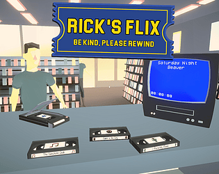
- Customers can (and often do) ask for movies that you don't have. You can mitigate this by giving them candy to calm them until you get the required movie, or you can just let them get angry and allow a different customer to fill their place
There are other bugs too, but these seem to be the most common. Hope this helps!
Really cool art, there's a lot of detail hidden in the foreground and background which is awesome. The boxes are a little finicky though, I ended up giving up on level 10 b/c I'm pretty sure you need to get that box attached between the right and left sides, but even when baby tapping to the left the box would shoot off further than I could get without a jump
Looks and feels pretty good to play. I didn't really understand the 'level rewind', it was grayed out most of the time, and I didn't end up using it at all. I also didn't end up getting past level 9, so it might need a better introduction to the inertia thing b/c I didn't get it. But solid entry into the jam none-the-less, very cool game!
Not a bad submission, but definitely could use some work. The platforming was actually quite solid, and the rewind mechanic worked well. I was also surprised to see a nice scene transition via the black gear zooming in and out, very nice. The sound effects (especially the jump) were pretty annoying though, and the story was pretty silly and nonsensical. Not to mention the human models were super creepy looking, haha. But overall it was good. Nice work!
Really fun game! It was really funny hitting people by mistake or hitting the person I just dropped off and hearing the scream sfx. My main complaint is that it's hard to know where to go (even with the arrow), and if you go the wrong way there's not many alternate paths so you have to backtrack. Other than that, very nice work here!
VERY good game, once I figured out what to do it was a lot of fun. There's definitely a lot of waiting around and it takes some trial and error to learn the ropes. But all the mechanics work together well and fit the theme perfectly. One change I'd like, is to be able to select specific movies from the 'in' box so that you can sleeve your rewound tapes that didn't come in the right sleeve.
Human music... I like it. Well, for a bit, I would've like the 'change music' button during the video rewinding section after awhile. Also there's no way to tell how much total money you have and you just have to wait around at the vendor even if you can't afford anything. But I like the art and concept here, a lot of people did VHS rewinding games it seems, including us, haha.
I really like the concept here and seeing the different endings play out, I only wish the game played a bit faster. There's like a 3-5 second pause between all the dialogue, and you have to hold the rewind button for around that long as well before it does anything. These should be near instantaneous imo, as it would be less frustrating to play through the same stuff over and over. Solid entry though, very well done!
I love the simple color palette and detailed pixel art, very cool! The game is fun once you get in a rhythm and start getting in a streak, but it opens up a bit hard, and got into the double (and triple!?) notes really early on. I think the opening of the song should be slower, with no double notes, and escalate in difficulty over time so players can adjust and find a flow to the rhythm. Solid entry overall though, very nice work!
Very clean and polished looking art style, and solid premise for a puzzle game. My main complaint is that things are not taught in an intuitive manner. You should have more levels with very simple and easy solutions so that players can learn the mechanics on their own, that'll make for a more rewarding puzzle game :)
The concept, art style, and mechanics all work really well! My main complaint would be that your control layout is all over the place. If mouse is required, then WASD should be allowed to move, which also positions your left hand closer to R for restarting, and then you could make Spacebar or Left Click flip through the cutscene instead of Enter. Nice job overall though, it's a really solid submission!
HELLO FELLOW WARRIOR!
I really like this submission, the voice dialogue is pretty funny and the art is good. The mechanics feel a bit cluttered though, the hunger/thirst/urine system is just kinda 'there' and doesn't contribute much to the core mechanics of the movie store. I rarely felt like I ever had time to organize the movies and didn't see much incentive to. It didn't help that there's not a very clear indication of a movie's genre without looking directly at it, so it takes a lot of time to find the out of place movies. I also kinda stopped bothering with the rewinder, as it took longer than the amount of returns I was getting. Maybe having multiple rewinders would help with that? And perhaps a smaller store layout would let you get to and from your desk quicker, making movie sorting less cumbersome. Also, there were times the customers all talked at once which was really annoying, so an audio queue system would help. Overall though, really cool game, nice work!
Very good art and visual presentation here, but the game design could use some work. The main menu has no music which caught me very off guard since I turned up the volume before starting the level. The cat is really hard to control and the collision on the sides isn't very clear. I like the idea of rewinding and fast-forwarding the cassette tape (both for cat movement and audio adjustment), but I think the amount of speed and audio adjustment is too high and doesn't blend well when trying to play. Solid submission though, I had fun playing!
The aesthetic for this game is awesome, I really love the style! Personally, I think the missions would have been more fun/interesting if they popped up on a HUD in the top corner, and your tasks flowed into each other. So first it just asks you to parkour the hedge, then switches to go to the gas station, then says to blow it up, etc. Then if you failed one it would just rewind to the last thing you completed. I also had a difficult time finding certain things, like the "market", so some better landmarks in the level design would help. Really fantastic entry though overall, excellent work!
That clears things up a bit, thanks for the response. Making art as a programmer is one thing, but programming as an artist is even harder I'm sure, so good on you for putting forth the effort and getting what you've got here! I'm still not sure using the pre-built stuff is ok, but I suppose it's not up for me to judge. Incredible job getting 200+ ratings on your first ever Game Jam though! I've done like, 7 or so and rarely break 30 ratings.
I... really don't know how to feel about this game. The visuals are unique and interesting, for about a minute until your eyes start hurting from the craziness of it all. The menu options are ridiculously high detail for a game jam game (I mean saving/loading and adjusting resolution and bloom, REALLY?!), but the saving is unnecessary for the kind of game it is and didn't even work when I tried it. The movement feels good and even has human feet and shadows, AND you can interact with stuff. However, if you press E to read a piece of paper it very clearly states that it is part of the Horror FPS Kit by Thunder Wire... which costs $45. This kit is the core of the game, as it provides the UI, character controller, inventory system, etc. While Mark's rules do seem to allow paid assets (as long as you have the legal right to use them) it doesn't allow for pre-built code: "The vast majority of code must be written during the jam". Asset kit aside though, there's not really a clear path for the player to walk, or a goal they are trying to accomplish. I walked around aimlessly for awhile to see if there was something more and just ended up finding the edge of the landscape, which wasn't sculpted down to finish the islands. I really want to like this game, but as someone who has built my own landscapes and character controllers in Unity, I can see just how generic this game is behind the filter. Apologies for potentially overly-harsh feedback.
TLDR: I like the aesthetics, but there's a lot of flaws here including the fact that it likely doesn't fall within Mark's rule-set for the jam.


