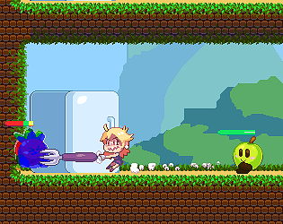
First version (gsdfhsdhdfgsh.zip) ends directly cause the game ends when your HP is above 0... but if you wish for a truthful, untainted and classic experience of iangklakmd, you can try it.
Second version (dfhdyhdfghghhghghghghhgghghghgh.zip) but was submitted a bit after the deadline. I recommend this one cause it's... well... playable. Literally.
Kwisarts
Creator of
Recent community posts
- About the hitbox; yes. We usually prefer smaller hitboxes for anything that hits the player (and bigger for any attack from the player) rather than the opposite because it will feel unfair if an hitbox is too close to what we see (especially because the hitboxes are moving). The player is more likely to forgive a favorable outcome and more likely to feel frustrated if the unfavorable outcome is frequent. Especially if the hitbox is a square (it often should be)
- About the spam fire, you could make the light decrease as the bullet travels space to avoid that. But the lack of visibility feels like it's downright impossible to understand what's going on. An alternative solution would be to have a "cone" of light in front of the player. It could fade a bit, but the idea would be to let the player "control" some of his visions. That way, it's more interactive, but still scary because you can't light every place. Think of Doom 3 and how light plays a role in this game.
- About reloading, yeah I personally think R can never be a restart button for shooters. It's in our habits to consider R to be a reload button. In any case however, Restarting should often be an uncommon key or simply in the menu. Unless the game makes you very likely to restart of course, in that case R can be fine. Maybe still not in shooters though.
In game jams, it makes sense that the restart button is not in the menu though, since it works a bit faster; but still be careful about the restart option :p
Also note that if the reloading takes time, it can be a good idea to let the player reload at will so that he can preemptively not have to deal with a reload in the worst moment.
OH the last orb isn't in the game! It would have been nice to include that in the game descrption, I was looking for the stick of light without finding it!
Well, as you stated, unfinished at this state. I wouldn't mix a keyboard type of control (left hand for wasd, right for enter) with the mouse. Especially since you actually don't need to click (as in, the mouse is not necessary in that type of gameplay)
Not sure the music is appropriate during dog fights petting :p
Aside that, it's cool, too bad you couldn't finish. RIP the people in the transparent stone.
- The X in the main menu wasn't that clear because it's placed in the dead center between the play button (that is fairly discreet, not really standing out so I didn't notice it at first, while it's supposed to be the most obvious element) and the controls.
- Try to avoid not having a way to quit the game if you force the full screen
- Would have liked the hitbox to be more obvious, since one mistake makes you start over
- Speaking of which, starting over for one mistake is frustrating, it forces you to be so careful that...
- ... the best way to play is to pick an ingredient, move up in a safe spot until an ingredient is free. There's way too much stuff floating around!
- Confused on how the game actually works. Apparently, what's on the top left is your recipe. Right? Since picking anything else in the wrong order makes you start over. But once I'm done with the sandwich, I get an "error" sound effect, the pick gets empty and on the top right, One of the toothpicks disappear. They look like lives and since there is an error sound, I am only left to assume that completing a burger removes me a life. Is that the goal? It's a bit confusing in that regard... So I assume it means "x burgers left to craft"
- The game doesn't feel very fair as it relies on RNG to have your specific ingredients and have them free from other ingredients to safely pick them.
Aside that nitpicking, not a bad game! It feels cool to craft while having gameplay to top it!
- Not very well balanced because of the hitbox. You barely have the time to see the zombies sometimes as their hitbox is rather huge. You die pretty easily.
- Might be too zoomed in. Would be nice to be able to see further. I know you aimed to give a claustrophobic feel but I would have liked to be able to see at least as far as the bullet could light
- In most games, "R" is fine to restart. Not in any shooters! The player might expect "R" to reload, not to restart.
- It's easy to see that the bullet doesn't come out from the tip of the gun.
The atmosphere is pretty good though! Good sounds, visuals and all. Nicely done on that regard!
Very interesting concept! I like how your weapon's range depends on its name.
As a result, "the professor obtained a Oh hey, i'll just give this weapon a preposterously long name just to be insanely overpowered. Oh wow, I can write that many letters? Isn't it like cheating?"
All I had to do was swing it.
I found the game rather frustrating (despite the cheat).
- The hitbox feels weird, probably because it's round. So when you're on edges, sometimes you are still "hanging" but can't jump.
- Similarily, it makes jump feel pretty weird, notably when you jump on the other circles, it feels hard to tell how to properly land. Not to mention that strange air-stretch that looks nice but feels confusing when playing.
- Some passages are waaaay to tight in terms of timing. The fire at the end is what made me gave up, notably because it was tedious to constantly jump over and over for the fire to still catch up as you gotta back track a bit (like in the screenshot)
Aside that, great level of polish! It visually feels very satisfying and has a unique charm ! The progression is smooth there even is some kind of narration (with your fellow balls dying)
Okay i'll kinda mix the bad and good for dramatic effect:
- The intro music is....... kinda difficult to listen to. Might be kinda wrong notes, I don't know but it made me feel uncomfortable...
- ...while the in game music is pretty punchy and enjoyable!
- Your collision approach might be the wrong one. When you keep pressing up on a collision, your character jiggles up and down. You might want to check for the collision before you're colliding (by adding your current speed to the position of the collision, if this can work in whatever language/program you're coding)
- The writing style is improvable, sometimes I see some informations that aren't brought up the best way "the slime i consider my father" (or something like that) could have felt better if you introduced the father so that you'd name it "father" instead of "the slime i consider my father"; I didn't note everything though so I hope you see what I mean...
- ...but overal though, it's pretty nice. The story is lovable and the characters are nice
- The fight is well designed..
- ...but sooooo slow. It would have been nice to speed it up to have a more satisfying flow. You wait about 3 seconds by the time a character moves to another.
I feel teased, is there a way to use the other options? Such as power and items?
Great entry!
Not sure I am a fan of the balance, especially because of how it's designed. Basically you have to trick the bomb to get to play the real thing and that on its own feels tedious :/ It's very easy to get bombed at this point. Once you passed it, it's easier. Which feels weird since it's the beginning of the level. It seems very hard to dodge stuff.
Aside that, I love the colors and how the camera moves!
Is it normal that the music stops existing when you go to the audio settings?
- The game feels like it could be smoother/more fluid in its movements.
- Might be just me, but I'm really not a fan of action games that makes you use the mouse to move. I didn't feel comfortable at all since it required speed and all, which I find inappropriate for a game where you only have movements and don't actually need to click (aside for triggering the fire, but that could be done with another keyboard key)
Aside that, I like the design! Rather polished and the music isn't bad!
- I'd say balance isn't necessarily the best unless you log in and stuff. Often, I feel like the minus mutagen is just too punishing to really feel like I'm progressing.
- The goop I got was rather... not my taste :p
Aside these nitpicks, the game is superbly fun! Super good polish, everything feels nice and Juicy. The sounds and music are superb and I just love that slapping sound :D
Everything felt satisfying and I think it's the game that hooked me the most.
...but I mean, yeah, it's not like I was expecting less. :p
- The blockchain only being able to hit up, you end up regrouping enemies, going down to the screen then just bash until they all die
- Didn't find the goo that useful since the mentioned method makes it easier...
- ....while the green blob that spawns a puddle is annoying because when you kill it, you're basically in the AOE. I think it would have been nice if the puddle didn't spawn on you.
- Is it normal that the main menu has a music, but when I start the game, it doesn't play anymore?
Aside that, not bad! Felt satisfying to kill them :)
Hey there, just an advice when participating in game jams:
Please avoid installers, they're not very encouraging. Most of the time, people don't want to install a game in game jams because they'd rather play as soon as possible. Plus, for every game they installed, they have to go to their programs and search them (considering sometimes they have obscure names that doesn't make it obvious, and sometimes no proper icon) to uninstall them. Really not convenient :(
When making your build with game maker studio 2, please prefer making it an executable in a zip, for the sake of conveniency. :)
I know i've enjoyed a jam game when I end the game with a chuckle!
Simple, straight to the point, with a nice plot twist! Sprinkled with light and simple humor!
I'd say it lacks a bit of "actual things to do", but honestly its simplicity and the story makes it enough to not have anything more to nitpick about. Good job!
Lovely. Nice atmosphere and the puzzles were really colorful!
A few remarks though: Making the puzzles is kind of awkward for 2 reasons:
- When you drag a piece, wherever you click, it will always snap the middle and it feels strange. You get used to it though but it's still kinda strange
- Since the text is important, it feels awkward sometimes cause when you place the pieces, you don't know where the edges are, so you might sometimes sigh because you've attached like 4 pieces together and need to move everything because it hides the text. I think that can bee solved by being able to select joined pieces together, but that might not have been possible because of the time for the jam. Or maybe you can, but not in an obvious way that I could find.
Need to inform you that there is a bug. Unfortunately, I am unable to get how I triggered that. Basically, I'm doing endless mode, buying every upgrades I can. Eggs got very buggy.
Eggs ramps up from 1 to 5 slowly an when it gets to 5, it gets back to 1.
Same with Mayo, except it didn't go up at all.
It keeps happening time to time to some items that are level 1.
^ This is what I thought until I realized the sandwitch factory takes ingredients to make the sandwiches. I think It would be nice if you could get info on your buildings while playing. (i mean, it's obvious when you think about it, but you don't always consider that when playing ahah)
Quite a charming management game! I would have liked a more friendly User Interface though, as it didn't have much charm on its own. Too bad there isn't any sound neither :o
Aside that, fun and addictive! I like the sandwich too!
Points I observed:
- The instruction screen is a bit tedious to read for two reasons:
first, the font chosen is not the best to read block of texts. (you usually choose more simpler and neutral fonts)
Second... it's a block of text :p To make it easier to read, you usually would use as few words as possible to give informations (though the story is still the story). It can be a good idea to use illustrations to show the controls or separate controls from the story.
- The first boss phases are a bit frustrating as he spammed me at some point that green ball and it became repetitive.
- The second boss also didn't offer much variety (he only ever spammed 2 attacks) while having an enormous amount of HP. Thank god you forgot to remove the debug cheat. Space got the best of the robot :p
- The repetitiveness of the boss fights comes from an easy trick you can use to beat him: Just camp on the left of the screen. Aside the first boss and the green ball (that requires you to move), you didn't have much reasons to move. Just aim in a different place. I think you would have needed attacks that push the player out of the comfort zone. It might help to have a "map" of the level and make sure each area gets attacked in a way or another, and differently. Obviously though, with the time limit in mind, it seems like something difficult to achieve. Maybe the top parts could swing differently each time they are triggered.
- EDIT: The hitboxes seemed a bit strange. I got hit at some point without knowing how. Does the steam coming out from the robot hurt you? Btw, getting hit should get visual or sound feedback!
- the bubbles have good feedback when shot... but they give no visual/sound feedback when disappearing, too bad. Would have liked a satisfying little animation as they get blown
- The game ends a bit suddenly and the "noooo" at the end didn't quite convince me.
...that being said, the rest of the voice acting was top notch! Not expected and pretty cool.
Overall, the game feels epic and the boss fight is really cool. He might be a bit too static on his own, but his moving parts really sell and it feels just right! I also like the satisfying effects of the bubbles.
I'll start with what I think can be improved (and may or may not be nitpicking):
- I felt very, very uncomfortable shooting with right click. I think it's overal way more intuitive to move with wasd (I tried using the mouse but... it's way better to use wasd) and shoot with left click (like in any shooter) simply because it's more convenient and comfortable to handle repetitive clicking with what you're used to mash the most (the left click) while the right click is often for secondary actions (usually you would just hold it or click once in a while, not repetitively).
- I found the game pretty easy, since the bot would just aim where you are and there isn't very much variation. Not an awful thing though, since I think the AI was very responsive and worked well generally. It just was a bit easy to predict.
- The screenshake might be too much. Don't get me wrong, I love screenshake! But I found it was a bit too easy to trigger. What makes a screenshake special is how it makes certain actions feel more satisfying and impactful than others. In this case, it shaked a bit on contact and i don't know if it activates while an enemy dies but it escalated fast and quick. I think toning it down would have been good to, for example, make it feel more satisfying when a bigger screenshake happens. (so, the screenshake balance overall)
- This one is 100% personal, but I feel like tiny crosshair and bullets makes it a bit too tiny to be visually as interesting as it would while bigger; although I'm guessing with so many bullets on screen it might have acted as nuisance; but i still find most of it really small. (as an example, the binding of isaac, enter the gungeon and nuclear throne - granted they're roguelights though, but still top down shooters - all have preposterous bullet sizes, but it works just so well and adds to the satisfaction)
That said, the game felt satisfying and the music and sound effects were very appropriate! The AI is well done and I love how the battlefield gets field... I mean, filled with corpses!
Good job!
First off! This is an amusing main menu. I spent about a minute or 2 just playing with the sound because it increases with up and decreases with down. Nice touch! I found it rather funny.
- The camera moves way too suddenly on proximity of text boxes. Also, if you just move a little, it gets back to you instantly, and if you stop moving, it goes on the text box suddenly too. I think it should be smoother!
- Speaking of which, the text box was pretty slow and restarts if you move. I think it should just stay there. On the tutorial, it felt like the focus on the text box should have been the normal view (it's more convenient to see above than below in platformers, with the exceptions of below platforms, since they lead to leaps of faith)
- The hot dog has sometimes weird sprites, with some mustard or such for a second, or trembling in fear? I didn't notice reasons for this to happen. Too bad cause several states are a fun idea. OHHH I get it now, the condiments you find change your sprite, but not all of them
- I think there is something weird with the collisions, as sometimes I feel like I should have reached a platform and not get blocked by it.
- Sometimes, the double jump doesn't trigger. It seems to happen near platforms (it happened to me on one block of platforms)
- The game feels floaty, accentuating that kind of lack of control while moving. Makes platform jumping tedious at times.
- I wouldn't recommend space for jump, it's kind of an awkward key in my opinion.
I gotta admit I gave up, I kept getting lost. If you can't make a minimap, I suggest you to add props/items that the player can recognize to have an easier time finding his way in this level because it's pretty big!
Aside that, the game looks nice and having dances and such is a nice touch!


