Nice bug catch man, thanks for playing..
LK
Recent community posts
Pixel art = A+ . Very nice style my man. The main mechanic is pretty solid, although a bit tedious/hard to keep track of both the player body and the player projectile. Especially since they share controls. But it was still a pretty fun.
When battling the boss(es) , upon death you respawn just a moment before entering their area. Since there is no place to get coins and no area from this point forward that have any coins, the boss fight becomes really really difficult.
The rest of the critique I can bring forth are based of off this being a very wip project, so I think won't bore you with them. This is neat, keep it up!
A+ style and very nice and straightforward gameplay. Here is something feedback.
- The physics can feel a bit floaty, like I make a leap or dash and if my path isn't good I screw myself pretty hard since there is no real return from gaining that velocity.
- Also hitting certain objects whilst having that velocity gain makes the player almost bounce of them, with this I encountered some unpredictable behavior. Example: In the fight against the consensual tentacle I got a hit that torpedoed me to behind him so that I gained access to the bandit camp without needing to beat him. Things like this can be fun and I myself as a player doesn't mind really, but I just thought I'd inform you of this.
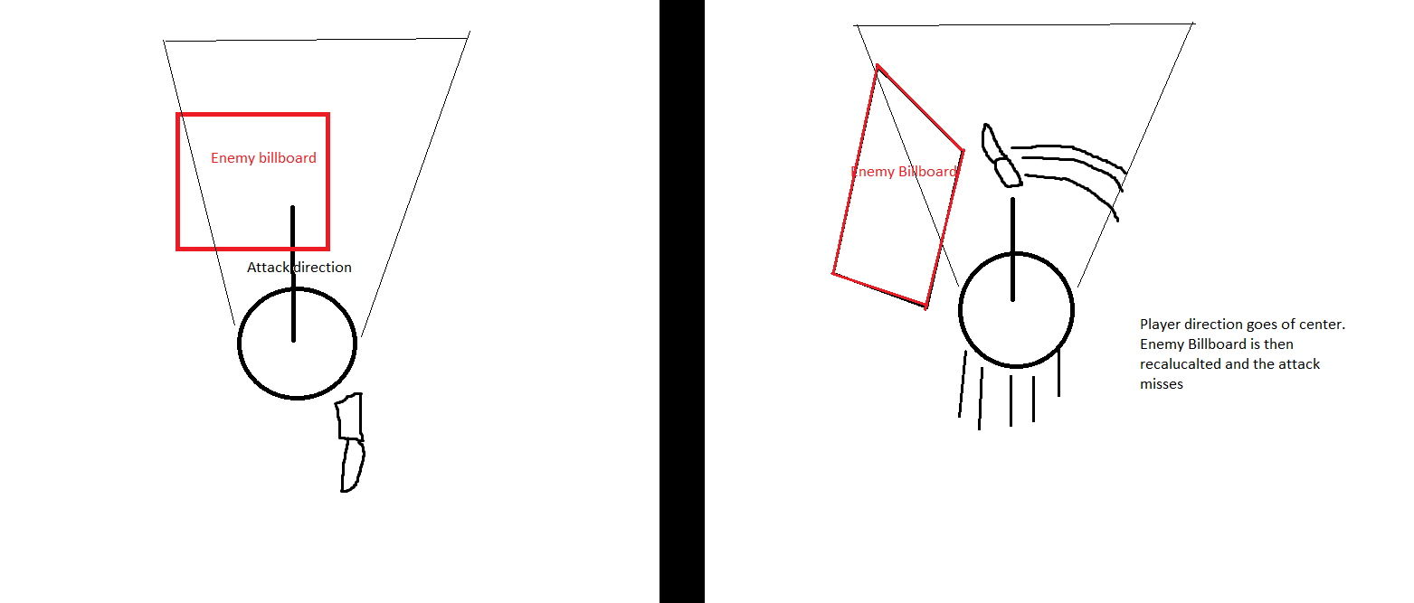
- Hitboxes/ billboarding: I'm not sure on your method of doing the hitboxes, but doing a attack or dash against a enemy and not landing it at the center of the enemy makes so that the billboard rotates against the camera/player center. This doesn't feel like a dodge from the enemy, but rather a technical hinder as to why I wouldn't land a attack.
 This problem wasn't that apparent against the bandits though, so maybe it has something to do with the spiders being closer to the ground?
It's cute and the style is pretty cozy. Don't give up and keep working hard.
Aight, here are my two cents buddy.
First off, nice to see a demo of this, I've been looking forward to it tbh.
- The motion blur is very very aggressive, now I'm on a very low end/ bad specs machine, maybe it is much smoother on other machines. I found it to be a bit excessive.
- I did remove it myself after checking the options menu. Huge props, really great to see effort being put into the options
- The dash is a bit jaggy, like it feels almost like the distance is too long. When dashing it felt like I ended up way way far away, almost to the point of it being a bit hard to predict where a dash would take me.
- The impale with the spear is really neat. Though one on one makes it a easy win since enemies can't attack. Also, impaling the first game on the spear makes all of the other npcs freak out and spinn around
I like the style and the effects are really superb, I also kinda like the aesthetic of being in a shady part of a modern city, kinda getting a dmc3 vibe from it. Keep work hard!
Well, if I was to do the task I would definitely split up the sprite into two pieces. One lower part for the legs and a top part for the rest of the body. That way your running animation is only really dependent on the leg section of the sprite. Then making the aim animation would be independent if you're moving or not.
also: Highly suggest looking up inverse kinematics if you want to make a very extensive/advanced animation without needing to draw all the frames and stuff yourself.
Aight, played it through. It was a pretty good experience overall, very nice style you've got there.
Some pointers/ critical feedback.
- If there was something of interest on a wall, it was of annoyance that I could not turn and face the wall if I stood to close to it. Everytime I wanted to turn to the wall I had to do a little loop.
- Going into aim whilst you run locks the animation into the running animation even when idled.
- I got a bit lost on the controlls mid through the game. This was especially apparent whilst in the inventory, having a cheat sheet of commands would not hurt to have displayed there.
- The zombie npcs very often bugged out and stood shaking at place.
- A bit nitpicky : The vertical climbing /slowdown in the stairs was waaay slow. Felt like the character was wadding through mud. I'd suggest speeding it up a bit.
This is good stuff. Don't stop working hard!
Oh wow, I'm really honored to hear that. Especially from someone with talent. We're both gonna make it!
On the subject of hard to tell cuts. I've added so that the player can't do more cuts with his blade unless he makes a new thrust (i:e releases the left mouse btn). Maybe I should say that more in detail or remove that so that the player don't have to release.
Thanks man.
This is really juicy for something with such basic graphics. Made it through 5 rooms, gonna get onto the remaining rooms later. It's very fun, the core puzzle mechanic and design is solid af.
Don't have any real complain, only thing that I could comment on would maybe be to change the order of the rooms.(?) I had a much harder time on the first puzzle room than on the rest (the other 4), but it was a good introduction to the anti-materia square.
Great shader work btw.
Haven't got that much too feedback on since last DD. It plays pretty well, the addition of arrow keys was a huge improvement, ended up using only that and not the mouse.
The only thing I can comment on is that the background music is a little "royalty free" sounding, but that's honestly not a huge complaint even.
Love it, great concept, release it on mobile and you're going to tap into a huge market I think.
First off, nice to see another Monogame devloper!
I dig the style, good shaderwork. I got a very violent and shaky effect on all of the terrain walls, which made it kinda twitch and straining on the eyes to play. I don't know if this is intentional or a bug, but I'd suggest just having the pattern as it is when you stand still.
I dunno if the game window is supposed to be able to be resized, but it started in fullscreen with just a tiny game window up in the left corner. It was very very difficult to read the ingame text.
The tutorial part stated the swap, combine and recycle, but still after playing it a couple of times I'm really confused at to what those commands actually does?
Gameplay was alright, like the concept of battleroyaling yourself to the new level. Also, lightning minigun is OP.
Aight, so the controls feel really good this time around. At times it's a bit complicated to initiate a wallrun (or a wallrun upwards to be more specific). You used to have a tutorial that pointed out controls, I forgot all about the grapple when I started playing the game, wasn't until I took a look at the old demo page that I remembered the "F to grapple". I really think you should put the tutorial text back in. Otherwise everything flows a lot better, except for the combat. Combat feels like it steals all your momentum, like the fighting animation steals all of your current velocity and sets it to zero. The combat animations are too long and they feel hard to control. When someone gets real close and personal with you, the attacks feel very difficult to direct. I commented on this the last DD, but I think you can do without combat, the parkour and movement is fun enough to carry the gameplay. Otherwise I think you should do the combat in such a way that you utilize the player speed.
Keep at it, I'm sure you are going to make it.
Some of the attack animations are a bit long. but I kinda guess that is the point is to make them faster with the skill system?
The game feels and controlls pretty good, the skill tree is a really compelling mechanic. I found out a way to trick enemies off of ledges. They kinda stop falling after just a little while and kinda just float in the air. Maybe you're aware of this.
Really cute style, really digging the UI. I was a bit confused what all the things on the skillmenu was. Maybe this game would benefit from having a more fleshed out tutorial? Anyways, i had pretty fun with it, keep at it!
Ey man, this was a pretty fun demo.
Like right off the bat it has a pretty great artstyle. As Khryse said, the window size is very small, maybe you should have it defulted to a bigger size? (I did resize it to the biggest size though)
I got through it fairly quickly, it's a pretty straight line experience as it is. I'm curious, I spent some of the cash in the start on candy and soda, if I had spent too much money on that [Spoiler] would that be a soft lock since I woulnd't have enough cash for vodka? [Spoiler]
The objective music with the walkman is really nifty too.
A bit nitpicky maybe, but your cursor and your game screen are two different resolutions, it's kind of a hickup in the art, but maybe that's just me.
Overall, real potential here, I can see it turning out great!
Not much has happened since last DD, but I'm glad you found the combat to be improved.
The parallax thing seem to only happen for certain people, I think it might be something spec related that I'm not taking into consideration. Would you mind posting specs? (I assume it's related to the problem of the lord getting stuck too)
I appreciate you taking the time to try my demo again, I'm gonna get around to handing some new feedback your way too!
>Love your game, anon.
Y-you too. We're both gonna make it!!
I suck at these types of games, I died constantly and got my first game over pretty quick. The game looks great, the transitions between screens/menus are really flavorful. Good music and good variation of enemies.
Don't have much negative to say, I just happen to suck at these types of games. The only really notable thing was when I entered a sort of corridor area and I had to avoid collision with the walls. In that area there were a some (at least one, I died at this point) vertical drops where the enemies were coming from the bottom and scaling it upwards. I died from colliding with an enemy, but with the screen pushing me forward and no ability to shoot up or down this seemed like a pretty dumb way to die.
Great game, very beautiful style.
Very nice looking graphics, the animation too are pretty good. Though It feels like there is missing a animation when performing the double jump. The jump feels very awkward to me, it's almost like it's getting this extra momentum which feels like there's something pushing your character forwards.
There's not too much to say about the enemies, they just seem to be a very WIP. Some general behavior is needed.
The dialogue portraits are really pretty, very flavorful with the dialogues.
Also: When I restarted the game I had the HP of my last session.
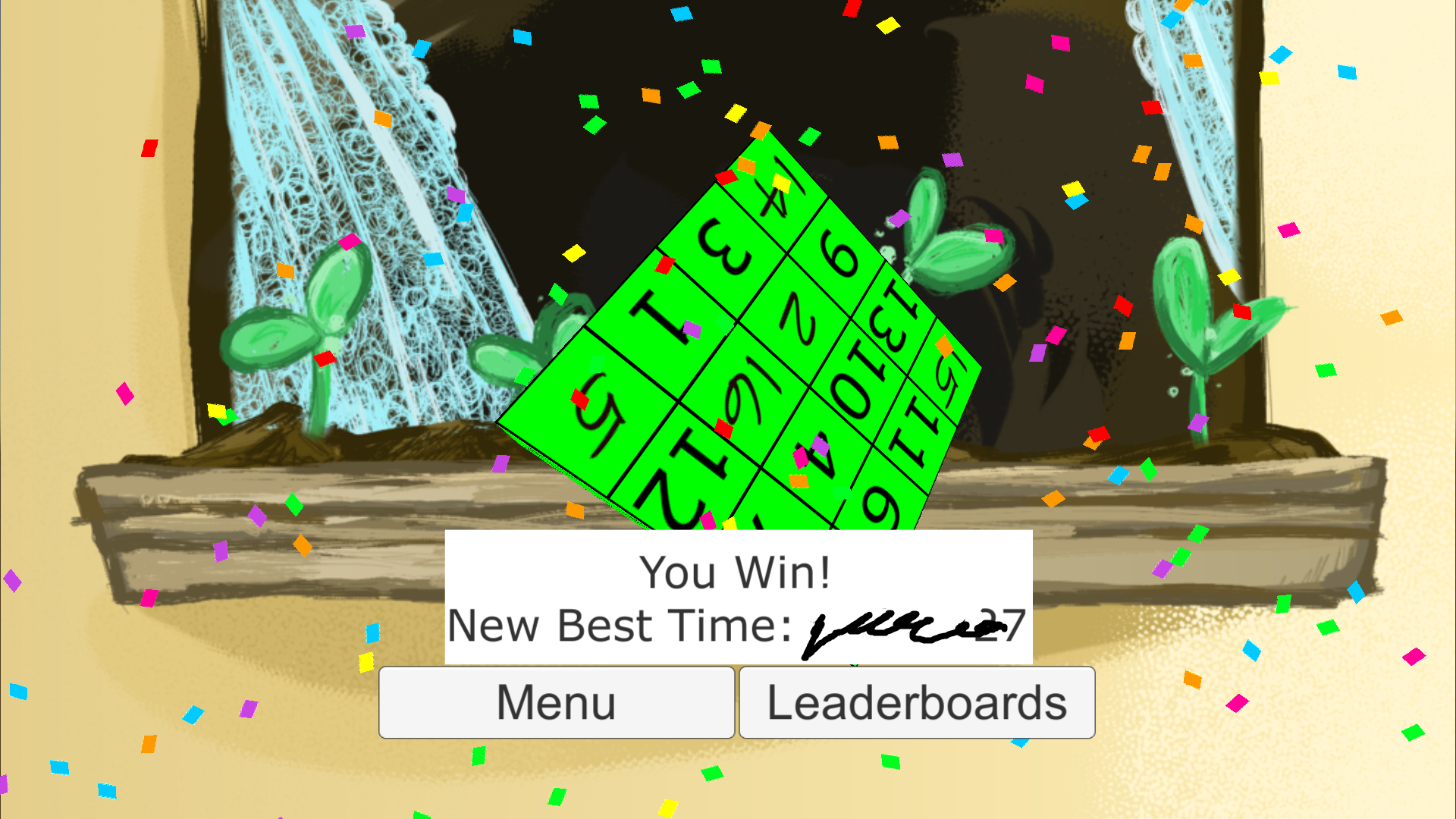
First off, I love me some sudoku and I did actually beat it. (In a underwhelming time)
Isn't really anything to complain about, its easy to navigate and the sides adjusts properly to show which side I'm working on. Only thing I could think of playing on the PC, It might be nice to naviagte the cube with the arrow keys. Like : Left Arrow = rotating the cube to the side on the left.
But this is a pretty cool concept, think it would be golden on mobile.

There is a lot of juice going on here. Attacking feels pretty good, pretty heavy but still controllable. The biggest complain that I have has already been said, the enemies hardly ever get to come near me to attack and I had no idea what was happening during the item and skill buying section. I accidentally bought lots of stuff without really thinking about it and it didn't really feel like it made any difference.
Still, combat feels nice. Keep it up!
First off, really great controls. I played around in the start pool area for a good while just playing with the controllers before heading out any further, which is a pretty good sign. I honestly haven't that much to say about the game, it played really nicely and it pretty fun (especially the boss).
I guess that the only complain I have was that the way leading up to the boss was a bit long and that the large waves of enemies really didn't compel me to stay around and fight them. Like they were pretty easy to fight against, but near the end I just did my best to skip them. Maybe if they were to occasionally drop health/stamina/energy it would feel more rewarding to slay them.
The boss was great, tough as nails but great.
This controls pretty satisfyingly. Sometimes it felt unclear if the "F" grapple was going to work or not. I think there was an indication that grapple was going to work whenever the crosshair changed to an x? The combat bit felt kinda janky, I don't know how much it actually adds to the gameplay, the parkour aspect of the game felt like it could carry itself pretty good without any combat.
The biggest concern I had was that the rope felt kinda elastic/slow. It kinda took too long for it to attach to objects and when it eventually stuck to something it kinda felt like the rope was way longer than it should have been.
Also: Highest tower climbed!

I won't iterate over what has already been said about the fighting. The game looks really great, it one of those games that immediately catches your eye. But in regard to gameplay the game seems to be lacking. The navigation system worked fine but I also felt kinda lost in the sense of not know what it is that I'm chasing after.
Thanks for the feedback man. I know that I had back-stepping as a animation task (I think it just got pushed down the todo list), but I can defiantly see people being confused/annoyed by that.
On the note of combat I had considered lowering the speed of the first enemy, I could also make their "sword lines" a bit more clearer. Maybe that could help make the combat a bit more approachable.
The parallax problem will take some research to figure out. Thanks for pointing it out.
Not much to comment on, but it has a pretty good simple pixel style. Good colors too.
The platforming and movement feels alright, the nailgun is a pretty neat idea, but I kinda feel like it's a bit limited by the players reach. Unless it's a very vertical climb I don't really see that many uses for it tbh.
Very cute artstyle, really digging the "playable" menu. Overall easy controls to grasp when firing it up for the first time. Short, but long enough to get the idea of it.
Only real complaint that I got was that the spikes and some of the other deadly stuff out on the map didn't pop out of the environment enough. Sometimes I would die from simply not noticing that I'm actually approaching spikes/etc.
Also, I think I got the sad/bad ending
Combat feels pretty good, at times disorienting only having the arrow as an indication of your direction. When ganged up on it felt like the marker got easily lost. Still, both blocking and attack was easy to understand and use. I got a bit confused at the start of the demo as I had a hard time figuring out how to "use" stuff. I had accidentally selected the armor(?) in the room (it was glowing green) and I couldn't leave the tent. Took me a embarrassingly long time to leave the tent.
I also picked up a bunch of stuff that I didn't really figure out what it was. Maybe more hints or a tutorial could be good for the game. I enjoyed playing this though.
:Also some sound effects could really give it some extra juice.

