Thx ^^
matchaberi
Creator of
Recent community posts
Yay!
It was fun to play it. I would have appreciated a little more margin to throw things into the pot instead of guiding them inside to avoid dropping them outside in front of it, but it's no big deal. I found some recipes a bit un-intuitive, but since it is a game about experimenting it's okay. The art is lovely, actually, that's how I found out about the game, searching for assets. Thank you for sharing them!
Hi! I read this a while ago but didn't find the time to answer.
I didn't think that clicking so many times could become something annoying, thanks for telling me that. When I have more time, I'll keep working on this game, having in mind all the comments. Music is something I love to create for games, but I struggled to even make something functional as I entered the jam 2 days before submission, and it was my first one. I'll work on that too.
Thanks for playing and giving feedback!
Oh, it doesn't mean it was a bad decision, I just suggest you warn the player some way. It might seem something very obvious when you know the game, but as a player I had no idea. Although, what I would highlight here is that the beginning felt a bit like a tutorial being repeated again and again every time I died. You could maybe add a checkpoint after this first part, which felt good as an introduction but not good to repeat. Then the player could experiment until they learn without getting so frustrated with this.
This is just my opinion, but I hope it helps. Thanks for replying :)
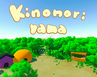
Made me get dizzy very quickly, but it's cool how 3D was implemented here. Maybe with bigger obstacles that look like buildings, it would make more sense. Also, I was confused at the beginning because I didn't know what to look for. Showing a sample of how the carrot boxes look from the beginning would help. It was a bit repetitive too, but adding some more objects and variating music would solve that. Good idea! And the art of the rabbit is very cute :)
Really fun! I like the system of this game!! It's challenging enough to keep you entertained and trying to improve. Having the ratings really helps feel rewarded when you do it correctly. I also love the art and the character, great job!
PD: Maybe you could highlight the tutorial, it's easy to go unaware of it and not understand the game when you start.
I liked the game! Though, I don't know if I'm using the right criteria for timing, am I supposed to follow the music? Calculate the time the cat takes to stop? I tried both and got better, but maybe it's a coincidence. It's really cute, and even if it's repetitive, it's fun. A different music, or even various tracks, would improve the auditive experience and avoid getting tired of the same sound. For extra spice, you could consider adding different fruits with different energetic values, or some kind of power-ups!
If my only entertainment waiting somewhere was a Nokia, I would love to have this game. It's simple, but very well adapted to the limitations. It's fun, just a bit repetitive. A day completion system, and maybe some variations like rush hours, might make it more interesting and give more sense of reward. I really liked the art and the theme, I wouldn't expect something like this to fit in Nokia 3310's limitations, but you did it :)
Could you explain this a bit more? I'm not sure if I got it. If it is a design choice, I want to try the game again with that in mind.
I played keeping in mind the game instructions that said “3. Monsters with Number must hit with the corresponding Numpad key, not its actual position.” I understand that if a Num Monster appears in position 3 but features number 5, you should hit 5, right? But that worked only sometimes. Am I missing something else?
Thank you for your quick reply :)
Cute and fun. The only problem: the numbers were difficult to distinguish, specially when many enemies overlapped. I know the resolution is limiting, but it's the most important part of the game ;_; Try with bigger text, maybe?
It's a great game, just try to fix that! As an extra, you could also add some music :)
I liked the idea, and the art of the killer's face, but the other things were a bit frustrating. The art in-game is confusing, specially the… spikes? at the beginning. Also, the platforms (even the ones where you don't need to switch colors) are unnecessarily difficult in a rush, they need to be tested further for spacing.
Keep working! The project has potential, it just requires some adjustment.
Great game! I was confused at first because I thought there wasn't an indicator of HP. Then I played again and saw the bar in the lower part of the screen. It's my fault that I didn't pay more attention, but a different shape (hearts…) or some text might have made it more clear. It's a bit confusing too, that it increases instead of decreasing, it gives “power accumulation bar” vibes.
Anyway, the game is just fun, and it kept my concentration all the time, in a good way.
It was fun, original and had a perfect difficulty curve. Although, I experienced some problems playing with TYU-GHJ-BNM mode.
It seemed to work perfectly at first, but when the monsters where you have to press their number (not the position) appeared, some worked, and some others didn't. It detected as if I was pressing the position (which was empty and resulted in penalization) instead of that number. I think this happened specially with nums 3, 5 and 9. I don't know if this happens only without a numpad, or if it's a bug happening only on this pc. Anyhow, it's best if you take a look at it after the jam, so other players don't experience the same issue.
Personally, I felt a bit confused with the explanations at the start of the levels. No big deal, as I managed to learn the system while playing, but maybe you could explore more ways to explain these things. I understand the small resolution is limiting, though.
Oh, I almost forgot: I love the transitions between scenes, and the art in general!
Good job!
It's a great game, very complete! The only thing I would work on a little more is music variety and something to know better your location. Apart from a map, something to make each area more unique would help and even make it more interesting. I missed a bit more of guidance too. About everything else, good work!
I like the game, but I couldn't finish it. I got frustrated that it's so easy to be killed without the slightest warning (HP reserve, maybe). At least until the point I tried I didn't encounter any checkpoints(I saw a flag that thought it was one, but nope, or it didn't work), which I think could be great specially at the beginning. When you're trying to get used to the game, you don't want to repeat the very beginning again and again.
Apart from this, I think it's a great idea and a fun game. Though nor the game or the music felt relaxing for me, I find both very interesting and pretty worked.
Hi, thank you for trying our game!
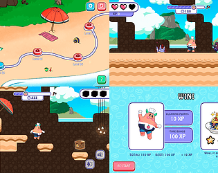
The extra pixelation was not intentonal but a bug we didn't have time to fix. I know it's not the best solution, but you can wait a few seconds until you lose all the lives and the level will end, then lead you to the gaccha, where you can navigate to all the other menus.
We will keep working on the game, so please come back to try it after the game jam rating period ends ^^
Thank you for your feedback!
Thank you! About the evolve button, it is happening only in the build and I don't know why yet, I checked some options and nothing… But I'll keep working on it and all the other details! Specially the gameplay which I already had in mind to be a bit more complex and fun. I'd like to implement various tiles where the player can choose to plant, a compost-making process with a few more stages and a reward system where you get new plants and more money/xp for the evolved ones. Let's see if I can learn enough coding for that!


