Indie game storeFree gamesFun gamesHorror games
Game developmentAssetsComics
SalesBundles
Jobs
TagsGame Engines

Pixelflausen

38
Posts
1
Topics
1
Followers
A member registered Nov 23, 2020 · View creator page →

Creator of

Recent community posts

Day 31: post mortem

Haven't posted anything the last week because I was way to busy with work and there ought to be some life left not in front of a computer screen. ;) I guess that is one of the biggest lessons I've learned this month: Do not exhaust yourself! Althoug the game is pretty small, I invested way too much time in it. Not that I'm burned out or got sick, no worries! I just realized that working every day on making games is not my way. I like to work in bursts because I need to get into some kind of flow which simply doesn't happen when I know I only have half an hour or so before another task will occupy me. That said, here is my overall evaluation of the project:

First things first: The game got finished. Except one minor issue: ad placement on different screen resolutions is probably off. But this is only an issue in the Google Play Store version and should be fixed within the next few days. Speaking of the Play Store: Yes, the game officially available for Android in the Google Play Store which makes me quite happy!

But there are some things that really bother me. The biggest issue I have is that the game is way too small/ simple for the time and effort I put into it. And that's also a main take away from participating in this game jam: Although a game might be of low standards, it still needs good planning. Because if I don't plan beforehand, I'm constantly tinkering with the game play, thinking of this and that to add and might it not cool if... That turned out to be a huge waste of time in the end. If I would have fiddled with the prototype in the first week and then stick with what I had and just polish that, the game would have been completed much sooner and probably be a bit more good-looking.

Speaking of which: The overall design of the game is quite clean and I think it's okay. Nonetheless I'm not satisfied. I'd like to make a game, be it small or not, that really shines, that looks like something. But I guess this is part of the learning curve. I know somewhat decent how to code (but being far from an expert!) but I do that as hobby for years. Design and aesthetics is a totally different beast and takes equally or probably even more experience before it's getting somewhere.

And I also learnt, that there is one thing I really dislike about game developement: Getting other people to play my game. I don't want to bother friends and family who are all not into gaming and finding players out there is way to hard. I don't like to make posts on reddit "please play my game" (they all got deleted anyway, probably because I haven't read the guidelines carefully engough), brag on twitter about silly improvements, take srceenshots and post them to Instagram and so on. I just want to make games as a hobby for myself. But: It's a good feeling when a game get's finished. Really finished. Finished that it actually would be playable if someone happens to play it. So that's another lesson I've learned: Stick with it until it's finished (or come back to it until it's finished). NB: That's a promise for my other games and those to come. :)

Tomorrow I have a day off and would really like to play some finished games of my fellow contestants!

See you all out there and all the best

Alex aka Pixelflausen

Day 24

Did it! The game is finally available on the Goole Play Store with screenshots and a short video: https://play.google.com/store/apps/details?id=org.godotengine.protectat

Things to keep in mind for next time: Give the project a unique name from the beginning. Now I'm stuck with "org.godotengine.protectat" forever as it seems. ;) Not a huge issue but com.pixelflausen.protectat would have been nicer. 

Another thing I need to pay attention to is srceen resolution. Obviously  not all mobile phone come with the same as mine so the add on top might overlay the score and time.  It fit's perfectly on my phone but today I had the brilliant idea to use the Android Emulator and well, it didn't look good. So the ad got moved to the bottom where is doesn't overlay anything. An update which still needs to be approved...

Day 23

Oh, oh, it's getting quiet here. But only here! Protect@ is now in it's final stage. At least I hope so...

The orientation is now vertical, i.e. landscape mode on phone. Because this is the primary device where it will be played (if it's played at all). No one fires up a destkop computer for such a simple kind of game. But I can very well imgaine that someone might have fun playing this game on their commute or alike. 

With the change of orientation comes another burden: Making new screenshots, GIFs, videos, uploading that all... I really dislike those parts of gamedev. I enjoy very much coding, fiddling with small details, even polishing isn't that dreadful any more for me. But uploading pictures, thinking of silly text, cutting video scenes? Nope, that's nothing that will ever be fun. But the work has to be done and I expect it to be done by tomorrow evening. 

For today, the change in orientation is a good milestone and the game is already uploaded to the Google Play Store in this version. Acceptance of the update shouldn't take as long as the initial publication. Maybe uploading screenshots tomorrow will be just in time.

(1 edit)

Day 19

Now that the game itself is in a state I'm quite happy with, the boring stuff slows me down. Which is to put it a decent state to publish it on Android. But nonetheless, it is now available in the Google Play Store, ads included! ;) The store entry still needs some decent entries and the icon is off. Those are the most prominent deficits. 

And I'm thinking about changing the layout of the game once again. Making it playable in portrait rather than landscape mode, would open up the possibility to include an annyoing, ever present banner ad. I'll probably will do that.

I also tweaked a bit the game from before the jam, Catch². I think what I've learned so far about the Android Play Store will help publish this game there, too.

Day 18

Improved the Highscores a bit. Not that they are prettier now but the input should be a bit more comfortable now.

Day 17

Finally back to the game. I've added the dreaded AdMob Plugin. I just don't know what I'm doing and just following tutorials. Especially the process of publishing something in the Google Play Store is a real pain in the back and I understand even less. But it seems to be working! The app got accepted a few days ago and when this more or less final version is online with some annoying ads I'm happy as I can be. ;) Meanwhile you can still play the game here without any ads and it will of course stay this way. ;)

Day 16

Another day of website work...

Day 15

Again a day with not much to show. I think I finaly fixed the CORS issue after just stumbling upon How to win at CORS via Hackernews. What a coincidence that it was on the frontpage! That lengthy article (that I only skimmed, foolish me!) stated that you can just add "Access-Control-Allow-Origin: *" in the header. Seems to work now!

I also worked a bit on my still shitty and very much empty and incomplete homepage. I fear that such a thing is really needed in the long run, not just for devtober. I'm trying to write some articles just about what I learned in Godot, coding and whatnot related to gamedev. Sorry for not posting a link but it's too early for that. ;)

Looks like it is fixed for now by adding a Access-Control-Allow-Origin header. But itch.io is using a CDN and I don't know if that URL is going to change over time. It probabaly is...

(1 edit)

Day 14

The spare time I had yesterday I was trying to get the highscores to work. And failed. Culprit was my wish to get an AES encrpytion of the transfered data to work. As this did not work out as expected, today I opted to at least get the highscores working some how. That is now the case but anyone who sniffes the URL can easily upload a highscore without playing the game... Please don't try and abuse this. ;)

But that put aside, the highscores are working! They are far from pretty and need still a lot of a polish but at least we can compete now! :)

Edit:

Uh... The highscores did work in Godot, do work in the linux export but they don't work in the web export... I see a cross-origin resource sharing error in the web console. Should be fixable, I guess. But I'm too tired right now. Next update then... ;)

Day 12

This week I have the feeling that not very much will be achieved... Lots of day job work is holding me back. 

But at least I put up a database and hacked together a PHP script to load and save the highscores. Although there is no encryption yet and no real display. I hope to get this part of the game finished by the end of the week. We'll see...

Day 11

Nothing to show today, but I'm working on a refined, online highscore system. It consists of a database and a PHP backend which will receive your highscore and display the world's (ha ha) top ten. I already have a working system but it's far from secure in the sense that anyone who figures out the URL could send a fake highscore. I don't know enough about security and encryption to make it near perfect secure, but at least prohibiting the casual packet sniffer should be doable. I'm thinking about a simple AES encryption.

Day 9

Completed the highscores for endurance mode and also changed the stage mode to a kind of tutorial. I'm really bad at "level design" (if you can even call it level design in this case). So there are now just seven stages that progressively introduce different speeds, attack patterns and what not. After you've finished the tutorial you'll be thrown in the endurance mode where you can try to beat your own personal highscore.

Tomorrow, I'll take a day off. For the rest of the month I guess I'll be working on the visuals. I really like to have a glow effect but I'm still unable to produce anything controllable. Either there is no glow or it just overshines everything and the carefully chosen colors (haha) get washed out. Another idea is to bring this game to the Android store — of course with ads. Every shitty game needs ads. ;)

(5 edits)

Day 8

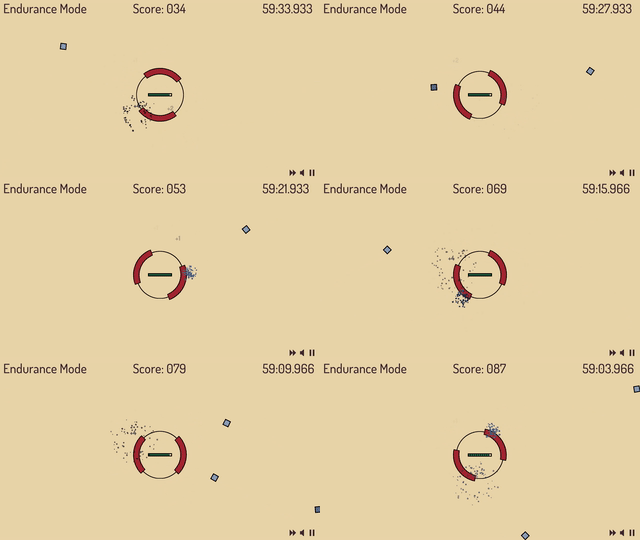
This is a big change! Two special squares were added: a health regen and a spawn timer reset. Those are desperately needed for the also new endurance mode, where you can play the game endless. Well, technically only for one hour but noone would do that, I guess. ;)

The endurance mode calls for a change of the highscore, too. It should only count in that mode where the staging mode could be some kind of tutorial. But that is for another day...

A little change in the sprialing pattern was made, as those squares substantially slowed down when they were near the center. Now the speed stays the same.


PS: Now also available as a download for Linux and Android. Why not when it's just a click away?

PPS: Could not withstand to change the highscores. :) They are now only available in endurance mode. This could potentially break the game at the end if you've already played it and your browser has a save file stored...

(1 edit)

Day 7

Happy birthday Protect@!

You're now one week old and doing great! Today I added a variation of the attacking enemies. They now might come in spirals which was really tricky to accomplish for me. First I wanted to compute the spiral pattern by myself and failed miserably. Then I had an insight: I only need to let the squares circle around the center and give them an ever so slight nudge towards the center. And the circling was also done without any calculations. I just added a pivot point in the screen center as a parent of the squares. Rotating that point also rotates the squares. Hooray! But it was a struggle and I'm pretty exausted now...


My lesson of the day: Don't rush, don't overdo, take brakes. That said: Over and out for today. ;)

Day 6

As suggested the style got cleaned up today and it's a bit more uniform. 

Also there was a silly bug in the spawning code that got fixed.:It could happen that very few or even no enemies at all would spawn in a level. The origin of this bug was a routine that checked if a square is still on screen. If it wasn't, it got deleted. And with the change in aspect ratio I changed the spawning regions so it could be that a square spawned off screen... 

The lesson to be learned here: If you include code from another project (the spawning was taken from Catch²), make sure to check if the logic still applies. In this case it was of course not the case. All squares fall to the center of the screen and either get destroyed by the paddle or when hitting the circle. So they could never be outside of the screen (if not spawned there) and therefore never need to be deleted.

Thanks for the feedback and the kind words! Sorry for only one enemy spawning... That obviously was a silly bug that got fixed today. But it's still very repetetive, admitted. But that's going to change in the course of Devtober. ;)

Thank you very, very much for the input! :D

Actually, there is some variation between the stages. The squares are spawning ever so slightly faster every few seconds. And depending on the stage the initial spawn time varies. But if it's not really noticeable then I should definitely tweak that. In the last stage you also get a doubled paddle/ shield. And I already thought about making the paddle smaller or bigger. I was also thinking about different enemy types or bonus/ malucious squares that would trigger different shield types, explosion of all squares on the screen and what not. Different attack patterns though didn't come to my mind, yet. Great idea!

And lo and behold, today I played with glow effects of paddle and squares that illuminate a darker background! :) Haven't touched those effects ever before and still struggle a lot with them. But I agree that the visuals can be much, much more improved. Besides level design that's my weakest point. So I even more appreciate your suggestions, which are really very helpful! 

Thinking about it, I totally agree on not mixing styles. Font will be exchanged. And considering the rest: October just has started. ;)

Thanks again and having a look at your other games: I'm definetly learning from a master of the art here! ;)

Day 5

Another day, another update. I realized that the cheat code doesn't seem to work when you play the game in the web browser. Although with Godot it's not a big deal to make it downloadable, I'm hesitant. The game is too silly that anyone would install it on their computer. At least I wouldn't. ;)

But the game was not only stripped, no! I got rid of the pixelated look. Because why would you need a pixel art style when there is no art? ;) Together with the change in resolution I opted for a different aspect ratio (16:9) to make it a bit more mobile friendly. But still, the sound on mobile is so awful, it's no fun. Turn it off. The game has a switch for that.

Last addition was a local highscore system. The game just saves your top score and stage in a file. If you beat that, it get's overwritten. At least that should work on HTML. 

Have a look at it or play it for yourself! :)

Man! Unbelievable! I wish I could. Not only make such games, but solve it. Stuck at level 17... ;)

My two cents for improving this game: If I have more than one action I want to click another atom while the electrons are still flying. And although the music is nice after a some time (and I spent a good amount) I wish another song would come up.

A question: I always struggle withwhen it comes to creating puzzles. How do you make levels? Thinking for hours? Using a clever algorithm? Or are you just one of those who just invent them? ;)

That looks awesome! If you need someone to playtest, let me know! :)

Day 4

Today new SFX were added. The old ones were just plain awfull. And speaking of sound, the game now has some nice background music from Zen Man. Besides sound a little screenshake makes the game play a bit more appealing.

And a very special addition was made: cheat codes! If you figured it out, you can play the game without dying. But I won't say a word how to activate the god mode.  ;)

Day 3

We now have colors! And different squares with different points! Whoa!

It's coming along but adding the different square types was kind of hacky. I'll have to redo this the next days, to keep the code clean and manageable.

Day 2

Added a scene manager and a staging system, aka levels. But as there is not much to change in level design, I opted for goals that need to be achieved to progress to the next stage. With every new stage there will be slightly harder to reach goals. 

Currently there are only 5 stages who's goals are expected to change. But of course you may try to beat my personal best of 69 points at stage four. ;)

Day 1

A quick prototype was finished after just 3 hours. It's barely playable but I'm astonished that I got that far that quick!

Thanks, mate! Appreciate it! Especially your comment about the design. I always struggle with the looks. That's why I opted for just squares. ;)

But, the game is already addictive?! Well, then I can call it a day... ;) Na, just kidding. Although the game concept is fairly simple and limits what can be added, there's still much to do that will make it even more addictive (or better: engaging). At least I hope. We'll see at the end of the month. :)

Guess, this here also counts as social media? ;) Although, I do post at Twitter, too. And then there is my newly set up website. And Youtube, not to mention Instagram. TikTok and whatnot... I'm already overwhelmed and can't bear to post everywhere. So I stick with this community and Twitter. The rest is jus bonus... ;)

Unity was to bloated for me, I couldn't get a grip on it. But with Godot on the other hand it just clicked. Give it a try. GDScript (their scripting language) is not that uncommon or hard to pick up if you're already familiar with C++ and Java.

Devtober is all about simplicity, I guess, so go ahead! :) Although I don't think platformers are that easy. But that's just my opinion. ;) Looking forward for your contribution! :)

This looks amazing! Do you consider publishing for web or linux as well? I'm not on windows... :(

(3 edits)

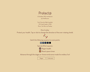
Protect@ is a hyper casual arcade game. Your mission is to protect the screen center from the falling squares. In every stage you have to fullfill a goal, like staying alive for a give amount of time or making x points. With every stage you complete the goals are harder to reach. 

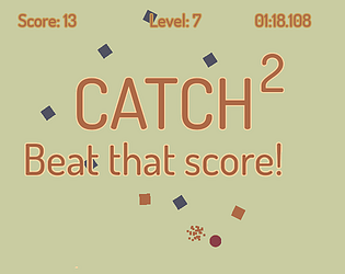
The primitive game play is kind of a sequel to Catch² where the square are falling straight from the top.

Trying to post daily updates here.

Like the simplicity of the objects and the glow. Oh! And the sounds are a good choice! :)

I just don't get it. What am I supposed to do?

Very much much a clone. ;) I'm missing a health bar and some clear indicator that the game has restarted. I only hear slaps in the face. ;)

I like that cute kitten! :) 

Haha! That's a nice idea! 

Unfortunately I have a non-standard keyborad layout (neo2) and can only type with all my fingers on the keyboard. Having one hand on the arrow keys I'm not able to press the right color keys. 

Maybe adding a configurable WASD-movement can fix this? Then at least I could leave my fingers all where they belong on the keyboard. ;)

Saw the video on Reddit and it looks quite nice! I'd really like to play it but it doesn't run in the browser on my phone. WebGL context lost is the message...

 Ah! But the APK does work!

Like the mechanics a lot and also the bouncing sound. Nice choices! But I don't get what the power (?) bar is for when you place an orb.

Thanks for playing and leaving a comment! Appreciate your brave effort! ;) 

Some decent levels and a little incentive to try again will be added soon.