Indie game storeFree gamesFun gamesHorror games
Game developmentAssetsComics
SalesBundles
Jobs
TagsGame Engines

Przemyslaw Jelonek

28
Posts
19
Followers
6
Following
A member registered Mar 20, 2023 · View creator page →

Creator of

Recent community posts

Hey! I was actually thinking about allowing extra spell charges by developing a special skill later in the game or something like that, I think it's a good idea overall :). This game will be in a development for a long time yet, so there's plenty of room to explore possibilities.

Thanks for the recommendation to take a look at Tetris Gaiden Battle, I will definitely check it out!

Oh, you're absolutely right, tutorial was broken due to recent changes, I completely missed it! Working version has been uploaded already.

Sorry for the inconvenience and thanks for letting me know about that bug! :)

This game has potential, but unfortunately it's very unpolished at the moment. I can imagine myself playing it on the mobile device (do you have plans to make it possible?), but for now it's definitely too hard to play.

Music and sounds are interesting. I like the idea of overheating the weapon. Graphic style have some charm to it too, somehow reminds me of older 3D games.

Like others before me have said, camera controls feel weird, it's very slow and I couldn't even turn around fast enough when someone was shooting at me from the side.  I also had strong impression that there's some delay.

The issue for me was also that if we press movement keys when shooting and then we stop firing a weapon, our character will stay in place. I think it would help a lot if you check if player is holding movement key right after we stop shooting.

Retry button after losing didn't work.

During the talking with NPC I was confused and I thought that the game froze, because there was no "Enter" button listed in the controls. I think that letting players proceed with the interact ("E") button too would be intuitive.

I believe that the player's weapon is too weak, I think the whole magazine wasn't enough to put down one enemy, when they could defeat us without stopping even for a moment. It would be nice if our gun was stronger, but if you don't want to do that, maybe you should at least make enemy weapons overheat too?

Enemy AI seems a little off. Sometimes they don't see us even from quite close range, while other time they can shoot as from very far away. I think that complete lack of reaction when we are shooting at them is weird too. I would consider changing it so they can see us only from closer distance. They could also react to our shots even from far away (maybe even after a few seconds), starting to shoot at us. It would encourage hiding and getting to know enemy routes, so we won't end up too close to them because it would be too risky.

General idea is fun, but it needs a lot of improvement. I believe that you will be able to repair it, I will check it out again in the future. Good luck :)

Hi! I just finished testing your game. The idea is really cool, just the game itself needs a lot of polishing. I am aware that it is still an early version though. I believe it will become a fantastic game over time.

Demiurges was fun to play despite the large amount of small flaws. I will describe them to help you get rid of them.

For a start I'd like to say that the atmosphere was very special - gloomy, but awesome! I like a lot the world you created, projects of heroes, units and town. Making fragments of the map connecting to form a one bigger place is a nice idea too.

I'll talk about map graphics now. Gentle mist around the obstacles are really nice to look at, I watched it for a while when I spotted it, haha.
Unfortunately, many places (at least on the first map, where it's quite dark) blend with each other. I think the issue is a small variety of brightness in colors there. I would recommend you to follow this advice: you can take a screenshot and paste it into a drawing program (like Krita - it's free and I personally use it), then decrease saturation to make it all in the shades of grey. That way you will see much better which elements needs to be more separated.

The music is very unique, gives the game very gloomy mood. I assume it was your target - the world is doomed after all. In that case music works really good! The only things I would complain about is that it lacks a variety a bit and that there's no separate battle soundtrack.
When it comes to other sound effects, I loved them all.

Overall I like UI, but there are things I don't understand about it. For example, animation and style of the left upper UI is very nice, but I completely don't know what's it for.
I think it wouldn't hurt to add some background under UI, even transparent one. When we are in the town resources indicators are a bit harder to read.
On the other hand, the whole UI when it comes to cards was cool and understandable for me.

I would love to be able to recruit all the creatures in one place in the town and I would really like to read about them before recruiting (I didn't see that option in the recruitment menu).

This game desperately needs a tutorial, but I guess you already know that.

Boss was much easier than I thought, I think you could make it a bit more difficult.

I didn't see the option to run from battle, maybe I missed something?

One more thing: I think that drawing a card would work better after we close the window showing us the time left.

It was a fun game, the concept is really awesome, it "only" needs a lot of polishing.

Same as here and on Twitter. I was active on the welcome-mat channel for a while when I joined, we must have missed each other. :)

Ah, thank you for taking the time to play and leave this comment, it really means a lot to me!

I'm really glad you enjoyed the game! What makes me especially happy is the fact that you liked the art so much, this is what I have the most experience in. However, I will definitely improve it a lot - most of it was done roughly, in order to build a demo faster.

By the way, I also want to thank you for something else! I followed your advice and joined the Indie Questing Discord server. It's a really nice community with lots of familiar faces, it was a great decision. :)

Thank you very much, nothing makes me happier than knowing that people enjoy my work! You're breathtaking! :)

Sure, the bug that lasted until the next fight was caused by the skeleton enemy, but it happened with other type too (it just almost instantly fixed itself... or maybe I got to the next fight so quickly that it made me remember it like that). Unfortunately I don't remember the second one.

I was battling a lot (I played for around 2 hours) and it happened only these two times.

Well... My brain didn't even registered how the defend option works, so... :'). I used it once out of curiosity, nothing more. Probably my character was so powerful that I didn't need it (I invested points in everything except the defence).

Battles have their charm, no doubt about it. They definitely feel chaotic, but most of the time they are understandable.

Hi, I just finished your game!
I died in the intro, would recommend.

It is funny, I enjoyed these silly jokes a lot. I like the overall setting and atmosphere in this game too :).
Gameplay loop is simple and quite enjoyable.

In battle, I never used the "defend" option. Combat felt a bit spammy, but I believe that the complexity of it is not the main focus in your game, so I didn't mind at all most of the time.

Level design is nice! I only had a problem with getting to Vampirelle because of completely hidden buttons and I was wandering around the whole map for about half an hour looking for something I missed.

Art design is simple and colorful, perfect for this type of game.
Sound design fits it too.


I experienced two bugs:

- twice after the fight (won) I was able to move around, but there still was a combat going on on the map and there was no battle menu active or anything, only an enemy icon moving in the right upper corner of the screen. Every few seconds my health was decreased from attacks. It lasted until I won another fight, even changing the location and resetting the game didn't help.

- once after loading the save state, music didn't start playing automatically untill I got into a fight


Some smaller issues I had:

1.Combat felt a bit rushy, sometimes it was hard to catch up with what's going on, but I feel like it'd be tiring if it was slower. Probably the main issue in this is that you have to constantly look at all sides of the screen to see what's happening.

2.Completely losing the game after losing all the health - maybe it would be a good idea to bring the player back with, for example, 5 health points and 1/2 of shards after such event, similar to when we lose all TP? We can still load autosave, sure, but I feel like this solution would fit the game anyway.

3. The code shown at the end of the game was already used, but I don't mind - just thought you would like to look into this issue to prevent others from encountering it.


I had a good time playing your game, really good job:)

It was a pleasure! :)

Yes, I suppose it wouldn't hurt to move EXP to the upper left side, there are not many informations in the HUD anyway. All of them would be gathered in one place and I think it would make it easier to see and read (unfortunately, I can't do that for my game because there are too many things to show the player).

Do you mean some Discord? I have to say that I've never tried using it, but maybe I should try it sometime. Until then, I'm available on the Twitter every day :).

I will be very happy if you try out my game. Can't wait to hear your opinion about it!

A wonderful and very polished game, I give it 5 stars in all categories!

It is really engaging and has some nice, surprising moments.
Both the sound and the graphic design create a great atmosphere.
Small things (like footprints and sounds) help a lot to bring the game to life.

There were just a few things that I'd like to point out:

- In the combat part of the game I encountered a bug. I was dashing through one of the rooms in laboratory when "Loading Error    Failed to load: img/characters/!Bot_00_Broken_dash.png" message popped up. It was popping up every few seconds and blocked loading of the next room. Restarting the game helped.

- changing targets in battle wasn't very intuitive for me - left and up arrows switched the target to the lower enemy, and right/down arrows to the upper one. I feel like it would work better reversed.

- I think that putting EXP count in the same corner as the rest of the HUD would work better. I found that that number is shown on the screen only after defeating the Brute, I didn't see it earlier because of this.

Despite these few small things I don't hesitate to give it the highest rating, this game definitely deserves it. Really great job! Wishlisted. :)

Thank you, I'm really glad you enjoyed this game! :).

Yeah, the combo effect graphic is an ugly placeholder, it will be changed eventually.

Hmm, I'm curious... Do you mean to rotate it by 180 degrees with the UP arrow? If so, I think it's a very interesting idea and I will definitely consider adding it to the final version of KoD!

I hope you'll have fun. :)

Oh, I think I understand now.

It was indeed my intention to leave the players to experience the game and gather informations on their own, so they can slowly start to understand the game as they learn more. I, personally, kind of like that way of learning, but of course it's not ideal for everyone.

I'll try to balance it a bit thanks to your feedback by adding some guidance at the beginning, when the game is played for the first time. I think the message will tell the player to wisely choose enemies they want to battle, to learn about new tools and utilize them and to gather enough strength to progress through the portal (you would find it if you follow the path). It should be enough both to give the player at least some directions and not ruin the way I'd like them to experience the game.

Story wise, as I mentioned earlier, I think that infos from the intro cutscene I'll add in the future will suffice, but for now I have to leave it as it is.

That said, this game is quite complex, which definitely sets a kind of barrier for a new player. Only by learning and memorizing new mechanics and content we can make a meaningful progress. It can cause a confusion and frustration, but I am careful not to make it a "tutorial festival" too.

I will try to make it more player friendly eventually, for example by using special animations in tutorial and by using popup windows when some of mechanics are encountered for the first time. I predict this game to be in development for about a year or more, so it will change a lot for sure.

Thanks for providing more details, it's the first time someone brought that issue to my attention, so it definitely helped :).

Hello there!

Thank you very much for those kind words. I'm glad you like the UI, it's really nice to hear.

Wow, I didn't know you streamed it, it's awesome. Sorry that my game led to a ragequit right after the tutorial, haha! Still, it was very fun to watch. :)

(1 edit)

Hi, thanks for comment. 

I watched the recording of your stream, but I didn't exactly get what the problem was. Let me make a few guesses in that case, maybe one of them will be accurate.

1. While watching the stream I felt like you would like this game to have more story, be a bit more linear, maybe that's the problem? In that case I'm sorry, but it was never meant to be a story heavy game (although some more story will be added in the future), it's just a roguelite sandbox, where I wanted to give players basic informations and let them explore the game on their own, learn about it and utilize new toys during subsequent runs. Bits of the story and informations about the goal of a game are provided in the first dialogue - there is a lingering, unknown danger and the hero is the one who must lead people out of those dying lands.

2. If the problem was a confusion about mechanics - I saw that during the stream you mentioned things that were actually explained in the tutorial (player health and consequences of losing a battle, hero and enemy power, creatures utility, etc.). That makes me think that maybe I should find some other way of explaining these things, like highlighting them during the tutorial talk to make it more memorable.

By the way, you should be able to find some answers in the compendium, the button is on the side bar. The goal is described on the first page of it too. However, if the problem was the absence of the story... I'll add an intro cutscene to this demo in the future, but I have a lot of other things to upgrade before I do that.

Please tell me more about the issue, if it was something I commented on or maybe you just didn't like some of the ideas/mechanics (which is perfectly fine). It will help me find a solution.


I know that it's a niche genre combination and requires specific mindset to enjoy it. Additionally, it's not meant to be played from the beginning to the "definitive" end in a single run. I would like to use something like The Binding of Isaac as an example of similar approach - in such games you discover, learn and repeat while slowly mastering the game.

I hope I clarified it a bit for you. I also hope you'll find some more value in it sometime and give it another try with these things in mind. :) If you have more questions, feel free to ask.

Hello there, I just finished your demo, it was really fun!

I like the art style and the sound design a lot, and the whole game idea is very nice, I enjoy that type of puzzles.

You did a really good job, so I have only a few bits of feedback for you.

1. Healing water placement is a little bit punishing in the middle game, the second one feels like a secret. I feel like adding at least one more of them and placing them in less hidden spots would be fine. It is important because some rooms require the player to return to the respawn point to heal. However, the teleport system did a great job in the final part of the game.

2. Some things (very few) could be better explained, like differences between weapons. A window with a short description that pops up when the weapon of given type is picked up for the first time should be enough.

3. It could be a good idea to make boss copies a little bit more distinguishable (maybe some phasing effect?). Sometimes the boss is pretty far away and if we spend too much time searching for the right one we may not be able to reach him.

4. I think that I found red clothes at one point, but they didn't show up in the menu, so I couldn't wear them.

These are the only things that I can think of now - all the rest is fantastic. I would definitely play it more sometime.

Introducing additional tutorial systems during the game is a really good idea, I'll put it on my list.

Thanks to you, I learned a lot about how systems implemented in KoD can be interpreted by new players :)

Thank you for such a positive comment. The fact that you enjoyed King of Deadlands already makes me feel fulfilled as a game developer, although I still have a long way to go :).

Hi, I just played your game!

I definitely had fun. Gameplay is rather smooth and the atmosphere is fantastic - sound ambience you chose really fits here in my opinion. I do not play horror games at all, so the whole experience was something new for me. I'm curious what will happen after the events presented in the demo!


I'll try to give you some feedback:

I experienced a small bug, but didn't manage to replicate it (I tried once again). When I first entered the room, after putting down the camera and clogging the sink, "Pick Up Camera" button disappeared. It was shown only when I pressed Tab or when main character was talking. Second time there was no problem. However, I think this button sometimes showed up at the wrong moments. It's not a big deal, just wanted to drag your attention to it. :)

I really like the mechanics of changing the camera, but I think that putting it down and picking up takes a bit long, and if we do it over and over again it starts to feel "clunky". I thought that maybe simply shortening (or cutting  in half) the animation duration would make it feel more fluid and enjoyable. It's not that important to make this one's pace so realistic, right?

When I got to the sector 2 hallway door, upon using it, my character turned around by 180 degree and only then transition begin. The second time I played Riley did the exact same thing.


These are all just small things - I enjoyed a whole demo nonetheless, it's pretty engaging and it would be a pleasure to have more of this experience in the future! :)

Hey there, Crab Raid Tactics are getting better and better!

I especially enjoyed the boss fight, it was fair and fun, just maybe a little too long for a first boss in my opinion. I had a healer, a tank and only one solid damage dealer, probably teams more resolving around attacking abilities would defeat him a lot quicker, I will test it later!

Here's what I caught:

I had to play Crab Raid on low graphics settings, initial settings caused my PC to overheat in the menu (it's not-high end, but I played Elden Ring on it with low graphics). It was set to EPIC on all, but maybe it shouldn't be the default choice if it requires a very good computer? :)

I found that when I set a higher resolution than my monitor could handle (I set to 1920x1080, my max screen res is 1680x1050, which sadly wasn't selectable in game) crabs were moving to wrong places (offset to left and upwards), even though movement arrows pointed to the correct place on map. There was no issue when I set resolution to be lower than 1680x1050.

In terms of gameplay, I don't think I have much new feedback.
There's only one thing that comes to my mind, something that GameGushGamer mentioned on the stream - when one of crabs leaves the raid, the keys we use to select specific crabs may change. If we got used to them during the raid it might be difficult to control the party right away, especially in the heat of battle.

Overall it was fun as always! :)

It's a bit complex for sure :). Anyway, thanks for checking out my game!

Thank you for your kind words, I'm really glad you're having fun with King of Deadlands!

These are "flavor" sounds that start to play when the object is visited. They repeat for a while, apparently for a bit too long (like the wind sound that you noticed - it came from the Magic Tablet).

English is not my first language, but typos will definitely be corrected someday :) .

Thanks for comment once again!

Hi! Happy to see you here too, glad to know my tweet was of use :). Thank you for checking out current version! I'm going to start reviewing games in a few days, I'll try out yours as well (I hope I'll defeat a boss!).

Let me answer to your feedback :)

  • I actually plan to make the tutorial a little bit more expanded in the future, but it's great to hear that it makes understanding rules easier already. I'd like to leave some things out of it (like Lesser Artifacts), but it definitely needs at least some changes.
  • Good point! I wanted to tell you that I am aware of this issue - I want to balance it by adding two other types of cottage, each of them built from just one resource, but with more quantity needed to place it than a cottage built from mixed resources.
  • That is a great feedback, I think I'll add a preview with the description somewhere on the screen when the building is chosen : ). It should clarify the way they work.
  • I'll definitely take a closer look at the part between 10 and 20 power, I intentionally gave a player some ways to deal with such situations, like potions, guilds etc. , but I'll be sure to check if it needs more balancing :)
  • That's quite new, didn't think of that! Maybe investing in Technology would be a good idea then? It not only reduces the cooldown if you have enough of it, but also helps with building and keeping the combo. There's another way to do that - Wisdom ability, it gives you 15% (and then 30%) increased spell charging. I want to make sure that player will not be spamming the spells, but maybe it (or enemy abilities system) really needs some rebalancing - I will consider it for sure.
  • The thing with a Fortune Teller is that it is quite risky, but can give you really nice bonuses (and it's relatively cheap when compared to other places in the town). So it's a place for gamblers... : D. I should make it more clear! And maybe I should clarify that you can still use that place even when the crystal ball breaks :)


Thank you so much for your feedback, it was really helpful :). I'm glad you like where the game is going!

Hi there, thank you for awesome feedback as always

  • Some kind of effect when hovering over clickable icons is a great idea, will definitely implement it in the future (if I don't change this system to tooltips, but I wanted to keep it consistent with a mobile version, at least for now).
  • Thank you for pointing it out, I just moved this arrow a little bit up and will be uploading this version immediately!
  • You're right, I actually plan to expand this tutorial at some point to cover more mechanics, but I chose to focus on upgrading graphics for Lesser Artifacts first (they badly need it!).


I'm really glad to hear you're enjoying it even more than before! I wanted to keep spells count relatively low (13 at the moment), but I think I'll add few soon, especially for you :)

Referring to the last issue you pointed out - it is highly possible that it was due to the randomness, but it could also be because I wanted to make the map management feel like a puzzle sometimes, where you have to look for the best option for that specific moment, maybe even one that is seemingly a bit "too hard", to add some difficulty ;). Anyway, I'll make sure to test it more.

Thank you once again! :)

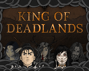
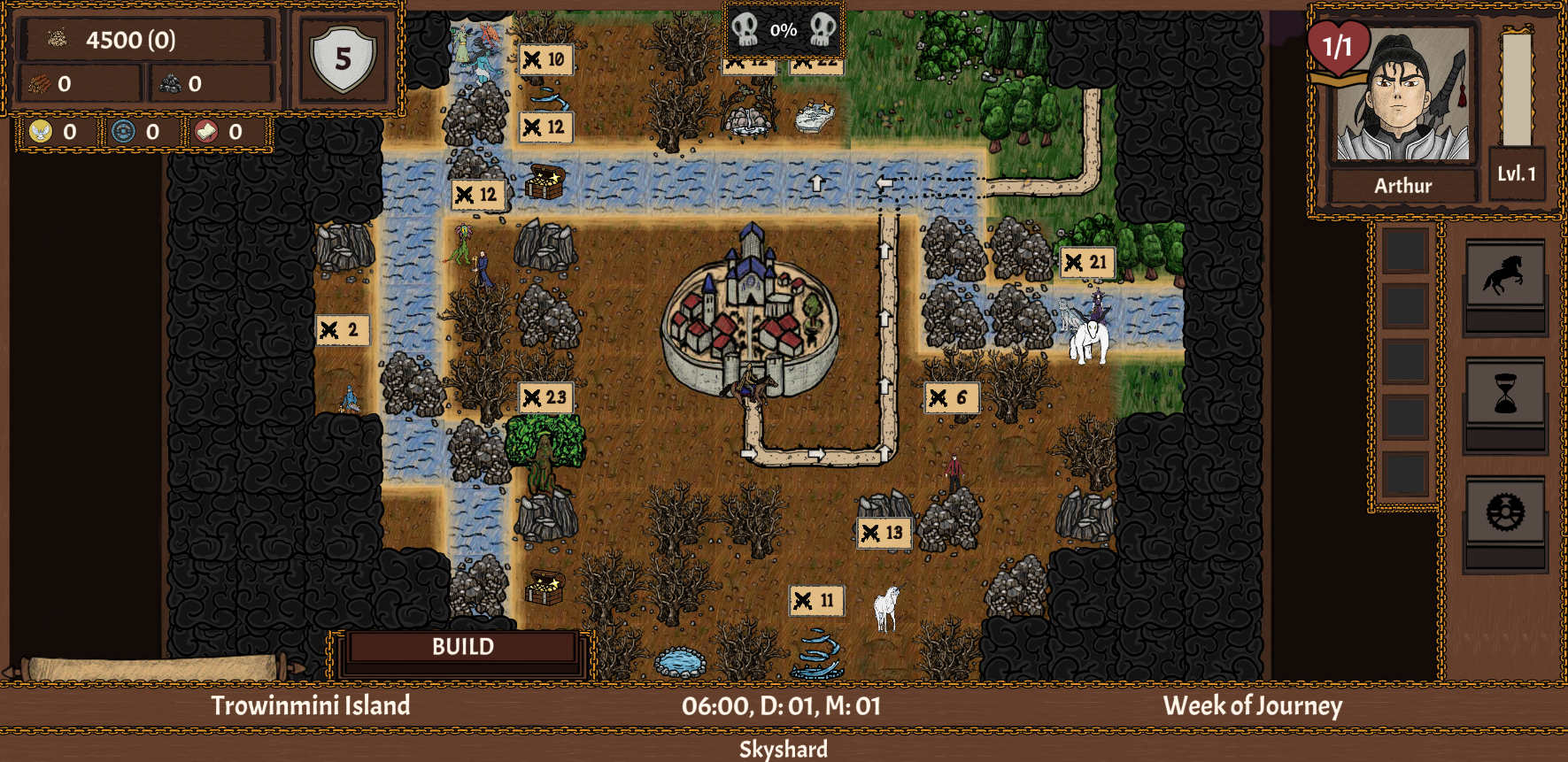
King of Deadlands (Demo)


First of all, thank you for playing and leaving feedback! I'm so happy that you liked it! :)

Good points you have there, let me reply to them:

Controls tutorial - you're absolutely right, I was thinking about doing special tutorial section where you could learn through gameplay, but it consumes time and effort and I couldn't wait forever with releasing this early demo, so I've chosen to make only an in-game compendium and text signs in battle. Definitely will do that later!

I'll note your point about the ship, it's interesting. However, I need to think more about if implementing it will fit nicely with what I want to add to King of Deadlands later. Maybe, maybe... :)

Regarding art - I'm really happy you like the effect of my efforts! The graphics are to be reworked in the near future, I will focus on that first. The thing with many of them is similar to control tutorial - I had to make them in fairly short amount of time. First things to change are Lesser Artifacts, units and "dead" parts of a map (which are just greyed out places now).

Thank you very much for such a constructive comment, I hope you will play it again sometime!