On Sale: GamesAssetsToolsTabletopComics
Indie game storeFree gamesFun gamesHorror games
Game developmentAssetsComics
SalesBundles
Jobs
TagsGame Engines

RedMarsDigital

10
Posts
3
Topics
22
Followers
2
Following
A member registered Jan 22, 2018 · View creator page →

Creator of

Recent community posts

Hey, thank you so much for taking the time to give feedback - I'm so sorry I only just stumbled onto it! Evidently I need to take a look at my notification settings...

I'm really glad you enjoyed the game, despite the rough edges. Every bit of your feedback is totally valid, I completely agree with all of your comments. 

To be honest the last couple of weeks I spent making the game ended up waaaaay more rushed than planned, because midway through the project I was offered a new full time job. So instead of being able to take my time to give things that final polish, send out to some playtesters, etc, I ended up instead just rushing to draw some kind of line under it all and releasing it to get some closure ahead of starting the new job. I basically sank 6 weeks full-time into developing this, and although it was an insane amount of fun, it was never going to pay the rent!

At the time I published the game, literally nobody else (except my gf who was sick of the sight of it) had played or even seen it, which I now see is a massive rookie mistake. When you're totally immersed in the code you kinda forget that everybody else is coming at it with fresh eyes, and stuff that's totally obvious to you may well be completely opaque to everyone else. That's an early step on the  game dev learning curve I guess!!

Anyway, excuses aside - the big issues you've identified are all on the cards for tackling in a major update, whenever I can find time to make that happen:

  • Add a mini-map, and / or some sort of helping hand (pointer arrows?) to guide towards the next 'objective'
  • Have all interactable objects / scenery make themselves a bit more obvious (eg by pulsing or flashing)
  • Blood splats / flashes to indicate successful hits on enemies
  • More differentiation to weapons / helmets, and for it to be more obvious what the differences are (nb there's currently a pretty weak 'elemental' style mechanic going on here, in which some weapons give significantly better chances of critical hits against some kind of enemies - and ditto for the helmets, which prevent critical hits on you from certain types of enemies - there are also a couple of other hidden mechanics with some types)
  • A pretty serious overhaul of items & pickups, particularly mushrooms (nb the 'invincible' mushroom effect gives a 50% chance of negating any damage you take while it's in efect - there's a metallic 'ching' sound effect when this is triggered, like a sword bouncing off armour - so now you know!)
  • ...etc (loads more ideas than time to code them)

Thanks also for flagging the glitch - not something I've seen myself yet but I'll try to replicate and squish it.

Anway I'll stop rambling - thanks again for playing & giving really constructive feedback, cheers!

Robin

This is now resolved thanks to the amazing itch.io admins finding the bug in my shonky code - game should work fine in the app now :)

Oh man, I knew it would be something fishy in my code rather than your excellent app! No idea how that slipped through. Thanks so much for posting back and sorry to waste your time! Owe you one :)

Just a warning to the people who have downloaded through the app - it looks like there's an issue (not sure if it's with my code, or the app) that is preventing weapon 'swipes' from being displayed. Being able to see these definitely helps! 

Until I get this sorted, I'd recommend playing in a browser - I suggest Chrome, Firefox or Opera.

Hope people are enjoying the game!

(1 edit)

My project https://redmarsdigital.itch.io/baronbackslash uses a series of html canvas context methods to render weapon 'swipes' in-game:

  • .moveTo
  • .beginPath
  • .arc
  • .lineTo
  • .closePath
  • .createRadialGradient
  • .addColorStop (x2)
  • .fill

The coloured arcs this series of methods creates are rendered fine in Chrome, Firefox and Opera (nb I'm not supporting IE at all), but are not being rendered at all in the itch app. As far as I can see everything else in the game displays fine and is working perfectly in the app. 

For reference - screenshot from Chrome:   ...and the equivalent from the app: 

This isn't entirely a game-breaker, but there is a rock-paper-scissors 'elemental' aspect to weapons / creatures, where different elemental attacks display as different colour swipes - so if this visual cue is absent it does have a signifcant impact on the game.

Any ideas anyone? Thanks in advance.

Also, apologies if this isn't where I should be posting this sort of issue, I'm pretty new here :)

"you spent a lot of hours developing it. "

...you can say that again! :)

This is my first attempt at making a game, and 2 months ago I didn't have the first clue how to go about any of it. Figuring everything out and getting this far basically swallowed up my life for 6 weeks - so I really need to take a break before I think about adding anything else!! I've been dreaming about pixel skeletons for the past month, which can't be healthy.

Thanks very much for checking the game out, and for the suggestions! 

Different enemies react in different ways to damage, but it varies by 'species' - some will always jump away when they're hit (such as the little green goblins and the slime creatures), but others will just take it in their stride and keep coming at you. There is an audio indication of a successful hit on *almost* all of the enemies, but I'll certainly think about adding a flash or something to give a visual indicator too... I know what you're saying, and I was planning to add blood splats - but just ran out of time to implement them. There's a lot of non-essential stuff like that on the 'add if I have time' list!

As to health bars, I personally quite like the uncertainty of not knowing how many more hits it's going to take to bring something down. Health gauges totally work in some games, but for this kind of style I think I prefer keeping it a bit mysterious. Certainly the games that have been the biggest inspirations to me (mostly the Binding of Isaac & Nuclear Throne) don't have health bars, and it works great in their case... will definitely give it some more thought though :)

Anyway, thanks again for playing & taking the time to give feedback!

(1 edit)

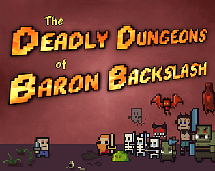
A fiendishly challenging pixel dungeon escape game. Can you defeat the dastardly Baron and escape his dungeons?

https://redmarsdigital.itch.io/baronbackslash

Inspired by perma-death hair-trigger action classics like the Binding of Isaac and the equally superb Nuclear Throne, this game calls for quick reflexes and careful timing to dodge attacks and take down the dungeon's evil inhabitants. Keep an eye out for useful gear to collect - it could just maybe give you the edge needed to survive...

Baron Backslash runs in the browser, needs a keyboard - and is completely free. The game is currently in a final release state and playable through to completion, but I have plenty of ideas for extra creatures, levels, bosses, dungeon variety, items and surprises that I'd love to add if there is any demand for it. So if you enjoy the game, please consider sharing it - and leave a comment to encourage me to add more content!

Good luck, Anonymous Victim...


Thanks very much! It's inspired by tough-as-nails permadeath games like the Binding of Isaac and Nuclear Throne, but with shooting transposed to melee combat. I've quite possibly over-done the difficulty level though, the mechanic isn't easy to master... although I guess that just means more kudos awaits the first person to beat the game and escape the dungeon!

(2 edits)

Thanks so much for sharing this incredible tileset, it's really awesome! It's got so much character. I've used it extensively for a html5 game (my first attempt at making one) which I've just published at www.baronbackslash.com. Hope you enjoy it :)