Indie game storeFree gamesFun gamesHorror games
Game developmentAssetsComics
SalesBundles
Jobs
TagsGame Engines

RobertChen

12
Posts
24
Followers
1
Following
A member registered Oct 24, 2019 · View creator page →

Creator of

Recent community posts

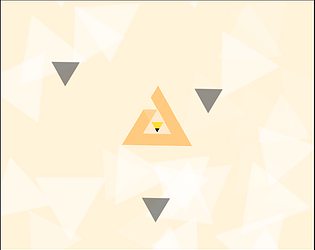
This is a great experience which also teaches me a lesson over stars. The idea of using triangle particles as hydrogen gives the game a unique visual identity of sharp and simple. The sprite for the stars looks cute and cartoonish. The changing chunky texture for the star is beautiful. However, they combined very well. This is a very visually appealing experience. 

I do hope the game gives players more response when the players click and drag. It can be visual or sound. Other than that, I think the game is perfect. Unique Idea for the prompt and very well executed.

Very polished and well-designed clicker game. The visual is very stylish. The juice is moderate and serves its purpose. I do hope the game gives more feedback when players successfully click on the robot and on the alloy. Especially later in the stage, it is hard to tell whether I performed the click. Personally, I really enjoy the bomb robot that drops a bomb after death. It is very satisfying when the bomb explosion chains together and clears a lot of robots. Really hope there can be more enemies designed with similar mechanics. Also, I hope the game can display the current damage of my attack and enemy health, etc. Overall, an impressive game done within a week, the craft and design are very strong.

Very beautiful pixel art. The changing background and the moving curtain looks amazing. I do wish more elements in the room can also have animation. I also noticed the shape of the frame and the layout of the button kind mimics the Tamagotchi. In this way, maybe change the button to look like a Tamagotchi button. Also, maybe the game should give players some visual feedback when they click the button. It can be some star particles that appear, etc. I enjoy the game a lot, it is a very soothing experience.

Great concept. I love the anomaly caused by the ghost. Just the object moving with no ghost appearing, having to use a camera to capture the ghost is a great mechanic. The animation for the anomaly feels on point and adds a lot of flavor to the game. There is a lot more to explore with this system. 

At the same time, I do feel like the resource management economy part of the game feels relatively weak compared to the ghost camera mechanic. They feel a bit tedious to manage, while they serve as a huge part of the fail state of the game. 

A very unique experience and polished game. Good job.

++++very polished game for every aspect(visual, control, juice)

+ the changing pattern of background, changing levels, and other effects combine well with the music. 

One thing I do notice as an issue for me is the orange color bar. First, it is the only orange color thing, everything else in the game is black color. It feels too much visual impact for a minor element of the game. Second, I personally feel it is very hard to dodge spikes after bouncing off the bar. I would advise having a safe zone near the bar to not spawn any obstacles. 

Overall very impressive game, well executed for the one button prompt. 

+ Great humor

+ Very solid game mechanics for a comedy game

+++++ There is no winning state. Just either get fired or become depressed. The only goal is to survive as long as possible. 

+ Very polished visual

Personal advice for future development 

Currently the player has no clue for where the boss is if the boss is not on screen. I would consider giving the boss some sound footsteps and talking etc. So the players can pause their videos to hear the boss sound, and get a clue how close the boss is. Then you can consider making the boss leave longer to add the dramatic comedy effect. Wonderful idea well executed within a week time frame. Great work. 

+ 3 different actions for a one button game

+ Satisfying sound when blocking and hitting the enemy.

+++ 3 distinct enemy types each with different mechanics. The second and the third type enemy are well designed to punish spamming players. 

Some issues I notices:

Sometimes the soldier type enemy can get knocked back close to a dog type enemy. It is very hard to deal with this kind of situation. I also encountered a bug that after I hit the heart tank, it leaves the scene and I am not able to progress afterwards. 

Overall great work for a game completely designed and developed in a week. It has a lot of potential to grow. 

  • +++Being the only level based physics puzzle game in the one button game jam.
  • +Levels are well designed to showcase the potential of the mechanics.

Some ways to improve:

Since it is a physics puzzle. I highly recommend adding sound to collisions. It makes the whole game feel a lot better. Also the current checkpoint does not convey the information that you have to stay on it to get it. Maybe consider changing the visual of the checkpoint to convey this information.

Very well designed puzzle game.


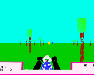
  • A wonderful remake of the game in 3d
  • well-programmed enemy motorcycle AI(tilting when turning, dodging trees, and evading player)
  • nice choice of having the hud directly built on the motorcycle
  • Currently shooting bullet this way feels unfair in 3D. I wonder how you can solve the shooting problems in a 3D setting.

Overall nice job of remaking this game in full 3D

++++++ Very faithful clone of the original game from its visual, shooting, driving, UI, Etc. 

Things need to work on:

  1. unlike the original game, Trees are blocking the bullets 
  2. Either the perspective of the game is a bit off or the player is moving too fast, the tree enlarges too fast. Consider tune it down a bit to improve the game feel.

Overall great work

++++++Very faithful clone of the original game from its visual, driving, UI, Etc. 

Couple Advice:

  1. Nice attempt to suddenly change the scale of the tree sprite to simulate the low frame in the original game. However, since everything else is running very smoothly in the game, only having the tree sprite scale does not simulate the low frame rate effect very successfully. (consider lower the unity system frame rate)
  2. The tree sprite feels way too big when the player is close to it. I hit trees couple times because a thin tree trunk suddenly turned into a very thick tree trunk.
  3. The bullet shoots out feels too three-dimensional compares to everything else in the scene.

Good Job!

Things need to work on:

  1. Still lacks some important main function(decelerate, shooting enemy motorcycle, etc)
  2. Turning a motorcycle feels a bit weird. It feels more like moving horizontally than turning.

  Cool features:

  1. The unique color palette that makes this death chase stands out among all death chases
  2. Successfully emulate the low frame rate using different sizes of tree sprites.

Nice work.