That's what demos are for, though. Posting about issues.
SeaFishelle
Creator of
Recent community posts
I found this outside of the jam. It's absolutely hilarious. The actor (who I assume is you?) looking like he's randomly bashing keys on a piano whenever the mech walks is priceless. I laughed out loud at most of what the guy said when I bowled over a building, but my personal favorite was "It seems I've picked an entire bouquet of oopsie-daisies". That had me on the floor.
Hey, thanks for playing! Don't worry, I fully intended to write up a proper algorithm for the encounter system, but it ultimately wasn't in the cards. By the time that point had come and gone, I didn't want to cut too far into polish. The trials of making a game beside a full-time 9-5 job, I guess. :(
Haha thanks! The kid was really excited to be part of a game, and while I've never met him myself, his dad is a friend of mine (and a former audio engineer who was able to clean up the audio a bit for me)! I was really impressed with the results!
As for the different music states, this was a case of a musician who didn't get a chance to do anything until the last two days of the jam, and she was doing it in her spare time, so I didn't want her doing more than one piece of music, or anything more complex than "give me a looping song" since she'd never worked on a game before. I was also kinda running on fumes at that point, and just wanted to get the music into the game and get it out the door. If I had more time, I'd probably have done something like that.
What I liked about this game: I love this top-down perspective, it really works for a game like this. The art is really nice. Animation is fluid and it reminds me of classic fantasy dungeon crawlers. I also like the music and SFX, you really know how to set the mood. It got me really excited to play, seeing that knight with his awesome armor doing idle animations on the title screen!
What needs improvement: ...er, pretty much everything else, I'm afraid. There seems to have been almost no effort put into polish. The controls are floaty, almost like there are light ice physics going on. The character's direction almost never matches with where I'm going. I find it very difficult to hit skeletons, the hitbox seems really small and off-set. There are no tertiary sound or visual effects to confirm most actions, giving no satisfaction at best and confusing me at worst. And this is minor compared to everything else, but I really don't like your font choice for the dialog boxes. It's too messy and hard to read.
Please don't let any of this get you down. You've clearly got the seed of something great, here. And these problems are all fixable! I really hope to see you improve this game after the jam's over, and even if you don't, I hope you keep making games and improving at the general craft. You're clearly talented in key areas, you just need to fix some stuff!
The cutscenes got a huge laugh out of me. It's a pretty surreal experience, and overall I enjoyed it. I will say, though, it ended pretty abruptly. The boss dies and the game doesn't really acknowledge it. Was that intentional, or is that a bug?
Either way, this entry gave me a good chuckle, and I look forward to the full game! :)
---
I'd appreciate it if you could find the time to check out my own entry, The Chronicles of Mega-Mart! You can't take duck vengeance, but you CAN evade security guards! :)
I'm angry about how good this game is. It's absolutely incredible.
The art is great. The humor is great. The characters are great (I will protecc Gub the grumpy hard snake with my life). The UX and controls are great. The freedom you give the player to explore this island by themselves is great. The simple yet rewarding puzzles are great. The task variety is great. The optional collectibles are great. Everything about this is great. And it makes me angry.
Five stars across the board. You two deserve it. My goodness. Fantastic game.
---
I'd appreciate it if you could find the time to check out my own entry, The Chronicles of Mega-Mart! What it lacks in hard snakes, it makes up for in sea monsters and wise old sages! :)
I'm very impressed with the UX polish. Your buttons look great, there's a custom cursor, you've got save/load implemented, there's even a macro to toggle fullscreen! Excellent stuff, it feels like I'm playing a full release!
The animation is great. I really enjoy the on-fours style you've got going on. And the room's design is really interesting, I liked it a lot!
The story is interesting, and while it gets a bit too science for me, I do appreciate your very Star Trek premise. "A virus that turns your molecules into photons" sounds like something right out of a TNG episode. I can just imagine some poor crewmember suddenly flashing out of existence in a shine of light, particles scattering off until they, too, fade away.
Sadly I couldn't get through even one of the puzzles, by the time I'd found the goober I was half an hour in. I guess I don't have the smarts for these puzzles like I used to. I won't dock you points on it, not giving myself enough time to figure this stuff out is on me, I'm just being honest with you. And if it's any consolation, I consider it a good time if I have to dedicate that much time to a puzzle. I was engaged the whole while. :)
Overall, a neat l'il game, very traditional P&C but with a unique and eye-catching style. I like it!
---
I'd appreciate it if you could find the time to check out my own entry, The Chronicles of Mega-Mart! There are no space bunnies, but there ARE some menacing lobsters! :)
Hahaha, this was cute!
Things I liked: The artstyle (Paper Mario aesthetics make me happy), the general premise, the fact that I had moral choices to make that affected the ending (and what a funny set of endings they were, haha!), the digging mechanic (very cute!), the music, and the hilarious dialogue! All the important stuff!
Things that need improvement: The biggest problem is that it took me too long to figure out that you can only be on one sidequest at a time. I was kinda frustrated that I couldn't pick up the medallion even though it was right there, and it wasn't until my second or third playthrough that I realized I needed to finish planting flowers and talk to the gardener first. Other than that, the crane game is pretty broken, but I guess that's what you'd expect from a crane game that steals wallets.
Overall, great entry! I really had a good time, and I want to see the world beyond that poorly-designed tunnel without lights in it! :)
I'd appreciate it if you could find the time to check out my own entry, The Chronicles of Mega-Mart! It doesn't have ants or birds in it, but it DOES have candy bars you can steal! :)
I'm going to preface this by saying that I don't want to belittle your accomplishments. This is a competent game, and I recognize that it may have been your first game. If that's true, congratulations for finishing and releasing something! That's HUGE!!
That all being said, though, I'm going to lay down my critiques as they currently sit. Please don't let them discourage you from making more and better games. :)
The biggest problem is, this isn't an adventure game. It doesn't even have a narrative, it's just a game about shooting targets. You're probably going to get low scores because of this, I'm afraid. Adventure Jam is about adventure games, after all!
As for the game itself, there are a few issues I have overall.
- The targets' hit zone is pretty small. It's almost like you have to be dead-center to hit the thing, when I'd expect a hit anywhere on the target to count.
- The "sprint" button feels like it doesn't do anything, there's no "oomph" to the speed boost you get when you sprint. There are a few ways to fix that, but making the character faster would have been one.
- The second weapon feels pretty useless, especially when considering that the targets need such a precise hit. Also, I should note - the secondary gun stops firing if you switch back to your primary then back to your secondary. At least, it did for me. You may want to look into that.
Again, I don't want to discourage you - this is otherwise a functional game, it's just not really a fit for this jam. I'd advise you to keep honing your skills, get some more demos under your belt, and enter more jams! You've got this! :D
Huh, I seem to have gotten stuck in the bookstacks room. There was no way for me to go back, and going deeper into the stacks wasn't an option. Was I doing something wrong?
I'll refrain from voting for now, because this might just be user error and I'd hate to judge a game based on that, but please let me know how I can finish this game! :)
I'm gonna preface this by saying that I couldn't get through this game, because its subject matter and atmosphere put me in a bad place. I played up to when I got in the police car with the creepy cop, and my fight-or-flight kicked in and I had to shut the game down. That's nothing to do with you or the quality of the game, I read the warnings, it's all on me. I won't think of docking score for my own inability to play it. :)
Now, the art. GORGEOUS. That "pixelart characters over simple model environments" aesthetic sends me to the moon. I adore the way this game looks. The VAs - those I heard, anyway - also sold their role, full props to them. And the game, overall, succeeds in what it appears to be trying to do, put you in that bad place to show you a bad situation. Very strong game. Props! :)
Thank you so much for playing!
Yeah, the RNG is totally unrefined, with one minor exception (the Shadow Knight only has a chance to spawn if the player takes a Divine Ration, and gets pulled out of the spawn pool if the player gives the ration back). During my testing, I didn't encounter many runs that made me go "aw man, RNG screwed me" instead of "aw man, I should have saved that item" or "aw man, I should have chosen health instead of energy", so I didn't stress out too much about RNG manipulation.
And the tutorial, yeah that would have been a cool idea. But it, like most tutorials in jam games, was a last-minute thing I just wanted to toss together with little overhead. I'd love to add an interactive tutorial if I ever revisit this game, though. :)
I'm glad you enjoyed it! Your game was great, too! :)
Awwww, this was really cute! I watched you post art updates in Discord and was really excited to check the game out! I grabbed the walkthrough just to be able to play through quickly (I have prior engagements today, I'm afraid) but I really enjoyed every moment of this! It was funny, it was clever, the art is fantastic and I got a great vibe overall! Pixel is a good kitty and I'm looking forward to seeing more of his adventures! :)
I'd appreciate it if you could find the time to check out my own entry, The Chronicles of Mega-Mart! There's no time travel, but there IS a baby in a shopping cart! :)
This is a gorgeous little demo. It's got some problems, but know going into my critique that it comes from love of this little project, and a desire to see it grow into something incredible.
- I couldn't figure out how to dock to the castle island. I docked to the balloon-tree island fine, but the castle island was giving me trouble.
- The story in the cutscenes was undercut by how bland the presentation is. I didn't feel the sense of loneliness and dread I think you were going for, when all I'm seeing is white text on a black background in a casual font.
- It took me a minute to figure out that the handle with the bigger ring was the "centre" one to line up turning with, but I managed it.
- A menu would have been nice, some way to quit the game without having to alt-tab out.
But enough of that - I'm in LOVE with airship games, and this one is no exception! I adore how you did the clouds, in particular - I actually felt like I was flying through clouds! And adding a sound effect for when the ship hits the water was an unexpected touch! Five stars, well done! :)
I'd appreciate it if you could find the time to check out my own entry, The Chronicles of Mega-Mart! It doesn't have airships in it, but it DOES have grand lakes to cross! :)
This was an interesting one. Not really an adventure game - like, at all - but the art is nice and I like the music. The rats are too hard to kill, and they get too close to the family members too quickly to be killed safely. I did get a laugh out of some of the dialogue though, especially the gandpa gave me a good chuckle. Overall, it's not great, but it's playable and I had a good time running around shooting stuff with nice art and good music. :)
I'd appreciate it if you could find the time to check out my own entry, The Chronicles of Mega-Mart! It's a more straight-forward adventure, and I mean that literally! :)
This is a neat l'il experiment. Short, but with all the text and the ways things connect, I can't fault it for that. I did find a couple of spelling errors, but nothing worth complaining about. And while I'm not really a fan of the "the weird kid nobody likes is a serial killer" angle, the tension of the game was engaging enough for me to forgive it. Overall, I liked it. :)
I'd appreciate it if you could find the time to check out my own entry, The Chronicles of Mega-Mart! It's nowhere near as heavy as this, but I hope you enjoy it all the same! :)
https://itch.io/jam/advjam2023/rate/2109372
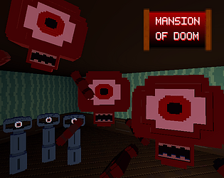
Thanks, I'm glad you enjoyed it! I tied the firing rate directly to the animation, and I wanted it to be that quick on purpose. Mansion of Doom is supposed to make you feel like a badass, blasting down these spooky demon monsters like they ain't no thang. The exact opposite of a horror game, but that's totally fine. :D
> fleshed
Haaa!
I'm glad you liked it! I was trying to be mindful of dominant strategy. If the boot worked on enemies, there'd rarely be a reason to use the shotgun. Granted, the fact that it has one specific use while the shotgun has the other specific use makes them more of a no-brainer to use and therefore not super engaging, but I thought that a better solution than the player almost never switching weapons and just running around with their boot the whole time.
Though fun fact, in the early days of the game, the boot was used to knock down the spire monsters (which is why shooting them makes them ragdoll like the doors do, I didn't have the time or energy to give them a proper "I've been shot" way to die). Then I decided it mucked up the flow I was going with, and just went "gun = enemies, boot = doors" to keep everything as clean as possible. Make sure that my players know, with as little implicit instruction as possible, how things work.
Anyway, I'll save the rest of that story for a post-mortem, if I decide to do one. Cheers, have a good jam!
Nothing better to hear than that I inspired someone. :) Though about it not being scary, it wasn't supposed to be. "Horror" may have been the theme, but I hate horror games. So I just made a game with the dressings of horror. Demon monsters, spooky mansion, etc. I combined two beloved "non-horror horror" games - Doom and Luigi's Manson - and everything sprouted from there.
Yeah, I had to cut what I planned for those boarded-off doors. It was going to be an outdoor garden-like area, but I realized too late I'd have to make more outdoor decor and a proper "outdoor" scene on top of the mansion itself, so I cut it. Glad I did, the game needed the polish.
Yeah, the eye monster only hits once, until it leaves your damage zone. That uh... never registered as a problem until you mentioned it. Always playtest, kids!
My whole plan was to envoke the Doom feeling, where it just feels good to run around and shoot things. You're not worried about ammo or tactics, just shoot things and don't die. The boot also fit that design I was going for, with that borderline goofy over-the-top action that just feels good to do. I'm really glad I succeeded there!
Overall I'm glad you enjoyed it!


