Thank you so much! Glad you enjoyed playing my game :)
snowshade
Creator of
Recent community posts
Thank you so much for playing and for the feedback! I am genuinely amazed how much depth people find in my game, even things I never considered myself. Glad you enjoyed it!
Oh, and I think I understood the other comment incorrectly. I thought they were able to put two artifacts of the same type in one row, which you can not do (you can't put items of the same color in one row either). But if the items are different in type and color − then you can. I probably worded the tutorial badly and it was not really clear, I'll fix that :)
This is a very fun and well executed puzzle game. And sometimes also really hard xD
I like that there is no pause button, because if you could pause at any time that would just ruin the fun of pulling off all the necessary moves in one quick succession. That said, it would be cool to have a little bit of a breathing room, so you can just sit and analyze what's ahead of you and prepare.
Congrats on releasing a very cool and polished game! I enjoyed it a lot!
Very interesting take on the theme. And I am actually amazed on the variety of stuff you managed to put into the game, so many different items and enemies! The art and overall mood of the game are also very well done.
Gameplaywise I think it would be cool to see what difference each item can make. For example, if I found an axe and one of my heroes has a sword, I would like to know if giving them the axe has any benefits. Maybe it has more damage, or bigger radius of attack, or faster attack, etc. Maybe some sort of icons on top of each hero could show that info.
P.S. I think I found a bug where I could just dupe the items infinitely xD For some reason the item did not disappear after I picked it up, but I still was able to throw it for my heroes.
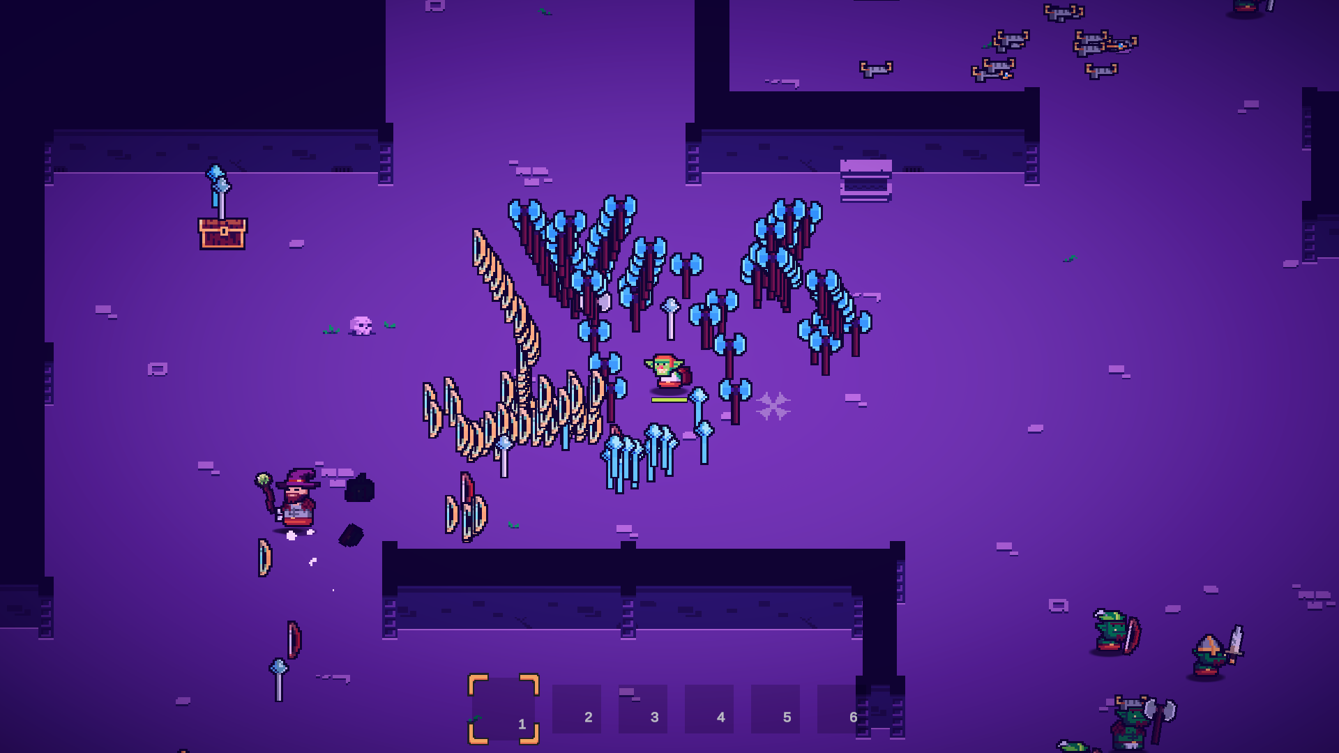
This was very interesting and enjoyable game with a cool and unique turn on the theme! Even floaty controls are enjoyable to use after you get used to it. Also like the atmosphere and the art style. Very well done!
I found it a bit hard to pay attention to the timer. Mostly because I need to precisely dodge the spotlights at the same time, and my eyes are always glued to the cursor. What if the timer was on the cursor itself? I am already looking at it, and it would be super easy to notice how much time I have left without moving my eyes somewhere else.
Congrats on releasing a very unique and enjoyable game in such short period of time!
Thank you so much for playing and for the feedback!
I definitely agree that the UI needs to be more compact for this type of game. I think I just need to move all the left icons to the right side, where the energy bars are located. That way all the important things should be in one tight place on the screen. And maybe shrink the lanes at least in half, because, to be fair, there is literally no point in having them that long :D
Thank you again for the feeedback, it gave me a lot of ideas!
Very cool and fun game! Managed to defeat 271 heroes :) Here's some things I noticed while playing:
- The Claw attack was a bit confusing at the beginning − I thought the hitbox was only covering the left part of the screen because the animation was also on the left part of the screen xD
- I think it's a bit tricky to understand the distance of your attacks sometimes.
Maybe having some sort of barely visibleradius underneath the player on the ground would help a bit. You know like in strategy games (or in MOBAs, I guess) when you use an ability it shows you the range or radius of it? Something similar could work here as well.Actually, scratch that. I think it just needs a tiny additional feedback when you hit an enemy, either sound or maybe particle effect. Which gets us to my next point ↓ - Would be cool to have better feedback when you take damage. Right now there is a sound of the sword swing, but at first I thought that all knights were just missing me, because there was no hit sound, only swing. So adding that hit sound when the attack connects would solve that problem. There are also many other ways to provide this feedback, like flashing red on the borders of the screen, or showing animations on the healthbar itself, so it's easy to notice with peripheral vision, etc.
- Same goes for the Heal recharge − adding just a tiny little animation on the UI or sound (or even both) will increase the quality of experience immensely. Oh, and speaking of Heal − at first I thought the blue bar was my 'heal juice' :D because it's so close to the label "Heal ready". So moving the Heal UI just a bit further away from other objects would solve this problem as fast as burning those knights in the fire 🔥
- I also think I found a bug where if you open the settings in game with X the fire breath sound gets looped infinitely, until you use fire breath again :D
Well, that was a lot xD Overall I enjoyed this game. It fits the theme, it's fun, engaging and does it's job very well. Congrats on making fun game in such short period of time!
I really like the concept of this game, very fitting to the theme. The art is wonderful and every character portrait has it own unique personality.
It would be nice to have a some sort of tutorial, but the game is not that complex and you can pretty much understand it's mechanics just by trying things. The UI/UX might need a bit of work as well, since it's not always clear what is clickable and what is not.
But overall this is a very enjoyable cool game with neat concept. Well done!
I think this game is wonderful, even though I got completely stuck on level 4 xD
I like that sometimes it's not always clear what to do. Because that way the game basically forces you to experiment and try things. And I really like that in puzzle games, where the game is not really holding your hand and just says "Here is some stuff, go do fun things with it".
Good job on releasing your fun game!
Thank you so much for the kind words and for taking the time to write the comment! Glad you enjoyed my game and thank you for the advice on the game page. I also agree that the game itself is not very presentable by itself, so I'll definitely keep that in mind in the future and work on that bit more.
Completed all the levels, unlocked everything and had a lot fun playing it!
I accidentally quit the game once, because the menu appeared and the cursor was right on the Quit button :D
Also at some point I realized that melee weapon hitboxes are active all the time, so you don't even need to swing it, just point the camera in the right angle. For example with the bat you can just gently push the dice instead of launching it into the stratosphere :)
Anyways, good job on releasing a fun game!
Thank you for playing the game! :)
Unfortunately there is no sound at all, but when you submit the game there are only two options: either "We created the vast majority of the music during the game jam" or "We used pre-existing audio". Neither of those are fitting my case, which is "No audio at all", so I just left it at the first option. But now that I look at it, the second option is probably more correct, even though it's just silence. Sorry for the confusion.
At the beginning it was a bit tricky for me to calculate the amount of damage. Maybe you could show the numbers on each tile around the player? Like, if you go left this is how much damage you will do.
People already mentioned the WASD controls. I think it could be tricky to understand it at the beginning, but after that it feels pretty natural. But for tile-based isometric game the mouse or some sort of selection-cursor type controls (where you first select the destination and then click to move) could work better.
Also would be nice to distinguish weapons not only by the shape, but maybe by the color as well? That could be tricky to pull off, since there are a lot of green around and it could get messy with a lot of colors.
In terms of difficulty maybe it would be cool to have like a level progression: you start at a smaller level to get the controls and basic mechanics, and then the size and difficulty slowly increases with each level.
But overall I had a lot of fun playing this game, even though I died a lot and did not progress too far :D The idea seems common (move the dice on the board), but you have your own unique twist on it. I also like the visual style and chill music in the background.
Good job on releasing your game! :)
Very interesting take on the theme! Might be a tiny bit confusing at the beginning. Also the game has a very nice sense of exploration and the top-down zelda-like perspective fits it pretty well.
It's a shame that teleporter doesn't work, but hey, you made a unique game from scratch in 48 hours, and that is already a great achievement!
Enjoyed this a lot, and good job on releasing your game :)
At first the tutorial text scared me a little because there was a lot to remember. But after the game starts you get the gist of it really quickly
It is very hard to make a balanced game that includes randomness, and I think you did a really good job on making it fair and enjoyable (even though I got multiple times into situation where both me and the enemy had low attack and high defense, and we were just missing each other for 5 minutes until someone got lucky to land a hit :D).
Really like the permanent upgrades mechanic that adds sense of progression and "becoming stronger" feeling.
Anyways, game is fun, presented well and very enjoyable. Hope you find a good way to make it more balanced after the jam :)


