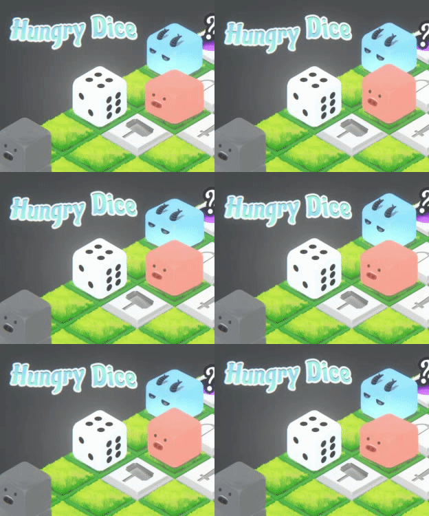
Play game
Hungry Dice's itch.io pageResults
Criteria | Rank | Score* | Raw Score |
Presentation | #337 | 4.140 | 4.140 |
Overall | #725 | 3.573 | 3.573 |
Creativity | #741 | 3.649 | 3.649 |
Enjoyment | #1836 | 2.930 | 2.930 |
Ranked from 57 ratings. Score is adjusted from raw score by the median number of ratings per game in the jam.
How does your game fit the theme?
You are a die, rolling on a grid-based map
Did your team create the vast majority of the art during the 48 hours?
Yes
We created the vast majority of the art during the game jam
Did your team create the vast majority of the music during the 48 hours?
Yes
We created the vast majority of the music during the game jam
Leave a comment
Log in with itch.io to leave a comment.
Comments
This game looks really beautiful, and is actually a fun concept. In this review i wont go into the controls because A. I didn't have a big problem with them, and B. you are probably tired of hearing about them. So lets begin!
Visually the game looks stunning, the characters are all nice and clear and cute, and the map itself looks pleasant.
Audio: The music, ( meaning all three tracks) sounded great and I am super impressed you(meaning the team) had time to make multiple tracks that all sounded really good: I also want to give props for having a nice movement sound that mixed well with the music, neither getting lost nor overpowering the music. My only feedback in this area is some attack damage sounds would have helped, and some sounds for the attack tiles would have also added some oomph to them.
UI: Honestly, it was very clear, and I was rather impressed that you had a fully featured settings menu so really good work there. It worked well and I didn't have trouble using it. In terms of feedback, a restart button would have been a good idea but I understand jams are short of time and you have to prioritize but given the difficulty of the game I would recommend you consider adding one if you do post jam updates.
Gameplay: The core concept of trying to survive as long as possible and move for as long as you can is a cool twist, and given that each dice move is a clear event I think it works well. I think my only feedback besides the aforementioned restart functionality, would be rather than use DFD for damage, it might make more sense to use the face up side for damage, up will always be more important than down to humans psychologically so you might want to use that to your advantage. with the damage side being down, i often forgot to consider it in the heat of the moment, if it was the up side, i would have been more careful because i could see the value i was going to use in the attack. Regarding the random level generation, very good work, it was a good choice for this game.
Overall great work, I hope my feedback is helpful, and that you had fun making this game. I had fun playing it. Thank you for sharing.
Hi, thanks for all these in-depth reviews.
At first, we have the "step on the grass" sound triggered somewhere in the code, but when we are trying to add the sound effect of sigils (attack tiles) triggering at the last minute, I found that the(my) corresponding code logic didn't simply allow me to switch different cases :((
Regarding the DFD part, it doesn't exactly mean "Face Down". Initially, we are using the so-called "DFD" design to emphasize "interact with the environment":
You can see that (1) and (2) eventually utilize the bottom face, but (3) does not. We ended up calling it DFD because we only have (1) and (2) at the moment. What we can improve is to add more visual aid to preview each corresponding face after rolling.
Your feedback is very helpful, glad you enjoy playing our game!
I see, thank you for the in depth explanation, that makes a lot of sense. I think you guys are on the right track and i look forward to seeing the updates! Again great work. jams are hard, and the level of polish present in your game was impressive.
Very clever concept where you have to think, anticipate and plan your every move. I like the graphics very much, but I've found it difficult to use the WASD controls on the isometric grid (got confused which button is which direction too often) if you insist on keeping the perspective, perhaps make the player move by clicking/tapping on the fields. Good game, nonetheless. Great job.
Hi, thanks for the comments. We agree that our UX is being not intuitive enough to let user know whether top left or top right is mapped onto the W key.
However, at this moment we believe that isometric is a better representation then others. Please have a read at our game page FAQ for the reason, in case you haven't read it.
You can also see a considerable amount of games in the jam also use isometric + WASD combo. What they are doing better then us is that they have an "isometric" picture of WASD printed on the UI, indicating the W direction. It helps a lot if one keep forgetting which side is W.
On the other hand, clicking on the ground may not work nicely, because it seems difficult for user to click on the exact grid as there are many things blocking the UI/Raycast. What are your suggestions on providing a user-friendly mouse control? (Like a huge transparent overlay of wasd button to click?)
I think the main issue with yours controls compared to others is that people in left-to-right reading countries perceive up and right as "up" and not up and left (i could have sworn there is a Poynter institute article describing this, but I cannot find it), and this makes the number of errors go up a bit. Scott Klemmer calls this category of UX problems a "mapping issue". In the old times where 3d camera was not a choice, game devs often solved this by making sure there is a clear "face" and "tail" to the character you are moving, and that the "face" always faces up, but I would suggest you try to solve the issues and at least try mouse control (having ground as a separate layer and raycasting only against that, with highliting tiles on hover will help, if not solve the issue).
It is not a game-breaking issue, don't get me wrong, just something that made me make a couple of mistakes, so my daily job as a UX consultant started creeping in the conversation. Great game and a very nice effort.
Really appreciate the free UX consulting session, haha. That explains why most of those isometric games in the jam map top-right movement to W. I will definitely look into more grid-based isometric games :D
Nice game with great graphics! Takes a bit of time to understand but then really fun! Good Work!
wooo thanks for playing! also having fun in your game!
Cool survival) And visually really satisfying) Gameplay is hard, but don't push you anywhere, liked that)
Turn-based, hard, but satisfying)
interesting that you use ) to replace . lol
Really cute puzzle game! I enjoyed playing it, although the randomness is a little difficult to balance with the strategy element. Altogether polished... i love the cow dice :')
Hi, thanks for the comments. You are right. We are thinking about how to improve the strategy element while preserving the randomness within the player's ability to control/maintain the number of different resources/enemies on the map.
Stating that you can play this game "casually" is what I would call a lie, haha! You clearly put a lot of thought into this, but to me this would've been a clear case of "less is more". I really like the idea, but the way it plays out is pretty overwhelming. Cute artstyle and chill music though. :)
(I really think this has some potential, it just may have been to ambitious for 48 hours.)
Hi, thanks for the comments. The reason why we stated that one can play causally is that the UX now is not so good, therefore not every average game jam enjoyer would spend time calculating the other side of the die face and foreseeing 10 steps after. Although it is a strategy game, we don't want players to get too overwhelmed with different things that could be improved.
One of the lessons we learned this time is like what you have mentioned - make easier levels or maps to let the players get familiar with the core mechanics first. Next time we would put this a higher priority.
As for the scope part, our primary goal of a game jam is not really about finishing all parts - it is about ideating good mechanics (and better within the scope). Sure we can make another Sokoban clone with a die rolling instead of the box, which will likely take us 1-2 hours to complete and polish into a 2A game level with the remaining time; But we don't do that here. Maybe objectively speaking it is too ambitious for 48 hours, but it is why we join the game jam :)
Nicely done art style and cozy music. Controls were kind of tricky and I didn’t understand how to restart so I just reloaded the page. Nice entry!
Hi, thanks for the comments. we appreciate you played and commented on our game more than once! Well done that you used the perfect way to restart our game!
lmao
Nicely done art style and cozy music. Controls were kind of tricky and I didn’t understand how to restart so I just reloaded the page. Nice entry!
Hi, thanks for the comments. we appreciate you played and commented on our game more than once! Well done that you used the perfect way to restart our game!
This was the first jam game I played and apparently, I forgot to comment lol anywho, I just wanted to commend you on the art and overall presentation. Hungry Dice is absolutely fantastic in the art department, I love it! The game itself ain't too shabby either, although a tad overwhelming. Still, really good jam game.
Hi, thanks for the comments. Glad to be the first game you played in the jam! Hope you enjoy it!
The soundtrack absolutely slaps! If you actually created it yourself — kudos to you!
The game is cool as well.
did you notice there are 3 songs lol
Yeah, I'm actually adding Chill 1 to my daily playlist, I can vibe to it all day :D
Great job!
I find the style nice and game is working smoothly. It was hard sometimes on the start, because it has spawn enemies all around without pigs and cows, but its not a problem :D
Music on background is chilling and good.
Hi, thanks for the comments. You are right and it is a problem. If we had extra time, we would balance the spawning types of enemies to make sure the RNG doesn't always spawn enemies/friendly animals.
Realy nice puzzle game, enjoyable, well presented and quite nicely polished game.
Hi, thanks for the comments, glad you like it!
I didnt eat the piggy. Poor piggy. Nice little battle puzzle game. Has some really cute graphics, the randomness can be quite frustrating at times though. But overall i would say its a really good entry. Good Job.
Hi, thanks for the comments. I agree with you that the randomness is a bit too much for a strategy game. We noticed that and did add a feature of showing the count-down timer for each portal to give time for players to prepare. Maybe we should also show the type of the spawning creature and also balance the amount of each spawn type(friendly/hostile) over time.
Very cool strategy game! Very chill and great execution! Great work with this!
hell yeah!!
The art is so cute, I love it.
Maybe like other comments, you can improve the control at least the control guide, and there is no restart button after death? but overall its a good game..
Hi, thanks for the comments. I think you can guess why we don't have the restart button, it's pretty simple - I put the tutorial panels and the game over panel just before building the game, to meet the deadline :) (You know at that time everyone is panicking and no one knows when will be the actual deadline)
A great looking and sounding game. Very relaxed and chill gameplay
glad you like the vibe ;)
Wow this game is so chill! *-*
The animais - and even the enemies - are very cute, and the relaxing music in the background makes it even better. The gameplay is very fun and surprisingly easy to understand, just a little sad that it ends too early (maybe you could increase the dice's life a little bit?).
Still, that's an amazing job, congrats!
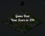
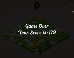
Also I'm curious, what strategy did you use to get 294 points? Best I got was 92 haha
Thanks for playing!
Yes, I do agree we should add more life and reducing enemy health to make playtime last longer. Congrats for scoring 92!! Around 100 scores are already very high, I think you have already known the strategy to score that high hahah. Don't want to say this, but I score 294 points are totally base on luck lol. That time, I got a lot of pigs and fewer enemies. I even ran out of steps. Then I never reach 200 again hahah.
Some strategy:
1. When the portal appears, try to keep distance and keep close to Bow tile. If it is enemy, deal damage with the bow.
2. Ver important!! PUSH enemy when he is close to you, NEVER walk aside with any enemies.
3. Stepping hammer tile with DFD (1) only deal 1 damage, pushing the enemy sometimes can deal more damage!
The level of polish of this game is awesome!
I must say that it was really really difficult to play for two main reasons:
1 - the isometric view: an isometric but slightly rotated view would have helped understand if UP was left or right from the center;
2 - I can't see what's behind the dice: it's hard to remember what face it's behind and doing the math every time is annoying. I think you could have added a small dice UI on one of the corners of the screen showing every side of the dice in the current position
Side note: I've seen many of these type of submission, but yours is greatly polished! The only thing this lacks from the others is that the important number is the Dice Face Down (as you called it).
Wouldn't have it been better to depend on the Dice Face Up?
Maybe it would have been more intuitive, as its the natural way we humans use dice!
The music and the art are too good, and it's a pity these small problems don't reflect how good this game could be! I hope you will fix them after the jam finishes!!! :D
thank you Fritto! you got us some great ideas.
the 1st point has mentioned before by others. don't wanna repeat too much. but i think isometric view is the best way cuz we can at most see 3 faces of a dice from 1 angle.
i like your 2nd point. we did think about that much during the development. and i do agree it's some sort of headache when to do only 1 dmg to monster unexpectedly. not sure what's the best way to show the backside of the dice.
anyways, thank you again for playing and hanging out in the community :)
Amaizing art and sound well done
thank you ;)
Really cool mechanic! I'm not really good at it but i enjoyed my play session a lot! Good job!
im so glad you like it :)