Indie game storeFree gamesFun gamesHorror games
Game developmentAssetsComics
SalesBundles
Jobs
TagsGame Engines

srpent

39
Posts
10
Followers
15
Following
A member registered Aug 01, 2019 · View creator page →

Creator of

Recent community posts

Thanks! I totally agree with you on the saving/resuming, thankfully it should be pretty easy to implement if we decide to update the game, it could be as simple as a bit field for the unlocked sets, maybe a bit field of piece collection and the player's position perhaps. So thanks for pointing out a big pain point that I totally agree with, with the added benefit of being a relatively simple fix! 

I agree that the instruction set was not explored very well, probably as you say a simpler puzzle/strategy game would have worked better since you can totally just write small snippets that change the player character's state a bit and rewrite stuff from there, thus avoiding (code) logic completely. Or maybe we could've focused on the character-controller-builder aspect more, where you could prewrite your controls with maybe some constraints and then not be allowed to edit it in "action mode" or whatever, somewhat like Kerbal Space Program's spacecraft building/flying loop.

Thanks for playing and going out of your way to provide some really nice and useful feedback! :')

Thank you, I'm glad you enjoyed it! The cmpkey instruction was certainly THE most debated one, since we thought  it might be a little too overpowered? Thinking back on it, I agree that we should have leaned more heavily into it since it was one of the more interesting aspects of the game! I'm 100% with you on this one now that you point it out, so doubly thanks!

And finally, thanks for playing and writing! :')

Thanks a ton, it helps out a lot! I thought I locked the screen res but apparently I must've done something wrong and didn't really test the final build too well. Thanks for the tips and going out of your way to share this, I'll keep all of it in mind for next time! :') 

Thanks for sticking with it and for the kind words! :') 

Thanks a ton, that's very kind! You're totally right on the shortcuts, that's something we totally missed but makes so much sense! 

Thanks for playing and writing! :')

Thanks for the feedback! I agree we could've done a better job at guiding the player, sorry about it. If it's worth anything at this point, on the top-middle pannel you can see some buttons with instruction names, if you press them a guide will be written on the bottom-left panel. You may have to scroll on both panels to see any relevant info. There's an example of an assembly program on the entry's page, but the gist of it goes something like this:

<instruction1> <param1> <param2>
<label1>:
<instruction2>
<instruction3> <param1>
hlt

Your first program might look something like this:

interact
hlt

Sorry if it's not too clear still, specially for the stuff later on.

Anyways, thanks for playing and writing! :')

Thank you! That's funny, RoboTurtle (or at least something similar) is precisely something my teammate and I were discussing as we built the game, so I'm glad to hear it came through to you! 

Just out of curiosity, what about being windowed made it hard to acquire focus to open the terminal/menu? Did it go off the screen or was it too small or something else?

Thanks for playing and writing btw! :')

That's so kind, thank you!! I'm super glad to hear that it brought you back, it means a lot :')

The source code is open if you're interested, I was thinking of putting a copyleft license but I have to read up more on the details. The Godot stuff is on the top-level files while the language stuff is under the "code/assembly" directory. Sorry it's a mess lol.

We don't have any plans currently on expanding it, but we might consider it at some point. If anyone wants to reach out I'd be happy to listen.

Thank you for playing and writing! :')

Thanks for the feedback! Godot's 3D editor did give me some rough simulation sickness I must say, not sure what it was lol. I'm totally with you on the interface! I wonder how replicating something more like the interface of Godot itself could work, or maybe something different might do us better. 

Thanks for playing and writing! :')

Thanks a lot! I hadn't thought of that, something like Sebastian Lague's "How Computers Work" could maybe work with a more polished version of this perhaps. That would be pretty fun!

Thanks for playing and writing! :')

I share at least the first frustration with you, and while I don't understand what you're trying to get at with the second one, I appreciate that you're trying to share your concerns regardless.

We fell more than a bit flat in all honesty and it's totally on us. Thanks for pointing some of it out! I understand that you don't know if we're aware of those issues and that when reviewing something you should point out what's wrong regardless of any internal reasons, since those challenges can and should be overcome!

However, I do want to ask you to keep the snarky remarks to yourself when reviewing submissions you think are not very good, while I do invite you to share your thoughts on them even if they're not positive. 

Anyways, thanks for playing and writing! :')

I loved the humor and the whole concept in general. I liked the platforming, but adding some sort of jump buffering and a bit of coyote time would help make it even better in my opinion. I enjoyed the combat, it was oddly satisfying, but I felt it a bit slow in comparison with the rest of the game, so maybe lowering the recharge time a little bit would've been nice. I really enjoyed the game overall, it's pretty funny and quite charming. Congrats! :'D

If it helps, you can try clicking the cubes from the sides where it’s closer to the white surface and drag your line from there. Sometimes if you click on top of the cube it detects that the line is floating because the cubes might be a little too high or your line might be going through the cube which is also not allowed. 


Thanks for the feedback! :’D

(1 edit)

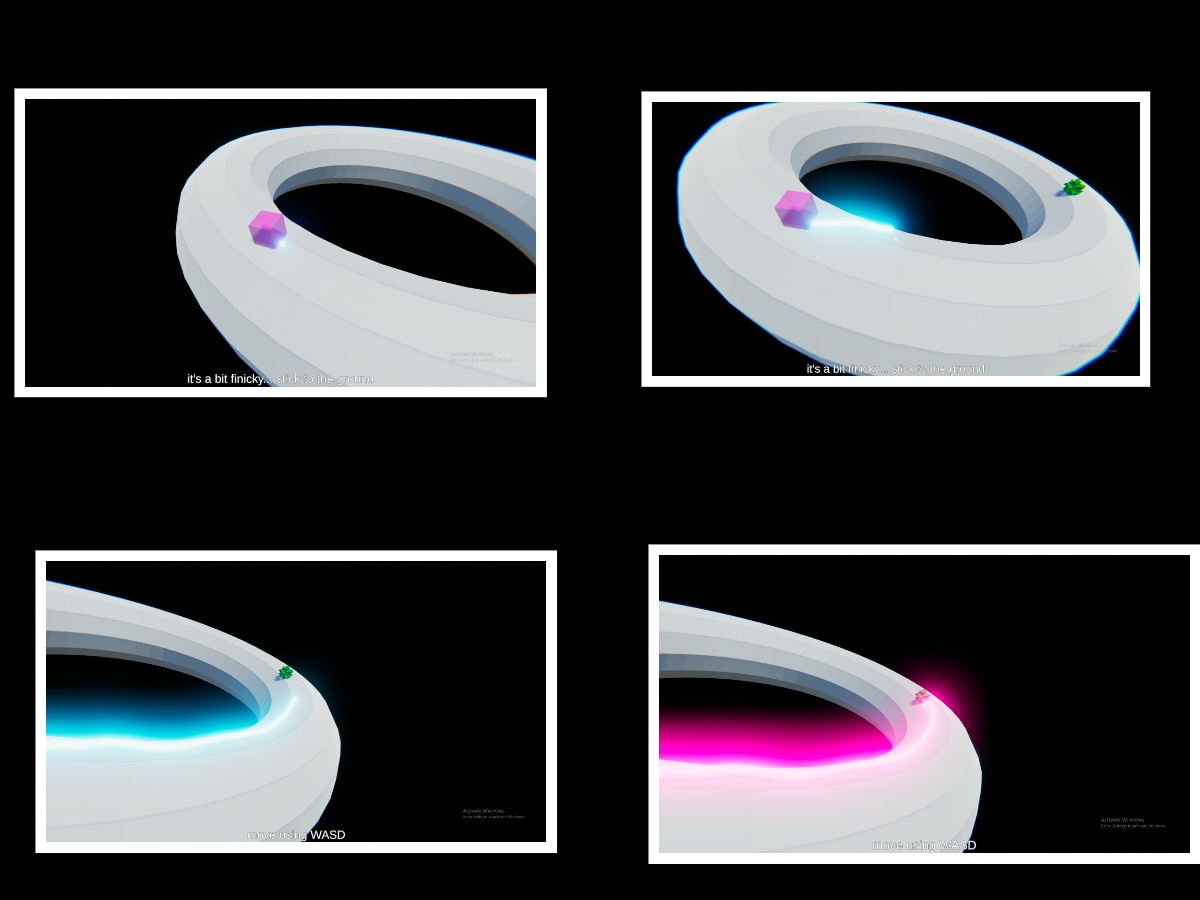
Sorry that it wasn't clear. You're meant to draw in the surface from the colored cubes all the way to the spiky green balls. You have to join all cubes with all spikes. Here's a quick image I put together on how that's done: 

Edit: You also can't cross lines, go through the surface nor have lines floating on the air.

It's easy to engage in and it's pretty fun. Well done!

I really enjoyed this game. It has some fair challenge with a good learning curve. Well done!

It was pretty entertaining to play this, it's oddly relaxing. Nice job!

Here are the controls just in case it isn't too clear in-game!

ActionKey
Look around Mouse movement
MoveW, A, S, D
DrawLeft click
Reset cameraR
RemoveLeft shift + Left click
Clean pathSpacebar
Show/Hide deformation menuTAB

Loved the dialogue, loved the comedy, loved the gameplay... Really good game, I enjoyed it thoroughly! Congrats! :'D

That's fair. Best of luck if you go through with it, it could become a kick-ass game! :'D

I really liked how you used the theme, I wouldn't have thought about using peircings! I also liked the music, it's pretty catchy tbh; good selection.

Good job! :'D

I really loved the visual style, great work in that department! The last level was my favorite, it would be cool to see more falling-down reflex-based levels like that one in the future. I would've liked it to be a bit faster-paced though.

Very good job! Especially for a first time! :'D

There seems to be a weird bug in the HTML version of the game where the audio sometimes experiences some clicking. Try downloading the Windows version if you experience the problem; that should fix it. :'D Enjoy!

Thanks for the feedback! I should add more cues to help the player get started quicker as you said, I dropped the ball there for sure. Something else that I found is that tempo is kind of hard to get right. I started by making the game go at a regular 120 bpm, however I found that by keeping it low, it's easier to teach the game, but at the same time you make the player have to spend more time for the same reward and the player must play safer and slower, making it more boring/tedious and having to plan from even further ahead, so I went with a 140 bpm which (I think) I once heard was about the upper limit on the speed that people normally talk at, but I do agree that it may be too fast to start off there, maybe have it ramp up alongside the challenge would have made for better balancing. 

Also I have a small question about the hand position thing. How is your keyboard layed out, how big is it, about how tall are the keys and could you provide with maybe a drawing on your position? This part has me a bit intrigued because I never considered the ergonomics being too harsh here, I really just felt it like a small piano, but it probably is different on different keyboards and different hands. I absolutely should have designed around such cases because everyone is different and their keyboards are too.

The drum beat thing being displayed visually and such is a good suggestion. I got to be honest here, the only rhythm games I've watched (not even played) are Guitar Hero and Piano Tiles, in reality I just wanted to try something new, but in retrospect that was probably the biggest overlook ever haha. Thanks for making me remember the importance of looking what others have done before every once in a while to fix some issues I might not have seen.

Again, thanks for the very insightful suggestions. They will come in really handy if I ever want to make something like this game again or decide to make it a bigger thing. (I mean, some of them, specially when thinking about the moral of their story, will come in very handy for game design in general anyways, so thank you!)

Sorry to hear that it was an issue for you too, and thanks for the suggestions and giving it a try!

(1 edit)

Hey, thanks for the feedback! I guess you're right in that it offers way too much challenge in different areas (movement and playing the lick) at the same time from the very beggining. If I ever decide to touch up on the game again, I'll definitely make for better introductory material and add better cues to show the player when and how to perform the lick to make it less daunting, maybe animating the next key to play in the lick pulsing to the beat or something (and also the technical stuff...).

I like the idea of making different notes have also different purposes, (stunning and parrying come to mind) but finishing off with the entire melody, although I'd maybe change it to make small three/four-note-melodies (easier and maybe slower ones) take that role in order to add diversity and expression as you said (which I wholeheartedly agree on), but keeping it to the 'performing melodies' core and sort of learning something that could work musically if you were to go to a piano or something and give it a go, I feel it is more rewarding to do something right and get rewarded for it than just pressing a button for an advantage in this case, plus you still get to kind of improvise and groove by choosing which smaller melodies to use, kind of if you were improvising a solo by stitching together particular techniques to your heart's content and give it a different feel depending on the intervals chosen; maybe one of this small melodies could be a diminished triad arpeggio back to the root, or maybe a suspended first triad, or a II V I but in notes only, and so on... (oh man, your idea here really rocks and it's making my imagination run wild haha thanks)

That being said, maybe having a small and weaker-than-playing-the-lick visual effect unique to each note would add a lot for the 'hitting notes and grooving out on devils' you mentioned too (and actually... that gives me another idea... if I map the notes you're playing correctly to the chromatic wheel, it should look good if you play something harmonious due to ratios and stuff and could probably help by giving more cues to the brain on what to do and make it create stronger connections/associations and have a higher aesthetic appeal while playing it).

Anyways, thanks a ton for the advice, I felt that the difficulty was right when playing it and that made me suspect it was all kinds of wrong, thanks for giving your feedback on it, it's super appreciated. Also thanks for suggesting the plug-ins, I don't know why I hadn't thought of that, and I'll absolutely look it up.


(Edited the comment by dividing it in smaller and more digestible paragraphs)

Hi everyone, thanks in advance for taking the time to help other people, that's super nice and what it's all about! :)


I'm not too sure about the main mechanic of my game here https://itch.io/jam/gmtk-2019/rate/461157. I think it may be fine for people who do music or rhythm games often because they may be used to multitasking/automating a repetitive pattern/melody, knowing when to press the buttons and memorizing it really fast (please correct me if I'm wrong though). I'd like some feedback specially from people who aren't too accostumed to musical notation and/or playing an instrument, on how does it affect the gameplay (and how easy/hard is it to get to play the game due to the mechanic, if it was even possible at all for you). Also, does it make it tedious?


I'd also like to know if the level design achieves its purpose. I wrote down some stuff on the game's page that came to my head while publishing it for the sake of documentation, and along other stuff, it kind of outlines (even if vaguely) the purpose of each room in the game, and I'd like to know if I achieved it and helped the mechanic shine through the level's design. (I also forgot to mention the introduction's purpose on my game's description, but I think that it's pretty clear)


The goal of the game is to experiment and find possible new tools/techniques that I can possibly use in the future, and learn how far can I push some different skills into games, while keeping them enjoyable. In other terms:  knowing if I can rely on some memorization, rhyth, multitasking, or whatever skills are needed to play the game as the basis for my mechanics, and knowing if I'm pushing them too far or making the game too crowded by having all of it. It's not (at least in the forseeable future) for something commercial, but rather for basic research/experimenting purposes. 


Side note: If you're attempting to play the game and hitting the notes seems kind of out of place, or delayed, or buggy, or unreliable, or whatever; try downloading the game (bottom of the page) and lower the rendering clarity in Unity if the problem still persists. (Sorry, it's a bug I couldn't fix due to time constraints. It's most likely frametime fluctuation related)


Thanks a ton!

(Sorry for the huge wall of text, and I'll get to test some of your games in here and give feedback another day because it's pretty late at night already here)

Really addictive game, this really blew me off! Maybe having the ability to change the ability you have chosen would improve the experience (like a selection you can change and then approve), but outside of that, it's really fun. Great job!

Great job, I really liked the whole multitasking thing going on. Even as is, it's a really good game to spend lots of time on by just replaying it, it's amazing; challenging yet fair.

Haha, love the game, definitely a fun experience when you just close your eyes and only play by feeling the groove; it's short but fun. Good job!

Nice game! I'll just add that the aim assist thing that you added was a good idea (even if you were going for a harder game), you might know this, but usually designers/developers add secret aid mechanics in their games to make them feel fair, even if the odds are stacked on the player's side.  Here's a good video by Extra Credits that goes into further detail if you're interested (and even intentionally challenging games do this often, for example Celeste's harder parts). That's why we test stuff beyond even bugs, and let me tell you that you're on the right path.  Good job!

Thank you! Glad you enjoyed it!

Sorry for replying so late, but I just have to say that I couldn't stop smiling after reading this haha,  made my week :) Thank you. 

Thanks for sticking with it and giving it a chance! Give me a few days and I might add another build with checkpoints. Also thanks a lot for the feedback and sorry for the late reply. :)

I really liked your premise of making an adventurous game where you can only carry one item at a time, it is really interesting and creative, the mechanics for grabbing and throwing stuff alongside the movement feel really good, and I loved your visuals. And please don't take this the wrong way, your game displays good effort on your part, but I must say though, that there are some things in your level's design which can be improved a fair bit, and I tell you this because it really shows that you like making games. Because you care, I would like to help you improve and reach your full potential. As I see it, there are three major problems that you should  try to work on for your next game, and some minor ones that you can work on after that; having honed your skills as a game maker. Here they are and I left some suggestions on what and how you could improve with the wishes that it is helpful to you:

1. Backtracking: This is important for your game, because holding only one item at a time makes the player need to go back and pick something up that they left behind, like a sword or a key of a particular color. Backtracking is usually seen as a bad thing because when you go for the first time into some new place, there is this sense of awe and discovery: a new challenge, a new level, a new area, a new mechanic, and so on. When you go back from an area you alreay beat, there is no new discovery or new challenge awaiting, it is just dead time for the player to walk back to the beginning. But you can either design around it, or use it for your advantage. A way to design around it would be to use one-way portals of sorts, where you have a main area that branches off into smaller areas, where at the end of them, a portal takes you back to the beginning. Or maybe this portal has to be activated from one side so that you can quickly go back to the end of the branch if you leave anything useful behind. An arguably more elegant approach to this, is to do what Dark Souls made with their levels; build your areas so that they end again on the beginning, with some locked door that you may have to unlock from the other side, or something similar. It requires a lot of thinking it through and it is hard to always be conscious about it, but keep making levels and keep trying to build stuff. It may not work as you intended, but know that you're getting better the more you experiment. Also, don't leave the things you make behind, iterate them, improve upon them, see how they can be fixed.

2. Use of space: This is pretty relevant to any game you make where there is navigation. Always know why are you making a level the size that you're making it. Is it to encourage the player to discover? Is it because the enemies in it demand the space? Is it because it is a boss arena? Is it a long hallway building up for the climax of the game?  This video is super relevant for this case, you have a lot of areas that are big but empty, and when there's empty space, the player will expect to find something there; maybe a treasure, a secret, a boss, a joke; something. As a thought experiment, see your map and shrink, block or outright cut the areas or the map that are dead space. Dead space are areas that offer no new/different challenge or  just don't have anything in there. Use space consciously, keeping track on why and acting upon it, will do wonders. Give areas a purpose.

3. Variation, contrast and repetition: I like to think about this as if I was writing a piece of music. Talking about music, in music theory there is something that is called phenomenology. Phenomenology is about how we percieve music; or <copy-pasting some article about it> "phenomenology of music is an investigation or inquiry into the direct perception and influence of sound and how the sound contributes to the musician's ability to reach a transcendent performance". What I'm trying to get at here, is don't only make things be factually different, but make them feel different; make the player feel different things; strive for variety of kind. On a top-down shooter you may have ten different shooting galleries, but maybe they feel more like one or two, because even if they absolutely are different, they convey the same; imagine having a level with a screen size of 256x256 and moving it a single pixel for each new level after that: yeah, you have a lot of levels, and they are factually different, but phenomenologically they're the same. On the flip side, too much variation makes your game feel like a gimmick or out of place, because repetition legitimizes (try reading between the lines in the video).


The biggest issues with your game link back to your level. Remember that your levels are the window to your mechanics. Without a good level, a great mechanic might be looked down upon because the levels did not show us that mechanic at its full potential, or didn't teach us how to use it properly. And levels are pacing/flow as well. Bad flow can make a very insightful story, or very good moments of gameplay be tarnished by everything else around it. A good experiment to try, is designing multiple cool moments based on what you want the player to feel, and writing reasons why it would achieve it, and placing them before the thing happen: Yoko Taro has an interesting GDC about it. Maybe make a game based around a single important moment / climax with a mechanic, and then make the rest of the levels that teach the player how to use the mechanics in interesting ways.  Maybe for another experiment, try making your levels using this structure or this, that are mechanic focused (don't get stuck with them though, always try to go beyond). 


Don't throw what you made away or brush it to the side! Use the assets you already have to create something new, little by little make more engaging levels and put them out there for people to give you feedback. A great way to start learning, would be Super Mario Maker 2 and Gamestar Mechanic, they both offer great insight into what makes a good level, have a supportive community that will gladly show you the way forward, and perhaps most importantly, you can make levels super quickly and improve them (iterate them) easily after testing and asking for feedback.


Hope that the information above is useful to you, and I'm excited for what you can come up with as you keep moving forward!


Keep creating and putting your stuff out there!

Great game! The way you designed your levels is really synergistic with your mechanic and made for a variety of wonderful puzzles. Also the way you introduced the mecanics was pretty good and clear, I specially loved how you introduced the green bottle's effect by making the player drop from multiple heights into it. You can tell that a lot of thought went into the levels. Good job! I wouldn't be shocked if your game makes it to the top 100. Well done!

Pretty interesting interpretation of the topic. It reminded me about Portal, but with the box teleporting twist. The fact that the box falls so slowly and that you can call it under your feet makes for some interesting platforming that you absolutely noticed and made use of in your level's design, which I applaud. Some things that could be improved could be the jumping and box spawning resets; I can't quite put my finger on what is it, but it feels kind of finicky at times (maybe it needs some coyote time effect? if it has one, maybe it needs a stronger one?).  All things considered, good job! You made a really good use of your own central mechanic (which was pretty creative) in your level, even if the game feel wasn't completely spot on at times.  Well done!

Well done! I love how you went beyond the just one bullet or just one life thing that Mark was talking about. I really enjoy that by having both movement and attack matched to the same button, the game creates some very interesting situations where you have to decide if you want to fight face on or to dodge an enemy. I think that is your game's real strength, specially when thinking about it in the jam's topic context. It's really simple yet very effective. Again, amazing job!