Indie game storeFree gamesFun gamesHorror games
Game developmentAssetsComics
SalesBundles
Jobs
TagsGame Engines

Trin-o

65
Posts
1
Topics
19
Followers
7
Following
A member registered Oct 06, 2018 · View creator page →

Creator of

Recent community posts

Oh, you're using sprite shaper 😮
Can't say I've ever used it, but it seems to use either a Polygon or Edge Collider, right?
I'd say the same advice would apply. Just break your level into smaller chunks (i.e. have a game object for the spawning area, another for the slide, another for the ceiling, etc.).

About my stairs you shouldn't worry about. I thought you were using a tile map.
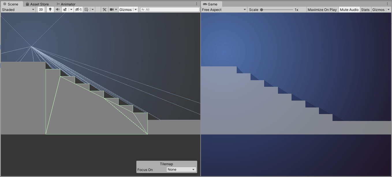
This by default gives you a grid of colliders for every tile (very bad and not supported by my asset) and once you use a Composite Collider (very good and supported by my asset) you end up with the shape you saw on my first reply.

If your setup is causing you problems maybe try using an Edge Collider instead of Poly? (dunno if your character might fall through if framerates go bad tho) 
Just remember to refresh the colliders every time you update your shape.
Don, sorry 💦
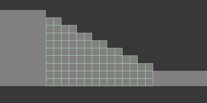
 

Didn't really understand what was the problem that made you add spikes for the stairs. Couldn't reproduce any graphical glitch on my end.

Unfortunately, performance does go down the more complex a scene becomes.
Assuming you're using a Tilemap/Composite Collider combo, the only advice I could give is to separate your map into chunks (like the image below).
This way, the light only has to take the relevant vertices into account, instead of validating vertices far away and not in range.

I'm not sure if the light source in your image is your rock-character or that triangle-shaped fire (?).
If it's the latter (and your character doesn't cast shadows), it's a good idea to activate the Calculate Only Once check under the Optimization Settings. This will "bake" the light mesh on the first frame and you won't have to worry about performance anymore.

Hope this helps somewhat 💦
If you got more questions, please let me know 👌


Ah, yes 😅
Many fixes and some much needed audio is coming in an update this week or next one.

Ah, yes 😅
This is one of the first games I made, back when I was learning how to program n stuff
Sorta forgot it was still here 🤣

(1 edit)

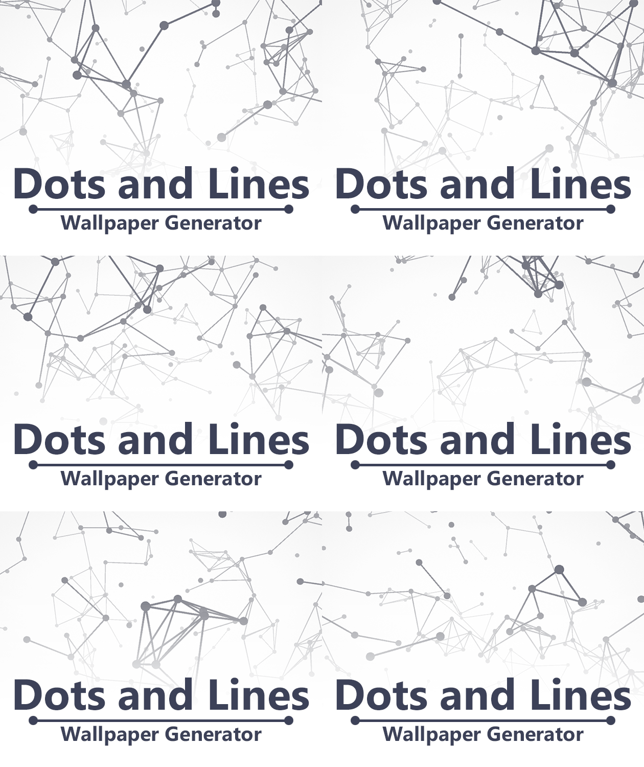
Dots and Lines - Wallpaper Generator

This is a little tool I made after not finding a simple kind of wallpaper in a high enough resolution.
It's built around the concept of spawning a lotta dots and drawing a line between every pair within a certain distance.
You can customize how the dots and lines are generated, what colors are used, apply post fx and scale the output resolution as high as you want.

You can play around on your browser, though I'd recommend using the standalone version if you wanna go crazy with the values.
Check it out here.

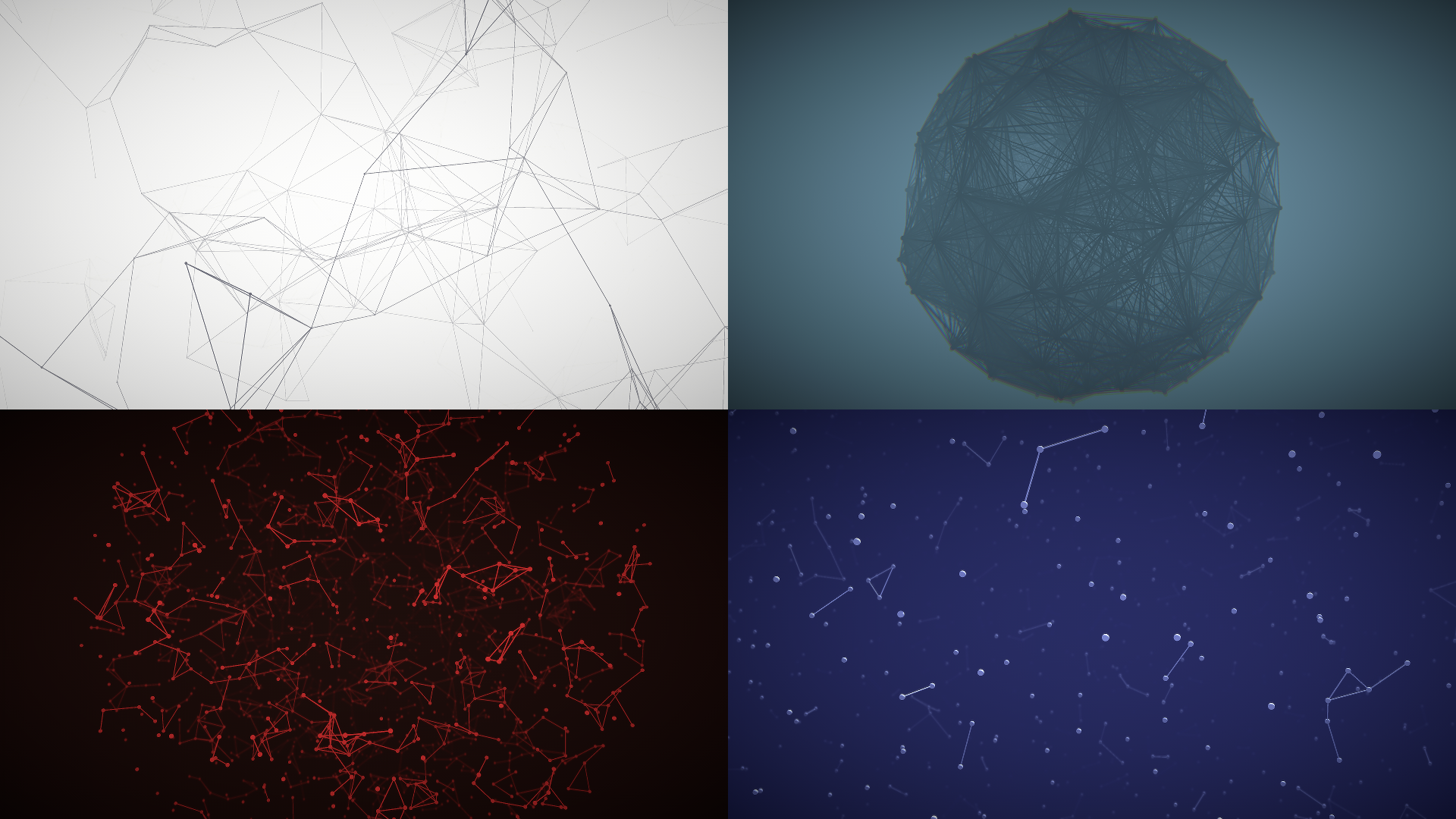
Here's some examples of what you can do with it:

Yup, it's not immediately obvious, but all the levels were just kinda thrown together in less than 2 hours 
One of the first things I wanna do (after adding sounds and music) is make some mirrors rotatables and have actual distraction sources

Thanks for the feedback!

(1 edit)

The distraction was going to be more objective back on the drawing board
I had planned to give them personalities so some would be distracted by radios/tvs or just because they wanted to be close to someone in particular (or away)
In any case, life got in the way and I didn't have time to implement that idea or any sounds at all 😅

I'm hoping to keep working on it, so all the feedback helps a lot
Many  thanks!

I guess it only happened on the stairs 🤔
In any case it didn't seem intentional, so some changes could be done
Something more intuitive, if you need to lock a follower in an area, could be to need them to stand on a pressure plate or something like that
That or just give the player a super jump lol

Yeah, back when I modeled the thing I thought the gradient on the texture would be enough to tell back from front, but not even I could tell at a quick glance so I threw the arrow as an emergency solution 🤣
Still not sure how I'll fix it, but I'll have time to think about it

Thanks for the feedback!

Cool concept!

It does need a bit more polish on the graphics and controls
The followers struggled to navigate the map, so that would need some fixin' too
Had fun hurling my followers tho 🤣

Hope you keep improving!

(1 edit)

Thanks, I really liked your take on the laser concept!

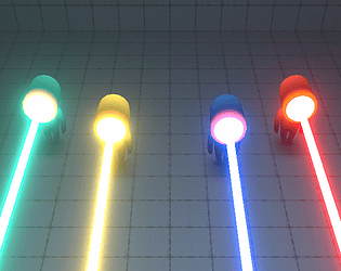
Yup, I used Unity's URP (tho it works on the standard or any RP as well)
All you need is a material with an emission parameter and a bloom post-processing effect
If you want something like the red laser, you just set the emission to red and crank the intensity to something like 5~10
If you activate the HDR boolean on your camera, the material will look white, but the bloom will have the correct color 😁

This is very interesting!
Don't think I've ever seen lasers powering each other up. Certainly not affecting both the output power and reflectiveness
Had to exercise a part of my brain I've never touched 🤣

With more polish on the graphics, some sounds and music, it could very well become a full game with virtually endless possibilities for level designs

Hope you keep improving
Good job!

Very strong style from both the graphics and sounds 👌💕
The music was on point and pushed the atmosphere further
A lot of thought was deceivably simple, but had a lot of depth which was great (tickled my brain whenever I figured out the solution 🤣)

Don't have much to add
Hope you can figure out those bugs on the web version
Great work!

This is great 👌
Loved playing the victim of the jam's theme for once
The sprites and voices are a lot of fun and go perfectly with the game's sense of humor
Always appreciate little quality of life features like obstacles fading when you're behind them or having a functional mini map (tho some critters did hide behind it on the bottom left of the map very often)
Definitely felt the difference in strength as soon as those dark brown hearts started appearing

The shooting is a bit basic (tho I only noticed the powerups after my playthrough) and, since you don't gain health back, I would've liked some unlockable attacks based on the wave or sth
Would like to see how far the concept can be pushed. I can imagine a giant-environment-breaking-heart as a later enemy or something crazier 🤣

Great job for the whole team!

I can relate 🤣
Good luck on your future projects!

Thanks, I really enjoyed your game too!

Thanks!

I sorta threw some quick animations that look more like chess pieces, but hopefully I'll find the time to rig the thingies in the future
If I end up creating more levels, I'll certainly add a level selection
Heck, if there's interest I could even throw in a level creator 👀

Thanks for the feedback!

The platforming physics needs a bit of polish, but I had fun playing nonetheless
Would like to see how far the concept could be pushed if you decided to keep working on it

Good job 👍

This was a lovely experience
The music is very simple, but fits perfectly with the tone. It's specially nice to know it was made by yourselves
Likewise, the gameplay becomes very intuitive after the first 2 levels and the difficulty increases at a good pace

Like some people said, you need to get used to the controls, but it didn't bother me too much
Something small I would've liked is to have a button to manually continue to the next level, since the phrases went by before I had a chance to read them whole

Nice job overall
A lot of effort went into this and it shows 👌💕

It's got a great atmosphere, nice artwork and music
While the concept of using your past lives is not entirely new, I thought it was really interesting that your copies could get mad at you and be not so helpful
The ending was a great payoff to that as well

I did feel like the story interrupted the gameplay too often
The art style is neat, but the color palette could use some work, specially on the UI and the combat scenes

Hope it can be polished in the future

(1 edit)

Yeah, originally (and hopefully in the future) the things would get distracted more predictably by having tv's, radios or things of the sort in the map
Had I had the time to implement audio, those objects would've added a lot to the sound design 😌💭

Thanks for the feedback!

(1 edit)

It's a pretty charming way to go about the jam's theme

The sprites are a bit blurry, but nothing that can't be fixed by changing the import settings
The combat is pretty basic and the movement is too slow, but the objectives were clear and the game didn't overstay its welcome so it never got annoying 

Hope you keep improving 👍

Can't remember right now 🤔
It was the one that introduced the "mind clearing" feature

Nice to see those small details didn't go to waste
Really wish I have had the time to add sound, but that'll have to wait after the ratings are over
Thanks!

This is great!
Very original and goes well with the theme too
It was very satisfying watching the huge difference as soon as you got a good hand like straight flush
Definitely got me addicted and got to win all 50 waves (with 6 hp remaining 🤣)

With a bit more polish and a bunch of extra maps, you could very well make this a full game
Great job!

Great atmosphere all around
Loved the demons' designs, the animations and sound design

Same as most people, I couldn't get past lvl4
Still enjoyed it and could feel the jam's theme very strongly
Good job!

Yeah, I feel like there's a bunch of mechanics that could be explored
I'll definitely try something with friendly fire for future updates
Many thanks!

It's a wholesome little game 🥰 (tho I did manage to lose and got to see me and my family surrounded and eaten alive) (which was great)
Would like to see how this game would be like with better animations and more detailed interactions

All that said, not gonna lie, the music did split my ears and I had to mute it

Never managed to bug out the laser, I'll have to look into it later
I'll definitely add a cooldown for it anyway since, as you said, is makes the whole mechanic useless

Those walls ARE meant to be solid. I just messed up and forgot to change their layers, because I was building all levels with 2 hours left and my brain was already mush 🤣

Many thanks for all the feedback!
I'm hoping to continue updating the game after the voting ends, so this is all very useful 🥰

It's a very pretty game with great art, music and a strong style 💕
Loved the great use of Unity's latest 2D features like the splined sprites and light sources
The floating disembodied enemies did look a bit silly tho 😅
Maybe they could use a big trail renderer behind them or something like that
Appreciated the generous checkpoints and health refills

On the start I could feel a strong level design and could tell apart every area, but I kinda gave up once I got to the spike maze which was a bit too pixel perfect to go through (aka: thread the needle)

Would've enjoyed the gathering of lanterns to reflect more on the gameplay since they only act as a checkpoint and healthpack
In fact, the more lanterns you get, the harder it is to see the spikes since they're all the same color

Big props to the team!
Hope you develop this further

This is one of those rare instances where a coop game is easier when playing alone (Since you can just leave one character resting in a safe spot while the other goes through the level)

The platforming is a bit too pixel perfect at times and the colliders for the characters and spikes are a bit wacky
I'm afraid I didn't feel the jam's theme at all

It's very fun if you get somewhat good at it
The graphics look really nice and the physics are on point

Like some people mentioned, it would really benefit if you could hit play without going for your mouse and clicking a button. Maybe pressing down all your right hand fingers could select the easy mode? idk
There were a few bugs on the control side, where fingers sometimes would not go up despite having the proper key pressed. It also happened with the space bar

Didn't really feel the jam's theme tbh
You got the "together" part down, but not the "stronger"

I really think this could go somewhere with a bit more effort and some quality of life improvements
Good game overall. Nice job!

(1 edit)

This is such a great game!
I loved everything from the sound, sprites, animations and effects

The battles felt very dynamic and full of juice
That extra mile to make you type out the attack instead of just clicking a button just goes to show the attention to detail that went into this

Don't have much to add, it's a good game overall
Great job!

Oof
Could've sworn it was technically impossible, but its seems fairly easy to do

Many thanks! I'll look into it some other day
For now I just need some rest

I like it!
I love these kind of games with exponential growth of fire power
The graphics are really nice and you can clearly tell between the different kind of units

The performance did drop as soon as I got a big ass army, even on the windows build
Perhaps this game could benefit a lot from the new ECS thing Unity is pushing 🤔
The sound was fine, but there should be something preventing the same sound from activating at the same time several times, cuz those laser sounds stacked hard

Very cool game
Would love to see it juiced up with sfx, particles and things of the sort

The gameplay is not very intuitive, but I appreciate having a VS and AI mode
Good job!

Thanks, I really liked your game too!

This was a really fun game to play!
Absolutely loved the concept and having the bullets collide mid air just added to the madness

Would love to see this further developed so you can work out the minor platforming issues

Btw, I crashed when defeating the last enemy on the third level

This was a really fun game to play!
Absolutely loved the concept and having the bullets collide mid air just added to the madness

Would love to see this further developed so you can work out the minor platforming issues

Btw, I crashed when defeating the last enemy on the third level