Game feels great!
yes'sn't
Creator of
Recent community posts
Cool game! Not very original concept but still pretty epic! The level ideas were probably too time consuming for a single level game like this probably being better off being individual levels but other than the time it takes to complete the level the game was pretty cool!
The part where there was a hotkey to zoom out was a little too random to be strategic as a level idea, as only on level 2 my friend was gonna quit since he was confused about what was up with the game!
Other critiques:
- The UI doesn't scale
- The assets were a mess of pixel sizes
- and level ideas as mentioned before
Overall though, the gameplay was there and the concept was in mind so it was pretty cool! I can't really critique the assets any more than the pixel sizes since you didn't make them. There was one bug though where you could jump into the side of the platform i assume because there was no slippery physics material applied!
The name of the game is pretty epicness!
Pretty stonk game. The aesthetics were great! The concept was pretty cool! The game play itself was a bit too difficult and felt kinda uninspired, i'd say the level should be simplified and track lengths extended longer! It took a few tries to get started and could only really finish by driving at a slow pace which is kinda oof since its epic when racing games are fast. Game is cool! Very basic though, maybe adding camera angles, more ui, simpler and more levels , backstory or more would up it from lacking!
Interesting game, the play again button doesn't work btw.
Critiques:
- It is very confusing to tell what even indicates which folder is sussy
- The help screen is a bit messy and the spelling is also a mess
- The music is pretty g since i suppose it is supposed to indicate confusion/sussyness but it could do with some sfx
Concept was pretty epic!, aesthetics were also pretty decent, the game play and help tho were pretty confusing!
Game was pretty chill and fun. My critiques though would be
- maybe have the music also on the menu,
- some of the pixel art was inconsistent in line thickness,
- the music seemed to be lacking composition but was pretty nice
- also maybe add the ability to shoot diagonally.
The level concepts and animated transitions were pretty epic, the enemy variations were pretty cool too , though i wish there was more context to the game, maybe a little panel at the start giving a backstory and controls would help!
Overall pretty chill, the theme I suppose was there, just lacking a proper scenario/backstory as to why a drone is following you and ur collecting rocks.
EDIT: just realised the rocks were being thrown at the drown
Thanks for the feedback! The level design was very finnicky due to the weird physics and how it interacts with objects. I'm not sure about the sprite flipping, i didn't notice if it does that but if so it'll be an easy fix. The object interaction can definitely be adjusted and changed for future change!
Thanks for the feedback. Definitely hard to make level design using the weird physics, it caused a lot of collision bugs, so making levels took most of the time. In future we would definitely want to add more sfx, when we added a button sfx the hitbox kept going off making spam sfx so we ditched it due to time restraints (the pressure plate button not UI button) we forgot about the ui sfx so we only managed to make one last minute for clicking. NGL i had no idea what to do other than a ball, so for the sake of simplicity i kept it a ball, the compression made it look a little ugly though.
Pretty solid visual novel game. THE UI WAS STOCKED OUT in the menu, extra points for that. Really solid with the map and inventory user interaction. Overall, for three days, really solid. Not many corners seen cut, the only thing is the music is slighty cheesy but still good and I wish there was an arrow on the map showing which way you are facing, but other than that I was hella thinking there was going to be a jumpscare lmao. Just wondering how was all the art made? Also the loading system doesn't seem to work, whenever i clicked on one of my saves it just brought me back to the start.
Seeing how the graphics and music was premade its hard to judge but it did suit the game style pretty well. The thing about 3d games that are all premade though leaves many things feeling lost, a tutorial should have definitely been implemented seeing the time most likely had to create the game. The two sides theme was more of a two route theme. There wasn't any sort of pause menu, the music didn't loop and the level design of the rooms felt pretty random. For the time restraints I can see the concept but it still needs polish to the design.
The game visuals could definitely do with polish and the collision too with when you walk into the side of a block you can float. The sound effects were alright though matching the theme of the game. Could definitely do with some in game music, the magnet ability wasn't the most prominent in use and maybe adding a reset button would be good. Overall a nice attempt, just needs polish.
Sadly couldn't play, there should 100% have been keyboard support in such a game jam. Other than that, looking at screenshots and what I could enter. The aesthetics looked pretty polished and the music did match the robot vibe. If the music was a little longer it could have sounded less looped, the UI sfx were way too quiet (if they were there) compared to the music. Other than those small details, it looks quite polished, seeing as I couldn't test the game though. I shall rate from screenshots and what I see.
I will give a 3 for audio and 4 for visuals. Seeing how I couldn't play the game itself i will leave the gameplay as 3 but theme for 4 seeing how the concept is. I can remove my rating though if you want me to.


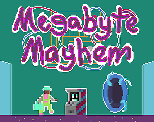


 Cool RTS, interesting objective but the FRIQ my laptop boutta EXPLODE