Indie game storeFree gamesFun gamesHorror games
Game developmentAssetsComics
SalesBundles
Jobs
TagsGame Engines

Youkos

13
Posts
35
Followers
5
Following
A member registered Mar 07, 2019 · View creator page →

Creator of

Recent community posts

If you check the documention, "ShowAnimationOnHud" is a setting only for the general config that allows the game to show combat animations for skills and etc on the hud. You should not be using it on specific items in the UI. 


If you check the documentation again, the only valid times for when animations play is:
"onSceneEnter" : When the screen appears
"onItemSelect": When selecting an object/item/command etc
"onItemUnselect": When an item/object/command is unselected

And two others we forgot to include:
"  onComponentShow:" When a window appears (eg, skills window)
"  onComponentHide:" When a window disappears

The type specifies the type of component, as in what the component literally is, Image, Text, etc etc. The correct setting there would probably be grid or image depending on how you've attempted to this this up. From what I can tell, you've already tried to set up a grid, so what you're aiming for is probably an image? If you've done lunatic items, you shouldn't have to manually define actor 1 image, actor 2 image, etc since it should render one image for each set of data that exists.


The type "face" from the sideview template draws on the face picture you've set in the engine for the character. I would suggest just directly taking that config if you're fine with that, but if you want to do custom images, take a look at how the busts in the main menu is handled and try that method with images instead.

(3 edits)

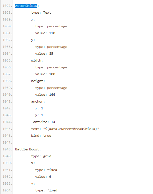
I'm not too familiar with the specific windows present in the plugin, but from the pastebin, it's clear the problem is caused starting around this section:


If ActorShield and BattlerBoost are their own windows, please reference the Lunatic section of the documentation for the correct structure of a lunatic-window config.


If they're not their own windows, but instead a component of another window, please include them under the correct window at the correct indentation.


From what you've already done, I assume you're trying to add them into BattleStatus, the correct indentation should be this instead: https://pastebin.com/E6p94kRL

Please pay attention to your nesting.

Next maybe try switching the battle scene config with the base battle scene config (it should be in the sample folder under Luna Engine Base) and see if the windows are there. If they are there, chances are that Selection Control displaces the windows off screen. If they're not there, then I would do a window search as specified in the manual to see if the plugin made new windows that replaced the existing window that holds the battle statuses.

Can you double check what plugin it is in particular that's causing the issue since Selection control requires Battle core (which we know works) and Target core (which we haven't tested)?

You can do this by turning both target core and selection control off, seeing if it works then, and then turning target core on, seeing if it works, and then finally selection control.


I suspect the issue is in how the windows have been set up in the scene. 

That seems really odd. As far as I know disable async hasn't caused that error for anyone else.

Can you post the console error and your config for the window? If it's a bug, we'll squish it. owo b

To make the menu horizontal, change the following command in the BattleStatus window:

    columns: -insert max number of actors here-

So for example, if you wanted a row of 5 actors laid out horizontally, you would change it to this:

    columns: 5


To move the position of the block of battle statuses, change the x and y settings of the BattleStatus window: 

  BattleStatus:
    type: Window
    x:
      type: fixed
      value: -horizontal-
    y:
      type: fixed
      value: -vertical-

If you're still confused on what to do, feel free to screenshot the config for the window and I'll annotate it for you.
(1 edit)

Horizontal Atlas doesn't exist, sadly. Only vertical does. Please reorganize your source file icons vertically and then change "horizontalAtlas" to "verticalAtlas". It will still display horizontally.

Good to hear! Feel free to post again if you need more help.

Hey, Youko here. I'm one of the primary testers for Luna and the one who made one of the UIs featured on the page (the gold and black one).


Basically to answer your question, the reason it fills back up has to do with you setting a colour for the gauge. Basically it refills because it gets confused about the conflicting settings (and probably the "blind: true"???). Simply getting rid of all the crossed out lines should resolve the issue. 


As for your second request, the cleanest way to accomplish that is by basically making a second "gauge back" image and layering it behind the gauge so once the gauge decreases, it will show through. Simply add another image component with your source file for the back with more or less the same rotation and position settings, and add it above your ActorHpGauge component on the lunatics item list.

(1 edit)

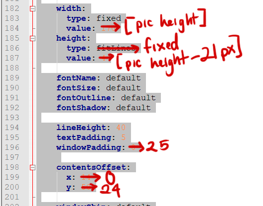
Here's an explanation:

width value: By changing this, you change the size of the "window", giving your items more space and making it automatically align the arrow indicators in a cleaner fashion. This should move the arrows to the middle. 

height type: By changing this from fitLines to fixed, it tells luna that you want the window to always be a certain pixel height(height value), changing the vertical position of the scroll down indicator and the number of lines of items that can fit.

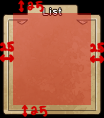
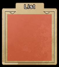
window padding: Window padding is the amount of space Luna will automatically put between the edge of the window and the contents of the window. Basically, you're telling it only to draw in the red area (assuming the size of the window is the same height and width as your image): 

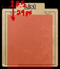
Since we don't want the image to draw the contents above where it would logically draw according to the image, at this point we use the y contentoffset to translate the draw area down 24 px, resulting in this:


At this point you'll notice that the bottom boundary of the box is too long again, so you can chop it down a bit via making the y of the window smaller (by around 21 px), so we end up with this:

Hopefully, that makes sense to you. Let me know if you need more help.

(1 edit)

The cleanest way to fix the menu would be the following:


The more "duct tapey" way to fix the problem would be to do what you originally wanted to via giving the "background window an offset". There is no way  to do this in the configs, but you can simply set up your source images to include the transparent white space so it's "offset". That said. I really wouldn't suggest this as it makes it very tedious to change any work you've already done if you decide to do something else down the line, and it adds a bigger lag factor due to larger images to work with.

If you want to understand why changing the above fixes the problem, look at my explanation below. 

I'd also suggest studying the documentation on either the physical document or the wiki closely since it explains a lot of this in extreme detail.

Hey,

Youko here. I'm one of the primary testers for Luna.  To answer your offset issue, how did you set up your background image in the first place? If you set it up as an image windowskin for the item menu, you should still be able to freely change the size of the actual window without breaking the imagine too severely. Simply go to the Block 1 section of the config (listed in the documentation) and change the width and height of the window.

The reason it's not naturally lining up has to do with both how you've set up your source images as well as your configurations. I would need to see both to really tell you how to fix it specifically outside of general advice.